Bootstrap 3: Display panels inside their wells on browser resize
How can I get these panels to stay inside their wells when the browser window is resized
Just use the .col-xs-* class (instead of col-md-*):
<div class="container">
<div class="row clearfix" id="content-row">
<div class="col-xs-12 column">
<div class="well" id="volume-fees-well">
<div class="row clearfix" id="volume-fees-row">
<div class="col-xs-9 column" id="volume-fees-chart">
<div class="panel panel-primary" id="volume-fees-panel">
<div class="panel-heading">
<h3 class="panel-title">
Volume & Fees
</h3>
</div>
<div class="panel-body">
<svg></svg>
</div>
</div>
</div>
<div class="col-xs-3 column">
<div class="panel panel-primary" id="volume-fees-summary-panel">
<div class="panel-heading">
<h3 class="panel-title">
Summary
</h3>
</div>
<div class="panel-body">
</div>
</div>
</div>
</div>
</div>
<div class="well" id="vehicle-class-well">
Will Weld
Updated on June 27, 2022Comments
-
Will Weld almost 2 years
How can I get these panels to stay inside their wells when the browser window is resized (particularly to the width of a mobile device)? It'd probably be best to resize the well too. I have some overlapping issues as well.
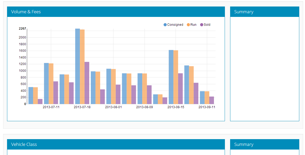
Here's full width:
Here's mobile width (ish):
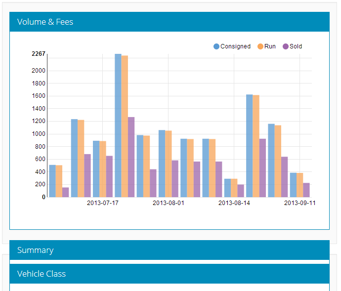
I'd like that Summary to be in the Volume & Fees well, on its own line, not overlapping with the other wells.
Here's the HTML:
<div class="container"> <div class="row clearfix" id="content-row"> <div class="col-md-12 column"> <div class="well" id="volume-fees-well"> <div class="row clearfix" id="volume-fees-row"> <div class="col-md-9 column" id="volume-fees-chart"> <div class="panel panel-primary" id="volume-fees-panel"> <div class="panel-heading"> <h3 class="panel-title"> Volume & Fees </h3> </div> <div class="panel-body"> <svg></svg> </div> </div> </div> <div class="col-md-3 column"> <div class="panel panel-primary" id="volume-fees-summary-panel"> <div class="panel-heading"> <h3 class="panel-title"> Summary </h3> </div> <div class="panel-body"> </div> </div> </div> </div> </div> <div class="well" id="vehicle-class-well">I'm using D3 for the charts, which is what the svg is for.
I'm using the Bootswatch Yeti theme and the standard Bootstrap.css. The only CSS I've overridden from the Bootstrap.css is:
#content-row {
margin-top: 50px;
}

#volume-fees-row, #vehicle-class-row, #consignor-map-row, #buyer-map-row {
    height: 450px;
}

.panel {
    max-width: 100%;
}

.panel-body {
    height: 400px;
}
Please let me know if you have any questions!