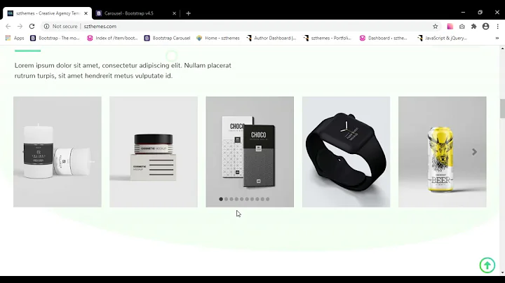
Bootstrap 4 Carousel with multi col slides
To have full control over carousel responsive columns in Bootstrap's framework, and have control over how many columns to slide in each breakpoint, is to use Ken Wheelers Slick slider. Its awesome! My demo is only scratching the surface, you can change slider options on every breakpoint if you want too. See his documentation.
Please note in my Slick jQuery javascript, I am defining mobileFirst: true which makes Slick's breakpoints work just like Bootstrap's breakpoints.. mobile first!
jQuery
This is a javascript array replicating Bootstrap 4's grid breakpoints which I then pass to the Slick slider jQuery function. The code below is overkill, to demo how you can change the column size and how many columns to slide on each Slick slide animation.
var breakpoint = {
  // Small screen / phone
  sm: 576,
  // Medium screen / tablet
  md: 768,
  // Large screen / desktop
  lg: 992,
  // Extra large screen / wide desktop
  xl: 1200
};

// page slider
$('#slick').slick({
  autoplay: true,
  autoplaySpeed: 2000,
  draggable: true,
  infinite: true,
  dots: false,
  arrows: false,
  speed: 1000,
  mobileFirst: true,
  slidesToShow: 1,
  slidesToScroll: 1,
  responsive: [
    {
      breakpoint: breakpoint.sm,
      settings: {
        slidesToShow: 2,
        slidesToScroll: 2
      }
    },
    {
      breakpoint: breakpoint.md,
      settings: {
        slidesToShow: 3,
        slidesToScroll: 3
      }
    },
    {
      breakpoint: breakpoint.lg,
      settings: {
        slidesToShow: 4,
        slidesToScroll: 4
      }
    },
    {
      breakpoint: breakpoint.xl,
      settings: {
        slidesToShow: 5,
        slidesToScroll: 5
      }
    }
  ]
});
Sass (css)
If your not using sass, let me know i'll update with css. This sass/css below, emulates Bootstrap 4's row/column margin and padding styles.
#slick {

  .slick-list {
    margin: {
      left: -15px;
      right: -15px;
    }
  }

  .slick-slide {
    padding-right: 15px;
    padding-left: 15px;

    &:focus {
      outline: none;
    }
  }
}
Very simple, and way more control than Bootstrap's carousel gives you.
See this jsfiddle where you can test each of Bootstrap's breakpoints, and on each breakpoint, you will see a change which is defined in my script above. The jQuery Slick function above, when Slick slides to the next slide, i've set on each breakpoint slidesToScroll to slide the same amount of slidesToShow.. but you can change these settings to what ever you want.
The nice thing about this method, is that you can loop all of your articles/posts in one single container, rather than breaking your loop to output an extra .row div. Just simply use Slick's function to control how many columns to show in each breakpoint.
See working demo https://jsfiddle.net/joshmoto/rh1wymuk/
See below stackoverflow demo but you wont be able to test breakpoints
var breakpoint = {
  // Small screen / phone
  sm: 576,
  // Medium screen / tablet
  md: 768,
  // Large screen / desktop
  lg: 992,
  // Extra large screen / wide desktop
  xl: 1200
};

// slick slider
$('#slick').slick({
  autoplay: true,
  autoplaySpeed: 2000,
  draggable: true,
  infinite: true,
  dots: false,
  arrows: false,
  speed: 1000,
  mobileFirst: true,
  slidesToShow: 1,
  slidesToScroll: 1,
  responsive: [{
      breakpoint: breakpoint.sm,
      settings: {
        slidesToShow: 2,
        slidesToScroll: 2
      }
    },
    {
      breakpoint: breakpoint.md,
      settings: {
        slidesToShow: 3,
        slidesToScroll: 3
      }
    },
    {
      breakpoint: breakpoint.lg,
      settings: {
        slidesToShow: 4,
        slidesToScroll: 4
      }
    },
    {
      breakpoint: breakpoint.xl,
      settings: {
        slidesToShow: 5,
        slidesToScroll: 5
      }
    }
  ]
});
#slick .slick-list {
margin-left: -15px;
margin-right: -15px;
}
#slick .slick-slide {
padding-right: 15px;
padding-left: 15px;
}
#slick .slick-slide:focus {
outline: none;
}<!-- Latest compiled and minified CSS -->
<link rel="stylesheet" href="https://maxcdn.bootstrapcdn.com/bootstrap/4.1.3/css/bootstrap.min.css">
<!-- Slick CSS -->
<link href="https://cdn.jsdelivr.net/npm/[email protected]/slick/slick.css" rel="stylesheet" />
<!-- jQuery library -->
<script src="https://ajax.googleapis.com/ajax/libs/jquery/3.3.1/jquery.min.js"></script>
<!-- Popper JS -->
<script src="https://cdnjs.cloudflare.com/ajax/libs/popper.js/1.14.3/umd/popper.min.js"></script>
<!-- Latest compiled JavaScript -->
<script src="https://maxcdn.bootstrapcdn.com/bootstrap/4.1.3/js/bootstrap.min.js"></script>
<!-- Slick jQuery min -->
<script src="https://cdn.jsdelivr.net/npm/[email protected]/slick/slick.min.js"></script>
<header>
<nav class="navbar navbar-expand-md navbar-dark bg-dark">
<a class="navbar-brand mr-auto" href="#">Slick in Bootstrap 4</a>
<a class="nav-link d-none d-sm-inline" href="http://kenwheeler.github.io/slick/" target="_blank">Slick Github</a>
</nav>
</header>
<main class="pt-3 pb-3">
<div class="container">
<div id="slick">
<div class="slide">
<div class="card">
<img src="https://via.placeholder.com/600x400&text=thumbnail" class="card-img-top" />
<div class="card-body">
<h5 class="card-title">Article title</h5>
<p class="card-text">Ut sed ligula vel felis vulputate lobortis id eget mauris. Nullam sollicitudin arcu ac diam ornare, eget iaculis nisl accumsan.</p>
<a href="#" class="btn btn-primary">Go somewhere</a>
</div>
</div>
</div>
</div>
</div>
</main>Related videos on Youtube
Christian
Updated on June 04, 2022Comments
-
 Christian almost 2 years
I need my carousel to run without images, and instead rotate rows with multiple columns(col-4).
Its essentially working, but the cols are displaying vertically and not 3 side by side as the code suggests. What am I missing?
 <div id="demo" class="carousel slide" data-ride="carousel">
  <div class="carousel-inner">
    <div class="row rss_ticker carousel-item m-0">
      <div class="col-xl-4 col-lg-4 col-md-4 col-sm-4 col-xs-4">
My code can be seen here. https://jsfiddle.net/pwf1dahr/1/
-
 brooksrelyt over 5 years
 -
 brooksrelyt over 5 yearsPossible duplicate of Bootstrap carousel multiple frames at once
 -
 Christian over 5 yearsThis fixed the issue - or pointed to the issue. stackoverflow.com/questions/18785963/… I had <div class="row item active"> but needed to separate it to <div class= item active"><div class="row">
-
-
ganar over 4 yearsThis is an excellent answer, the code is clean and well explained. Kudos to Josh: @christian, please consider marking the question as solved!
-
 Yohan W. Dunon almost 3 yearsVery nice! The best example I've seen for now! Thank you for your work. Just one question: It's possible to see how to do it for ReactJs using hooks without Jquery?
 -
joshmoto almost 3 years@YohanW.Dunon are you using this react-slick.neostack.com ?
-
 Yohan W. Dunon almost 3 years@joshmoto Hi No sorry, I've found a solution. Thanks.


