Bootstrap 4 - How to change order on mobile?
Visual order of columns can be changed in Bootstrap 4 since it uses flex box .The responsive ordering classes using flex can be used.
And we can specify order to differently to each viewports.
Using order-xs-12,order-sm-2,order-md-0, order-lg-5, order-xl-last.We can specify order of columns from 0-12,order-first and order-last for first and last column.
 <div class="container">
 <div class="row ">
   <div class="col-lg-8  col-md-6 col-sm-12 d-flex flex-column ">
     <div class="mb-4">
     left 1
     </div>
     <div class="mb-4 bg-info order-sm-last order-md-first order-lg-last ">
     left 2
     </div>
     <div class="mb-4">
     left 3
     </div>
     <div class="mb-4">
     left 4
     </div>
   </div>
   <div class="col-lg-4 col-md-6 col-sm-12 d-flex flex-column">
     <div class="mb-4">
     right 1
     </div>
     <div class="mb-4">
     right 2
     </div>
     <div class="mb-4 bg-success order-lg-last order-md-first order-sm-
    first">
     right 3
     </div>
     <div class="mb-4">
     right 4
     </div>
     <div class="mb-4">
     right 5
     </div>
   </div>
</div>
</div>
On Larger Screen

On Medium Screen

On Small Screen

krezy
Updated on June 04, 2022Comments
-
krezy almost 2 years
I'm making a responsive layout with Bootstrap 4 which consists of two columns. Both columns have a total of 9 divs, four on the first column, five on the second column. I'd like to change the orders of the divs inside the columns if the breakpoint is below LG.
Here's an explanation and the correct order I'd like to achieve:
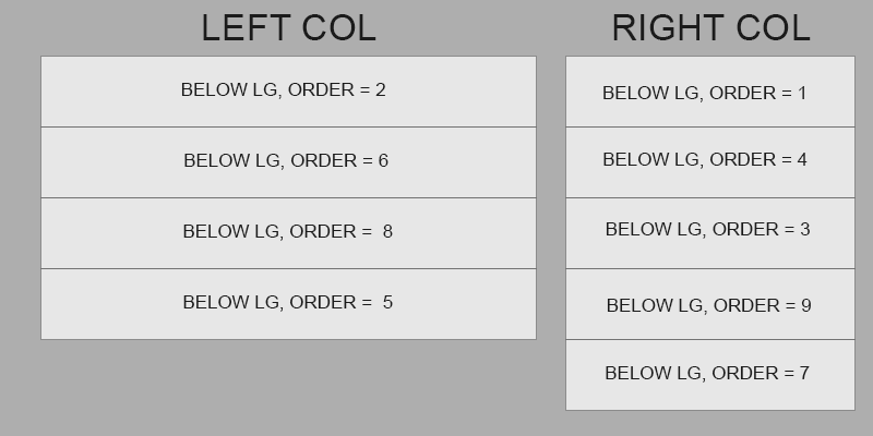
What I currently have:
<div class="container"> <div class="row"> <div class="col-lg-8"> <div class="mb-4"> left 1 </div> <div class="mb-4"> left 2 </div> <div class="mb-4"> left 3 </div> <div class="mb-4"> left 4 </div> </div> <div class="col-lg-4"> <div class="mb-4"> right 1 </div> <div class="mb-4"> right 2 </div> <div class="mb-4"> right 3 </div> <div class="mb-4"> right 4 </div> <div class="mb-4"> right 5 </div> </div> </div> </div>-
 KIKO Software about 6 years"Correct order"? I don't see the logic behind it. It seems random. This is not ideal for a responsive layout.
 -
krezy about 6 yearsLook at the screenshot I provided, there's nothing random. Not ideal? Your statement nor your whole comment does make any sense.
-
 Paulie_D about 6 yearsYou numbers in the code do not match the image...it's really unclear what it is you are trying to do... but you can't change the
orderbetween containers. -
krezy about 6 yearsThe numbers do match the image and there's only one container used as you can see in the code. smh
-
 cloned over 3 yearsStill not clear what you want to do for me. You have
right 1as text in the code andorder = 1on your image, are these the same boxes? If so you can't do it since you can't change the order between containers (as previously said) Don't mix container (=== a div) with a div which has a classcontainer
-