Bootstrap 4 row fill remaining height
Solution 1
Use the Bootstrap 4.1 flex-grow-1 class...
https://codeply.com/go/Iyjsd8djnz
html,body{height:100%;}

.bg-purple {
  background: rgb(48,0,50);
}
.bg-gray {
  background: rgb(74,74,74);
}
.bg-blue {
  background: rgb(50,101,196);
}
.bg-red {
  background: rgb(196,50,53);
}
<link rel="stylesheet" href="https://stackpath.bootstrapcdn.com/bootstrap/4.3.1/css/bootstrap.min.css" integrity="sha384-ggOyR0iXCbMQv3Xipma34MD+dH/1fQ784/j6cY/iJTQUOhcWr7x9JvoRxT2MZw1T" crossorigin="anonymous">
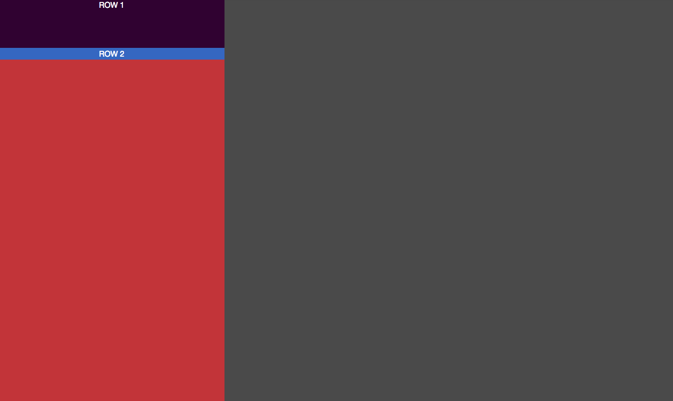
<div class="container-fluid h-100">
<div class="row justify-content-center h-100">
<div class="col-4 bg-red">
<div class="h-100 d-flex flex-column">
<div class="row justify-content-center bg-purple">
<div class="text-white">
<div style="height:150px">ROW 1 - fixed height</div>
</div>
</div>
<div class="row justify-content-center bg-blue flex-grow-1">
<div class="text-white">ROW 2 - grow remaining height</div>
</div>
</div>
</div>
<div class="col-8 bg-gray"></div>
</div>
</div>Update 4.3.1: Another example using the vh-100 utility class
https://codeply.com/go/h3bZbM6eSS
.bg-purple {
  background: rgb(48,0,50);
}
.bg-gray {
  background: rgb(74,74,74);
}
.bg-blue {
  background: rgb(50,101,196);
}
.bg-red {
  background: rgb(196,50,53);
}
<link rel="stylesheet" href="https://stackpath.bootstrapcdn.com/bootstrap/4.3.1/css/bootstrap.min.css" integrity="sha384-ggOyR0iXCbMQv3Xipma34MD+dH/1fQ784/j6cY/iJTQUOhcWr7x9JvoRxT2MZw1T" crossorigin="anonymous">
<div class="container-fluid">
<div class="row justify-content-center min-vh-100">
<div class="col-4 bg-red">
<div class="d-flex flex-column h-100">
<div class="row justify-content-center bg-purple">
<div class="text-white">
<div style="height:150px">ROW 1 - fixed height</div>
</div>
</div>
<div class="row justify-content-center bg-blue flex-grow-1">
<div class="text-white">ROW 2 - grow remaining height</div>
</div>
</div>
</div>
<div class="col-8 bg-gray"></div>
</div>
</div>Related: How to make the row stretch remaining height
Solution 2
This is a solution. The wrapper div has to have h-100, the div that adapts to height has to have flex-grow-1 and overflow-auto. This way, the div will grow to fill the space when its content is minor than the available space and will show the scrollbar when its content is higher than the available space.
<div class="h-100 d-flex flex-column bg-yellow px-2">
<div class="flex-column justify-content-center bg-purple px-2">
    <div class="text-white p-0" style="height:50px">HEADER</div>
</div>

<div class="flex-column justify-content-center bg-red text-white px-2 flex-grow-1 overflow-auto">

        <div>Item1</div>
        <div>Item2</div>
        INNER text 1<br>
        INNER text 2<br>

</div>

<div class="flex-column justify-content-center bg-darkblue px-2">
    <div class="text-white p-0" style="height:50px">FOOTER</div>
</div>
Related videos on Youtube
 06 : 01
 01 : 32
 07 : 53
 12 : 54
 08 : 43
 06 : 27
 01 : 35
 01 : 41
 02 : 00
Egor
Updated on July 09, 2022Comments
-
Egor almost 2 years
I'm struggling to make the a row stretch to fill the rest of the available height. I tried adding
h-100to the row class but that causes a white space at the bottom of the screen. There must be a way to do it but I'm totally stumped.. Here is my code:<div class="container-fluid h-100"> <div class="row justify-content-center h-100"> <div class="col-4 bg-red"> <div class="h-100"> <div class="row justify-content-center bg-purple"> <div class="text-white"> <div style="height:200px">ROW 1</div> </div> </div> <div class="row justify-content-center bg-blue"> <div class="text-white">ROW 2</div> </div> </div> </div> <div class="col-8 bg-gray"></div> </div> </div>codepen: https://codepen.io/ee92/pen/zjpjXW/?editors=1100
I'd like to make the the blue row (ROW 2) fill all the red space. Any suggestions?
Thanks
-
m1l05z over 5 yearsEverything it's great until the text from first row starting to grow and hiding under second row.. codepen.io/anon/pen/maVoKy :/
-
m1l05z almost 5 years@Nate Did You look at example I attached? Anyway in my case setting fixed height is not a option..
-
 Nate almost 5 yearsWhat browser are you using? In chrome, your first row exceeds the height of the screen for me, but it doesn't "hide" under the second row -- instead it pushes the second row off-screen. On Safari it hides underneath the second row, which feels more appropriate than what chrome does. What exactly are you looking to achieve? I, too, didn't want a fixed height, but I knew it was small enough that it would fit inside of my expected minimum height. I think in this problem domain you have a row you know is "small" and then the other should expand to remaining space. That isn't what you want?
 -
 C4d almost 5 years@Nate as
ROW 1has a fixed height in this answer it shouldnt grow but the content should overflow to the right or bottom. -
Nate almost 5 years@C4d I understand. I removed the fixed height from row 1 in my usage, because I wanted two rows to consume the entire space, but the first row to be minimal. It sounded like
m1l05zwanted the same. Perhaps this wasn't the best solution for my problem, but it's what I found =). -
Haider about 4 yearsThank you so much for this answer. This solved my problem. Can you also tell how can I achieve the same with two columns? I want to have ColumnA and columnB, both should adapt to the height and scroll independently of each other.
-
7skies over 3 yearsWhat if row2 displays a long list, and wanted to have it stick to whatever height remaining, and not grow to the end of the list.