Change built-in colors
Solution 1
I found this on the Angular2 Material github page
So assuming you are using Angular-CLI
Color Pallette - For selecting the colors you want to use and their shades, eg brown = $md-brown then choose a shade like 800.
1.) First Create a ./src/forest-theme.scss file (Whatever name you want)
@import '~@angular/material/core/theming/all-theme';

@include md-core();

$forest-app-primary: md-palette($md-brown, 800);       // Brown  <-- CUSTOM COLOR HERE!
$forest-app-accent:  md-palette($md-green, A400);      // Green  <-- CUSTOM COLOR HERE!

$forest-app-warn:    md-palette($md-deep-orange, 500); // Orange <-- CUSTOM COLOR HERE!

$forest-app-theme: md-light-theme($forest-app-primary, $forest-app-accent, $forest-app-warn);

@include angular-material-theme($forest-app-theme);
2.) Next: Add a new entry to the "styles" list in angular-cli.json pointing to the theme file (e.g., forest-theme.scss).
angular-cli.json
{
    "project": {
        "version": "blah",
        "name": "my_forest_app"
    },
    "apps": [
      {
        "styles": [
            "styles.css",
            "forest-theme.scss"
        ]
      }
    ],
}
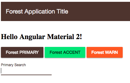
3.) Then in your component you should be able to do something like this
import {Component} from '@angular/core';

@Component({
  selector: 'my-app',
  template: `
    <md-toolbar color="primary">
      <span>Forest Application Title</span>
    </md-toolbar>
    <br/>
    <div>
      <h2>Hello {{name}}</h2>
      <button md-raised-button color="primary">Forest PRIMARY</button>
      <button md-raised-button color="accent">Forest ACCENT</button>
      <button md-raised-button color="warn">Forest WARN</button>
      <br>
      <br>
      <md-input color="primary" placeholder="Primary Search"></md-input>
    </div>
  `,
})
export class App {
  name:string;

  constructor() {
    this.name = 'Angular2 Material'
  }

}
That should do it, any questions this page should answer them
Update
Angular Material has its own web site with plenty of Guides
Solution 2
The answer given by @Logan H was right, but is outdated.
These are the new links for:
The steps are the same as @Logan H said in his answer:
- Create a file (theme.scss) under the src/ folder of your angular 2 project
- Add the file name in the array of styles specified in angular-cli.json or .angular-cli.json depends on your ng project version:
.angular-cli.json
"styles": [
        "styles.less",
        "theme.default.scss"
]
src/theme.scss
//CHOOSE ONE, depending on your version, check UPDATE at the end
@import '~@angular/material/core/theming/all-theme';
@import '~@angular/material/theming';

// Plus imports for other components in your app.

// Include the base styles for Angular Material core. We include this here
// so that you only
// have to load a single css file for Angular Material in your app.
@include mat-core();

// Define the palettes for your theme using the Material Design palettes
// available in palette.scss
// (imported above). For each palette, you can optionally specify a default,
// lighter, and darker
// hue.
$app-default: mat-palette($mat-indigo);
$app-default-accent:  mat-palette($mat-pink, A200, A100, A400);

// The warn palette is optional (defaults to red).
$app-default-warn:    mat-palette($mat-red);

// Create the theme object (a Sass map containing all of the palettes).
$app-default-theme: mat-light-theme($app-default, $app-default-accent, $app-
default-warn);

// Include theme styles for core and each component used in your app.
// Alternatively, you can import and @include the theme mixins for each
// component
// that you are using.
@include angular-material-theme($app-default-theme);
In the comments is explained where to find the set of colors and options to choose. pallette.scss (\node_modules\@angular\material\core\theming_palette.scss)
UPDATE
In the last version of angular material 2 (Beta 3) some paths have changed, see here.
The breaking changes are:
New path to import pallette or to create your own theme. The path changes in src/theme.scss from @import '~@angular/material/core/theming/all-theme'; to @import '~@angular/material/theming'; The same would happen if you are just importing a pre-built theme, the new path for amber theme is @import '~@angular/material/prebuilt-themes/deeppurple-amber.css';
Since Material 2 Beta 3 depends on Angular 4 (Angular latest version), we need to import in our main module the animation module from BrowserAnimationsModule or NoopAnimationsModule and I quote:
Now that animations have been refactored into a separate package, users of @angular/material need to explicitly import BrowserAnimationsModule (or NoopAnimationsModule) from @angular/package-browser/animations as well as installing @angular/animations.
Related videos on Youtube
 29 : 34
 06 : 02
 14 : 41
 02 : 46
 26 : 09
 14 : 51
 31 : 34
 14 : 49
 10 : 18
![🌈 POCOYO in ENGLISH - Change Your Color Again [94 min] Full Episodes |VIDEOS and CARTOONS for KIDS](https://i.ytimg.com/vi/-_jAik3-_BY/hq720.jpg?sqp=-oaymwEcCNAFEJQDSFXyq4qpAw4IARUAAIhCGAFwAcABBg==&rs=AOn4CLDAGuHHfc2onnklVqpc5BWrfNCUzA) 01 : 34 : 26
01 : 34 : 26
 05 : 40
 05 : 21
Alexander Abakumov
Hello, My name is Alex Abakumov and I've been a professional Software Engineer since 2005. At the beginning of my career, I used primarily C\C++, and a little bit of PHP and Java. In 2008 I started using .NET and since then it became my passion :) In 2010 - 2015 I've been working with a German company doing projects for US and German clients and since 2015 I work exclusively with US companies onsite. I have extended experience in developing software solutions in Transportation, Insurance, Finance fields. I'm experienced with full .NET Web and Windows desktop stacks, WCF, SQL Server, HTML5 web apps based on JavaScript\TypeScript and Angular, KnockoutJS, jQuery frameworks, as well as developing mobile apps for iOS and Android (both Java and NDK) available on AppStore\Google Play. I'm proficient with C#, Java, C\C++, JavaScript, TypeScript, SQL, Objective-C languages. Except coding, I like science, reading, psychology, jogging and swimming. Thanks for your time and hope you have a great day! :)
Updated on September 15, 2022Comments
-
Alexander Abakumov over 1 year
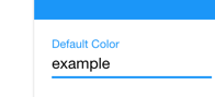
I just wanna ask how to change these build-in colors in Angular 2 material.
Its specified in the ng2-material docs:
color: "primary"|"accent"|"warn"How to change colors in these palettes? Or even how to just change that blue color of the text?
I've tried this and it doesn't work.md-input: { color: black; border-color: black }