Chrome issue with background-attachment fixed and position fixed elements
Solution 1
Found this solution on: https://fourword.fourkitchens.com/article/fix-scrolling-performance-css-will-change-property
Seems to me to be a clever way to use :before pseudo element. Limit the width for fixed width elements but works great for full width pages. Essentially comes out to look like this:
.background_fill {
  overflow: hidden;
  position: relative;
    color: red;
}
.background_fill:before {
  background-color: white;
  background: url('http://www.lausanneworldpulse.com/pdfs/brierley_map_0507.jpg') no-repeat center center;
  background-size: cover;
  z-index: -3;
  content: " ";
  position: fixed;
  will-change: transform;
  width: 100%;
  height: 100%;
}
<div class="background_fill">
<div>this is on a background / this is on a background / this is on a background / this is on a background / this is on a background / this is on a background</div>
<div>this is on a background / this is on a background / this is on a background / this is on a background / this is on a background / this is on a background</div>
<div>this is on a background / this is on a background / this is on a background / this is on a background / this is on a background / this is on a background</div>
<div>this is on a background / this is on a background / this is on a background / this is on a background / this is on a background / this is on a background</div>
<div>this is on a background / this is on a background / this is on a background / this is on a background / this is on a background / this is on a background</div>
<div>this is on a background / this is on a background / this is on a background / this is on a background / this is on a background / this is on a background</div>
<div>this is on a background / this is on a background / this is on a background / this is on a background / this is on a background / this is on a background</div>
<div>this is on a background / this is on a background / this is on a background / this is on a background / this is on a background / this is on a background</div>
<div>this is on a background / this is on a background / this is on a background / this is on a background / this is on a background / this is on a background</div>
<div>this is on a background / this is on a background / this is on a background / this is on a background / this is on a background / this is on a background</div>
<div>this is on a background / this is on a background / this is on a background / this is on a background / this is on a background / this is on a background</div>
<div>this is on a background / this is on a background / this is on a background / this is on a background / this is on a background / this is on a background</div>
<div>this is on a background / this is on a background / this is on a background / this is on a background / this is on a background / this is on a background</div>
<div>this is on a background / this is on a background / this is on a background / this is on a background / this is on a background / this is on a background</div>
<div>this is on a background / this is on a background / this is on a background / this is on a background / this is on a background / this is on a background</div>
<div>this is on a background / this is on a background / this is on a background / this is on a background / this is on a background / this is on a background</div>
</div>Works great for me as a way of getting around this very annoying bug.
Solution 2
Since a fixed positioned background seems to break for no reason in Chrome, you can potentially try playing around with the clip and position:fixed properties. It's not very well known, but the clip property when set on an absolute positioned element will actually even crop fixed positioned child elements.
There are some drawbacks, however. Most importantly, this trick sadly doesn't work flawlessly on iOS for some reason, whereas the browser has troubles rendering the entire image while the user is scrolling (you kinda get a pop-in effect). It's not something overly major, but perhaps something you should take in regard. Of course, you can still work around this by using for example some clever javascript that falls back to a fixed background. Another iOS workaround is by merely using -webkit-mask-image: -webkit-linear-gradient(top, #ffffff 0%,#ffffff 100%) which is basically a webkit-specific alternative for clip: rect(auto,auto,auto,auto) (i.e. crop everything outside the container).
I made a JSFiddle (codepen didn't want to play with me) implementation example for how you can do this. Look specifically at .moment, .moment-image and the new .moment-clipper.
I hope this is of some help!
Update: Clip is now deprecated in favour of clip-path, but is as of writing still supported in all browsers. The same effect can however be achieved with:
-webkit-clip-path: polygon(0 0, 100% 0, 100% 100%, 0 100%);
clip-path: polygon(0 0, 100% 0, 100% 100%, 0 100%);
overflow: hidden;
position: absolute is no longer required on the container. Support for clip-path seems to be relatively limited, with only Chrome and Safari currently supporting it with prefixes. The safest bet is probably to include both clip and clip-path since they don't appear to interfere with each other.
I've updated the fiddle above to also include clip-path.
Solution 3
A late answer but I came around with this and somehow I made a hack for this one.
The idea was to create an inner element which will hold the background-image and will act same as background-attachment:fixed property.
Since this property makes the background image position relative to the window we have to move the inner element within it's container and this way we will get that effect.
var parallax_container = $(".parallax_container");
/*Create the background image holder*/
parallax_container.prepend("<div class='px_bg_holder'></div>");
$(".px_bg_holder").css({
    "background-image" : parallax_container.css("background-image"), /*Get the background image from parent*/
    "background-position" : "center center",
    "background-repeat" : "no-repeat",
    "background-size" : "cover",
    "position" : "absolute",
    "height" : $(window).height(), /*Make the element size same as window*/
    "width" : $(window).width()
});
/*We will remove the background at all*/
parallax_container.css("background","none");
parallax_container.css("overflow","hidden");/*Don't display the inner element out of it's parent*/
$(window).scroll(function(){
    var bg_pos = $(window).scrollTop() - $(".parallax_container").offset().top; /*Calculate the scrollTop of the inner element*/
    $(".px_bg_holder").css({
        "margin-top" : bg_pos+"px"
    });
});
$(window).resize(function(){
    $(".px_bg_holder").css({
        "height" : $(window).height(),
        "width" : $(window).width()
    });
});
Solution 4
As seen on this great pen by Raphael Rychetsky, translate3d may be the troublemaker.
If you use transform: translate3d(0,0,0), try replacing it by transform: translate(0,0) and it should do the trick. At least it worked for me.
Solution 5
Hi it's very simple no need to add any webkit & media tag just follow below
- steps I removed the background Url tag in below container
.content .container { /* background: url(http://beeverlyfields.com/wp-content/uploads/2015/02/bgBeeverly4.jpg); */
- i added img src tag in class="container" and position as fixed and top=0
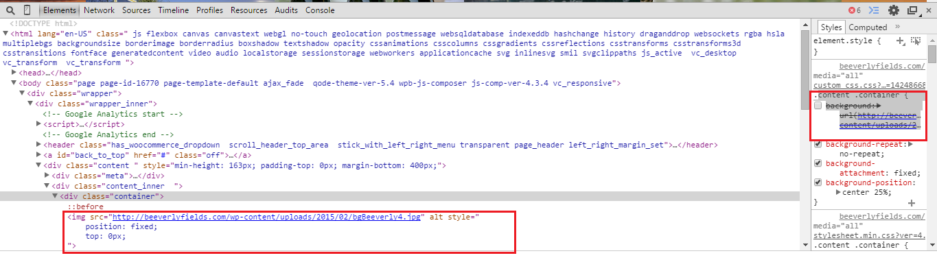 now its working in chrome-40 and IE
Alex
Updated on February 23, 2020Comments
-
Alex about 4 years
I've had this issue for a while and it seems to be a Chrome redraw bug that hasn't been fixed. So I'm looking for any stop-gap fixes.
The main issue is that when an element on the page has a background image that uses:
background-attachment: fixed;If another element is fixed and has a child video element it causes the element with the background image to disappear.
Now it works fine in Safari (and Firefox and IE) so it's not exactly a webkit issue. I've applied several properties that have been suggested to no avail.
-webkit-backface-visibility: hidden; -webkit-transform: translate3d(0, 0, 0);Currently my solution is just to target the elements with a fixed bg image via a media query and just turn off the fixed background property.
@media screen and (-webkit-min-device-pixel-ratio:0) {
background-attachment: scroll;
}
Any ideas?Update
Working Demo thanks to Daniel.Update 2
Shoutout to somesayinice and FourKitchens blog post
-
 mn. almost 9 yearsCheers for posting your solution. Always great to see people still posting solutions, even if the post is old
 -
Flobin almost 9 yearsThis is great, but just FYI: this doesn’t work in Firefox or IE.
-
 Daniel Perván almost 9 yearsAre you talking about mobile FF and IE? For me it works in at least IE9+ and FF 16+
 -
Alex almost 9 yearsThat seems like a great approach. I'll look into it. Thanks!
-
Alex over 8 yearsI'm changing the answer to yours. Not only does it work in modern browsers I get my fixed backgrounds back without a hacky solution. Amaze!
-
 Benjamin over 7 yearsThis is great, but what if you have multiple backgrounds like this? I'm facing this challenge. My best solution so far is to change the z-index of each background as the section scrolls into view, but it doesn't perform well.
 -
 somesayinice over 7 yearsWhy not use multiple divs within a div all using the same scrolling background? I'm not sure about your use case. @Benjamin
 -
Alex over 6 yearsYeah, that's already the selected answer for this issue. Thank tho :)
-
 Prid almost 5 yearsJust a small error: move
background-size: cover;belowbackground: url(..);, as the latter overrides the former property declaration.