Create a Table with CSS grid
Solution 1
display: contents is what you need.
contentsThese elements don't produce a specific box by themselves. They are replaced by their pseudo-box and their child boxes.
Add this CSS (example):
.row {
    display: contents;
}
More links:
Solution 2
In your first example, your data cells are children of the container. Hence, grid properties – which only work between parent and child – work as you expect.
In your second example, you have some data cells that are children of .row containers. These cells are no longer children of .wrapper, the grid container. Therefore, these cells are outside the scope of grid layout, do not recognize grid properties and are rendered as standard block-level elements.
So, basically, grid containers with different child elements render different layouts.
One solution to get your examples to match would be to make the grid items into grid containers having the same properties as the parent. Here's the general idea:
Revised Codepen
.wrapper {
display: grid;
grid-template-columns: repeat(3, minmax(50px, 1fr));
background-color: #fff;
color: #444;
max-width: 800px;
}
.row {
grid-column: 1 / -1;
display: grid;
grid-template-columns: repeat(3, minmax(50px, 1fr));
}
div:nth-child(4) { grid-row-start: 2; }
div:nth-child(5) { grid-row-start: 3; }
.box {
background-color: #444;
color: #fff;
border-radius: 5px;
padding: 20px;
font-size: 150%;
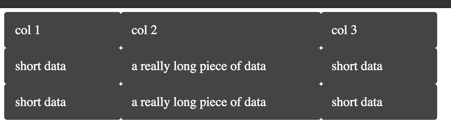
}<div class="wrapper">
<div class="box a">col 1</div>
<div class="box b">col 2</div>
<div class="box c">col 3</div>
<!-- Table Row -->
<div class="row">
<div class="box d">short data</div>
<div class="box e">a really long piece of data</div>
<div class="box f">short data</div>
</div>
<!-- Table Row -->
<div class="row">
<div class="box d">short data</div>
<div class="box e">a really long piece of data</div>
<div class="box f">short data</div>
</div>
</div>Solution 3
It didn't break, it works exactly as intended. Every child element is using one cell of the grid, if you wrap your header in another div you'll see they swap rows for columns, because each group will use one cell.
If you are going to display tabular data, then you should stick with tables as they are the semantically correct element for that purpose.
However if you are trying to build responsive designs or you really want to use grid I suggest you to read this incredible article about CSS grids.
Take a look in display: subgrid; maybe it is what you are looking for in this scenario.
realph
Updated on June 10, 2020Comments
-
realph about 4 years
I'm trying to create a table using CSS grid, with equal columns based on the content. I want to avoid using
<table>. This is a follow-up to this question: Auto-adjusting columns with CSS gridWhat I'm trying to achieve:
This table works: https://codepen.io/anon/pen/baExYw
But I want to wrap the each row in a
div, which unsurprisingly breaks the table.This table is broken: https://codepen.io/anon/pen/qpbMgG
app.html
<div class="wrapper"> <div class="box a">col 1</div> <div class="box b">col 2</div> <div class="box c">col 3</div> <!-- Table Row --> <div class="row"> <div class="box d">short data</div> <div class="box e">a really long piece of data</div> <div class="box f">short data</div> </div> <!-- Table Row --> <div class="row"> <div class="box d">short data</div> <div class="box e">a really long piece of data</div> <div class="box f">short data</div> </div> </div>app.css
.wrapper {
  display: grid;
  grid-template-columns: repeat(3, auto);
  background-color: #fff;
  color: #444;
  max-width:  800px;
}

.box {
  background-color: #444;
  color: #fff;
  border-radius: 5px;
  padding: 20px;
  font-size: 150%;
}
I'm still very new to CSS Grid, so I'm still having trouble understanding how half of this stuff works behind the scenes.
Any help is appreciated. Thanks in advance.