Css mask not working on Chrome (Webkit)
Solution 1
This is not currently working in Chrome (Version 58.0.3029.110 (64-bit)). You can see this in the example at https://developer.mozilla.org/en-US/docs/Web/CSS/mask-image#Browser_compatibility. In FireFox, the green looks like a star. On Chrome, it is just a box, although it does work if you use the -webkit prefix. However, changing that .svg to your .jpg makes it fail. Take their example:
<div id="masked"></div>

#masked {
  width: 100px;
  height: 100px;
  background-color: #8cffa0;
  -webkit-mask-image: url(https://mdn.mozillademos.org/files/12676/star.svg);
}
and it works. But replace the url with yours:
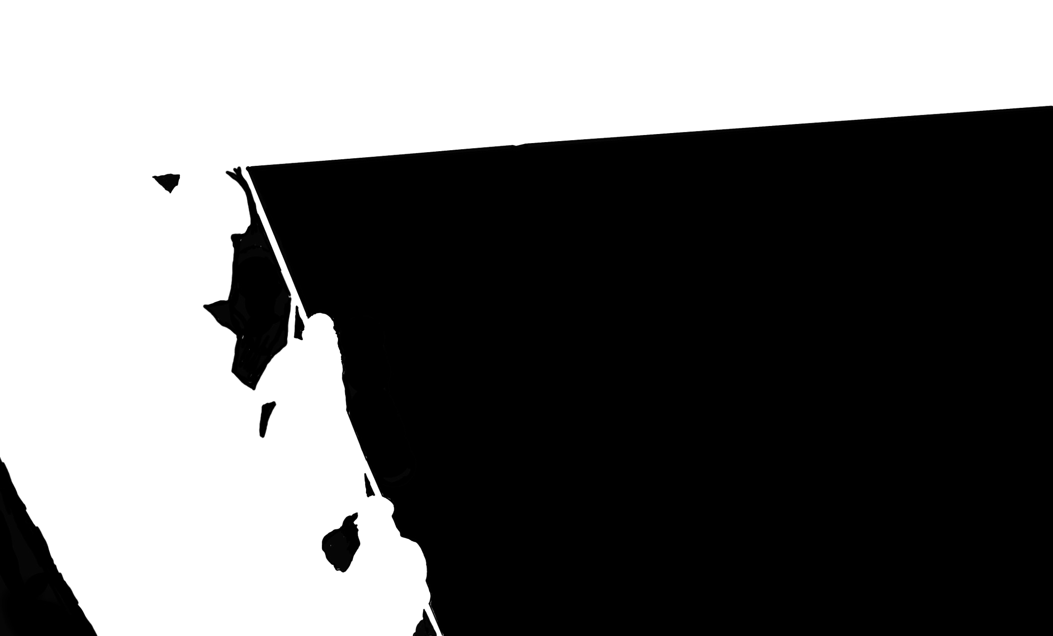
http://felixjely.fr/projet/DGN1/film-couloir/img/piranese/mask-01.jpg
and you will see it doesn't work.
As sheriffderek pointed out, it's always best to start with the simplest possible example.
Solution 2
The mask that the browser expects is not like a Photoshop/Illustrator mask where the white/black corresponds to show/hide. Instead it should be: black/transparent corresponds to show/hide.
Here is the CSS that gets it working with your mask (I turned your mask into a PNG to support transparency, then made the white part transparent):
#masked {
  width: 100px;
  height: 100px;
  background-color: #8cffa0;
  -webkit-mask-image: url(https://i.stack.imgur.com/yl5tc.png);
  -webkit-mask-size: 100px 100px;
  mask-image: url(https://i.stack.imgur.com/yl5tc.png);
  mask-size: 100px 100px;
}
Also note that your mask is much bigger than the masked div's width and height so you have to also specify mask-size/-webkit-mask-size. My corrected PNG mask image is also attached.
You can also see in the same Mozilla doc page that you mentioned that they used a linear-gradient as a mask and this gradient has two stops: black and transparent: linear-gradient(rgba(0, 0, 0, 1.0), transparent);
Felox
Updated on July 09, 2022Comments
-
Felox almost 2 years
I have a problem: I made a picture with some layer and wanted to mask them with the mask css property. It works fine on Firefox, whereas on Chrome it doesn't even with the -webkit- prefixe.
Here is the code, note the mask is applied on #plan-1
Maybe Chrome can't make a mask from a jpeg ? :o
body{
            margin: 0;
            background-color:black;
            transform: translateZ(0);
            height: 100vh;
            width: 100vw;
            overflow: hidden;
            }
section{
            display: block;
            background-position: center;
            height: 100%;
            width: 100%;
            position: absolute;
            margin: auto;

       }

#plan-1{
    mask-image: url('http://felixjely.fr/projet/DGN1/film-couloir/img/piranese/mask-01.jpg'); /*Option de Masque*/
    mask-position:center;
    mask-mode: luminance;
    mask-size: contain;

    -webkit-mask-image: url('http://felixjely.fr/projet/DGN1/film-couloir/img/piranese/mask-01.jpg'); /*Webkit*/
    -webkit-mask-position:center;
    -webkit-mask-size: contain;
    -webkit-mask-type: luminance;


    background:url("http://felixjely.fr/projet/DGN1/film-couloir/img/piranese/03.jpg") no-repeat center;
    background-size: contain;

    z-index: 15;
}

#plan-2{
    background-color:red;
    background-size: contain;

    z-index: 5;
}
<script src="https://ajax.googleapis.com/ajax/libs/jquery/2.1.1/jquery.min.js"></script> <div id="align"> <section id="plan-1"></section> <section id="plan-2"></section> </div>EDIT
As WahhabB said, I made a vector based image out of the mask (by vectorise with illustrator/inskape).
Unfortunately, It doesn't work.
body{
            margin: 0;
            background-color:black;
            transform: translateZ(0);
            height: 100vh;
            width: 100vw;
            overflow: hidden;
            }
section{
            display: block;
            background-position: center;
            height: 100%;
            width: 100%;
            position: absolute;
            margin: auto;

       }

#plan-1{
    mask-image: url('http://felixjely.fr/projet/DGN1/film-couloir/img/piranese/mask-01.svg'); /*Option de Masque*/
    mask-position:center;
    mask-mode: luminance;
    mask-size: contain;

    -webkit-mask-image: url('http://felixjely.fr/projet/DGN1/film-couloir/img/piranese/mask-01.svg'); /*Webkit*/
    -webkit-mask-position:center;
    -webkit-mask-size: contain;
    -webkit-mask-type: luminance;


    background:url("http://felixjely.fr/projet/DGN1/film-couloir/img/piranese/03.jpg") no-repeat center;
    background-size: contain;

    z-index: 15;
}

#plan-2{
    background-color:red;
    background-size: contain;

    z-index: 5;
}
<script src="https://ajax.googleapis.com/ajax/libs/jquery/2.1.1/jquery.min.js"></script> <div id="align"> <section id="plan-1"></section> <section id="plan-2"></section> </div>