CSS Media Query - Soft-keyboard breaks css orientation rules - alternative solution?
Solution 1
I know this is a couple of years late but I found a great solution
For landscape media:
@media screen and (min-aspect-ratio: 13/9) { /* landscape styles here */}
And for portrait media:
@media screen and (max-aspect-ratio: 13/9) { /* portrait styles here */}
The full solution and why it works can be found here Michael Barret - Android browser challenges
Edit: this link is now expired, but a snapshot can be found on the internet archive: Michael Barret - Android browser challenges
Solution 2
The problem lies in the way that orientation is calculated:
http://www.w3.org/TR/css3-mediaqueries/#orientation
The ‘orientation’ media feature is ‘portrait’ when the value of the ‘height’ media feature is greater than or equal to the value of the ‘width’ media feature. Otherwise ‘orientation’ is ‘landscape’.
Since the height/width is calculated on the visible viewport, the soft keyboard apparently causes the orientation to flip now that the viewport width is less than the height. One solution would be just to use your media queries based on just width instead. This makes it more flexible across devices regardless of orientation, not to mention width/height is more widely supported than orientation.
If you want to account for the width instead of orientation, I'll use the iPhone as an example:
@media screen and (max-width: 320px) {
  /* rules applying to portrait */
}

@media screen and (max-width: 480px) {
  /* rules applying to landscape */
}
This approach is more flexible than orientation since the queries aren't limited to devices/user-agents that support orientation, not to mention that orientation tells you very little versus the width.
Of course if you really need to know orientation, it seems like setting the class initially and just use that might be your best option.
Solution 3
An alternative might be to use device-aspect-ratio, which remains unchanged. However, in Webkit, rotating the device doesn't trigger an update of CSS rules using this query, even though JavaScript tests return true for the new aspect ratio. This is apparently due to a bug, but I'm not able to find a bug report. Using a combination of orientation and {min,max}-device-aspect-ratio seems to work fine:
@media screen and (max-device-aspect-ratio: 1/1) and (orientation: portrait)
@media screen and (min-device-aspect-ratio: 1/1) and (orientation: landscape)
The use of orientation triggers updates as expected, and the use of device-aspect-ratio restricts updated to actual changes of orientation.
Solution 4
I worked through the options listed above and none quite fixed the issues for me. I switched to using screen.availHeight as it gives consistent height results avoiding the keyboard display issue.
// Avoiding the keyboard in Android causing the portrait orientation to change to landscape.
// Not an issue in IOS. Can use window.orientation.
var currentOrientation = function() {
  // Use screen.availHeight as screen height doesn't change when keyboard displays.
  if(screen.availHeight > screen.availWidth){
    $("html").addClass('portrait').removeClass('landscape');
  } else {
    $("html").addClass('landscape').removeClass('portrait');
  }
}

// Set orientation on initiliasation
currentOrientation();
// Reset orientation each time window is resized. Keyboard opening, or change in orientation triggers this.
$(window).on("resize", currentOrientation);
Solution 5
For me, this did the trick:
  @media screen and (max-device-aspect-ratio: 1/1), (max-aspect-ratio: 1/1){
        /*Portrait Mode*/
};
While max-aspect-ratio takes care of triggering Portrait mode simply by resizing the window (useful for PCs and other landscape-only devices), max-device-aspect-ratio helps with smartphones or other devices with variable orientation. And because I'm not declaring specific settings for Landscape mode, even if max-aspect-ratio is reporting >1 to the system, Portrait mode will still be triggered by max-device-aspect-ratio if the Android device is oriented that way.
The 1/1 part basically means that if the ratio is <=1, it goes to Portrait mode, otherwise it goes to landscape mode.
Related videos on Youtube
 07 : 11
 01 : 24
 01 : 29
 01 : 21
 01 : 24
Hossain Khan
Passionate Android engineer, foodie and travel fanatic.
Updated on March 28, 2021Comments
-
Hossain Khan about 3 years
I am working with multiple tablet devices - both Android
and iOS. Currently I have following resolution variations for all the tablets.- 1280 x 800
- 1280 x 768
-
1024 x 768 (iPad Obviously)- iPad does not have this issue
Simplest way to apply device orientation based style is to use media query's orientation using following syntax.
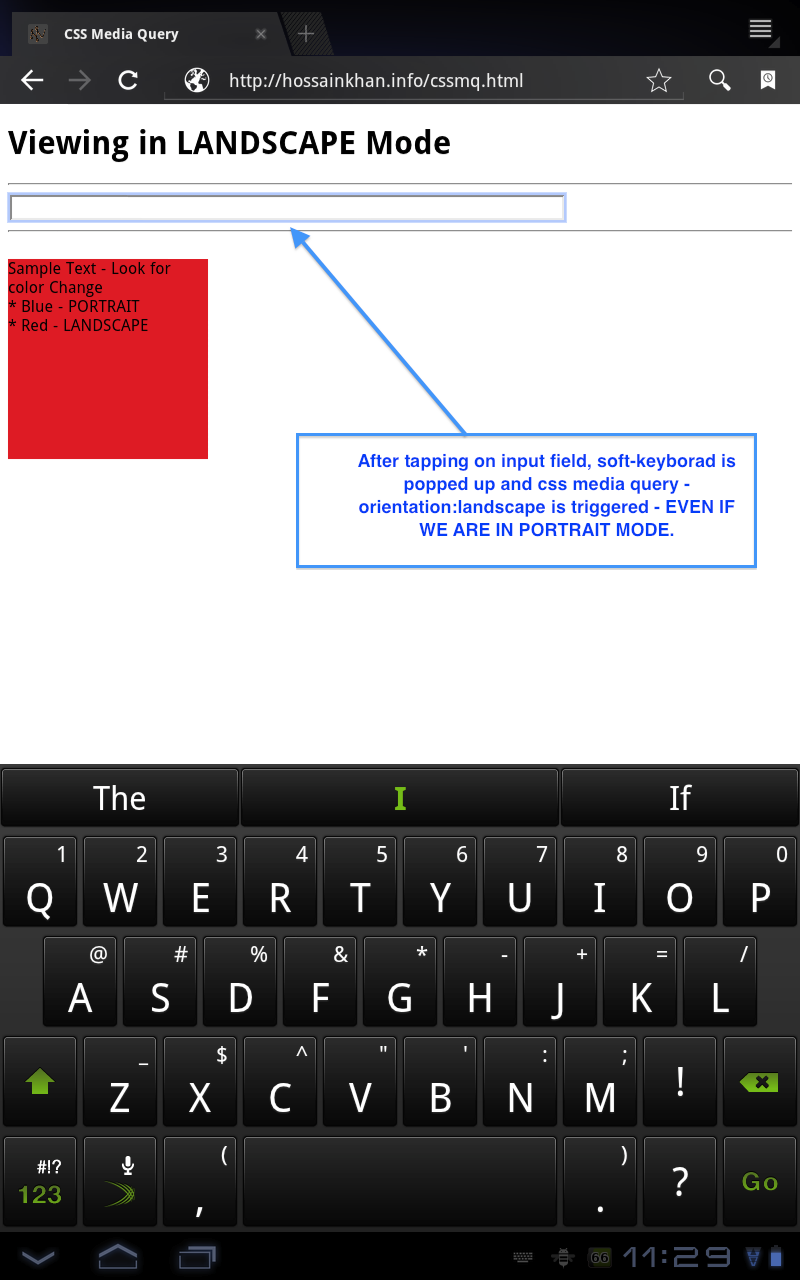
@media all and (orientation:portrait)
{
  /* My portrait based CSS here */
}

@media all and (orientation:landscape)
{
  /* My landscape based CSS here */
}
This works perfectly fine on all tablet devices. BUT, the problem is, when device is in portrait mode and user taps on any input field (eg. search) the soft-keyboard pops up - which reduces the visible area of web page and forces it to render in landscape based css. On android tablet devices, it depends on keyboard's height. So, ultimately the web page looks broken. Therefore, I can't use CSS3's orientation media query to apply styles based on orientation (unless there is better media query to target orientation). Here is a fiddle http://jsfiddle.net/hossain/S5nYP/5/ which emulates this - for device testing use full test page - http://jsfiddle.net/S5nYP/embedded/result/
Here is a screenshot of the behaviour taken from the demo page.
So, is there any alternative to takle this issue, I'm open to JavaScript based solution if native CSS based solution does not work.
I found a snippet on http://davidbcalhoun.com/2010/dealing-with-device-orientation which suggests to add class on and target based on that. For example:
<html class="landscape">
  <body>
    <h1 class="landscape-only">Element Heading - Landscape</h1>
    <h1 class="portrait-only">Element Heading - Portrait</h1>
    <!-- .... more... ->

# CSS
.landscape .landscape-only { display:block; }
.landspace .portrait-only  { display:none; }
.portrait .portrait-only   { display:block; }
.portrait .landscape-only  { display:none; }
What do you guys think about this? Do you have better solution?
-
Hossain Khan over 12 yearsJust found out, iPad does NOT have this issue. ONLY android OS (honeycomb tablets) and mobiles has this issue.
-
 TJ Kirchner almost 12 yearsI ran into a similar issue with my mobile website. After testing across a couple Android devices, it doesn't seem to be limited to any specific OS or mobile/tablet device. It looks like its primarily a problem with Motorola and Samsung devices. I wasn't able to reproduce the issue on our HTC phone.
 -
Hossain Khan over 11 yearsThis issue is mainly with android devices, mobile/tablet - only way you can reproduce this is to install custom keyboard which has large height, so that, when the keyboard is showing, the available height for webview is less than available width. Only then, webview triggers orientation change. For example, in the screenshot, if I can disable the suggestion layer on top of keyboard, then this issue will not be there, because, webview height will be greater than width. But, anyway, I haven't got any elegant & efficient solution yet.
-
Alexandre over 10 yearsJust realize that IOS 7.0.0 fullscreen WebApp has this behaviour too
-
Hossain Khan over 10 yearsThat's sad. I was not able to resolve the issue efficiently, hence marked it as
known limitation. -
John Conde almost 10 years
-
Hossain Khan over 12 yearsI understand how landscape and portrait is calculated by the browsers. But, need alternative and better way of handling this. Another interesting thing is, iPad does not trigger orientation change when keyboard is up. I don't know why the **** android had to implement that way.
-
scurker over 12 yearsI'm just curious as to why you specifically need the orientation of the device as opposed to just the width. What is the problem you're trying to solve that just the width alone won't fix?
-
Hossain Khan over 12 yearsI'm working with multiple device with different resolution. Could you please give example how width can be used as an alternative to orientation? About, use of orientation change, there are multiple application on orientation change - usually available space different in different orientation. So, some elements can be hidden or re-sized based on orientation. Thanks for all the help.
-
RaphaelDDL over 12 years@HossainKhan
@media all and (max-device-wdith:NNNpx){}or@media all and (min-device-wdith:NNNpx){}or@media all and (device-wdith:NNNpx){} -
scurker over 12 yearsI updated my answer. The device width should take orientation into account, so that when your orientation changes the width should update accordingly.
-
Ricardo Gomes over 11 yearscheck out this post on how to use this technique to help define your retina images
-
Robby Jennings over 11 yearsSo I've been testing this a bit more and it's not so straight forward. Android devices need to use screen.availHeight and screen.availWidth. IOS is buggy with these though so use window.orientation for IOS. Desktop should use window.innerHeight, window.innerWidth as you want the window dimensions not the screen dimensions.
-
Robby Jennings over 11 yearsI've been bashing my head against the wall with the code above. Too finicky. I'm not supporting desktop for this app, so I'm using window.orientation is the magic solution for Android and IOS. Working fine now. var orientation = Math.abs(window.orientation) === 90 ? 'landscape' : 'portrait';
-
Libin almost 11 yearsultimately by removing
and (orientation:portrait)and just applied the max and min width resolved my issue.!!! -
 Stephan Bijzitter about 9 yearsIt solves the issue, but creates more issues on other devices for me (mainly laptops and computers)
 -
Diogo Cardoso about 9 yearsUnfortunately this solution doesn't work in all mobile devices.
-
 Sean Routledge almost 9 years@StephanBijzitter maybe you could use the 'max-width' property?
 -
raacer over 8 yearsThis solution is very rough and will not work on some devices. For example my phone gives about 17.7/9 when opening the soft keyboard, while the landscape aspect ratio is much less on many other devices.
-
 rubmz almost 8 yearsthe stupid thing about this whole media query that the browsers actually identify themselves, so y the hell aren't we provided with the information?????
 -
 William Dunne over 6 yearsRadical answer dude
 -
adi518 over 6 yearsWhat about when the keyboard comes up?
-
 helveciofneto over 6 yearsWhen the virtual keyboard comes up on a mobile device, nothing changes, because the device's aspect ratio (max-device-aspect-ratio) only changes when you actually rotate the device or when you deliberately change the screen orientation from Portrait to Landscape and vice-versa.
 -
adi518 over 6 yearsYes, I ended up implementing and testing it for myself. I'm developing a package around this: npmjs.com/package/mobile-orientation
-
adi518 about 6 yearsCame back to inquire over one more thing:
(max-aspect-ratio: 1/1). It seems we only need this bit to detect portrait on desktop? -
helveciofneto about 6 yearsRight. The 1/1 is to ensure that a perfect square still triggers portrait mode (which is possible in systems that allow window resizing, like a browser window on a desktop). Without it, weird things happen in this exact ratio.
-
adi518 about 6 yearsI see. I only need to detect mobile, so I don't need this bit. Thanks.
-
adi518 about 6 yearsChecking MDN reveals it's deprecated, which is unfortunate. The solution won't last, but can be used as a fallback test.
-
adi518 about 6 yearsSee here for the npm package I based around it.
-
Sparkmorry about 6 yearsThe full solution link is broken.
-
Lars C. Magnusson over 5 yearsGreat! While orientation:landscape did not work, this solution did :)
-
 Eugene Gluhotorenko almost 5 yearsUnfortunately this feature is deprecated now developer.mozilla.org/en-US/docs/Web/CSS/@media/…
 -
Amir Farahani almost 4 yearsyou save my day :), but when it comes back from landscape to portrait, zoom of the page is broken how to handle this?
-
qraqatit almost 4 yearsmid 2020 and this still works despite being deprecated...great solution, the only one that actually worked for me in all the cases I have!
-
QMaster over 3 yearsThis relies on current max-width of mobile devices and when improving technology these will changes. So should we change all media queries scenario? I think this is a poor idea.
-
QMaster over 3 yearsThis relies on current max-width of mobile devices and when improving technology these will changes. So should we change all media queries scenario? I think this is a poor idea.
-
 Kelon about 3 yearsThis helped me to create my own selector, tested on windows/firefox+chrome, android, iPad:
(max-aspect-ratio: 1/1), (orientation: portrait)