CSS to make table 100% of max-width
Solution 1
Like this
css
table{
    width:100%;
}
Solution 2
You need to use:
table{
   width:100%;
   table-layout: fixed;
   overflow-wrap: break-word;
}
Solution 3
I have a very well working solution for tables of max-width: 100%.
Just use word-break: break-all; for the table cells (except heading cells) to break all long text into several lines:
<!DOCTYPE html>
<html>
<head>
<style>
table {
max-width: 100%;
}
table td {
word-break: break-all;
}
</style>
</head>
<body>
<table border="1">
<tr>
<th><strong>Input</strong></th>
<th><strong>Output</strong></th>
</tr>
<tr>
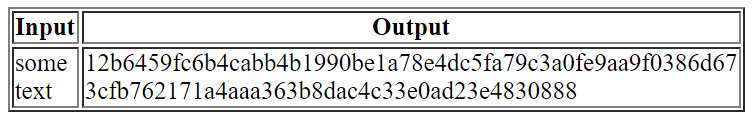
<td>some text</td>
<td>12b6459fc6b4cabb4b1990be1a78e4dc5fa79c3a0fe9aa9f0386d673cfb762171a4aaa363b8dac4c33e0ad23e4830888</td>
</tr>
</table>
</body>
</html>
This will render like this (when the screen width is limited):
Solution 4
I had the same issue it was due to that I had the bootstrap class "hidden-lg" on the table which caused it to stupidly become display: block !important;
I wonder how Bootstrap never considered to just instead do this:
@media (min-width: 1200px) {
    .hidden-lg {
         display: none;
    }
}
And then just leave the element whatever display it had before for other screensizes.. Perhaps it is too advanced for them to figure out..
Anyway so:
table {
    display: table; /* check so these really applies */
    width: 100%;
}
should work
Guram Savinov
I work for Lendio which helps small businesses find lending. While I have spent a lot of time as a full stack LAMPP programmer, my first love was data and databases. At present I get to spend all of my time at Lendio working on data architecture solutions, data quality, and helping data tell its story to our employees.
Updated on July 19, 2021Comments
-
Guram Savinov almost 3 years
Given the following for an email template:
<style>
  @import url("http://fonts.googleapis.com/css?family=Open Sans");
</style>

<div style="width:100%; background:#F2F2F2">
  <table style="padding: 25px; margin: 0 auto; font-family:'Open Sans', 'Helvetica', 'Arial';">
    <tr align="center" style="margin: 0; padding: 0;">
      <td>
        <table style="border-style:solid; border-width:2px; border-color: #c3d2d9;" cellspacing="0">
          <tr style="background-color: white;">
            <td style="width: 700px; padding: 10px 15px 10px 15px; color: #000000;">
              <p>Some content here</p>
              <span style="font-weight: bold;">My Signature</span><br/>
              My Title<br/>
              My Company<br/>
            </td>
          </tr>
        </table>
      </td>
    </tr>
  </table>
</div>
The table will be exactly 700px wide is what is needed. However, because its entirely fixed width, it can't resize on devices with less than 700px width. But if I modify the td element to this:
<td style="max-width: 700px; width: 90%; padding: 10px 15px 10px 15px; color: #000000;">
   <p>Some content here</p>
   <span style="font-weight: bold;">My Signature</span><br/>
   My Title<br/>
   My Company<br/>
</td>
Then the table is only ~100px wide.
How would I reorder the CSS to make it so that the table is 700px but resizes as the viewport grows smaller?