Flex box container width doesn't grow
I've actually found a CSS-only solution to this but it isn't the most perfect thing in the world. Here it is: http://codepen.io/anon/pen/vEPBKK
The trick here is to create a visibility: collapsed container. In flex, visibility: collapsed objects take themselves out of the normal flex flow but retain their dimensions for the purpose of layout. This widens the flex container to the desired width but leaves the flex items unaffected. There are a few caveats, however:
- This requires a bit of fiddling. As you can see, the magic
<div>is a set width but it uses:nth-childto determine how many boxes are before it. If your actual design breaks at more or less than 3 rows, you'll have to adjust this and you'll most certainly have to adjust the width of the object. - Because of a rendering bug, this does not work in IE. Luckily, IE's incorrect implementation does exactly what you wanted in the first place without any changes so all you have to do is give IE it's own stylesheet with some conditional statements and shoot the
div.magicsome good olddisplay: none.
HTML
<div id="container">
  <div class="fb"></div>
  <div class="fb"></div>
  <div class="fb"></div>
  <div class="fb"></div>
  <div class="fb"></div>
  <div class="fb"></div>
  <div class="fb"></div>
  <div class="magic"></div>
</div>
CSS
#container {
  position: absolute;
  display: flex;
  flex-direction: column;
  flex-wrap: wrap;
  border: 1px solid #f00;
  height: 650px;
  padding: 1px;
}

#container div.fb {
  border: 1px solid #555;
  flex: 0 0 200px;
  background-color: #ccc;
  width: 200px;
  margin: 1px;
  height: 200px;
}

#container > div.magic {
  height: 0;
  margin: 0;
  padding: 0;
  visibility: collapsed;
}

#container > div.magic:nth-child(5),
#container > div.magic:nth-child(6),
#container > div.magic:nth-child(7) {
  width: 408px;
}

#container > div.magic:nth-child(8),
#container > div.magic:nth-child(9),
#container > div.magic:nth-child(10) {
  width: 612px;
}

#container > div.magic:nth-child(11),
#container > div.magic:nth-child(12),
#container > div.magic:nth-child(13) {
  width: 816px;
}
Related videos on Youtube
 08 : 42
 15 : 12
 06 : 31 : 24
 11 : 27
 15 : 33
 04 : 59
 35 : 04
 04 : 15
 06 : 48
 07 : 53
Tamlyn
Updated on September 16, 2022Comments
-
Tamlyn over 1 year
When using flex box in default row direction, the container height grows to contain all the flex items, even if it is absolutely positioned.
#container {
  position: absolute;
  display: flex;
  flex-wrap: wrap;
}

#container > div {
  flex: 0 0 200px;
  height: 200px;
}
See http://codepen.io/tamlyn/pen/dPjLoN/?editors=110
However if the flex direction is changed to column, the container collapses to the width of a single flex item, even if the items wrap onto the next column.
#container {
  position: absolute;
  display: flex;
  flex-direction: column;
  flex-wrap: wrap;
}

#container > div {
  flex: 0 0 200px;
  width: 200px;
}
See http://codepen.io/tamlyn/pen/rarbeN?editors=110
How can I make the container contain all flex items in
columnmode?-
pschuellerDuplicate of stackoverflow.com/q/23408539/2126792 and stackoverflow.com/q/26744648/2126792
-
-
Tamlyn about 9 yearsIsn't that just the same as my first example? What I'm looking for is that behaviour but in column mode rather than row.
-
Pixel Rubble about 9 yearsIf you do
flex-flow: column wrap;then you'll get your column mode, but I don't think that's what you're looking for cause then they all just stack vertically and do nothing horizontally. With it this way, they become a column as needed. But it might be. -
Tamlyn about 9 yearsI've added numbering to the boxes in the codepens to better illustrate what I mean.
-
Tamlyn about 9 yearsThe question is about
flex-direction: column. Please see updated codepens. -
 Kinburn101 about 9 yearsI think this is the only way too approach this but setting a max-width to #container. That way you can determine the max number of columns you want and stretch the content vertically.
 -
Michael Martin-Smucker over 8 yearsAs far as I can tell,
collapsedisn't a valid value for the visibility property.collapseis, but yourmagicdiv seems to work with or without thevisibilityproperty, which makes me even more confused about what's going on here. -
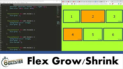
Chris Browne over 7 yearsThe way it works is that the div.magic essentially is setting a "width" property on the container, but by setting it on a child you can use nth-child to essentially "count" the children using CSS. It's hacky as all hell, will only work for the number of elements you directly code it to work for, and involves fiddling with pixel values until you get something that works - but I'm nonetheless impressed by the simplicity and straightforwardness of it.