Flexbox not working in Internet Explorer 11
Solution 1
According to Flexbugs:
In IE 10-11,
min-heightdeclarations on flex containers work to size the containers themselves, but their flex item children do not seem to know the size of their parents. They act as if no height has been set at all.
Here are a couple of workarounds:
1. Always fill the viewport + scrollable <aside> and <section>:
html {
  height: 100%;
}

body {
  display: flex;
  flex-direction: column;
  height: 100%;
  margin: 0;
}

header,
footer {
  background: #7092bf;
}

main {
  min-height: 0; /* added 2021*/
  flex: 1;
  display: flex;
}

aside, section {
  overflow: auto;
}

aside {
  flex: 0 0 150px;
  background: #3e48cc;
}

section {
  flex: 1;
  background: #9ad9ea;
}
<header>
<p>header</p>
</header>
<main>
<aside>
<p>aside</p>
</aside>
<section>
<p>content</p>
<p>content</p>
<p>content</p>
<p>content</p>
<p>content</p>
<p>content</p>
<p>content</p>
<p>content</p>
<p>content</p>
<p>content</p>
</section>
</main>
<footer>
<p>footer</p>
</footer>2. Fill the viewport initially + normal page scroll with more content:
html {
  height: 100%;
}

body {
  display: flex;
  flex-direction: column;
  height: 100%;
  margin: 0;
}

header,
footer {
  background: #7092bf;
}

main {
  flex: 1 0 auto;
  display: flex;
}

aside {
  flex: 0 0 150px;
  background: #3e48cc;
}

section {
  flex: 1;
  background: #9ad9ea;
}
<header>
<p>header</p>
</header>
<main>
<aside>
<p>aside</p>
</aside>
<section>
<p>content</p>
<p>content</p>
<p>content</p>
<p>content</p>
<p>content</p>
<p>content</p>
<p>content</p>
<p>content</p>
<p>content</p>
<p>content</p>
</section>
</main>
<footer>
<p>footer</p>
</footer>Solution 2
See "Can I Use" for the full list of IE11 Flexbox bugs and more
There are numerous Flexbox bugs in IE11 and other browsers - see flexbox on Can I Use -> Known Issues, where the following are listed under IE11:
- IE 11 requires a unit to be added to the third argument, the flex-basis property
- In IE10 and IE11, containers with
display: flexandflex-direction: columnwill not properly calculate their flexed childrens' sizes if the container hasmin-heightbut no explicitheightproperty - IE 11 does not vertically align items correctly when
min-heightis used
Also see Philip Walton's Flexbugs list of issues and workarounds.
Solution 3
I have tested a full layout using flexbox it contains header, footer, main body with left, center and right panels and the panels can contain menu items or footer and headers that should scroll. Pretty complex
IE11 and even IE EDGE have some problems displaying the flex content but it can be overcome. I have tested it in most browsers and it seems to work.
Some fixed i have applies are IE11 height bug, Adding height:100vh and min-height:100% to the html/body. this also helps to not have to set height on container in the dom. Also make the body/html a flex container. Otherwise IE11 will compress the view.
html,body {
    display: flex;
    flex-flow:column nowrap;
    height:100vh; /* fix IE11 */
    min-height:100%; /* fix IE11 */
}
A fix for IE EDGE that overflows the flex container: overflow:hidden on main flex container. if you remove the overflow, IE EDGE wil push the content out of the viewport instead of containing it inside the flex main container.
main{
    flex:1 1 auto;
    overflow:hidden; /* IE EDGE overflow fix */
}
You can see my testing and example on my codepen page. I remarked the important css parts with the fixes i have applied and hope someone finds it useful.
Admin
Updated on May 25, 2021Comments
-
Admin almost 3 years
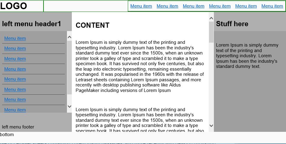
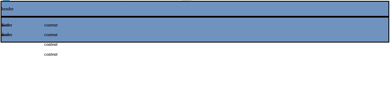
This piece of code works fine in Firefox, Chrome and Edge, but it does not work properly in IE11 because of flex model, apparently. How can I fix it?
This is how it looks in Firefox

This is how it looks in IE11
body * {
  box-sizing: border-box;
}
html {
  height: 100%;
}
body {
  min-height: 100%;
  display: flex;
  flex-flow: column;
  margin: 0;
}
main {
  flex: 1;
  display: flex;
}
header,
footer {
  background: #7092BF;
  border: solid;
  width: 100%;
}
section {
  border: solid;
  background: #9AD9EA;
  flex: 1
}
aside {
  border: solid;
  width: 150px;
  background: #3E48CC
}
<header> <p>header </header> <main> <aside> <p>aside <p>aside </aside> <section> <p>content <p>content <p>content <p>content </section> </main> <footer> <p>footer <p>footer </footer>