IE 11 flexbox child width not respecting content (Safari too)
Solution 1
Instead of flex: 1 use flex-grow: 1; flex-basis: 0; or specify all 3 values that you want for the shorthand. And if you specify flex-basis make sure you specify a unit. https://jsbin.com/ketolifuhu/edit?html,css,output
Here's a good article that covers some of the bugs and inconsistencies https://philipwalton.com/articles/normalizing-cross-browser-flexbox-bugs/
:root {
    --dark-primary-color: #303F9F;
    --default-primary-color: #3F51B5;
    --light-primary-color: #C5CAE9;
    --text-primary-color: #FFFFFF;
    --accent-color: #FF4081;
    --primary-text-color: #212121;
    --secondary-text-color: #757575;
    --divider-color: #BDBDBD;
    --box-size: 150px;
    font-family: Roboto, 'sans-serif';
    font-size: 20px;
    letter-spacing: 1.25px;
    font-weight: 100;
    color: white;
}

body {
  background-color: #BDBDBD;
}

.flex-container {
  display: flex;
  flex-flow: row wrap;
  justify-content: space-between;
}

.flex-container > div {
  flex-grow: 1;
  margin: 10px;
  box-shadow: 2px 2px 6px 1px rgba(0,0,0,.2);
  padding: 30px;
  flex-basis: 0;
}

.left {
  background-color: #3F51B5;
}

.right {
  background-color: #3F51B5;
}

.heading {
  letter-spacing: .5px;
  font-weight: 400;
  white-space: nowrap;
}

.sub-text {
  margin-top: 20px;
  font-size: 14px;
}
<!DOCTYPE html>
<html>
<head>
<meta charset="utf-8">
<meta name="viewport" content="width=device-width">
<link href="https://fonts.googleapis.com/css?family=Roboto:100,400" rel="stylesheet">
<title>JS Bin</title>
</head>
<body>
<div class="flex-container">
<div class="left">
<div class="heading">Here is a heading that shouldn't wrap</div>
<div class="sub-text">This is just some content that should wrap just fine and I don't really care what it says, but it'll just wrap just fine and that behavior should be handled by the heading.</div>
</div>
<div class="right">
<div class="heading">Here is a heading that shouldn't wrap</div>
<div class="sub-text">This is just some content that should wrap just fine and I don't really care what it says, but it'll just wrap just fine and that behavior should be handled by the heading.</div>
</div>
</div>
</body>
</html>Solution 2
You should avoid using flex: 1 shorthand as some older versions of browsers have different default values for it, which will create issues for you.
A lot of others have mentioned specifying flex-basis, but you need to specify the unit. I.e. don't write flex-basis: 0, write flex-basis: 0% or flex-basis: 0px, otherwise some browsers won't know how to handle the 0 value.
Now to the main point, to avoid overflow I usually just set max-width: 100% on the flex-child.
If the flex-child has padding, for instance padding-left: 10px; padding-right:10px; then set max-width to 100% minus the padding! i.e...
padding: 0 10px;
max-width: calc(100% - 20px);
Now if you do these steps and remove the white-space: nowrap then you'll be rid of the bugs.
Solution 3
(Vote me up, vote me down... but I am just saying, what helped me ¯_(ツ)_/¯)
Changing the flex-property on the child element from
flex: auto
to:
flex: 100% (or 1 1 100%, if you prefer)
solved the thing for me.
Issue only existed under IE11 by the way, not under Edge.
Greg Van Gorp
Updated on August 04, 2021Comments
-
Greg Van Gorp over 2 years
I have a strange bug that I seem to keep stumbling upon and I'd like to know what is actually going on here. I have a flexbox container (row wrap) with two child divs (flex: 1). When I have a heading that I don't want to wrap (white-space: nowrap), IE 11's containing div doesn't respect its width and shrinks to less than the header width. This seems to work just fine in Chrome, but Safari and IE seem to not respect the heading's width. What's going on here?
Here is the js bin: https://jsbin.com/bowodiz/edit?css,output
I have put the main styles and markup inline below for convenience sake.
HTML:
<div class="flex-container">

    <div class="left">
      <div class="heading">Here is a heading that shouldn't wrap</div>
      <div class="sub-text">This is just some content that should wrap just fine ..</div>
    </div>

    <div class="right">
      <div class="heading">Here is a heading that shouldn't wrap</div>
      <div class="sub-text">This is just some content that should wrap just fine ...</div>
    </div>

</div>
CSS (partial):
.flex-container {
  display: flex;
  flex-flow: row wrap;
  justify-content: space-between;
}

.flex-container > div {
  flex: 1;
}

.heading {
  white-space: nowrap;
}
Desired:
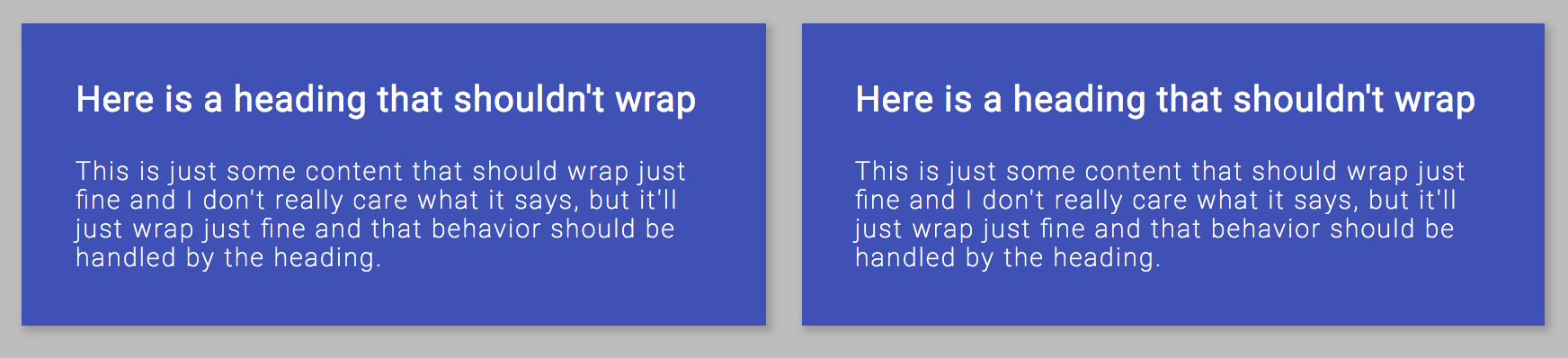
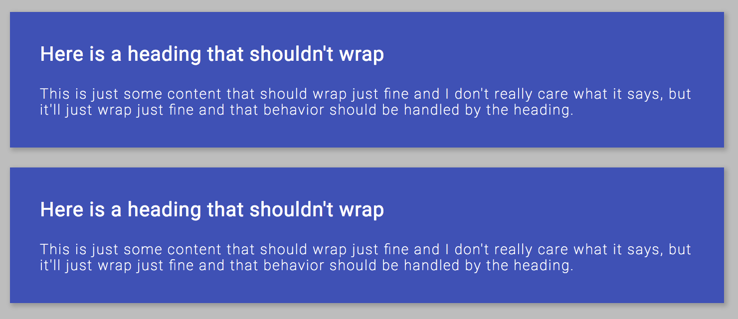
IE/Safari Behavior:
-
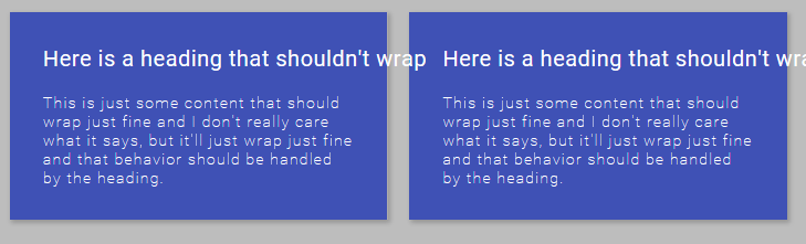
Greg Van Gorp about 7 yearsI'm pretty familiar with flexbugs, but your solution doesn't fix the issues in Safari or IE. It just forces the wrapping and won't appear side to side and as soon as the window gets too small, the text overflows the container. Please view it in Chrome to see the desired behavior.
-
 Michael Coker about 7 years@GregVanGorp oh sorry, didn't notice they weren't side by side. You just need to specify
flex-basis: 0for that. Mind checking again? -
Greg Van Gorp about 7 yearsThe heading is still flowing over the edge of the .left and .right divs when shrinking and it never wraps now. I want the containing divs (.left and .right) to shrink until it hits the full size of the heading and then wrap when it does. If you look at chrome, it works as I expect, but the heading overflows in Safari and IE 11 (which I do not want).
-
Patrick over 6 yearsFixed my issues, added the shorthand:
flex: 1 1 0%;. % is needed at the end for IE (otherwise it won't recognise the value and ignore it).