How can I change the label size of a material ui TextField?
Here's an example of how to modify the label font size in v4 of Material-UI (v5 example further down). This example also modifies the font-size of the input on the assumption that you would want those sizes to be in sync, but you can play around with this in the sandbox to see the effects of changing one or the other.
import React from "react";
import ReactDOM from "react-dom";

import TextField from "@material-ui/core/TextField";
import { withStyles } from "@material-ui/core/styles";

const styles = {
  inputRoot: {
    fontSize: 30
  },
  labelRoot: {
    fontSize: 30,
    color: "red",
    "&$labelFocused": {
      color: "purple"
    }
  },
  labelFocused: {}
};
function App({ classes }) {
  return (
    <div className="App">
      <TextField
        id="standard-with-placeholder"
        label="First Name"
        InputProps={{ classes: { root: classes.inputRoot } }}
        InputLabelProps={{
          classes: {
            root: classes.labelRoot,
            focused: classes.labelFocused
          }
        }}
        margin="normal"
      />
    </div>
  );
}
const StyledApp = withStyles(styles)(App);
const rootElement = document.getElementById("root");
ReactDOM.render(<StyledApp />, rootElement);

Below is an equivalent example for v5 of Material-UI using styled instead of withStyles:
import React from "react";
import ReactDOM from "react-dom";

import MuiTextField from "@material-ui/core/TextField";
import { inputClasses } from "@material-ui/core/Input";
import { inputLabelClasses } from "@material-ui/core/InputLabel";
import { styled } from "@material-ui/core/styles";

const TextField = styled(MuiTextField)(`
  .${inputClasses.root} {
    font-size: 30px;
  }
  .${inputLabelClasses.root} {
    font-size: 30px;
    color: red;
    &.${inputLabelClasses.focused} {
      color: purple;
    }
  }
`);
function App() {
  return (
    <div className="App">
      <TextField
        id="standard-with-placeholder"
        label="First Name"
        margin="normal"
        variant="standard"
      />
    </div>
  );
}
const rootElement = document.getElementById("root");
ReactDOM.render(<App />, rootElement);
Here are the relevant parts of the documentation:
- https://material-ui.com/api/text-field/
- https://material-ui.com/api/input/
- https://material-ui.com/api/input-label/
- https://material-ui.com/api/form-label/
intA
Updated on June 11, 2022Comments
-
intA almost 2 years
I have a TextField defined as follows:
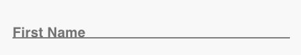
<TextField
  id="standard-with-placeholder"
  label="First Name"
  className={classes.textField}
  margin="normal"
/>
And it looks like this:
But I want it look like this:
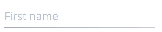
The "First Name" text is larger. How can I adjust the label text size? Currently my styles object is empty. I think that should be where the CSS to do this should go, but I'm unsure what the css would look like for the label text.
Thanks
-
intA about 5 yearsThis doesn't seem to do anything. I think the CSS from a custom bootstrap version that's being used in the project may be overriding it. How can I add !important when defining CSS in javascript like this?
-
 Ryan Cogswell about 5 yearsYour question about "!important" has been answered here. I'll warn that you are likely to encounter a lot of annoying issues trying to get the Material-UI components to look correct if you are battling a lot of global styles bleeding in.
 -
Jay J about 2 years@RyanCogswell appreciate the above. Do you know how to prevent the label from wrapping in a full width text box? It's wrapping after ~45 characters and I want to override that default. I'm on v4x of Material and can't upgrade for a few months.
-
Ryan Cogswell about 2 years@JayJ Please create a separate question including a sandbox reproducing your problem. I do have an approach in my own code for dealing with labels that would otherwise wrap, but it is more involved than what I can explain in a comment.
-
Jay J about 2 years@RyanCogswell I found an answer - thanks though.