How can I use flexbox to achieve a complex, responsive HTML layout?
Solution 1
You’re looking for the experimental grid syntax. Flexbox is good for smaller, widget or component layout systems. Grid is for overall page layout, and it’s awesome.
Thing is, grid is only supported in IE, Edge, and the upcoming Safari browsers right now, but Firefox and Chrome support is allegedly just around the corner, and you can start trying it out today by enabling the right developer flag in those browsers.
Here is some sample code, but again, it will only work if your browser supports the new grid syntax.
*{
  box-sizing: border-box;
}

.flexbox{
  width: 320px;
  display: grid;
  grid-template-columns: calc(50% - 0.5ch) calc(50% - 0.5ch);
  grid-gap: 1ch;
}

.one{
  order: 2;
  background-color: red;
}

.two{
  grid-column: 1 / 3;
  order: 1;
  background-color: green;
}

.three{
  order: 3;
  background-color: pink;
}

.four{
  display: grid;
  grid-column: 1 / 3;
  grid-gap: 1ch;
  order: 4;
  background-color: lavender;
}

.inner-container{
  background-color: violet;
}

@media screen and (min-width: 500px){
  .flexbox{
    width: 500px;
    grid-template-columns: calc(33.333% - 0.333ch) calc(33.333% - 0.333ch) calc(33.333% - 0.333ch);
  }

  .one{
    grid-row: 1 / 3;
    order: 1;
  }

  .two{
    order: 2;
    grid-column: 2 / 4;
  }

  .three{
    order: 3;
  }

  .four{
    grid-column: 3 / 4;
    order: 4;
  }
}
<div class="flexbox">
<div class="content-flexbox one">
<h1 class="posttitle">Lorem ipsum</h1>
<h2 class="subtitle">dolor sit amet</h2>
</div>
<div class="content-flexbox two">
<img src="http://placehold.it/300x300" />
</div>
<div class="content-flexbox three">
<span>Lorem ipsum dolor</span>
</div>
<div id="container-voting" class="content-flexbox four">
<div class="inner-container set">
<span>Lorem ipsum dolor</span>
</div>
<div class="inner-container get">
<span>Lorem ipsum dolor</span>
</div>
</div>Solution 2
Although this question explicitly asked for a flexbox approach, there is another way to achive it using simple floats.
A media query allows to rearange the elements in the desired order on viewports less than 414px wide:
.wrap {
  background: #d0d0d0;
  padding: 1%;
}
.wrap:after {
  content: '';
  display: block;
  clear: both;
}
.el {
  float: left;
  margin: 1%;
}
.el1 {
  width: 31.33%;
  padding-bottom: 31.33%;
  background: #FF7676;
}
.el2 {
  float: right;
  width: 64.66%;
  padding-bottom: 14.66%;
  background: #C2FF76;
}
.el3 {
  width: 31.33%;
  padding-bottom: 14.66%;
  background: #FF9BF7;
}
.el4 {
  width: 31.33%;
  padding-bottom: 6.33%;
  background: #9BA4FF;
}
@media (max-width: 414px) {
  .el2, .el4 {
    width: 98%;
    padding-bottom: 31.33%;
  }
  .el1, .el3 {
    width: 48%;
    padding-bottom: 48%;
  }
}
<div class="wrap">
<div class="el el2"></div>
<div class="el el1"></div>
<div class="el el3"></div>
<div class="el el4"></div>
<div class="el el4"></div>
</div>Note that I used padding-bottom to keep the aspect ratio of the elements in this example (more info in this answer).
I don't know what content you intend to put in the blocks but you will need to use absolute positionnig for it if you want to stick with the "padding technique". For plain text content, you can check this fiddle.
Solution 3
The problem is that, if you want to be able to rearrange all items, they must be flex items of the same flex container. But Flexbox does not provide any direct way to make an element occupy more than one flex line.
However, you can use multiple containers and display: contents:
The element itself does not generate any boxes, but its children and pseudo-elements still generate boxes as normal. For the purposes of box generation and layout, the element must be treated as if it had been replaced with its children and pseudo-elements in the document tree.
/* Desktop */
.container {
display: flex;
flex-wrap: wrap;
}
.container > * {
flex-grow: 1;
}
.item {
margin: 2px;
}
.column {
flex-direction: column;
}
.fill {
width: 100%;
}
/* Mobile */
@media (max-width: 414px) {
.container > .container {
display: contents;
}
.i2 {
order: -1;
}
.i4 {
width: 100%;
}
}
/* Pretty */
.i1 { background: #FF7676; }
.i2 { background: #C2FF76; }
.i3 { background: #FF9BF7; }
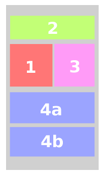
.i4 { background: #9BA4FF; }<div class="container">
<div class="item i1">1</div>
<div class="container">
<div class="item i2 fill">2</div>
<div class="item i3">3</div>
<div class="container column">
<div class="item i4">4a</div>
<div class="item i4">4b</div>
</div>
</div>
</div>The only problem is that display: contents is not widely supported yet, but you can see it working on Firefox.
Comments
-
Marco about 2 years
I have looked into Flexbox to achieve a responsive layout like pictured below. Unfortunately I still have not figured out how to achieve a desktop layout like Figure 1 which rearranges itself to Figure 2 on viewports smaller than 414 pixel.
Figure 1 (desktop viewports)

Figure 2 (mobile viewports)
 (scaled version)
Click here for image in original size
My code so far :
.flexbox {
  display: -webkit-box;
  display: -ms-flexbox;
  display: -webkit-flex;
  display: flex;
  flex-wrap: wrap;
  width: 100%;
  margin: 0;
  flex-direction: row;
}
.content-flexbox.one {
  flex-basis: calc(66% - 1rem);
  order: 2;
}
.content-flexbox.two {
  flex-basis: calc(30% - 1rem);
  order: 1;
}
.content-flexbox.three {
  order: 3;
}
.content-flexbox.four {
  order: 4;
}
.content-flexbox {
  margin: 1rem;
  -webkit-box-flex: 1;
  -webkit-flex: 1;
  -ms-flex: 1;
  flex: 1;
}
@media only screen and (max-width: 959px) {
  .flexbox {
    -flex-direction: column;
    padding-top: 1rem;
  }
  .content-flexbox {
    margin: 1rem;
    flex: 1;
    flex-basis: 100%;
  }
  .content-flexbox.one {
    flex-basis: 100%;
    order: 1;
  }
  .content-flexbox.two {
    flex-basis: 100%;
    order: 2;
  }
}
<div class="flexbox"> <div class="content-flexbox one"> <h1 class="posttitle">Lorem ipsum</h1> <h2 class="subtitle">dolor sit amet</h2> </div> <div class="content-flexbox two"> <img src="http://placehold.it/300x300" /> </div> <div class="content-flexbox three"> <span>Lorem ipsum dolor</span> </div> <div id="container-voting" class="content-flexbox four"> <div class="inner-container set"> <span>Lorem ipsum dolor</span> </div> <div class="inner-container get"> <span>Lorem ipsum dolor</span> </div> </div> </div>My question
Is this even possible with flexbox? Is there a better alternative more suited for this layout?
-
 Sunny R Gupta almost 8 yearsIt is going to be free flowing content (like plain-text).
 -
web-tiki almost 8 years@SunnyRGupta Do the elements need to keep their aspect ratio or are their height defined by the content?
-
Sunny R Gupta almost 8 yearsThey are going to be defined by the content. Only width can be fixed in percentages.
-
web-tiki almost 8 years@SunnyRGupta that will be very hard if not impossible. How will you keep layout consistency (like the bottom alignment of the elements) without constraining the height of elements in some way?
-
Sunny R Gupta almost 8 yearsIt's not more about the bottom alignment that the order. I'm fine with boxes of variable height and not stacking perfectly. But the issue is getting 1 to fall below 2 on mobile and stay on the side in desktop.
-
Sunny R Gupta almost 8 yearsGood ol Floats :) Well, since there are no answers using flex and your answer is the only one close to what is expected. (Without JS) I'm granting the bounty. Thanks for the help.
-
Sunny R Gupta almost 8 yearsI was looking for a more stable implementation across browsers.
-
Oriol almost 8 yearsThe only downside of floats is that the items won't stretch to have consistent sizes. You must hardcode heights to make it look nice, but then it's not fluid.
-
Marco over 5 yearsCSS grid layout is now supported by all major browsers, so I will accept this answer as the correct one. Thank you!