How do I change the shape of a button in MUI using theme?
Solution 1
There is a global border radius shape value in the theme. You can change it like this:
const theme = createMuiTheme({
  shape: {
    borderRadius: 8,
  },
})
Alternatively, if you are only interested in the button style:
const theme = createMuiTheme({
  overrides: {
    MuiButton: {
      root: {
        borderRadius: 8,
      },
    },
  },
})
Or, you could target the global class name of the button:
.MuiButton-root {
  border-radius: 8px;
}
Solution 2
In MUI v5.0+, you can easily approach that with this:
<Button type="submit" color="primary" sx={ { borderRadius: 28 } }>Enter</Button>
If you want to reuse the same style, you can import it from an external file and your code would be something like this:
<Button type="submit" color="primary" sx={ { ...styles.button.rounded } }>Enter</Button>
Alternatively to affect all buttons - globally via theme (MUI v5):
import { createTheme } from '@mui/material';

const theme = createTheme({
  components: {
    MuiButton: {
      styleOverrides: {
        root: {
          borderRadius: 28,
        },
      },
    },
  },
});
I also tried it by creating a new variant (new in v5.0) but I think is more complicated because you'll have to add many styles by each prop which is added:
createTheme function
MuiButton: {
            defaultProps: {
                variant: 'contained',
                color: 'inherit'
            },
            styleOverrides: {
                containedInherit: {
                    backgroundColor: '#fff'
                }
            },
            variants: [
                {
                    props: { variant: 'rounded' },
                    style: {
                        borderRadius: 28
                    }
                },
                {
                    props: { variant: 'rounded', color: 'primary' },
                    style: {
                        color: 'white',
                        backgroundColor: '#01697d'
                    }
                }
            ]
        }
Besides, with sx prop solution, you can combine variants with round style (outlined and contained).
Solution 3
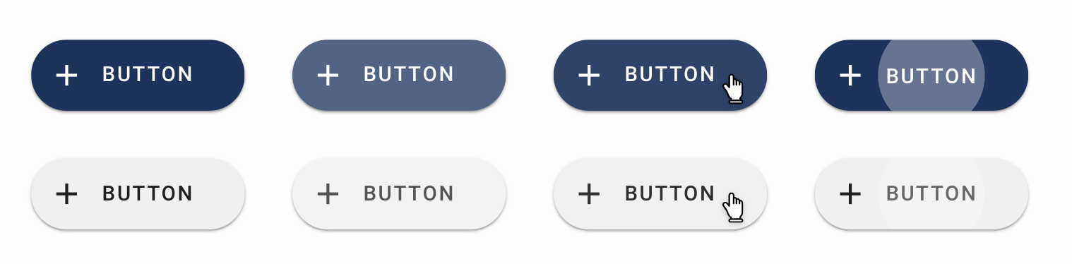
If you want to have a *ahem* well rounded Button, use Fab:
<Fab>
  <Icon />
</Fab>
<Fab variant="extended">
  <Icon sx={{ mr: 1 }} />
  Extended
</Fab>
How can I use it as a "rounded" prop? (like in Vuetify)
You can add custom styling props like rounded in MUI v5 by using styled to create an enhanced version of the original component with extra styles and whatever props you want to customize it:
import MuiButton from '@mui/material/Button';
import { styled } from '@mui/material/styles';

const options = {
  shouldForwardProp: (prop) => prop !== 'rounded',
};
const Button = styled(
  MuiButton,
  options,
)(({ theme, rounded }) => ({
  borderRadius: rounded ? '24px' : null,
}));
<Button variant="contained">Rectangle</Button>
<Button variant="contained" rounded>
  Round
</Button>
To change the borderRadius globally, you can use createTheme, note that this approach also affects other components which reference theme.shape.borderRadius like Accordion or Skeleton:
const theme = createTheme({
  shape: {
    borderRadius: 5,
  },
});
Live Demo

Solution 4
Why not just add a borderRadius in makeStyles?
const useStyles = makeStyles(theme => ({
  button: {
    margin: theme.spacing(1),
    borderRadius: "5em"
  },
  input: {
    display: 'none',
  },
}));
Example: https://codesandbox.io/s/material-demo-f00qi?fontsize=14
daydreamer
Hello Viewer, Some of the places to see my work are BonsaiiLabs My Website
Updated on November 10, 2021Comments
-
daydreamer over 2 years
So the documentation on
Buttoncomponent has various sections and also a Codesandbox linked at https://codesandbox.io/s/npie4However, there is nowhere mentioned how to change the shape of a button if needed.
I am using Google Material Sketch file and I want the buttons to be rounded
How can I do that using the
themeobject so that in my entire app theButtoncomponent are always rounded? -
daydreamer almost 5 yearsThank you, however, I needed to fit that in
theme, so I accepted another answer, but your works too when someone needs to do one-time work -
 Ivan Cabrera over 2 yearsHow can I use it as a "rounded" prop? (like in Vuetify)
 -
KManish over 2 yearsAwesome, just what I was looking for. Didn't know this existed.