How do I create a Flat combo box using WPF?
Solution 1
You'll need to override the ControlTemplate for your ComboBox. The link that voddy mentioned in the comments will lead you (via another link) to the default ComboBox style (http://msdn.microsoft.com/en-us/library/ms752094.aspx) which you should be able to tweak to get the appearance you want.
As an alternative, you can try the ControlTemplate included with Kaxaml (a neat XAML tool), which already a more "flat" appearance.
For Reference (from Kaxaml):
<!-- Enclosed in your resources, or a resource dictionary -->
<Window.Resources>
    <ControlTemplate x:Key="ComboBoxToggleButton" TargetType="{x:Type ToggleButton}">
        <Grid>
            <Grid.ColumnDefinitions>
                <ColumnDefinition />
                <ColumnDefinition Width="20" />
            </Grid.ColumnDefinitions>
            <Border
  x:Name="Border"
  Grid.ColumnSpan="2"
  CornerRadius="2"
  Background="#C0C0C0"
  BorderBrush="#404040"
  BorderThickness="1" />
            <Border
  Grid.Column="0"
  CornerRadius="2,0,0,2"
  Margin="1"
  Background="#FFFFFF"
  BorderBrush="#404040"
  BorderThickness="0,0,1,0" />
            <Path
  x:Name="Arrow"
  Grid.Column="1"
  Fill="#404040"
  HorizontalAlignment="Center"
  VerticalAlignment="Center"
  Data="M 0 0 L 4 4 L 8 0 Z"/>
        </Grid>
        <ControlTemplate.Triggers>
            <Trigger Property="ToggleButton.IsMouseOver" Value="true">
                <Setter TargetName="Border" Property="Background" Value="#808080" />
            </Trigger>
            <Trigger Property="ToggleButton.IsChecked" Value="true">
                <Setter TargetName="Border" Property="Background" Value="#E0E0E0" />
            </Trigger>
            <Trigger Property="IsEnabled" Value="False">
                <Setter TargetName="Border" Property="Background" Value="#EEEEEE" />
                <Setter TargetName="Border" Property="BorderBrush" Value="#AAAAAA" />
                <Setter Property="Foreground" Value="#888888"/>
                <Setter TargetName="Arrow" Property="Fill" Value="#888888" />
            </Trigger>
        </ControlTemplate.Triggers>
    </ControlTemplate>

    <ControlTemplate x:Key="ComboBoxTextBox" TargetType="{x:Type TextBox}">
        <Border x:Name="PART_ContentHost" Focusable="False" Background="{TemplateBinding Background}" />
    </ControlTemplate>

    <Style x:Key="{x:Type ComboBox}" TargetType="{x:Type ComboBox}">
        <Setter Property="SnapsToDevicePixels" Value="true"/>
        <Setter Property="OverridesDefaultStyle" Value="true"/>
        <Setter Property="ScrollViewer.HorizontalScrollBarVisibility" Value="Auto"/>
        <Setter Property="ScrollViewer.VerticalScrollBarVisibility" Value="Auto"/>
        <Setter Property="ScrollViewer.CanContentScroll" Value="true"/>
        <Setter Property="MinWidth" Value="120"/>
        <Setter Property="MinHeight" Value="20"/>
        <Setter Property="Template">
            <Setter.Value>
                <ControlTemplate TargetType="{x:Type ComboBox}">
                    <Grid>
                        <ToggleButton
        Name="ToggleButton"
        Template="{StaticResource ComboBoxToggleButton}"
        Grid.Column="2"
        Focusable="false"
        IsChecked="{Binding Path=IsDropDownOpen,Mode=TwoWay,RelativeSource={RelativeSource TemplatedParent}}"
        ClickMode="Press">
                        </ToggleButton>
                        <ContentPresenter
        Name="ContentSite"
        IsHitTestVisible="False"
        Content="{TemplateBinding SelectionBoxItem}"
        ContentTemplate="{TemplateBinding SelectionBoxItemTemplate}"
        ContentTemplateSelector="{TemplateBinding ItemTemplateSelector}"
        Margin="3,3,23,3"
        VerticalAlignment="Center"
        HorizontalAlignment="Left" />
                        <TextBox x:Name="PART_EditableTextBox"
        Style="{x:Null}"
        Template="{StaticResource ComboBoxTextBox}"
        HorizontalAlignment="Left"
        VerticalAlignment="Center"
        Margin="3,3,23,3"
        Focusable="True"
        Background="Transparent"
        Visibility="Hidden"
        IsReadOnly="{TemplateBinding IsReadOnly}"/>
                        <Popup
        Name="Popup"
        Placement="Bottom"
        IsOpen="{TemplateBinding IsDropDownOpen}"
        AllowsTransparency="True"
        Focusable="False"
        PopupAnimation="Slide">
                            <Grid
          Name="DropDown"
          SnapsToDevicePixels="True"
          MinWidth="{TemplateBinding ActualWidth}"
          MaxHeight="{TemplateBinding MaxDropDownHeight}">
                                <Border
            x:Name="DropDownBorder"
            Background="#FFFFFF"
            BorderThickness="1"
            BorderBrush="#888888"/>
                                <ScrollViewer Margin="4,6,4,6" SnapsToDevicePixels="True">
                                    <StackPanel IsItemsHost="True" KeyboardNavigation.DirectionalNavigation="Contained" />
                                </ScrollViewer>
                            </Grid>
                        </Popup>
                    </Grid>
                    <ControlTemplate.Triggers>
                        <Trigger Property="HasItems" Value="false">
                            <Setter TargetName="DropDownBorder" Property="MinHeight" Value="95"/>
                        </Trigger>
                        <Trigger Property="IsEnabled" Value="false">
                            <Setter Property="Foreground" Value="#888888"/>
                        </Trigger>
                        <Trigger Property="IsGrouping" Value="true">
                            <Setter Property="ScrollViewer.CanContentScroll" Value="false"/>
                        </Trigger>
                        <Trigger SourceName="Popup" Property="Popup.AllowsTransparency" Value="true">
                            <Setter TargetName="DropDownBorder" Property="CornerRadius" Value="4"/>
                            <Setter TargetName="DropDownBorder" Property="Margin" Value="0,2,0,0"/>
                        </Trigger>
                        <Trigger Property="IsEditable"
           Value="true">
                            <Setter Property="IsTabStop" Value="false"/>
                            <Setter TargetName="PART_EditableTextBox" Property="Visibility" Value="Visible"/>
                            <Setter TargetName="ContentSite" Property="Visibility" Value="Hidden"/>
                        </Trigger>
                    </ControlTemplate.Triggers>
                </ControlTemplate>
            </Setter.Value>
        </Setter>
        <Style.Triggers>
        </Style.Triggers>
    </Style>

    <!-- SimpleStyles: ComboBoxItem -->
    <Style x:Key="{x:Type ComboBoxItem}" TargetType="{x:Type ComboBoxItem}">
        <Setter Property="SnapsToDevicePixels" Value="true"/>
        <Setter Property="OverridesDefaultStyle" Value="true"/>
        <Setter Property="Template">
            <Setter.Value>
                <ControlTemplate TargetType="{x:Type ComboBoxItem}">
                    <Border
      Name="Border"
      Padding="2"
      SnapsToDevicePixels="true">
                        <ContentPresenter />
                    </Border>
                    <ControlTemplate.Triggers>
                        <Trigger Property="IsHighlighted" Value="true">
                            <Setter TargetName="Border" Property="Background" Value="#DDDDDD"/>
                        </Trigger>
                        <Trigger Property="IsEnabled" Value="false">
                            <Setter Property="Foreground" Value="#888888"/>
                        </Trigger>
                    </ControlTemplate.Triggers>
                </ControlTemplate>
            </Setter.Value>
        </Setter>
    </Style>
</Window.Resources>
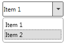
Will produce something that looks like this:
You'll probably want to separate the template into a ResourceDictionary, so you can use it in multiple places.
You may also want to alter the line:
<Style x:Key="{x:Type ComboBox}" TargetType="{x:Type ComboBox}">
To use a named key, which you can then apply to specific ComboBox elements:
<Style x:Key="FlatComboBoxStyle" TargetType="{x:Type ComboBox}">
<!-- Other Code -->

<ComboBox Style="{StaticResource ResourceKey=FlatComboBoxStyle}">
Solution 2
why so complicated? ;)
<ComboBox Style="{StaticResource {x:Static ToolBar.ComboBoxStyleKey}}"/>
Yoiku
Updated on July 27, 2022Comments
-
Yoiku almost 2 years
Hi I want to create a flat combo box with wpf. Acctually I have already done it but when the mouse is over the combo box it returns to its old style.
I have this xaml code:
    <Style TargetType="ComboBox" x:Key="Flat_ComboBox">
        <Setter Property="HorizontalAlignment" Value="Stretch"/>
        <Setter Property="VerticalAlignment" Value="Top"/>
        <Setter Property="MinWidth" Value="60"/>
        <Setter Property="UIElement.SnapsToDevicePixels" Value="True"/>
        <Setter Property="ScrollViewer.HorizontalScrollBarVisibility" Value="Disabled"/>
        <Setter Property="ScrollViewer.VerticalScrollBarVisibility" Value="Auto"/>
        <Setter Property="ScrollViewer.CanContentScroll" Value="True"/>
        <Setter Property="TextElement.Foreground" Value="Black"/>
        <Setter Property="FrameworkElement.FocusVisualStyle" Value="{x:Null}"/>
        <Setter Property="BorderThickness" Value="0" />
        <Setter Property="Background" Value="White" />

        <Style.Triggers>
            <Trigger Property="IsMouseOver" Value="True">
                <Setter Property="Background" Value="LightSkyBlue" />
            </Trigger>
        </Style.Triggers>

    </Style>
Which properties of the Trigger "IsMouseOver" do I need to change?
-
 edtheprogrammerguy over 8 yearsAwesome! Thanks @pr0gg3r