How to add dividers between specific menu items?
Solution 1
As of SDK version 28, you can use menu.setGroupDividerEnabled(boolean). If you're using ContextMenu this is only supported on SDK 28+, but MenuCompat offers backwards compatibility when used in onCreateOptionsMenu().
This will add a divider between the actions for each different groupId, shown as 0 and 1 below:
menu.add(0, getAdapterPosition(), action1, R.string.action1);
menu.add(1, getAdapterPosition(), action2, R.string.action2);
menu.setGroupDividerEnabled(true);

// Or for MenuCompat < SDK 28:
MenuCompat.setGroupDividerEnabled(menu, true);
Documentation here: https://developer.android.com/reference/android/view/Menu#setGroupDividerEnabled(boolean)
EDIT: Sample code as requested by asker:
Here's the code I am currently using in my app, located in a RecyclerView Adapter. It should work with your menu implementation as well. Since you're defining the menu by XML, the below will also work for you as long as you reference the menu resource. Here's what the result looks like:
Override onCreateContextMenu or your menu's relevant onCreate.. method like so within the:
@Override
public void onCreateContextMenu(ContextMenu menu, View v, ContextMenu.ContextMenuInfo menuInfo) {
menu.setHeaderTitle(getStr(R.string.actions_title));
// Groups 0 and 1, first parameter for menu.add()
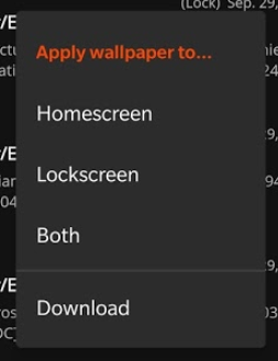
menu.add(0, getAdapterPosition(), 0, R.string.homescreen);
menu.add(0, getAdapterPosition(), 1, R.string.lockscreen);
menu.add(0, getAdapterPosition(), 2, R.string.wpLocation_both);
menu.add(1, getAdapterPosition(), 3, R.string.action_download);
if (Build.VERSION.SDK_INT >= Build.VERSION_CODES.P) {
menu.setGroupDividerEnabled(true); // This adds the divider between groups 0 and 1, but only supported on Android 9.0 and up.
}
}
Solution 2
You should use action layout
<menu xmlns:android="http://schemas.android.com/apk/res/android"
    xmlns:app="http://schemas.android.com/apk/res-auto"
    xmlns:tools="http://schemas.android.com/tools"
    tools:context=".LandingActivity">
    <item
        android:id="@+id/action_cart"
        android:title="cart"
        android:actionLayout="@layout/cart_update_count"
        android:icon="@drawable/shape_notification"
        app:showAsAction="always"/>
</menu>
and then the action layout can have the textview with divider.
<LinearLayout
    xmlns:android="http://schemas.android.com/apk/res/android"
    android:layout_width="wrap_content"
    android:layout_height="match_parent"
    android:orientation="vertical">

    <View
        android:id="@+id/divider"
        android:layout_width="match_parent"
        android:layout_height="wrap_content"
        android:background="@drawable/divider"/>

    <TextView
        android:id="@android:id/text"
        android:layout_width="match_parent"
        android:layout_height="wrap_content"
        android:background="?android:attr/selectableItemBackground"
        android:gravity="center_vertical"
        android:textAppearance="?attr/textAppearanceListItemSmall"/>

</LinearLayout>
then you can add the click listener in code
Solution 3
OK, I've found a nice workaround, but I'm not sure the styling should be this way. That's what I'm missing:
- background of items is on top of the background of the popup of the spinner, and I'm not sure if that's the correct way to put it.
- I used the white background of the support library for the popup of the spinner. I think there should be a better way to make it white.
- I need to know what is the correct style of the divider. for now I used a simple one
- Action bar item style is missing. I just used a simple ImageView, and I think it should be different.
- For some reason, on some Android versions (maybe Lollipop and below) the background of the items look black instead of white.
- The spinner might sometimes have issues with setOnItemSelectedListener , not sure when.
MainActivity
@Override
public boolean onCreateOptionsMenu(Menu menu) {
    getMenuInflater().inflate(R.menu.menu_main, menu);
    final MenuItem item = menu.findItem(R.id.action_settings);
    final Spinner spinner = ((Spinner) MenuItemCompat.getActionView(item));
    SimpleImageArrayAdapter adapter = new SimpleImageArrayAdapter(this);
    spinner.setAdapter(adapter);
    return true;
}

public class SimpleImageArrayAdapter extends ArrayAdapter<String> {
    private final String[] items = {"item 1", "item 2", "item 3", "extra item"};

    public SimpleImageArrayAdapter(Context context) {
        super(context, 0);
    }

    @Override
    public int getCount() {
        return items.length;
    }

    @Override
    public String getItem(final int position) {
        return items[position];
    }

    @Override
    public View getDropDownView(int position, View convertView, ViewGroup parent) {
        View rootView = convertView == null ? LayoutInflater.from(getContext()).inflate(R.layout.spinner_item, parent, false) : convertView;
        TextView tv = (TextView) rootView.findViewById(android.R.id.text1);
        tv.setTextColor(0xff000000);
        tv.setText(items[position]);
        boolean isLastItem = position == getCount() - 1;
        rootView.findViewById(R.id.action_divider).setVisibility(isLastItem ? View.VISIBLE : View.GONE);
        rootView.setLayoutParams(new AbsListView.LayoutParams(LayoutParams.MATCH_PARENT, LayoutParams.WRAP_CONTENT));
        return rootView;
    }

    @Override
    public View getView(int position, View convertView, ViewGroup parent) {
        //this is the view that's shown for the spinner when it's closed
        ImageView iv = new ImageView(getContext());
        iv.setImageResource(android.R.drawable.ic_menu_add);
        int viewSize = getDimensionFromAttribute(MainActivity.this, android.support.v7.appcompat.R.attr.actionBarSize);
        iv.setLayoutParams(new ViewGroup.LayoutParams(viewSize, viewSize));
        iv.setScaleType(ScaleType.CENTER_INSIDE);
        iv.setBackgroundResource(getResIdFromAttribute(MainActivity.this, R.attr.selectableItemBackground));
        return iv;
    }

}

public static int getResIdFromAttribute(final Activity activity, final int attr) {
    if (attr == 0)
        return 0;
    final TypedValue typedValue = new TypedValue();
    activity.getTheme().resolveAttribute(attr, typedValue, true);
    return typedValue.resourceId;
}

public static int getDimensionFromAttribute(final Context context, final int attr) {
    final TypedValue typedValue = new TypedValue();
    if (context.getTheme().resolveAttribute(attr, typedValue, true))
        return TypedValue.complexToDimensionPixelSize(typedValue.data, context.getResources().getDisplayMetrics());
    return 0;
}
res/menu/menu_main.xml
<menu xmlns:android="http://schemas.android.com/apk/res/android"
      xmlns:app="http://schemas.android.com/apk/res-auto"
      xmlns:tools="http://schemas.android.com/tools"
      tools:context="com.example.user.myapplication.MainActivity">
    <item
        android:id="@+id/action_settings"
        android:actionLayout="@layout/spinner"
        android:title=""
        app:actionLayout="@layout/spinner"
        app:showAsAction="always"
        />
</menu>
res/layout/spinner_item.xml
<?xml version="1.0" encoding="utf-8"?>
<LinearLayout
    xmlns:android="http://schemas.android.com/apk/res/android"
    android:layout_width="wrap_content"
    android:layout_height="match_parent"
    android:orientation="vertical">

    <ImageView
        android:id="@+id/action_divider"
        android:layout_width="match_parent"
        android:layout_height="wrap_content"
        android:background="@drawable/divider"/>

    <TextView
        android:id="@android:id/text1"
        android:layout_width="match_parent"
        android:layout_height="wrap_content"
        android:background="?android:attr/selectableItemBackground"
        android:gravity="center_vertical"
        android:minHeight="?attr/listPreferredItemHeightSmall"
        android:paddingEnd="?attr/listPreferredItemPaddingRight"
        android:paddingLeft="?attr/listPreferredItemPaddingLeft"
        android:paddingRight="?attr/listPreferredItemPaddingRight"
        android:paddingStart="?attr/listPreferredItemPaddingLeft"
        android:textAppearance="?attr/textAppearanceListItemSmall"/>

</LinearLayout>
res/layout/spinner.xml
<?xml version="1.0" encoding="utf-8"?>
<Spinner
    android:id="@+id/spinner"
    style="@style/SpinnerWithoutArrow"
    xmlns:android="http://schemas.android.com/apk/res/android"
    android:layout_width="wrap_content"
    android:layout_height="wrap_content" />
res/values/styles.xml
<style name="SpinnerWithoutArrow" parent="@style/Widget.AppCompat.Spinner">
    <item name="android:background">@null</item>
    <item name="android:popupBackground">@drawable/abc_popup_background_mtrl_mult</item>
</style>
res/drawable/divider.xml
<?xml version="1.0" encoding="utf-8"?>
<shape
    xmlns:android="http://schemas.android.com/apk/res/android"
    android:shape="rectangle">
    <size
        android:height="1dp"/>
    <solid android:color="#FFff0000" />
</shape>
Solution 4
This can be done by using popup window and list view. In your list view, you can have different view types, such as menu item and divider.
I list the code for popup window part:
    LayoutInflater inflater = LayoutInflater.from(context);
    View view = inflater.inflate(R.layout.option_menu, null);
    ListView listView = (ListView) view.findViewById(R.id.listView);
    listView.setDivider(null);

    mAdapter = new OptionListAdapter(context, options);
    listView.setAdapter(mAdapter);

    listView.setOnItemClickListener(new AdapterView.OnItemClickListener() {
        @Override
        public void onItemClick(AdapterView<?> parent, View view, int position, long id) {
            //TODO: The code when item is clicked.
        }
    });

    mPopupWindow = new PopupWindow(context, null, R.attr.popupMenuStyle);
    mPopupWindow.setFocusable(true); // otherwise on android 4.1.x the onItemClickListener won't work.
    mPopupWindow.setContentView(view);
    mPopupWindow.setOutsideTouchable(true);

    int height = 0;
    int width = 0;
    float density = context.getResources().getDisplayMetrics().density;
    int minWidth = Math.round(196 * density); // min width 196dip, from abc_popup_menu_item_layout.xml
    int cellHeight = context.getResources().getDimensionPixelOffset(R.dimen.option_height);
    int dividerHeight = context.getResources().getDimensionPixelOffset(R.dimen.divider_height);
    final int widthMeasureSpec = View.MeasureSpec.makeMeasureSpec(0, View.MeasureSpec.UNSPECIFIED);
    final int heightMeasureSpec = View.MeasureSpec.makeMeasureSpec(0, View.MeasureSpec.UNSPECIFIED);
    for (int i = 0; i < mAdapter.getCount(); i++) {
        Object item = mAdapter.getItem(i);
        if (item != null) {
            View childView = mAdapter.getView(i, null, listView);
            childView.measure(widthMeasureSpec, heightMeasureSpec);
            height += cellHeight;
            width = Math.max(width, childView.getMeasuredWidth());
        } else {
            height += dividerHeight; // divider
        }
    }
    width = Math.max(minWidth, width);
    Drawable background = mPopupWindow.getBackground(); // 9-pitch images
    if (background != null) {
        Rect padding = new Rect();
        background.getPadding(padding);
        height += padding.top + padding.bottom;
        width += padding.left + padding.right;
    }
    mPopupWindow.setWidth(width);
    mPopupWindow.setHeight(height);
    mPopupWindow.setInputMethodMode(PopupWindow.INPUT_METHOD_NOT_NEEDED);
Then you can use following method to show the popup window:
PopupWindowCompat.showAsDropDown(mPopupWindow, parent, x, y, gravity);
In the adapter for list view, you can override getViewTypeCount() and getItemViewType() to support both menu item layout and divider layout, also you can add any view type that you need.
Here is a snapshot in my app:
android developer
Really like to develop Android apps & libraries on my spare time. Github website: https://github.com/AndroidDeveloperLB/ My spare time apps: https://play.google.com/store/apps/developer?id=AndroidDeveloperLB
Updated on October 04, 2020Comments
-
android developer over 3 years
Background
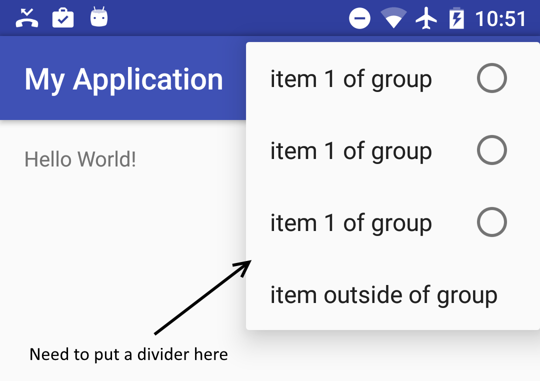
I have a menu item in the action bar (toolbar actually) that when clicked, shows a list of items to choose from, similar to radio-buttons:
<menu xmlns:android="http://schemas.android.com/apk/res/android"
      xmlns:app="http://schemas.android.com/apk/res-auto">

    <item
        android:icon="@drawable/..."
        android:title="@string/..."
        app:showAsAction="always">
        <menu>
            <group
                android:id="@+id/..."
                android:checkableBehavior="single">
                <item .../>
                <item .../>
                <item .../>
            </group>
        </menu>
    </item>
</menu>
I need to put an item below this list of items, that will have a divider between it and the list. Similar to what the material design guidelines show (taken from here) :
EDIT: here's a sketch of what I want to do:
The problem
I can't find a way to do it.
What I've tried
The only possible solutions I've found are:
change the theme of the activity (here), but this will also affect other menu items of the activity
methods to put a divider between menu items when they appear on the action bar, but here they do not appear on the toolbar itself. They appear on a popup menu of a selected item.
I tried to put fake items between the list and the extra item, and I also tried to put a group, an empty group and even tried various attributes.
Sadly nothing worked.
The question
How can I add a divider between specific items of an action-item's popup menu ?
Perhaps I need to create a custom popup menu when clicking on the action item (like here) ? If so, how do I put a divider between specific items there ? Maybe use a Spinner as an action item?
-
 BNK over 8 yearsLook at my answer at the following stackoverflow.com/questions/32695710/…. IMO, you can try using icon or background for grouping items (I mean item android:title="Communi...)
 -
android developer over 8 yearsIt doesn't work. I'm talking about the menu of the action bar. Please try it there. You can do it easily by creating a new project, and choose the one with the FAB (in the wizard). It will create a menu for you.
-
BNK over 8 yearsThere's a workaround, however it is not pretty, that you can add items like the following
<item android:id="@+id/menu_divider" android:enabled="false" android:icon="@drawable/white_divider" android:title="" /> -
android developer over 8 years@BNK It doesn't work. It just shows a whole empty item instead, without any drawable. I'm talking about a menu, not iconized action items. One that appears when clicking an item on the actionbar . I will put another screenshot to show what I mean.
-
BNK over 8 yearsHere is my screenshot drive.google.com/file/d/0B2HGUM4c0YwpdEFVSmlyMjIxc3M/… and you should update
<style name="AppTheme.PopupOverlay" parent="ThemeOverlay.AppCompat" /> -
android developer over 8 years@BNK I don't know why you got to show the image, but it still takes a full row (that's also probably clickable), instead of the size of the drawable. Plus, for some reason you got it to be black, but that's probably easy to fix.
-
BNK over 8 yearsI forgot to tell you, must add
@Override public boolean onMenuOpened(int featureId, Menu menu) { if (featureId == 108 && menu != null) { if (menu.getClass().getSimpleName().equals("MenuBuilder")) { -
BNK over 8 years
try { Method m = menu.getClass().getDeclaredMethod( "setOptionalIconsVisible", Boolean.TYPE); m.setAccessible(true); m.invoke(menu, true); } catch (NoSuchMethodException e) { e.printStackTrace(); } catch (Exception e) { throw new RuntimeException(e); } } } return super.onMenuOpened(featureId, menu); } -
android developer over 8 years@Bnk Can you please post as an answer. It's hard to read this way. Also, will it work as I've written? A divider that's not of the same height as a normal row? One that I can configure? And, why do you use reflection? Isn't there a better way?
-
BNK over 8 yearsSorry, I cannot chat at this moment. I uploaded my full sample code to drive.google.com/file/d/0B2HGUM4c0YwpWmxjWFFtQ3VyQkE/…
-
android developer over 8 yearsThe chat was by mistake. I wanted to put a comment and then I did.
-
Awadesh over 8 yearsPlease try this answer stackoverflow.com/questions/30625280/…
-
android developer over 8 years@BNK The sample on the Google-drive link works, but the divider takes a full, clickable row. Plus it's black for some reason.
-
android developer over 8 years@Awadesh Already tried it. It's not for menus of actionbar. Only for navigationView.
-
BNK over 8 yearsSo I said "it is not pretty" above :). I think the screenshot in your question is for navi drawer/view
-
android developer over 8 years@BNK I thought you meant the code isn't pretty...
-
BNK over 8 yearsI think the pic of group divider in your question is for navi drawer/view only.
-
BNK over 8 yearsIMO, you can try create a custom view which contains a horizontal line for that menu item. I have not tried yet.
-
 Admin over 8 yearsput divider after complete all group menu or seperate menu divider ?
 -
android developer over 8 years@Harshad I don't understand the question. The divider should be below the group. and above the item that's after the group. It divides the group from the extra item.
-
android developer over 8 years@BNK That's what I'm trying. In fact, I have succeeded, by using Spinner. The only thing that's missing for me is the style of each item, to make it look exactly like menu items. For some reason, I can't find how to do it. I will now add an answer. I hope someone could help with the styling
-
Admin over 8 yearsUse below link : [link] (stackoverflow.com/questions/10414668/…)
-
android developer over 8 years@Harshad This is not about the menu of the action bar, and even then, it shows an item that just has "----..." in it, which is also clickable and takes a full row.
-
android developer over 8 yearsHave you really tried it? As far as I know, actionLayout only works on action items, but not popup menus of them .
-
android developer about 8 yearsWow this looks really nice. Are there any disadvantages or issues when using it? Sadly I've moved on from this question, so I can't accept it without checking it out, but I will give +1 for the effort :)
-
 Hexise about 8 yearsNo issue found yet. The UI is just made from scratch so everything can be customized. I tested from Android 4.0.3 to Android 6.0, not including lower version API level devices.
 -
babay over 7 yearsnope, we need to insert dividers between specific items, not between all items.
-
 usernotnull about 7 yearsI didn't try it out but I think it will draw a divider between each item, while this post is more about setting a divider in specific places not below each time.
 -
 Tarit Ray almost 6 yearsI think it will not work fir the question ""How to add dividers between specific menu items?"" , but it will work those who need divider for each item
 -
Tarit Ray almost 6 yearsI was trying this but where is ""OptionListAdapter"" im not getting that... or can you plz upload the above project into gethub ???
-
Hexise almost 6 years@TaritRay OptionListAdapter is the subclass of ListView adapter, you can give it any name you want.
-
android developer over 3 yearsWait, now there is an official way to do it? Can you please share a Github sample? Also a screenshot of how it looks? Is there also a way to customize the divider?
-
Bryan W over 3 years@androiddeveloper I've updated my answer with a sample from my app. Note this is only compatible on Android 9.0 and up. I don't believe there is a direct way to customize the divider, although there are some more options that you could look into such as submenus.
-
android developer over 3 yearsSeems to work for
onCreateOptionsMenutoo. Is it possible in XML too somehow, and not just in code? Also, how comesetHeaderTitleisn't available foronCreateOptionsMenu? And I think it's not just for Android 9 and up, if you use support library. You can useMenuCompat.setGroupDividerEnabled(menu,true), at least according to my tests. -
Bryan W over 3 years@androiddeveloper I quickly skimmed the menu resource docs, seems like the only way is by referencing the menu resource
R.menu.filenameand adding the flag from the inflater, along with<group>tags in the XML. Also,setHeaderTitleis only available for ContextMenu because it's not attached to the toolbar/appbar (likely Google's design choice). Thanks for info about MenuCompat, I've added that to the answer. -
android developer over 3 yearsI don't understand. You say it's impossible to do it via XML ? Also, about MenuCompat, I don't see you've updated the code of the answer.
-
Bryan W over 3 years@androiddeveloper Sorry for the confusion. You can add dividers only with the
setGroupDividerEnabled()method, as long as you define<group>tags when you're using the XML menu resource. I have not tested MenuCompat, but seems you can use it like this:MenuCompat.setGroupDividerEnabled(menu, true);in your onCreateOptionsMenu override. -
android developer over 3 yearsCan you please show a sample with XML? As for
MenuCompat.setGroupDividerEnabled, I know it works. I just said that you didn't update your code to use it instead, as it supports older versions of Android too. -
android developer over 3 yearsSay, is it also possible to customize the looks of each item there?