How to apply rounded borders to highlight/selection
Solution 1
Not perfect but it's working:
http://jsfiddle.net/coma/9p2CT/
Remove the real selection
::selection {
   background-color: transparent;
}
Add some styles
span.highlight {
    background: #ADD6FF;
}

span.begin {
    border-top-left-radius: 5px;
    border-bottom-left-radius: 5px;
}

span.end {
    border-top-right-radius: 5px;
    border-bottom-right-radius: 5px;
}

pre.merge-end > span:last-child {
    border-bottom-right-radius: 0;
}

pre.merge-end + pre > span:last-child {
    border-top-right-radius: 0;
}

pre.merge-begin > span:first-child {
    border-bottom-left-radius: 0;
}

pre.merge-begin + pre > span:first-child {
    border-top-left-radius: 0;
}
Wrap every character in a node element
var format = function () {

    var before = -1;
    var html = $.trim(editor.text())
    .split("\n")
    .reverse()
    .map(function (line) {

        var a = line.length === before ? 'merge-end' : '';
        before = line.length;

        return '<pre class="' + a + '"><span>' + line.split('').join('</span><span>') + '</span></pre>';
    })
    .reverse()
    .join('');

    editor.html(html);
};
Get the selected nodes and highlight them, take care of their parents
var getSelectedNodes = function () {

    var i;
    var nodes = [];
    var selection = rangy.getSelection();

    for (i = 0; i < selection.rangeCount; ++i) {

        selection
        .getRangeAt(i)
        .getNodes()
        .forEach(function (node) {

            if ($(node).is('span')) {

                nodes.push(node);
            }
        });
    }

    return nodes;
};

var highlight = function (nodes, beforeNode) {

    var currentNode = $(nodes.shift()).addClass('highlight');
    var currentParent = currentNode.parent();

    if (beforeNode) {

        var beforeParent = beforeNode.parent();

        if (currentParent.get(0) !== beforeParent.get(0)) {

            currentNode.addClass('begin');
            beforeNode.addClass('end');
            beforeParent.addClass('merge-begin');
        }

    } else {

        currentNode.addClass('begin');
    }

    if (nodes.length) {

        highlight(nodes, currentNode);

    } else {

        currentNode.addClass('end');
    }
};

format();

$(document).on('mouseup', function () {

    $('.highlight').removeClass('highlight begin end');
    highlight(getSelectedNodes());
});
Solution 2
I can assure you this has nothing to do with html, css border radius or highlighting. The proof?
- The whole selection appears as a single block with multiple edges and veritices and is not symmetric. There is no way to have multiple edged shape directly in html, without using SVG or Canvas. (well, that's a possibility open for discussion)
- If it is not a single block, but indeed multiple lines highlighted or marked with some kind of HTML or CSS or JS, then there cant be an outward facing curve like this:

(there are always possibilities. For example you could cover the selection using a white rectangle with a border-radius, but this appears to be highly inefficient and unlikely... So...)
Summary, they must be using the Canvas property and whole lot of codes to 'underlay' an interactive selection procedure. There are numerous different types of highlighting appearing in the editor, like 'same word highlighting', 'selected highlighting', 'out of focus highlighting', etc... For all these to happen efficiently, I can't find a better alternative than canvas.
Don't be mad at me for posting this. But I didn't want to see my 4 hours of research as a waste. At least I got an observation and that's that.
UPDATE :
Though I thought covering the selection using a white rectangle with a border-radius at the end, is a rather inefficient and unnecessary way. Microsoft doesn't think so.
They are using the curved edged rectangles to cover up the end of highlights to give that effect. They are using absolutely positioned, round-edged <div>s to give the effect of highlighting. And at the end of that <div>, they overlay an image of a rounded rectangle.
And kudos to them, they have done a great job with it.
Solution 3
They are actually using round edged rectangles to cover the end of highlights in sentences which are smaller than the preceding or succeeding lines (just as I said in point 2). Check this out yourself:
- You cannot inspect element directly from the iframe. So click somewhere else and navigate to the iframe. I did it using chromes' built in source code inspector.
- Then use this image to find out the position of line highlighted in the image.
- That
<div>contains all the "selection" highlights. They just put round edged, background-colored rectangles below the text using absolute, top and left!!!** - The next
<div>holds similar background-colored<div>s, only they are for highlighting focused word, similar words, etc...
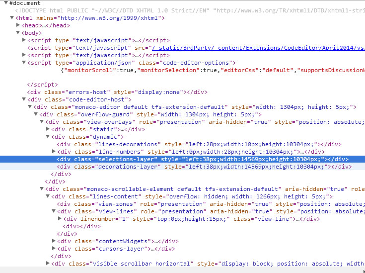
This is actually the content of the iframe. See the #document at the top?
See the expanded view. The small space above having the code is actually the highlighted section.

This is not a very good idea for a simple website though. They really needed to parse and stuff with the words and letters, since it is supposed to be a high-end code editor, so cant blame them for spending a comparatively little time to 'round'ening the edges a little.
Solution 4
CSS' ::selection only supports declaring color, background, cursor and outline (See W3C). So there's no possibility to define border-radius for the selection with pure CSS.
So I believe they did it like Niklas mentioned in comments:
- Wait until the user selects something (selectstart, combination of mousedown and mouseup)
- Get the selected text
- Get the position of the selected text (number of characters from the beginning) since if you just double-click a single word, you can't create a rule from it
- Wrap the selection with a div or span
- Apply styles to the wrapper
- Listen for the user to click something else etc. (unselects text) -> remove wrapper
I begun to try to create a solution myself, but I lost my motivation since it tooks too much time. Maybe someone could need my suggestions (I used jQuery):
For point 2:
var selection = (window.getSelection() // > IE 9
                 || document.selection.createRange() //< IE 9
                ).toString();
For point 4 use replace()
For point 6:
$(".selection").replaceWith($(".selection")[0].childNodes);
Solution 5
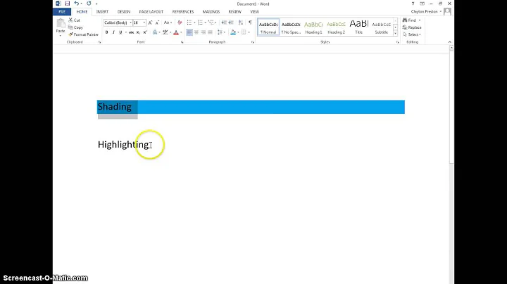
I fond also a solution which you might like. It basically works with spans around each word which you then can apply a border-radius. But I don't know how to archive the corner above - so it's only horizontal connected.
p.introduction {
  width: 150px;
}

p.introduction span {
  background-color: #f48024;
  color: #1d1d1e;
  border-radius: 25px;
  float: left;
  padding: 0 15px 0 10px;
  margin: 4px -15px 4px 0px;
}
<p class="introduction"><span>Be</span><span>part</span><span>of</span><span>our</span><span>awesome</span><span>community</span><span>and</span><span>have</span><span>fun</span><span>with</span><span>us.</span></p>Related videos on Youtube
 01 : 18
 11 : 09
 01 : 01
 02 : 00
 01 : 43
 01 : 40
 01 : 43
Cyral
Updated on June 18, 2022Comments
-
Cyral almost 2 years
I have used Visual Studio Online for a while for a project, and the way they apply rounded borders to selections in their online code viewer is very interesting:

I've tried inspecting the element and looking for some kind of custom CSS, but had no luck.
I have a feeling this requires some complex "hacks" to make it work, but it seems very interesting as I've never seen it done before.
How are they able to apply rounded borders to a selection?
Note: The normal selection is completely hidden WHILE selecting, and the rounded selection follows your cursor just like a regular selection. Not AFTER you have selected something.
Edit: I have created a fork of @Coma's answer that should work in Firefox and select while the mouse if moving using:
$(document).on('mousemove', function () {(The borders in certain cases could still use work.)
-
Cyral almost 10 yearsDown-voter mind explaining?
-
Niklas almost 10 yearsSorry for my first comment, misunderstood your comment and didn't see it was you who had wrote it. That said, I upvoted. I'm also curious about how they can do that!
-
 Coolen almost 10 yearsremoved downvote. But can't help you with the question.
 -
Niklas almost 10 yearsMy guess is, since it's inside an editor that color-highlights the code using tags and classes (I presume), that the selection is made up by a wrapper tag of some sort. Which give them the possibility to add border-radius. If so, still curious how they do the "negative border-radius" in the inward corners...
-
Noah Huppert almost 10 yearsIt looks like the actual text is in an iframe that is pointing to JS. My guess is they are actually using something like OpenGL to do the text editor.
-
Tim Down almost 10 yearsI've implemented custom selection in a browser before and it's more likely the highlighting is done with an overlay than wrapping the editor elements themselves.
-
 coma almost 10 yearsHey @TimDown!!!, I was making an jsfiddle using your Rangy library!
-
-
 BlackPanther almost 10 years@Cyral That was an awesome way to do it. They used monotype font. So, they know the exact height and width of each character and had to start the 'highlight' <div> just before or after a charachter, whichever was closer to the 'mouseDown()'... Intelligent piece of work...!! :)
 -
Cyral almost 10 years+1, Closest yet. Make sure you remember
moz-selectionfor Firefox users :) -
BlackPanther almost 10 yearsseriously? a
<span>for each character? -
Cyral almost 10 yearsIs there a disadvantage to using
mousemoveinstead ofmouseup? It seems to make this work perfectly because it applies the selection as soon as you move your mouse, not when you stop selecting. -
coma almost 10 yearsYes, mousemove it's the right one but I was not sure if working with so many span elements could be expensive to handle so quick. Btw, I'm working on another approach using a canvas, but it won't be ready for today (I have to work).
-
coma almost 10 yearsOh thanks! but @Cyral, I think that using canvas (I'm playing with Paper.js) and mapping the shape (since the heights are known) we can get a much better solution for this. I'll publish it once is ready, busy week!
-
imsky almost 10 yearsThe canvas/SVG technique actually sounds interesting enough to implement.