How to create a printable Twitter-Bootstrap page
Solution 1
Be sure to have a stylesheet assigned for printing.
It could be a separate stylesheet:
<link rel="stylesheet" type="text/css" media="print" href="print.css">
or one you share for all devices:
<link rel="stylesheet" type="text/css" href="bootstrap.min.css"> # Note there's no media attribute
Then, you can write your styles for printers in the separate stylesheets or in the shared one using media queries:
@media print {
    /* Your styles here */
}
Solution 2
Bootstrap 3.2 update: (current release)
Current stable Bootstrap version is 3.2.0.
With version 3.2 visible-print deprecated, so you should use like this:
Class                        Browser    Print
 -------------------------------------------------
.visible-print-block         Hidden        Visible (as block)
.visible-print-inline        Hidden        Visible (as inline)
.visible-print-inline-block  Hidden        Visible (as inline-block)
.hidden-print                Visible       Hidden
Bootstrap 3 update:
Print classes are now in documents: http://getbootstrap.com/css/#responsive-utilities-print
Similar to the regular responsive classes,
       use these for toggling content for print.

Class            Browser    Print
 ----------------------------------------
.visible-print   Hidden     Visible
.hidden-print    Visible    Hidden
Bootstrap 2.3.1 version:
After adding bootstrap.css file into your HTML,
Find the parts that you don't want to print and add hidden-print class into tags.
Because css file includes this:
@media print {
  .visible-print  { display: inherit !important; }
  .hidden-print   { display: none !important; }
}
Solution 3
Replace every col-md- with col-xs-
eg: replace every col-md-6 to col-xs-6.
This is the thing that worked for me to get me rid of this problem you can see what you have to replace.
Solution 4
There's a section of @media print code in the css file (Bootstrap 3.3.1 [UPDATE:] to 3.3.5), this strips virtually all the styling, so you get fairly bland print-outs even when it is working.
For now I've had to resort to stripping out the @media print section from bootstrap.css - which I'm really not happy about but my users want direct screen-grabs so this'll have to do for now. If anyone knows how to suppress it without changes to the bootstrap files I'd be very interested.
Here's the 'offending' code block, starts at line #192:
@media print {
  *,
  *:before,enter code here
  *:after {
    color: #000 !important;
    text-shadow: none !important;
    background: transparent !important;
    -webkit-box-shadow: none !important;
            box-shadow: none !important;
  }
  a,
  a:visited {
    text-decoration: underline;
  }
  a[href]:after {
    content: " (" attr(href) ")";
  }
  abbr[title]:after {
    content: " (" attr(title) ")";
  }
  a[href^="#"]:after,
  a[href^="javascript:"]:after {
    content: "";
  }
  pre,
  blockquote {
    border: 1px solid #999;

    page-break-inside: avoid;
  }
  thead {
    display: table-header-group;
  }
  tr,
  img {
    page-break-inside: avoid;
  }
  img {
    max-width: 100% !important;
  }
  p,
  h2,
  h3 {
    orphans: 3;
    widows: 3;
  }
  h2,
  h3 {
    page-break-after: avoid;
  }
  select {
    background: #fff !important;
  }
  .navbar {
    display: none;
  }
  .btn > .caret,
  .dropup > .btn > .caret {
    border-top-color: #000 !important;
  }
  .label {
    border: 1px solid #000;
  }
  .table {
    border-collapse: collapse !important;
  }
  .table td,
  .table th {
    background-color: #fff !important;
  }
  .table-bordered th,
  .table-bordered td {
    border: 1px solid #ddd !important;
  }
}
Solution 5
Best option I found was http://html2canvas.hertzen.com/
http://jsfiddle.net/nurbsurf/1235emen/
html2canvas(document.body, {
  onrendered: function(canvas) {
    $("#page").hide();
    document.body.appendChild(canvas);
    window.print();
    $('canvas').remove();
    $("#page").show();
  }
});
Related videos on Youtube
 18 : 40
 02 : 10
 05 : 49
 05 : 42
 05 : 25
 09 : 21
 45 : 24
 40 : 58
 07 : 17
 14 : 15
 01 : 23 : 35
 13 : 49
Comments
-
Jay Q. almost 4 years
I'm using Twitter-Bootstrap and I need to be able to print the page the way it looks on the browser. I'm able to print other pages made with Twitter-Bootstrap just fine but I can't seem to print my page that uses purely Twitter-Bootstrap. Am I missing a tag somewhere?
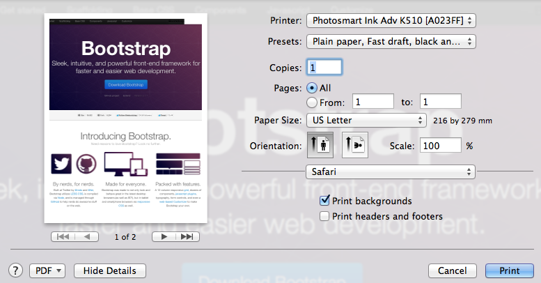
Official TB page when printed:
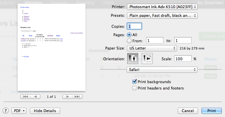
My page when printed:
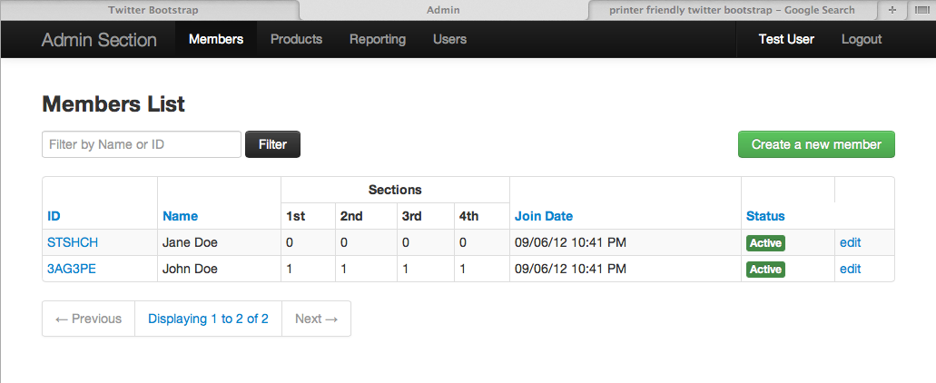
What my page actually looks like:
-
 albertedevigo almost 12 yearsAre you specifying a media="screen" attribute? Take a look to my answer.
-
-
Jay Q. almost 12 yearsI just added this:<link rel="stylesheet" type="text/css" media="print" href="bootstrap.min.css"> and didn't need to do anything else. Worked like a charm. Thanks!
-
Wex over 10 yearsIf you're already using this stylesheet, chances are you have you currently have
media="screen", which will not be seen by a printer. You can either switch this tomedia="all", or simply removemediaas the above answer suggests. -
David Bélanger over 9 yearsThanks ! Was having problem with the scale of the HTML view compared to the Print View... everything is good now !
-
Vincent Poirier over 9 yearsIsn't there a class to make something visible on both the browser and printer in the case where I make everything (
body) invisible with.hidden-print, but want to override a specific element to be shown? -
Fr0zenFyr about 9 yearsHey thanks! I was facing problem when printing my page, each
divused to go below the previous one. This answer gave me a hint, I addedcol-xs-*before eachcol-md-*and this fixed the issue. DISCLAIMER: I didn't test adding a container as<div class="row"></div>which may also have solved the problem(seems obvious). -
 Csaba Toth about 9 yearsI tried both 0.4 and 0.5 but neither of them worked. 0.5 appended some good looking stuff after my page, but the original page was still there, and then how I supposed to print that? Trying 0.4 triggered a print, the original page was also still there, and the render was kinda broken.
 -
ToolmakerSteve almost 9 years@VincentPoirier - if an element is hidden, everything inside it is hidden. So it is not meaningful to hide body, but unhide something that is part of body. Because there would be no context (container) in which to show that sub-element. Instead do css to hide all your leaf elements (e.g. put a default class on your inner divs), then use appropriate css class or id where desired to be visible. Will likely require some experimentation to get this exactly right.
-
ToolmakerSteve almost 9 yearsUnless one intended to have a different layout for narrow screens (e.g. phone) than for printing. Seems odd that bootstrap printer logic thinks its print screen is so narrow.
-
Suraj almost 9 yearsThis should be on the top.
-
musafar006 about 8 yearsalbertedevigo, I need some help regarding the styling. Like change font-size, widths, ... what exactly needed to be changed? TIA. @JayQ. : Is that still working or outdated? cause I can't get it to work.
-
albertedevigo about 8 years@dreamster, just include your styles in the stylesheet that applies to printing. Note that CSS cascading still works; so order, inheritance and selector priorities will influence the outcome. You'd probably ask a new question with your own code.
-
 zaidorx over 7 yearsJust to add that you can replace col-md- as the answer says or you can just add col-xs- like: class="col-md-6 col-xs-6" and you can mix and match depending on the requirements of your design.
 -
PDoria over 6 yearsThanks. This helped me in a similar issue as well.
-
 ardev about 6 yearsonly problem is now your layout might not be as responsive because you have taken what used to break at around 768px (I think) and made it full width all the way through. I think the chosen answer is the best as it decouples the purposes of digital and print styles and allows you to have the best of both worlds: responsive digital and good looking print