How to Create Grid/Tile View?
Solution 1
This type of layout is called Masonry layout. Masonry is another grid layout but it will fill out the whitespace caused by the difference height of elements.
jQuery Masonry is one of jQuery plugin to create masonry layout.
Alternatively, you can use CSS3 columns. But for now jQuery based plugin is the best choice since there is compatibility issue with CSS3 column.
Solution 2
You can use flexbox.
-
Place your elements in a multiline column flex container
#flex-container { display: flex; flex-flow: column wrap; } -
Reorder the elements, so that the DOM order is respected horizontally instead of vertically. For example, if you want 3 columns,
#flex-container > :nth-child(3n + 1) { order: 1; } /* 1st column */ #flex-container > :nth-child(3n + 2) { order: 2; } /* 2nd column */ #flex-container > :nth-child(3n + 3) { order: 3; } /* 3rd column */ -
Force a column break before the first item of each column:
#flex-container > :nth-child(-n + 3) {
  page-break-before: always; /* CSS 2.1 syntax */
  break-before: always;  /* New syntax */
}
Sadly, not all browsers support line breaks in flexbox yet. It works on Firefox, though.
#flex-container {
  display: flex;
  flex-flow: column wrap;
}

#flex-container > :nth-child(3n + 1) { order: 1; } /* 1st column */
#flex-container > :nth-child(3n + 2) { order: 2; } /* 2nd column */
#flex-container > :nth-child(3n + 3) { order: 3; } /* 3rd column */

#flex-container > :nth-child(-n + 3) {
  page-break-before: always; /* CSS 2.1 syntax */
  break-before: always;  /* New syntax */
}

/* The following is optional */
#flex-container > div {
  background: #666;
  color: #fff;
  margin: 3px;
  display: flex;
  justify-content: center;
  align-items: center;
  font-size: 36px;
}
#flex-container > :nth-child(1) { height: 100px; }
#flex-container > :nth-child(2) { height: 50px; }
#flex-container > :nth-child(3) { height: 75px; }
#flex-container > :nth-child(4) { height: 50px; }
#flex-container > :nth-child(5) { height: 100px; }
#flex-container > :nth-child(6) { height: 50px; }
#flex-container > :nth-child(7) { height: 100px; }
#flex-container > :nth-child(8) { height: 75px; }
#flex-container > :nth-child(9) { height: 125px; }
<div id="flex-container">
<div>1</div><div>2</div><div>3</div>
<div>4</div><div>5</div><div>6</div>
<div>7</div><div>8</div><div>9</div>
</div>Solution 3
Now that CSS3 is widely available & compatible through major browsers, Its time for a pure solution equipped with SO's snippet tool:
For creating masonry layout using CSS3 the column-count along with column-gap would suffice. But I've also used media-queries to make it responsive.
Before diving into the implementation, please consider that it'd be much safer to add a jQuery Masonry library fallback to make your code compatible for legacy browser, specially IE8- :
<!--[if lte IE 9]>
    <script src="/path/to/js/masonry.pkgd.min.js"></script>
<![endif]-->
Here we go:
.masonry-brick {
    color: #FFF;
    background-color: #FF00D8;
    display: inline-block;
    padding: 5px;
    width: 100%;
    margin: 1em 0; /* for separating masonry-bricks vertically*/
}

@media only screen and (min-width: 480px) {
    .masonry-container {
        -moz-column-count: 3;
        -webkit-column-count: 3;
        column-count: 3;
    }
}

@media only screen and (min-width: 768px) {
    .masonry-container {
        -moz-column-count: 4;
        -webkit-column-count: 4;
        column-count: 4;
    }
}

@media only screen and (min-width: 960px) {
    .masonry-container {
        -moz-column-count: 5;
        -webkit-column-count: 5;
        column-count: 5;
    }
}
<div class="masonry-container">
<div class="masonry-brick">Masonry pure CSS3 Masonry pure CSS3 Masonry pure CSS3 Masonry pure CSS3 Masonry pure CSS3 </div>
<div class="masonry-brick">Masonry pure CSS3 Masonry pure CSS3 Masonry pure CSS3 Masonry pure CSS3 Masonry pure CSS3 </div>
<div class="masonry-brick">Masonry pure CSS3 Masonry pure CSS3 </div>
<div class="masonry-brick">Masonry pure CSS3 Masonry pure CSS3 Masonry pure CSS3 Masonry pure CSS3 Masonry pure CSS3 </div>
<div class="masonry-brick">Masonry pure CSS3 Masonry pure CSS3 Masonry pure CSS3 Masonry pure CSS3 Masonry pure CSS3 Masonry pure CSS3 Masonry pure CSS3 Masonry pure CSS3 Masonry pure CSS3 Masonry pure CSS3 </div>
<div class="masonry-brick">Masonry pure CSS3 Masonry pure CSS3 Masonry pure CSS3 Masonry pure CSS3 Masonry pure CSS3 </div>
<div class="masonry-brick">Masonry pure CSS3 Masonry pure CSS3 Masonry pure CSS3 Masonry pure CSS3 Masonry pure CSS3 </div>
</div>Solution 4
The best option to solve that with only css is using css column-count property.
 .content-box {
   border: 10px solid #000000;
   column-count: 3;
 }
Check this for more info: https://developer.mozilla.org/en/docs/Web/CSS/column-count
Solution 5
With the CSS Grid Module you can create a pretty similar layout.
1) Set three fixed-width grid columns
ul {
  display: grid;
  grid-template-columns: 150px 150px 150px;
  ...
}
2) Make sure the items with large height span 2 rows
li:nth-child(1),
li:nth-child(3),
li:nth-child(5),
li:nth-child(8),
li:nth-child(9),
li:nth-child(10),
li:nth-child(12)
{
  grid-row: span 2;
}
body {
  margin: 0;
}
ul {
  display: grid;
  grid-template-columns: 150px 150px 150px;
  grid-gap: 1rem;
  justify-content: center;
  align-items: center;

  /* boring properties: */
  list-style: none;
  width: 90vw;
  height: 85vh;
  margin: 4vh auto;
  border: 5px solid green;
  padding: 1rem;
  overflow: auto;
  counter-reset: item;
}
li {
  position: relative;
}
li:after {
  content: counter(item);
  counter-increment: item;
  position: absolute;
  padding: 0.3rem;
  background: salmon;
  color: white;
  left:0;
  top:0;
}
img {
  outline: 5px solid salmon;
}
li:nth-child(1),
li:nth-child(3),
li:nth-child(5),
li:nth-child(8),
li:nth-child(9),
li:nth-child(10),
li:nth-child(12)
{
  grid-row: span 2;
}
<ul>
<li><img src="http://lorempixel.com/150/150/animals" alt="" /></li>
<li><img src="http://lorempixel.com/150/50/animals" alt="" /></li>
<li><img src="http://lorempixel.com/150/140/animals" alt="" /></li>
<li><img src="http://lorempixel.com/150/80/animals" alt="" /></li>
<li><img src="http://lorempixel.com/150/220/animals" alt="" /></li>
<li><img src="http://lorempixel.com/150/120/animals" alt="" /></li>
<li><img src="http://lorempixel.com/150/70/animals" alt="" /></li>
<li><img src="http://lorempixel.com/150/200/animals" alt="" /></li>
<li><img src="http://lorempixel.com/150/230/animals" alt="" /></li>
<li><img src="http://lorempixel.com/150/240/animals" alt="" /></li>
<li><img src="http://lorempixel.com/150/130/animals" alt="" /></li>
<li><img src="http://lorempixel.com/150/160/animals" alt="" /></li>
</ul>Codepen demo
The problems:
- The gaps between the items won't be uniform
- You have to manually set the large/high items to span 2 or more rows
- Limited browser support :)
Ariona Rian
internet addict, loving web design and web developing process, currently active as tutorial writer for ariona.net
Updated on July 08, 2022Comments
-
Ariona Rian almost 2 years
For example, I have some class .article, and I want to view this class as grid view. So I applied this style:
.article{
  width:100px;
  height:100px;
  background:#333;
  float:left;
  margin:5px;
}
That style will make the .article look tiled/grid. It's work fine with fixed height. But if I want to set the height to auto (automatically stretch according to the data within it), the grid look nasty.
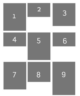
And I want to make the view like this:
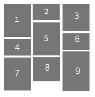
-
Ariona Rian over 8 yearsWow, this was an old question. And using flexbox to simulate the masonry layout is not the best options. Your snippet is not working by the way :D, i think you miss the point here. The other workaround to solve this problem is by using CSS3 columns. but, thanks for the answer
-
Oriol over 8 years@ArionaRian Try the snippet on Firefox, other browsers don't support forced line breaks yet. And yes, CSS columns might work too, but unlike flexbox that seems more designed for text than for layout.
-
Ariona Rian over 8 yearsYeah, that's the problem :) , That's why until now, we are still stick to masonry/isotope plugin for laying out this kind of design.
-
LBJ over 7 yearsJust put display: flex; flex-wrap: wrap; (and nothing more) on the container, and it works perfect in Chrome, Firefox, Safari, IE11 on Win11 and Win7. Be careful with min-height, though (see caniuse.com/#search=flex-wrap)
-
Oriol over 7 years@LBJ But then the elements are arranged in rows. That's not the desired behavior here
-
behkod about 7 yearsAdded the CSS3-way here to stay !
-
LBJ about 7 years@Oriol True, I see that now. My bad. Thanks for pointing it out.
-
intcreator almost 7 yearsDo you know how to have equal space between items in the masonry and the container?
-
 jscul over 6 yearsIt's good but for a lot of people, there's a necessity to ORDER the
masonry bricks. The column orders things top to bottom, the question was asking for the order to stay the same horizontally, not to switch to vertically. For example, the shortest block found above SHOULD be in the third column but the top row. -
le hollandais volant over 5 yearsThis is amazing. One has only to add a width+inline-block on the childs and it’s okay. The new "column" syntax works great also, but it’s not possible in my case, since I can’t modify the container.
-
Yatix over 3 yearsWorks items with equal height. Wont work like Masonry.