Position floated elements directly under each other
Solution 1
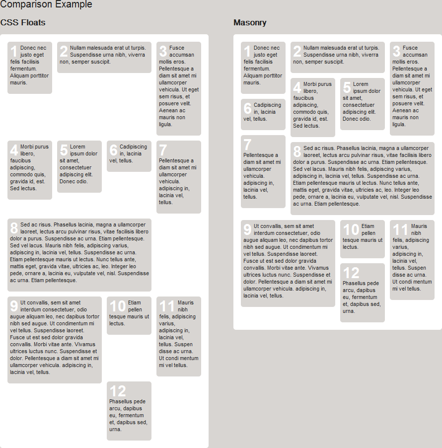
Because of the different heights, this looks like the problem where I still haven't found a general purpose pure CSS technique to handle it properly, despite trying really hard.
I've posted this answer before: css alignment question
I've given up and used a jQuery plugin to do this in the past for something similar:
A picture is worth a thousand words:
Solution 2
you can use the nth-child(odd) to clear the float:left;.
css
.box {height:100px;width:100px;float:left;}
.box:nth-child(odd) {clear:left;}
.green {background:green;}
.red{background:red;}
.blue {background:blue;}
.yellow {background:yellow;}
html
<div class="box green">BOX 1</div>
<div class="box red">BOX 2</div>
<div class="box blue">BOX 3</div>
<div class="box yellow">BOX 4</div>
Demo: http://jsfiddle.net/YSP2S/
Keep in mind that this will not work for internet explorer. You can use conditional comment and javascript to achieve the same for internet explorer also.
Comments
-
wowpatrick almost 2 years
I would like to display a row of tow divs next to each other while in the next row, the next div sits directly under the last one. Like this:

Because the layout has to be built into an CMS, I can't put Box 1,3 and 2,4 in a separat div. Is there a way to achieve this kind of behavior without extra wrapping elements? (Normal float behavior doesn't work, display inline/inline-block also doesn't do the trick.) Or is some JavaScript required to build a layout like this?