How to custom switch button?
Solution 1
However, I might not be taking the best approach, but this is how I have created some Switch like UIs in few of my apps.
Here is the code -
<RadioGroup
        android:checkedButton="@+id/offer"
        android:id="@+id/toggle"
        android:layout_width="match_parent"
        android:layout_height="30dp"
        android:layout_marginBottom="@dimen/margin_medium"
        android:layout_marginLeft="50dp"
        android:layout_marginRight="50dp"
        android:layout_marginTop="@dimen/margin_medium"
        android:background="@drawable/pink_out_line"
        android:orientation="horizontal">

        <RadioButton
            android:layout_marginTop="1dp"
            android:layout_marginBottom="1dp"
            android:layout_marginLeft="1dp"
            android:id="@+id/search"
            android:background="@drawable/toggle_widget_background"
            android:layout_width="0dp"
            android:layout_height="match_parent"
            android:layout_weight="1"
            android:button="@null"
            android:gravity="center"
            android:text="Search"
            android:textColor="@color/white" />

        <RadioButton
            android:layout_marginRight="1dp"
            android:layout_marginTop="1dp"
            android:layout_marginBottom="1dp"
            android:id="@+id/offer"
            android:layout_width="0dp"
            android:layout_height="match_parent"
            android:layout_weight="1"
            android:background="@drawable/toggle_widget_background"
            android:button="@null"
            android:gravity="center"
            android:text="Offers"
            android:textColor="@color/white" />
    </RadioGroup>
pink_out_line.xml
<shape xmlns:android="http://schemas.android.com/apk/res/android"
    android:shape="rectangle">
    <corners android:radius="2dp" />
    <solid android:color="#80000000" />
    <stroke
        android:width="1dp"
        android:color="@color/pink" />
</shape>
toggle_widget_background.xml
<?xml version="1.0" encoding="UTF-8" standalone="no"?>
<selector xmlns:android="http://schemas.android.com/apk/res/android">
    <item android:drawable="@color/pink" android:state_checked="true" />
    <item android:drawable="@color/dark_pink" android:state_pressed="true" />
    <item android:drawable="@color/transparent" />
</selector>
And here is the output -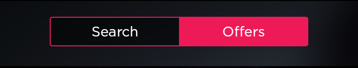
Solution 2
Its a simple xml design. It looks like iOS switch, check this below image
You need to create custom_thumb.xml and custom_track.xml
This is my switch,I need a very big switch so added layout_width/layout_height parameter
 <androidx.appcompat.widget.SwitchCompat
        android:id="@+id/swOnOff"
        android:layout_width="@dimen/_200sdp"
        android:layout_marginStart="@dimen/_50sdp"
        android:layout_marginEnd="@dimen/_50sdp"
        android:layout_marginTop="@dimen/_30sdp"
        android:layout_gravity="center"
        app:showText="true"
        android:textSize="@dimen/_20ssp"
        android:fontFamily="@font/opensans_bold"
        app:track="@drawable/custom_track"
        android:thumb="@drawable/custom_thumb"
        android:layout_height="@dimen/_120sdp"/>
Now create custom_thumb.xml
<?xml version="1.0" encoding="utf-8"?>
<selector
    xmlns:android="http://schemas.android.com/apk/res/android">
    <item android:state_checked="false">
        <shape android:shape="oval">
            <solid android:color="#ffffff"/>
            <size android:width="@dimen/_100sdp"
                android:height="@dimen/_100sdp"/>
            <stroke android:width="1dp"
                android:color="#8c8c8c"/>
        </shape>
    </item>
    <item android:state_checked="true">
        <shape android:shape="oval">
            <solid android:color="#ffffff"/>
            <size android:width="@dimen/_100sdp"
                android:height="@dimen/_100sdp"/>
            <stroke android:width="1dp"
                android:color="#34c759"/>
        </shape>
    </item>
</selector>
Now create custom_track.xml
<?xml version="1.0" encoding="utf-8"?>
<selector xmlns:android="http://schemas.android.com/apk/res/android">
    <item android:state_checked="false">
        <shape android:shape="rectangle">
            <corners android:radius="@dimen/_100sdp" />
            <solid android:color="#ffffff" />
            <stroke android:color="#8c8c8c" android:width="1dp"/>
            <size android:height="20dp" />
        </shape>
    </item>
    <item android:state_checked="true">
        <shape android:shape="rectangle">
            <corners android:radius="@dimen/_100sdp" />
            <solid android:color="#34c759" />
            <stroke android:color="#8c8c8c" android:width="1dp"/>
            <size android:height="20dp" />
        </shape>
    </item>
</selector>
Solution 3
you can use the following code to change color and text :
<org.jraf.android.backport.switchwidget.Switch
                        android:id="@+id/th"
                        android:layout_width="match_parent"
                        android:layout_height="wrap_content"
                        app:thumb="@drawable/apptheme_switch_inner_holo_light"
                        app:track="@drawable/apptheme_switch_track_holo_light"
                        app:textOn="@string/switch_yes"
                        app:textOff="@string/switch_no"
                        android:textColor="#000000"
                        />
Create a xml named colors.xml in res/values folder:
<?xml version="1.0" encoding="utf-8"?>
<resources>
    <color name="red">#ff0000</color>
    <color name="green">#00ff00</color>
</resources>
In drawable folder, create a xml file my_btn_toggle.xml:
  <selector xmlns:android="http://schemas.android.com/apk/res/android">
        <item android:state_checked="false" android:drawable="@color/red"  />
        <item android:state_checked="true" android:drawable="@color/green"  />
    </selector>
and in xml section defining your toggle button add:
android:background="@drawable/my_btn_toggle
to change the color of textOn and textOffuse
android:switchTextAppearance="@style/Switch"
Solution 4
<Switch android:layout_width="wrap_content"
                    android:layout_height="wrap_content"
                    android:thumb="@drawable/custom_switch_inner_holo_light"
                    android:track="@drawable/custom_switch_track_holo_light"
                    android:textOn="@string/yes"
                    android:textOff="@string/no"/>
drawable/custom_switch_inner_holo_light.xml
<selector xmlns:android="http://schemas.android.com/apk/res/android">
    <item android:state_enabled="false" android:drawable="@drawable/custom_switch_thumb_disabled_holo_light" />
    <item android:state_pressed="true"  android:drawable="@drawable/custom_switch_thumb_pressed_holo_light" />
    <item android:state_checked="true"  android:drawable="@drawable/custom_switch_thumb_activated_holo_light" />
    <item                               android:drawable="@drawable/custom_switch_thumb_holo_light" />
</selector>
drawable/custom_switch_track_holo_light.xml
<selector xmlns:android="http://schemas.android.com/apk/res/android">
    <item android:state_focused="true"  android:drawable="@drawable/custom_switch_bg_focused_holo_light" />
    <item                               android:drawable="@drawable/custom_switch_bg_holo_light" />
</selector>
Next images are 9.paths drawables and they must be in different density (mdpi, hdpi, xhdpi, xxhdpi). As example I give xxhdpi (you can resize they if u needed):
drawable/custom_switch_thumb_disabled_holo_light

drawable/custom_switch_thumb_pressed_holo_light

drawable/custom_switch_thumb_activated_holo_light

drawable/custom_switch_thumb_holo_light

drawable/custom_switch_bg_focused_holo_light

drawable/custom_switch_bg_holo_light

Solution 5
I achieved this

by doing:
1) custom selector:
<?xml version="1.0" encoding="utf-8"?>
<selector xmlns:android="http://schemas.android.com/apk/res/android">
    <item android:drawable="@drawable/ic_switch_off"
          android:state_checked="false"/>
    <item android:drawable="@drawable/ic_switch_on"
          android:state_checked="true"/>
</selector>
2) using v7 SwitchCompat
<android.support.v7.widget.SwitchCompat
    android:layout_width="wrap_content"
    android:layout_height="wrap_content"
    android:background="@null"
    android:button="@drawable/checkbox_yura"
    android:thumb="@null"
    app:track="@null"/>
TooCool
Updated on July 08, 2022Comments
-
TooCool almost 2 years
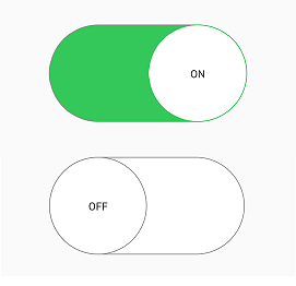
I am looking to Custom The
SwitchButton to becoming as following :
How to achieve this ?