How to handle responsive image in bootstrap on smaller media?
Solution 1
Bootstrap don't wan't to increase your images sizes- that's the deal.
Easy way to solve the problem:
use this meta-tag <meta name="viewport" content="width=device-width, initial-scale=1">
and media queries, like this:
@media all and (max-width: 699px) and (min-width: 520px), (min-width: 1151px) {
  img {
    width: 700px;
    height: auto;
  }
}
It's just example. Change exactly width of query for your need.
Solution 2
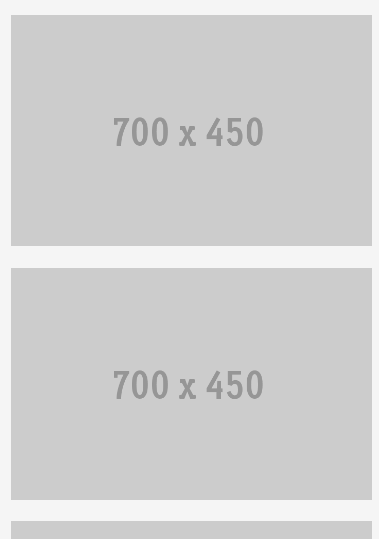
You can use two sets of images.
<div id="first" class="row">
    <div class="col-md-8">
        <img src="http://placehold.it/640x450"  class="img-responsive hidden-xs hidden-sm">
        <img src="http://placehold.it/700x450"  class="img-responsive visible-xs visible-sm">
    </div>
    <div class="col-md-4">
        <img src="http://placehold.it/300x450"  class="img-responsive hidden-xs hidden-sm">
        <img src="http://placehold.it/700x450"  class="img-responsive visible-xs visible-sm">
    </div>
</div>
And the css can go like:
.img-responsive {
    width: 100%;
}
It will be a good option to use 2 sets in this case because re-sizing a 640x450 image to 700x450 will alter its aspect ratio. You can read more about responsive utilities provided by bootstrap here: http://getbootstrap.com/css/#responsive-utilities
xitas
I'm a web developer and a Student. Eager to learn new things and creating good code. HTML/CSS JavaScript/Jquery Ajax/JSON PHP SQL Angular
Updated on June 14, 2022Comments
-
xitas almost 2 years
Hi I am new in using bootstrap and I am not very good handling responsive image in bootstrap.
So here is my question.
I have images result formation like this on 992px:
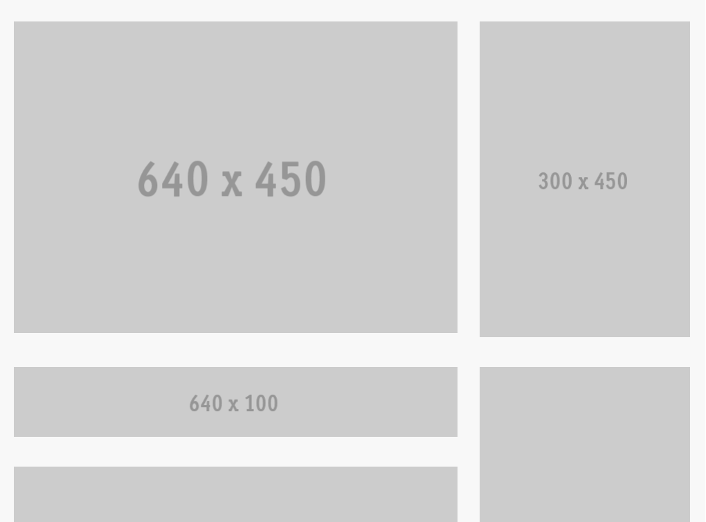
but when I change my screen width to smaller media (e.g:520px) the images come in line with no gaps in it.
It become like this.
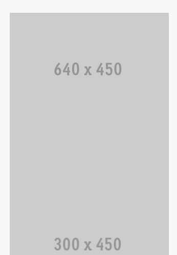
I want it like this with padding(gaps) in it.
here is my HTML code:
<!--two columes 3/1-->
 <div id="first" class="row">
  <div class="col-md-8"><img src="http://placehold.it/640x450"  class="img-responsive"></div>
  <div class="col-md-4"><img src="http://placehold.it/300x450"  class="img-responsive"></div>
</div>

<div id="clean">
<!--two columes 3/1-->

<div id="second" class="row">
  <div class="col-md-8">
  <img src="http://placehold.it/640x100"  class="img-responsive">
  <br>
  <br>
  <img src="http://placehold.it/640x330"  class="img-responsive"></div>

  <div class="col-md-4"><img src="http://placehold.it/300x470"  class="img-responsive"></div>
</div>

<!--two columes half half-->
<div class="row" id="third">
  <div class="col-md-6"><img src="http://placehold.it/470x470"  class="img-responsive"></div>

  <div class="col-md-6"><img src="http://placehold.it/470x470" class="img-responsive"></div>
</div>

<!--four columes-->
<div class="row" id="forth">
  <div class="col-xs-6 col-sm-3"><img src="http://placehold.it/250x250" class="img-responsive"></div>
  <div class="col-xs-6 col-sm-3"><img src="http://placehold.it/250x250" class="img-responsive"></div>

  <!-- Add the extra clearfix for only the required viewport -->
  <div class="clearfix visible-xs"></div>

  <div class="col-xs-6 col-sm-3"><img src="http://placehold.it/250x250" class="img-responsive"></div>
  <div class="col-xs-6 col-sm-3"><img src="http://placehold.it/250x250" class="img-responsive"></div>
</div>
And here is CSS:
#first { padding:20px; } #second { padding:20px; } #third { padding:20px; } #forth { padding:20px; } -
Jost over 9 yearsThats not the way to do it - this way some browsers will load all the images, resulting in bandwidth waste. A better way is to use something like picturefill, along with a good fallback image.