how to make a capsule shape Button in android?
Solution 1
finally I found the way to do it with xml file. here is the code of the xml file that gave me the capsule shape button.
<?xml version="1.0" encoding="utf-8"?>
<shape xmlns:android="http://schemas.android.com/apk/res/android"
android:shape="rectangle" >

  <corners
    android:bottomLeftRadius="30dp"
    android:bottomRightRadius="30dp"
    android:radius="60dp"
    android:topLeftRadius="30dp"
    android:topRightRadius="30dp" />

  <solid android:color="#CFCFCF" />

  <padding
    android:bottom="0dp"
    android:left="0dp"
    android:right="0dp"
    android:top="0dp" />

  <size
    android:height="60dp"
    android:width="270dp" />

</shape>
Solution 2
Just use a MaterialButton using the cornerRadius attribute and your favorite width.
 <com.google.android.material.button.MaterialButton
            android:layout_width="100dp"
            android:layout_height="wrap_content"
            app:cornerRadius="18dp"
            android:text="BUTTON"
            />

You can also use the shapeAppearanceOverlay attribute:
<com.google.android.material.button.MaterialButton
        app:shapeAppearanceOverlay="@style/buttomShape"
        .../>
with:
  <style name="buttomShape">
    <item name="cornerFamily">rounded</item>
    <item name="cornerSize">50%</item>
  </style>
Solution 3
I haven't tried all of the answers here, but I believe some/all of them are works.
The accepted answer is also works, but it can be simplified. Since I love elegant and simple solution, I come up with my own solution. Basically, we just need to add radius big enough compared with your View width and height, so it will create a round corner. In this case I put 1000dp to make it safe. We don't even need to add android:shape="rectangle" at all.
Just follow these 2 simple steps:
-
Create an XML file in your drawable folder. For example let's name it
bg.xml<?xml version="1.0" encoding="utf-8"?> <shape xmlns:android="http://schemas.android.com/apk/res/android"> <corners android:radius="1000dp"/> <solid android:color="@color/yourPreferredColor"/> </shape> Then you can use it in layout XML file as your
Viewpropertyandroid:background="@drawable/bg"or directly in the codeview.setBackgroundResource(R.drawable.bg)
Solution 4
consider customizing a shape to it and use corners inside that shape:
<?xml version="1.0" encoding="utf-8"?>
<shape xmlns:android="http://schemas.android.com/apk/res/android"
    android:shape="rectangle">
    <corners android:radius="10dp"/> <!-- increasing the value, increases the rounding. And as  TTransmit said, to make it like a capsule make the radius half of your button height -->
    <solid android:color="#AAAAAA"/> <!-- the button color -->

</shape>
So, save that shape in your /drawable folder, let's say it will be saved as "button_bg.xml", so when declaring the Button in your layout xml:
<Button
    android:background="@drawable/button_bg"
    android:layout_height="20dp"
                .
                .                          />
Solution 5
It's called a Chip in Material and can be used like so:
<com.google.android.material.chip.Chip
    android:layout_width="wrap_content"
    android:layout_height="wrap_content"
    android:text="@string/hello_world"/>
More info can be found here and here.
To use Material components in your project, you'll to add the appropriate lib to your build.gradle:
dependencies {
    // ...
    implementation 'com.google.android.material:material:1.0.0-beta01'
    // ...
  }
More info on adding Material to your project can be found here.
Alternatively, you can use the latest version of the support design lib:
<android.support.design.chip.Chip
    android:layout_width="wrap_content"
    android:layout_height="wrap_content"
    app:chipText="@string/hello_world"/>
Also pull in the appropriate libs:
dependencies {
    // ...
    implementation 'com.android.support:appcompat-v7:28.0.0-alpha1'
    implementation 'com.android.support:design:28.0.0-alpha1'
    // OR
    implementation 'com.android.support:design-chip:28.0.0-alpha1'
    // ...
}
See this answer for more on the latter approach.
user3393926
Updated on November 24, 2021Comments
-
user3393926 over 2 years
I want to make a button exactly like in this image
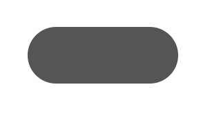
I want to use a xml file that will used to produce such button. Can anyone tell me how to do that?
-
TTransmit over 9 yearsThe trick to get the capsule shape is to additionally specify the height of the button element as twice the corner radius i.e. 20dp in this case. Making a style using the height and the drawable background together would be a good option.
-
user3393926 over 9 yearsI tried the above mention ways using both rectangle and oval shape but nothing seems to give the capsule shape i want.
-
 Muhammed Refaat over 9 years@user3393926 So, what you got ?
 -
Muhammed Refaat over 9 years@user3393926 if you got a rounded shape but not rounded enough to look like a capsule, try what TTransmit suggest of manually set the height of the Button as twice the radius value or try to combine them together in a style if you don't have the value of the button fixed
-
TTransmit over 9 yearsFeel free to add
android:height="20dp"to theButtonin your answer. It should make it clearer for other users. -
 tir38 over 8 yearsThe
radiusattribute will get ignored because you also set the individual radius (e.g.bottomLeftRadius). To quote the docs, "The radius for all corners, as a dimension value or dimension resource. This is overridden for each corner by the following attributes." -
 Ravi Yadav almost 8 yearsI have removed the static size attribute and increased the common radius to 50 dp(after removing all the top,bottom,left and right radius)
 -
 Neon Warge over 7 yearsWould this cause so much problem when supporting multiple screen? I always avoid specifying everything in dp. Specifying dp in rounded corners is forgivable since this is the only value I have to support on larger screen. But height on a view in dp units? This is bad. Imagine I have to specify the best dp units on different screens.
 -
Muhammed Refaat over 7 years@NeonWarge specifying values in dp is the best practice in specifying size values in Android, and in a case like a small button it won't harm to specify a fixed value, however in the case of full layouts, the best practice to specify dp values is to specify values for each density or values for each size, for example name the value "dp_test" and specify it with a slight different changes in values-sw600dp/dimens and values-sw720dp/dimens
-
 Carson Holzheimer about 6 yearsIf you want the shape to stay correct for any view size, just set the radius to 10000dp
 -
 HendraWD over 5 yearsSo complex for a solution. See stackoverflow.com/a/51947130/3940133 for more simple and elegant solution.
 -
HendraWD over 5 yearsNice! I believe this can simplify Android development. But IMHO, it's too overkill, since it has so many functionalities that we don't even need to create a simple capsule-shape button.
-
Rohan Sharma about 4 yearsUse <androidx.appcompat.widget.AppCompatButton/> button in combnation with above code.
-
 Rinav over 3 yearsThis should be the new accepted answer with modern android development using Material Components
 -
 Farid over 2 yearsHow do you tell this "smart" widget to be always capsule no matter what height it gets without crappy workarounds like giving it
app:cornerRadius="GOOGOLdp"? -
Gabriele Mariotti over 2 years@Farid I've updated the answer. You can use the shapeAppearanceOverlay attribute using a cornerSize of 50%.