How to make a Semantic UI React grid full screen with different row heights?
I don't think stretched does what you are trying to do. Read the docs on Stretched to see their example.
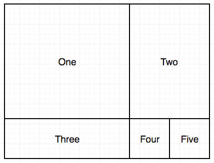
You can set the height of the grid to 100vh, the height of the first row to 70%, and the height of the second row to 30%. Here's a jsfiddle example I put together.
render() {
  return (
    <Grid celled padded style={{height: '100vh'}}>
      <Grid.Row style={{height: '70%'}}>
        <Grid.Column width={10}>
          <p>One</p>
        </Grid.Column>
        <Grid.Column width={6}>
          <p>Two</p>
        </Grid.Column>
      </Grid.Row>

      <Grid.Row style={{height: '30%'}}>
        <Grid.Column width={10}>
          <p>Three</p>
        </Grid.Column>
        <Grid.Column width={3}>
          <p>Four</p>
        </Grid.Column>
        <Grid.Column width={3}>
          <p>Five</p>
        </Grid.Column>
      </Grid.Row>
    </Grid>
  );
};
grabury
Updated on June 12, 2022Comments
-
grabury almost 2 years
I am trying to make a Semantic UI React grid full screen with a particular layout.
In my component I have the following render method:
  render() {
    return (
      <Grid celled>
        <Grid.Row stretched>
          <Grid.Column width={10}>
            <p>One</p>
          </Grid.Column>
          <Grid.Column width={6}>
            <p>Two</p>
          </Grid.Column>
        </Grid.Row>

        <Grid.Row>
          <Grid.Column width={10}>
            <p>Three</p>
          </Grid.Column>
          <Grid.Column width={3}>
            <p>Four</p>
          </Grid.Column>
          <Grid.Column width={3}>
            <p>Five</p>
          </Grid.Column>
        </Grid.Row>
      </Grid>
    );
  }
The widths of the columns are correct but the heights are not. This is what the above code gives me:
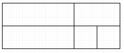
How do I stretch the top row to fit 70% of the screen and the bottom the remaining 30%? Or how can I set the top row to 600px and the bottom row the remainder of the screen? Either way would be ok with me.
I have tried giving the component an id and setting that id to 100% in the style.css but the height is unchanged.