How to transform black into any given color using only CSS filters
Solution 1
@Dave was the first to post an answer to this (with working code), and his answer has been an invaluable source of shameless copy and pasting inspiration to me. This post began as an attempt to explain and refine @Dave's
answer, but it has since evolved into an answer of its own.
My method is significantly faster. According to a jsPerf benchmark on randomly generated RGB colors, @Dave's algorithm runs in 600 ms, while mine runs in 30 ms. This can definitely matter, for instance in load time, where speed is critical.
Furthermore, for some colors, my algorithm performs better:
- For
rgb(0,255,0), @Dave's producesrgb(29,218,34)and mine producesrgb(1,255,0) - For
rgb(0,0,255), @Dave's producesrgb(37,39,255)and mine producesrgb(5,6,255) - For
rgb(19,11,118), @Dave's producesrgb(36,27,102)and mine producesrgb(20,11,112)
Demo
"use strict";
class Color {
constructor(r, g, b) { this.set(r, g, b); }
toString() { return `rgb(${Math.round(this.r)}, ${Math.round(this.g)}, ${Math.round(this.b)})`; }
set(r, g, b) {
this.r = this.clamp(r);
this.g = this.clamp(g);
this.b = this.clamp(b);
}
hueRotate(angle = 0) {
angle = angle / 180 * Math.PI;
let sin = Math.sin(angle);
let cos = Math.cos(angle);
this.multiply([
0.213 + cos * 0.787 - sin * 0.213, 0.715 - cos * 0.715 - sin * 0.715, 0.072 - cos * 0.072 + sin * 0.928,
0.213 - cos * 0.213 + sin * 0.143, 0.715 + cos * 0.285 + sin * 0.140, 0.072 - cos * 0.072 - sin * 0.283,
0.213 - cos * 0.213 - sin * 0.787, 0.715 - cos * 0.715 + sin * 0.715, 0.072 + cos * 0.928 + sin * 0.072
]);
}
grayscale(value = 1) {
this.multiply([
0.2126 + 0.7874 * (1 - value), 0.7152 - 0.7152 * (1 - value), 0.0722 - 0.0722 * (1 - value),
0.2126 - 0.2126 * (1 - value), 0.7152 + 0.2848 * (1 - value), 0.0722 - 0.0722 * (1 - value),
0.2126 - 0.2126 * (1 - value), 0.7152 - 0.7152 * (1 - value), 0.0722 + 0.9278 * (1 - value)
]);
}
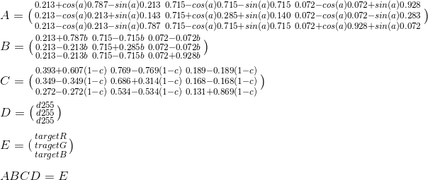
sepia(value = 1) {
this.multiply([
0.393 + 0.607 * (1 - value), 0.769 - 0.769 * (1 - value), 0.189 - 0.189 * (1 - value),
0.349 - 0.349 * (1 - value), 0.686 + 0.314 * (1 - value), 0.168 - 0.168 * (1 - value),
0.272 - 0.272 * (1 - value), 0.534 - 0.534 * (1 - value), 0.131 + 0.869 * (1 - value)
]);
}
saturate(value = 1) {
this.multiply([
0.213 + 0.787 * value, 0.715 - 0.715 * value, 0.072 - 0.072 * value,
0.213 - 0.213 * value, 0.715 + 0.285 * value, 0.072 - 0.072 * value,
0.213 - 0.213 * value, 0.715 - 0.715 * value, 0.072 + 0.928 * value
]);
}
multiply(matrix) {
let newR = this.clamp(this.r * matrix[0] + this.g * matrix[1] + this.b * matrix[2]);
let newG = this.clamp(this.r * matrix[3] + this.g * matrix[4] + this.b * matrix[5]);
let newB = this.clamp(this.r * matrix[6] + this.g * matrix[7] + this.b * matrix[8]);
this.r = newR; this.g = newG; this.b = newB;
}
brightness(value = 1) { this.linear(value); }
contrast(value = 1) { this.linear(value, -(0.5 * value) + 0.5); }
linear(slope = 1, intercept = 0) {
this.r = this.clamp(this.r * slope + intercept * 255);
this.g = this.clamp(this.g * slope + intercept * 255);
this.b = this.clamp(this.b * slope + intercept * 255);
}
invert(value = 1) {
this.r = this.clamp((value + (this.r / 255) * (1 - 2 * value)) * 255);
this.g = this.clamp((value + (this.g / 255) * (1 - 2 * value)) * 255);
this.b = this.clamp((value + (this.b / 255) * (1 - 2 * value)) * 255);
}
hsl() { // Code taken from https://stackoverflow.com/a/9493060/2688027, licensed under CC BY-SA.
let r = this.r / 255;
let g = this.g / 255;
let b = this.b / 255;
let max = Math.max(r, g, b);
let min = Math.min(r, g, b);
let h, s, l = (max + min) / 2;
if(max === min) {
h = s = 0;
} else {
let d = max - min;
s = l > 0.5 ? d / (2 - max - min) : d / (max + min);
switch(max) {
case r: h = (g - b) / d + (g < b ? 6 : 0); break;
case g: h = (b - r) / d + 2; break;
case b: h = (r - g) / d + 4; break;
} h /= 6;
}
return {
h: h * 100,
s: s * 100,
l: l * 100
};
}
clamp(value) {
if(value > 255) { value = 255; }
else if(value < 0) { value = 0; }
return value;
}
}
class Solver {
constructor(target) {
this.target = target;
this.targetHSL = target.hsl();
this.reusedColor = new Color(0, 0, 0); // Object pool
}
solve() {
let result = this.solveNarrow(this.solveWide());
return {
values: result.values,
loss: result.loss,
filter: this.css(result.values)
};
}
solveWide() {
const A = 5;
const c = 15;
const a = [60, 180, 18000, 600, 1.2, 1.2];
let best = { loss: Infinity };
for(let i = 0; best.loss > 25 && i < 3; i++) {
let initial = [50, 20, 3750, 50, 100, 100];
let result = this.spsa(A, a, c, initial, 1000);
if(result.loss < best.loss) { best = result; }
} return best;
}
solveNarrow(wide) {
const A = wide.loss;
const c = 2;
const A1 = A + 1;
const a = [0.25 * A1, 0.25 * A1, A1, 0.25 * A1, 0.2 * A1, 0.2 * A1];
return this.spsa(A, a, c, wide.values, 500);
}
spsa(A, a, c, values, iters) {
const alpha = 1;
const gamma = 0.16666666666666666;
let best = null;
let bestLoss = Infinity;
let deltas = new Array(6);
let highArgs = new Array(6);
let lowArgs = new Array(6);
for(let k = 0; k < iters; k++) {
let ck = c / Math.pow(k + 1, gamma);
for(let i = 0; i < 6; i++) {
deltas[i] = Math.random() > 0.5 ? 1 : -1;
highArgs[i] = values[i] + ck * deltas[i];
lowArgs[i] = values[i] - ck * deltas[i];
}
let lossDiff = this.loss(highArgs) - this.loss(lowArgs);
for(let i = 0; i < 6; i++) {
let g = lossDiff / (2 * ck) * deltas[i];
let ak = a[i] / Math.pow(A + k + 1, alpha);
values[i] = fix(values[i] - ak * g, i);
}
let loss = this.loss(values);
if(loss < bestLoss) { best = values.slice(0); bestLoss = loss; }
} return { values: best, loss: bestLoss };
function fix(value, idx) {
let max = 100;
if(idx === 2 /* saturate */) { max = 7500; }
else if(idx === 4 /* brightness */ || idx === 5 /* contrast */) { max = 200; }
if(idx === 3 /* hue-rotate */) {
if(value > max) { value = value % max; }
else if(value < 0) { value = max + value % max; }
} else if(value < 0) { value = 0; }
else if(value > max) { value = max; }
return value;
}
}
loss(filters) { // Argument is array of percentages.
let color = this.reusedColor;
color.set(0, 0, 0);
color.invert(filters[0] / 100);
color.sepia(filters[1] / 100);
color.saturate(filters[2] / 100);
color.hueRotate(filters[3] * 3.6);
color.brightness(filters[4] / 100);
color.contrast(filters[5] / 100);
let colorHSL = color.hsl();
return Math.abs(color.r - this.target.r)
+ Math.abs(color.g - this.target.g)
+ Math.abs(color.b - this.target.b)
+ Math.abs(colorHSL.h - this.targetHSL.h)
+ Math.abs(colorHSL.s - this.targetHSL.s)
+ Math.abs(colorHSL.l - this.targetHSL.l);
}
css(filters) {
function fmt(idx, multiplier = 1) { return Math.round(filters[idx] * multiplier); }
return `filter: invert(${fmt(0)}%) sepia(${fmt(1)}%) saturate(${fmt(2)}%) hue-rotate(${fmt(3, 3.6)}deg) brightness(${fmt(4)}%) contrast(${fmt(5)}%);`;
}
}
$("button.execute").click(() => {
let rgb = $("input.target").val().split(",");
if (rgb.length !== 3) { alert("Invalid format!"); return; }
let color = new Color(rgb[0], rgb[1], rgb[2]);
let solver = new Solver(color);
let result = solver.solve();
let lossMsg;
if (result.loss < 1) {
lossMsg = "This is a perfect result.";
} else if (result.loss < 5) {
lossMsg = "The is close enough.";
} else if(result.loss < 15) {
lossMsg = "The color is somewhat off. Consider running it again.";
} else {
lossMsg = "The color is extremely off. Run it again!";
}
$(".realPixel").css("background-color", color.toString());
$(".filterPixel").attr("style", result.filter);
$(".filterDetail").text(result.filter);
$(".lossDetail").html(`Loss: ${result.loss.toFixed(1)}. <b>${lossMsg}</b>`);
});.pixel {
display: inline-block;
background-color: #000;
width: 50px;
height: 50px;
}
.filterDetail {
font-family: "Consolas", "Menlo", "Ubuntu Mono", monospace;
}<script src="https://ajax.googleapis.com/ajax/libs/jquery/2.1.1/jquery.min.js"></script>
<input class="target" type="text" placeholder="r, g, b" value="250, 150, 50" />
<button class="execute">Compute Filters</button>
<p>Real pixel, color applied through CSS <code>background-color</code>:</p>
<div class="pixel realPixel"></div>
<p>Filtered pixel, color applied through CSS <code>filter</code>:</p>
<div class="pixel filterPixel"></div>
<p class="filterDetail"></p>
<p class="lossDetail"></p>Usage
let color = new Color(0, 255, 0);
let solver = new Solver(color);
let result = solver.solve();
let filterCSS = result.css;
Explanation
We'll begin with some Javascript.
"use strict";

class Color {
    constructor(r, g, b) {
        this.r = this.clamp(r);
        this.g = this.clamp(g);
        this.b = this.clamp(b);
    } toString() { return `rgb(${Math.round(this.r)}, ${Math.round(this.g)}, ${Math.round(this.b)})`; }

    hsl() { // Code taken from https://stackoverflow.com/a/9493060/2688027, licensed under CC BY-SA.
        let r = this.r / 255;
        let g = this.g / 255;
        let b = this.b / 255;
        let max = Math.max(r, g, b);
        let min = Math.min(r, g, b);
        let h, s, l = (max + min) / 2;

        if(max === min) {
            h = s = 0;
        } else {
            let d = max - min;
            s = l > 0.5 ? d / (2 - max - min) : d / (max + min);
            switch(max) {
                case r: h = (g - b) / d + (g < b ? 6 : 0); break;
                case g: h = (b - r) / d + 2; break;
                case b: h = (r - g) / d + 4; break;
            } h /= 6;
        }

        return {
            h: h * 100,
            s: s * 100,
            l: l * 100
        };
    }

    clamp(value) {
        if(value > 255) { value = 255; }
        else if(value < 0) { value = 0; }
        return value;
    }
}

class Solver {
    constructor(target) {
        this.target = target;
        this.targetHSL = target.hsl();
    }

    css(filters) {
        function fmt(idx, multiplier = 1) { return Math.round(filters[idx] * multiplier); }
        return `filter: invert(${fmt(0)}%) sepia(${fmt(1)}%) saturate(${fmt(2)}%) hue-rotate(${fmt(3, 3.6)}deg) brightness(${fmt(4)}%) contrast(${fmt(5)}%);`;
    }
}
Explanation:
- The
Colorclass represents a RGB color.- Its
toString()function returns the color in a CSSrgb(...)color string. - Its
hsl()function returns the color, converted to HSL. - Its
clamp()function ensures that a given color value is within bounds (0-255).
- Its
- The
Solverclass will attempt to solve for a target color.- Its
css()function returns a given filter in a CSS filter string.
- Its
Implementing grayscale(), sepia(), and saturate()
The heart of CSS/SVG filters are filter primitives, which represent low-level modifications to an image.
The filters grayscale(), sepia(), and saturate() are implemented by the filter primative <feColorMatrix>, which performs matrix multiplication between a matrix specified by the filter (often dynamically generated), and a matrix created from the color. Diagram:
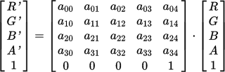
There are some optimizations we can make here:
- The last element of the color matrix is and will always be
1. There is no point of calculating or storing it. - There is no point of calculating or storing the alpha/transparency value (
A) either, since we are dealing with RGB, not RGBA. - Therefore, we can trim the filter matrices from 5x5 to 3x5, and the color matrix from 1x5 to 1x3. This saves a bit of work.
- All
<feColorMatrix>filters leave columns 4 and 5 as zeroes. Therefore, we can further reduce the filter matrix to 3x3. - Since the multiplication is relatively simple, there is no need to drag in complex math libraries for this. We can implement the matrix multiplication algorithm ourselves.
Implementation:
function multiply(matrix) {
    let newR = this.clamp(this.r * matrix[0] + this.g * matrix[1] + this.b * matrix[2]);
    let newG = this.clamp(this.r * matrix[3] + this.g * matrix[4] + this.b * matrix[5]);
    let newB = this.clamp(this.r * matrix[6] + this.g * matrix[7] + this.b * matrix[8]);
    this.r = newR; this.g = newG; this.b = newB;
}
(We use temporary variables to hold the results of each row multiplication, because we do not want changes to this.r, etc. affecting subsequent calculations.)
Now that we have implemented <feColorMatrix>, we can implement grayscale(), sepia(), and saturate(), which simply invoke it with a given filter matrix:
function grayscale(value = 1) {
    this.multiply([
        0.2126 + 0.7874 * (1 - value), 0.7152 - 0.7152 * (1 - value), 0.0722 - 0.0722 * (1 - value),
        0.2126 - 0.2126 * (1 - value), 0.7152 + 0.2848 * (1 - value), 0.0722 - 0.0722 * (1 - value),
        0.2126 - 0.2126 * (1 - value), 0.7152 - 0.7152 * (1 - value), 0.0722 + 0.9278 * (1 - value)
    ]);
}

function sepia(value = 1) {
    this.multiply([
        0.393 + 0.607 * (1 - value), 0.769 - 0.769 * (1 - value), 0.189 - 0.189 * (1 - value),
        0.349 - 0.349 * (1 - value), 0.686 + 0.314 * (1 - value), 0.168 - 0.168 * (1 - value),
        0.272 - 0.272 * (1 - value), 0.534 - 0.534 * (1 - value), 0.131 + 0.869 * (1 - value)
    ]);
}

function saturate(value = 1) {
    this.multiply([
        0.213 + 0.787 * value, 0.715 - 0.715 * value, 0.072 - 0.072 * value,
        0.213 - 0.213 * value, 0.715 + 0.285 * value, 0.072 - 0.072 * value,
        0.213 - 0.213 * value, 0.715 - 0.715 * value, 0.072 + 0.928 * value
    ]);
}
Implementing hue-rotate()
The hue-rotate() filter is implemented by <feColorMatrix type="hueRotate" />.
The filter matrix is calculated as shown below:

For instance, element a00 would be calculated like so:

Notes:
- The angle of rotation is given in degrees, which must be converted to radians before passed to
Math.sin()orMath.cos(). -
Math.sin(angle)andMath.cos(angle)should be computed once and then cached.
Implementation:
function hueRotate(angle = 0) {
    angle = angle / 180 * Math.PI;
    let sin = Math.sin(angle);
    let cos = Math.cos(angle);

    this.multiply([
        0.213 + cos * 0.787 - sin * 0.213, 0.715 - cos * 0.715 - sin * 0.715, 0.072 - cos * 0.072 + sin * 0.928,
        0.213 - cos * 0.213 + sin * 0.143, 0.715 + cos * 0.285 + sin * 0.140, 0.072 - cos * 0.072 - sin * 0.283,
        0.213 - cos * 0.213 - sin * 0.787, 0.715 - cos * 0.715 + sin * 0.715, 0.072 + cos * 0.928 + sin * 0.072
    ]);
}
Implementing brightness() and contrast()
The brightness() and contrast() filters are implemented by <feComponentTransfer> with <feFuncX type="linear" />.
Each <feFuncX type="linear" /> element accepts a slope and intercept attribute. It then calculates each new color value through a simple formula:
value = slope * value + intercept
This is easy to implement:
function linear(slope = 1, intercept = 0) {
    this.r = this.clamp(this.r * slope + intercept * 255);
    this.g = this.clamp(this.g * slope + intercept * 255);
    this.b = this.clamp(this.b * slope + intercept * 255);
}
Once this is implemented, brightness() and contrast() can be implemented as well:
function brightness(value = 1) { this.linear(value); }
function contrast(value = 1) { this.linear(value, -(0.5 * value) + 0.5); }
Implementing invert()
The invert() filter is implemented by <feComponentTransfer> with <feFuncX type="table" />.
The spec states:
In the following, C is the initial component and C' is the remapped component; both in the closed interval [0,1].
For "table", the function is defined by linear interpolation between values given in the attribute tableValues. The table has n + 1 values (i.e., v0 to vn) specifying the start and end values for n evenly sized interpolation regions. Interpolations use the following formula:
For a value C find k such that:
k / n ≤ C < (k + 1) / n
The result C' is given by:
C' = vk + (C - k / n) * n * (vk+1 - vk)
An explanation of this formula:
- The
invert()filter defines this table: [value, 1 - value]. This is tableValues or v. - The formula defines n, such that n + 1 is the table's length. Since the table's length is 2, n = 1.
- The formula defines k, with k and k + 1 being indexes of the table. Since the table has 2 elements, k = 0.
Thus, we can simplify the formula to:
C' = v0 + C * (v1 - v0)
Inlining the table's values, we are left with:
C' = value + C * (1 - value - value)
One more simplification:
C' = value + C * (1 - 2 * value)
The spec defines C and C' to be RGB values, within the bounds 0-1 (as opposed to 0-255). As a result, we must scale down the values before computation, and scale them back up after.
Thus we arrive at our implementation:
function invert(value = 1) {
    this.r = this.clamp((value + (this.r / 255) * (1 - 2 * value)) * 255);
    this.g = this.clamp((value + (this.g / 255) * (1 - 2 * value)) * 255);
    this.b = this.clamp((value + (this.b / 255) * (1 - 2 * value)) * 255);
}
Interlude: @Dave's brute-force algorithm
@Dave's code generates 176,660 filter combinations, including:
- 11
invert()filters (0%, 10%, 20%, ..., 100%) - 11
sepia()filters (0%, 10%, 20%, ..., 100%) - 20
saturate()filters (5%, 10%, 15%, ..., 100%) - 73
hue-rotate()filters (0deg, 5deg, 10deg, ..., 360deg)
It calculates filters in the following order:
filter: invert(a%) sepia(b%) saturate(c%) hue-rotate(θdeg);
It then iterates through all computed colors. It stops once it has found a generated color within tolerance (all RGB values are within 5 units from the target color).
However, this is slow and inefficient. Thus, I present my own answer.
Implementing SPSA
First, we must define a loss function, that returns the difference between the color produced by a filter combination, and the target color. If the filters are perfect, the loss function should return 0.
We will measure color difference as the sum of two metrics:
- RGB difference, because the goal is to produce the closest RGB value.
- HSL difference, because many HSL values correspond to filters (e.g. hue roughly correlates with
hue-rotate(), saturation correlates withsaturate(), etc.) This guides the algorithm.
The loss function will take one argument – an array of filter percentages.
We will use the following filter order:
filter: invert(a%) sepia(b%) saturate(c%) hue-rotate(θdeg) brightness(e%) contrast(f%);
Implementation:
function loss(filters) {
    let color = new Color(0, 0, 0);
    color.invert(filters[0] / 100);
    color.sepia(filters[1] / 100);
    color.saturate(filters[2] / 100);
    color.hueRotate(filters[3] * 3.6);
    color.brightness(filters[4] / 100);
    color.contrast(filters[5] / 100);

    let colorHSL = color.hsl();
    return Math.abs(color.r - this.target.r)
        + Math.abs(color.g - this.target.g)
        + Math.abs(color.b - this.target.b)
        + Math.abs(colorHSL.h - this.targetHSL.h)
        + Math.abs(colorHSL.s - this.targetHSL.s)
        + Math.abs(colorHSL.l - this.targetHSL.l);
}
We will try to minimize the loss function, such that:
loss([a, b, c, d, e, f]) = 0
The SPSA algorithm (website, more info, paper, implementation paper, reference code) is very good at this. It was designed to optimize complex systems with local minima, noisy/nonlinear/ multivariate loss functions, etc. It has been used to tune chess engines. And unlike many other algorithms, the papers describing it are actually comprehensible (albeit with great effort).
Implementation:
function spsa(A, a, c, values, iters) {
    const alpha = 1;
    const gamma = 0.16666666666666666;

    let best = null;
    let bestLoss = Infinity;
    let deltas = new Array(6);
    let highArgs = new Array(6);
    let lowArgs = new Array(6);

    for(let k = 0; k < iters; k++) {
        let ck = c / Math.pow(k + 1, gamma);
        for(let i = 0; i < 6; i++) {
            deltas[i] = Math.random() > 0.5 ? 1 : -1;
            highArgs[i] = values[i] + ck * deltas[i];
            lowArgs[i]  = values[i] - ck * deltas[i];
        }

        let lossDiff = this.loss(highArgs) - this.loss(lowArgs);
        for(let i = 0; i < 6; i++) {
            let g = lossDiff / (2 * ck) * deltas[i];
            let ak = a[i] / Math.pow(A + k + 1, alpha);
            values[i] = fix(values[i] - ak * g, i);
        }

        let loss = this.loss(values);
        if(loss < bestLoss) { best = values.slice(0); bestLoss = loss; }
    } return { values: best, loss: bestLoss };

    function fix(value, idx) {
        let max = 100;
        if(idx === 2 /* saturate */) { max = 7500; }
        else if(idx === 4 /* brightness */ || idx === 5 /* contrast */) { max = 200; }

        if(idx === 3 /* hue-rotate */) {
            if(value > max) { value = value % max; }
            else if(value < 0) { value = max + value % max; }
        } else if(value < 0) { value = 0; }
        else if(value > max) { value = max; }
        return value;
    }
}
I made some modifications/optimizations to SPSA:
- Using the best result produced, instead of the last.
- Reusing all arrays (
deltas,highArgs,lowArgs), instead of recreating them with each iteration. - Using an array of values for a, instead of a single value. This is because all of the filters are different, and thus they should move/converge at different speeds.
- Running a
fixfunction after each iteration. It clamps all values to between 0% and 100%, exceptsaturate(where the maximum is 7500%),brightnessandcontrast(where the maximum is 200%), andhueRotate(where the values are wrapped around instead of clamped).
I use SPSA in a two-stage process:
- The "wide" stage, that tries to "explore" the search space. It will make limited retries of SPSA if the results are not satisfactory.
- The "narrow" stage, that takes the best result from the wide stage and attempts to "refine" it. It uses dynamic values for A and a.
Implementation:
function solve() {
    let result = this.solveNarrow(this.solveWide());
    return {
        values: result.values,
        loss: result.loss,
        filter: this.css(result.values)
    };
}

function solveWide() {
    const A = 5;
    const c = 15;
    const a = [60, 180, 18000, 600, 1.2, 1.2];

    let best = { loss: Infinity };
    for(let i = 0; best.loss > 25 && i < 3; i++) {
        let initial = [50, 20, 3750, 50, 100, 100];
        let result = this.spsa(A, a, c, initial, 1000);
        if(result.loss < best.loss) { best = result; }
    } return best;
}

function solveNarrow(wide) {
    const A = wide.loss;
    const c = 2;
    const A1 = A + 1;
    const a = [0.25 * A1, 0.25 * A1, A1, 0.25 * A1, 0.2 * A1, 0.2 * A1];
    return this.spsa(A, a, c, wide.values, 500);
}
Tuning SPSA
Warning: Do not mess with the SPSA code, especially with its constants, unless you are sure you know what you are doing.
The important constants are A, a, c, the initial values, the retry thresholds, the values of max in fix(), and the number of iterations of each stage. All of these values were carefully tuned to produce good results, and randomly screwing with them will almost definitely reduce the usefulness of the algorithm.
If you insist on altering it, you must measure before you "optimize".
First, apply this patch.
Then run the code in Node.js. After quite some time, the result should be something like this:
Average loss: 3.4768521401985275
Average time: 11.4915ms
Now tune the constants to your heart's content.
Some tips:
- The average loss should be around 4. If it is greater than 4, it is producing results that are too far off, and you should tune for accuracy. If it is less than 4, it is wasting time, and you should reduce the number of iterations.
- If you increase/decrease the number of iterations, adjust A appropriately.
- If you increase/decrease A, adjust a appropriately.
- Use the
--debugflag if you want to see the result of each iteration.
TL;DR
Solution 2
This was quite a trip down the rabbit hole but here it is!
var tolerance = 1;
var invertRange = [0, 1];
var invertStep = 0.1;
var sepiaRange = [0, 1];
var sepiaStep = 0.1;
var saturateRange = [5, 100];
var saturateStep = 5;
var hueRotateRange = [0, 360];
var hueRotateStep = 5;
var possibleColors;
var color = document.getElementById('color');
var pixel = document.getElementById('pixel');
var filtersBox = document.getElementById('filters');
var button = document.getElementById('button');
button.addEventListener('click', function() {
	getNewColor(color.value);
})

// matrices taken from https://www.w3.org/TR/filter-effects/#feColorMatrixElement
function sepiaMatrix(s) {
	return [
		(0.393 + 0.607 * (1 - s)), (0.769 - 0.769 * (1 - s)), (0.189 - 0.189 * (1 - s)),
		(0.349 - 0.349 * (1 - s)), (0.686 + 0.314 * (1 - s)), (0.168 - 0.168 * (1 - s)),
		(0.272 - 0.272 * (1 - s)), (0.534 - 0.534 * (1 - s)), (0.131 + 0.869 * (1 - s)),
	]
}

function saturateMatrix(s) {
	return [
		0.213+0.787*s, 0.715-0.715*s, 0.072-0.072*s,
		0.213-0.213*s, 0.715+0.285*s, 0.072-0.072*s,
		0.213-0.213*s, 0.715-0.715*s, 0.072+0.928*s,
	]
}

function hueRotateMatrix(d) {
	var cos = Math.cos(d * Math.PI / 180);
	var sin = Math.sin(d * Math.PI / 180);
	var a00 = 0.213 + cos*0.787 - sin*0.213;
	var a01 = 0.715 - cos*0.715 - sin*0.715;
	var a02 = 0.072 - cos*0.072 + sin*0.928;

	var a10 = 0.213 - cos*0.213 + sin*0.143;
	var a11 = 0.715 + cos*0.285 + sin*0.140;
	var a12 = 0.072 - cos*0.072 - sin*0.283;

	var a20 = 0.213 - cos*0.213 - sin*0.787;
	var a21 = 0.715 - cos*0.715 + sin*0.715;
	var a22 = 0.072 + cos*0.928 + sin*0.072;

	return [
		a00, a01, a02,
		a10, a11, a12,
		a20, a21, a22,
	]
}

function clamp(value) {
	return value > 255 ? 255 : value < 0 ? 0 : value;
}

function filter(m, c) {
	return [
		clamp(m[0]*c[0] + m[1]*c[1] + m[2]*c[2]),
		clamp(m[3]*c[0] + m[4]*c[1] + m[5]*c[2]),
		clamp(m[6]*c[0] + m[7]*c[1] + m[8]*c[2]),
	]
}

function invertBlack(i) {
	return [
		i * 255,
		i * 255,
		i * 255,
	]
}

function generateColors() {
	let possibleColors = [];

	let invert = invertRange[0];
	for (invert; invert <= invertRange[1]; invert+=invertStep) {
		let sepia = sepiaRange[0];
		for (sepia; sepia <= sepiaRange[1]; sepia+=sepiaStep) {
			let saturate = saturateRange[0];
			for (saturate; saturate <= saturateRange[1]; saturate+=saturateStep) {
				let hueRotate = hueRotateRange[0];
				for (hueRotate; hueRotate <= hueRotateRange[1]; hueRotate+=hueRotateStep) {
					let invertColor = invertBlack(invert);
					let sepiaColor = filter(sepiaMatrix(sepia), invertColor);
					let saturateColor = filter(saturateMatrix(saturate), sepiaColor);
					let hueRotateColor = filter(hueRotateMatrix(hueRotate), saturateColor);

					let colorObject = {
						filters: { invert, sepia, saturate, hueRotate },
						color: hueRotateColor
					}

					possibleColors.push(colorObject);
				}
			}
		}
	}

	return possibleColors;
}

function getFilters(targetColor, localTolerance) {
	possibleColors = possibleColors || generateColors();

	for (var i = 0; i < possibleColors.length; i++) {
		var color = possibleColors[i].color;
		if (
			Math.abs(color[0] - targetColor[0]) < localTolerance &&
			Math.abs(color[1] - targetColor[1]) < localTolerance &&
			Math.abs(color[2] - targetColor[2]) < localTolerance
		) {
			return filters = possibleColors[i].filters;
			break;
		}
	}

	localTolerance += tolerance;
	return getFilters(targetColor, localTolerance)
}

function getNewColor(color) {
	var targetColor = color.split(',');
	targetColor = [
	    parseInt(targetColor[0]), // [R]
	    parseInt(targetColor[1]), // [G]
	    parseInt(targetColor[2]), // [B]
    ]
    var filters = getFilters(targetColor, tolerance);
    var filtersCSS = 'filter: ' +
	    'invert('+Math.floor(filters.invert*100)+'%) '+
	    'sepia('+Math.floor(filters.sepia*100)+'%) ' +
	    'saturate('+Math.floor(filters.saturate*100)+'%) ' +
	    'hue-rotate('+Math.floor(filters.hueRotate)+'deg);';
    pixel.style = filtersCSS;
    filtersBox.innerText = filtersCSS
}

getNewColor(color.value);
#pixel {
width: 50px;
height: 50px;
background: rgb(0,0,0);
}<input type="text" id="color" placeholder="R,G,B" value="250,150,50" />
<button id="button">get filters</button>
<div id="pixel"></div>
<div id="filters"></div>EDIT: This solution is not intended for production use and only illustrates an approach that can be taken to achieve what OP is asking for. As is, it is weak in some areas of the color spectrum. Better results can be achieved by more granularity in the step iterations or by implementing more filter functions for reasons described in detail in @MultiplyByZer0's answer.
EDIT2: OP is looking for a non brute force solution. In that case it's pretty simple, just solve this equation:
where
a = hue-rotation
b = saturation
c = sepia
d = invert
Solution 3
Note : OP asked me to undelete, but the bounty shall go to Dave's answer.
I know it's not what was asked in the body of the question, and certainly not what we were all waiting for, but there is one CSS filter which does exactly this :
drop-shadow()
Caveats :
- The shadow is drawn behind the existing content. This means we have to make some absolute positioning tricks.
- All pixels will be treated the same, but OP said [we should not be ] "Caring about what happens to colors other than black."
- Browser support. (I'm not sure about it, tested only under latests FF and chrome).
/* the container used to hide the original bg */

.icon {
  width: 60px;
  height: 60px;
  overflow: hidden;
}


/* the content */

.icon.green>span {
  -webkit-filter: drop-shadow(60px 0px green);
  filter: drop-shadow(60px 0px green);
}

.icon.red>span {
  -webkit-filter: drop-shadow(60px 0px red);
  filter: drop-shadow(60px 0px red);
}

.icon>span {
  -webkit-filter: drop-shadow(60px 0px black);
  filter: drop-shadow(60px 0px black);
  background-position: -100% 0;
  margin-left: -60px;
  display: block;
  width: 61px; /* +1px for chrome bug...*/
  height: 60px;
  background-image: url(data:image/svg+xml;base64,PHN2ZyBmaWxsPSIjMDAwMDAwIiB4bWxucz0iaHR0cDovL3d3dy53My5vcmcvMjAwMC9zdmciIHhtbG5zOnhsaW5rPSJodHRwOi8vd3d3LnczLm9yZy8xOTk5L3hsaW5rIiB2ZXJzaW9uPSIxLjEiIHg9IjBweCIgeT0iMHB4IiB2aWV3Qm94PSIwIDAgOTAgOTAiIGVuYWJsZS1iYWNrZ3JvdW5kPSJuZXcgMCAwIDkwIDkwIiB4bWw6c3BhY2U9InByZXNlcnZlIj48Zz48cGF0aCBmaWxsLXJ1bGU9ImV2ZW5vZGQiIGNsaXAtcnVsZT0iZXZlbm9kZCIgZD0iTTYxLjUxMSwyNi4xNWMtMC43MTQtMS43MzgtMS43MjMtMy4yOTgtMy4wMjYtNC42NzkgICBjLTEuMzAzLTEuMzY2LTIuODA5LTIuNDUyLTQuNTE1LTMuMjU5Yy0xLjc1NC0wLjgyMi0zLjYwMS0xLjI4OC01LjU0LTEuMzk2Yy0wLjI4LTAuMDMxLTAuNTUyLTAuMDQ3LTAuODE0LTAuMDQ3ICAgYy0wLjAxOCwwLTAuMDMxLDAtMC4wNDcsMGMtMC4zMjcsMC4wMTYtMC41NzQsMC4wMjMtMC43NDUsMC4wMjNjLTEuOTcxLDAuMTA4LTMuODQxLDAuNTc0LTUuNjA5LDEuMzk3ICAgYy0xLjcwOCwwLjgwNy0zLjIxMiwxLjg5My00LjUxNywzLjI1OWMtMS4zMTgsMS4zODEtMi4zMjcsMi45NDgtMy4wMjYsNC43MDJ2LTAuMDIzYy0wLjc0NCwxLjgxNS0xLjExOCwzLjcxNi0xLjExOCw1LjcwMiAgIGMtMC4wMTUsMi4wNjQsMC41MzcsNC4xODIsMS42NTQsNi4zNTVjMC41NzQsMS4xMzMsMS4yOTUsMi4yNSwyLjE2NCwzLjM1MmMwLjQ4MiwwLjYwNSwxLjAwMiwxLjIxLDEuNTYsMS44MTYgICBjMC4wMzEsMC4wMTYsMC4wNTUsMC4wMzksMC4wNzEsMC4wN2MwLjUyNywwLjQ5NiwwLjg5MiwwLjk3OCwxLjA5MywxLjQ0M2MwLjEwOCwwLjIzMywwLjE3OSwwLjUyLDAuMjEsMC44NjIgICBjMC4wNDYsMC4zNzEsMC4wNjksMC44MjIsMC4wNjksMS4zNXYxLjA0OGMwLDAuNjIsMC4xMTcsMS4yMTgsMC4zNDksMS43OTJjMC4yMzQsMC41NDMsMC41NiwxLjAyNCwwLjk3OCwxLjQ0M2gwLjAyNSAgIGMwLjQxOCwwLjQxOSwwLjg5MiwwLjc0NSwxLjQyLDAuOTc3aDAuMDIzYzAuNTU4LDAuMjQ5LDEuMTQ4LDAuMzczLDEuNzY5LDAuMzczaDcuMjg3YzAuNjIsMCwxLjIwOS0wLjEyNCwxLjc2OS0wLjM3MyAgIGMwLjU0My0wLjIzMSwxLjAyMy0wLjU1OCwxLjQ0My0wLjk3N2MwLjQxOC0wLjQxOSwwLjc0My0wLjksMC45NzgtMS40NDNjMC4yNDgtMC41NzQsMC4zNzEtMS4xNzIsMC4zNzEtMS43OTJ2LTEuMDQ4ICAgYzAtMC41MjcsMC4wMjMtMC45NzksMC4wNzEtMS4zNWMwLjAyOS0wLjM0MiwwLjA5Mi0wLjYzNywwLjE4Ni0wLjg4NWMwLjEwOC0wLjIzMywwLjI2NC0wLjQ3MywwLjQ2Ni0wLjcyMnYtMC4wMjMgICBjMC4xODctMC4yMzMsMC40MDMtMC40NjYsMC42NTEtMC42OTljMC4wMTYtMC4wMTYsMC4wMzEtMC4wMywwLjA0Ny0wLjA0NmMwLjU3NC0wLjYwNSwxLjEwMy0xLjIxLDEuNTgzLTEuODE2ICAgYzAuODY4LTEuMTAyLDEuNTkxLTIuMjE5LDIuMTY1LTMuMzUyYzEuMTE3LTIuMTczLDEuNjY3LTQuMjkxLDEuNjUyLTYuMzU1QzYyLjYwNSwyOS44NTksNjIuMjQsMjcuOTY2LDYxLjUxMSwyNi4xNXogICAgTTgxLjc4NSw0My4xNDJjMCw2Ljg3NS0xLjc1MywxMy4wMi01LjI2MSwxOC40MzZjLTEuMzgxLDIuMTQxLTMuMDMyLDQuMTY3LTQuOTU4LDYuMDc1Yy02Ljc1LDYuNzk3LTE0LjkxMywxMC4xOTUtMjQuNDg2LDEwLjE5NSAgIGMtNi40NTcsMC0xMi4yOTItMS41NDQtMTcuNTA1LTQuNjMyYy0wLjI0OSwwLjI5NS0wLjU2LDAuNTI3LTAuOTMyLDAuNjk4bC0xNi4xMzEsNy42NThjLTAuNTEyLDAuMjMzLTEuMDQ3LDAuMzAzLTEuNjA2LDAuMjEgICBjLTAuNTU5LTAuMDk0LTEuMDQtMC4zNDItMS40NDMtMC43NDVjLTAuNDA0LTAuNDAzLTAuNjUyLTAuODg2LTAuNzQ2LTEuNDQzYy0wLjA5My0wLjU2LTAuMDIzLTEuMDk0LDAuMjEtMS42MDVsNy42NTgtMTYuMjcxICAgYzAuMTQtMC4zMTEsMC4zMzQtMC41NzQsMC41ODMtMC43OTJjLTMuMTk3LTUuMjYxLTQuNzk2LTExLjE4OC00Ljc5Ni0xNy43ODRjMC05LjYyMSwzLjM3Ni0xNy44MDcsMTAuMTI1LTI0LjU1OCAgIGMwLjUyOC0wLjUyNywxLjA3MS0xLjA0LDEuNjMtMS41MzZjMi4yMDQtMS45NTYsNC41MzktMy41Nyw3LjAwNi00Ljg0MkMzNS45NDUsOS42OTIsNDEuMjYsOC40MzYsNDcuMDgsOC40MzYgICBjOS41NzMsMCwxNy43MzYsMy4zODIsMjQuNDg2LDEwLjE0OGM2LjQyNiw2LjM3OCw5LjgyNCwxNC4wMjksMTAuMTk1LDIyLjk1MkM4MS43NzgsNDIuMDYzLDgxLjc4NSw0Mi41OTksODEuNzg1LDQzLjE0MnogICAgTTUxLjM4NiwyNS4yNjZjLTAuNzE0LTAuMzI2LTEuNDU5LTAuNTEzLTIuMjM1LTAuNTU5Yy0wLjQ4LTAuMDMxLTAuODc2LTAuMjI1LTEuMTg4LTAuNTgzYy0wLjMxMS0wLjM0LTAuNDU3LTAuNzUyLTAuNDQxLTEuMjMzICAgYzAuMDMxLTAuNDY2LDAuMjI1LTAuODU0LDAuNTgyLTEuMTY1YzAuMzU3LTAuMzEsMC43NjktMC40NTcsMS4yMzQtMC40NDFjMS4yMjYsMC4wNzcsMi4zOTcsMC4zOCwzLjUxNSwwLjkwNyAgIGMxLjA2OSwwLjQ5NywyLjAxOCwxLjE3OSwyLjg0LDIuMDQ5YzAuODA3LDAuODY5LDEuNDM1LDEuODU0LDEuODg0LDIuOTU2YzAuNDY2LDEuMTMzLDAuNjk5LDIuMzIsMC42OTksMy41NjIgICBjMCwwLjQ2NS0wLjE3MSwwLjg2OS0wLjUxMiwxLjIxYy0wLjMyNSwwLjMyNi0wLjcyMiwwLjQ4OS0xLjE4OCwwLjQ4OWMtMC40OCwwLTAuODg0LTAuMTYzLTEuMjEtMC40ODkgICBjLTAuMzQyLTAuMzQxLTAuNTEzLTAuNzQ2LTAuNTEzLTEuMjFjMC0wLjc5Mi0wLjE0Ni0xLjU1Mi0wLjQ0MS0yLjI4MWMtMC4yNzktMC42OTktMC42ODMtMS4zMjctMS4yMTEtMS44ODYgICBTNTIuMDY3LDI1LjU5MSw1MS4zODYsMjUuMjY2eiBNNTcuNzg3LDM1LjM2OGMwLDAuNTEyLTAuMTg4LDAuOTU0LTAuNTYsMS4zMjZjLTAuMzU2LDAuMzU3LTAuOCwwLjUzNi0xLjMyNiwwLjUzNiAgIGMtMC41MTIsMC0wLjk0Ni0wLjE3OS0xLjMwMy0wLjUzNmMtMC4zNzQtMC4zNzItMC41Ni0wLjgxNC0wLjU2LTEuMzI2YzAtMC41MTMsMC4xODYtMC45NTYsMC41Ni0xLjMyNyAgIGMwLjM1Ni0wLjM1NywwLjc5MS0wLjUzNiwxLjMwMy0wLjUzNmMwLjUyNiwwLDAuOTcsMC4xNzgsMS4zMjYsMC41MzZDNTcuNiwzNC40MTMsNTcuNzg3LDM0Ljg1NSw1Ny43ODcsMzUuMzY4eiBNNTEuODk3LDU0LjcxMSAgIEg0My40Yy0wLjcxMiwwLTEuMzE4LDAuMjU2LTEuODE1LDAuNzY5Yy0wLjUxMiwwLjQ5Ny0wLjc2OSwxLjA5NC0wLjc2OSwxLjc5MmMwLDAuNzE0LDAuMjQ5LDEuMzE5LDAuNzQ2LDEuODE1bDAuMDIzLDAuMDI0ICAgYzAuNDk3LDAuNDk2LDEuMTAzLDAuNzQ0LDEuODE1LDAuNzQ0aDguNDk3YzAuNzE1LDAsMS4zMTgtMC4yNDgsMS44MTUtMC43NDRjMC40OTctMC41MTMsMC43NDUtMS4xMjYsMC43NDUtMS44NCAgIGMwLTAuNjk4LTAuMjQ4LTEuMjk1LTAuNzQ1LTEuNzkydi0wLjAyM0M1My4yMDEsNTQuOTU5LDUyLjU5Niw1NC43MTEsNTEuODk3LDU0LjcxMXogTTQyLjcyNiw2Mi40MzhoLTAuMDIzICAgYy0wLjQ5NywwLjQ5Ny0wLjc0NSwxLjEwMy0wLjc0NSwxLjgxNnMwLjI1NywxLjMxOCwwLjc2OSwxLjgxNWMwLjQ5NywwLjQ5NywxLjEwMiwwLjc0NSwxLjgxNiwwLjc0NWg2LjEyMiAgIGMwLjY5NywwLDEuMjk1LTAuMjQ4LDEuNzkyLTAuNzQ1aDAuMDIyYzAuNDk3LTAuNDk3LDAuNzQ2LTEuMTAyLDAuNzQ2LTEuODE1cy0wLjI0OS0xLjMxOS0wLjc0Ni0xLjgxNiAgIGMtMC41MTItMC41MTItMS4xMTctMC43NjgtMS44MTQtMC43NjhoLTYuMTIyQzQzLjgyOCw2MS42NzEsNDMuMjIzLDYxLjkyNyw0Mi43MjYsNjIuNDM4eiIvPjwvZz48L3N2Zz4=);
}
<div class="icon">
<span></span>
</div>
<div class="icon green">
<span></span>
</div>
<div class="icon red">
<span></span>
</div>Solution 4
You can make this all very simple by just using a SVG filter referenced from CSS. You only need a single feColorMatrix to do a recolor. This one recolors to yellow. The fifth column in the feColorMatrix holds the RGB target values on the unit scale. (for yellow - it's 1,1,0)
.icon {
  filter: url(#recolorme);
}
<svg height="0px" width="0px">
<defs>
#ffff00
<filter id="recolorme" color-interpolation-filters="sRGB">
<feColorMatrix type="matrix" values="0 0 0 0 1
0 0 0 0 1
0 0 0 0 0
0 0 0 1 0"/>
</filter>
</defs>
</svg>
<img class="icon" src="https://www.nouveauelevator.com/image/black-icon/android.png">Solution 5
I started with this answer using a svg filter and made the following modifications:
SVG filter from data url
If you don't want to define the SVG filter somewhere in your the markup, you can use a data url instead (replace R, G, B and A with the desired color):
filter: url('data:image/svg+xml;utf8,\
  <svg xmlns="http://www.w3.org/2000/svg">\
    <filter id="recolor" color-interpolation-filters="sRGB">\
      <feColorMatrix type="matrix" values="\
        0 0 0 0 R\
        0 0 0 0 G\
        0 0 0 0 B\
        0 0 0 A 0\
      "/>\
    </filter>\
  </svg>\
  #recolor');
Grayscale fallback
If the version above does not work, you could also add a grayscale fallback.
The saturate and brightness functions turn any color to black (you don't have to include that if the color is already black), invert then brightens it with the desired lightness (L) and optionally you can also specify the opacity (A).
filter: saturate(0%) brightness(0%) invert(L) opacity(A);
SCSS mixin
If you want to specify the color dynamically, you could use the following SCSS mixin:
@mixin recolor($color: #000, $opacity: 1) {
  $r: red($color) / 255;
  $g: green($color) / 255;
  $b: blue($color) / 255;
  $a: $opacity;

  // grayscale fallback if SVG from data url is not supported
  $lightness: lightness($color);
  filter: saturate(0%) brightness(0%) invert($lightness) opacity($opacity);

  // color filter
  $svg-filter-id: "recolor";
  filter: url('data:image/svg+xml;utf8,\
    <svg xmlns="http://www.w3.org/2000/svg">\
      <filter id="#{$svg-filter-id}" color-interpolation-filters="sRGB">\
        <feColorMatrix type="matrix" values="\
          0 0 0 0 #{$r}\
          0 0 0 0 #{$g}\
          0 0 0 0 #{$b}\
          0 0 0 #{$a} 0\
        "/>\
      </filter>\
    </svg>\
    ##{$svg-filter-id}');
}
Example usage:
.icon-green {
  @include recolor(#00fa86, 0.8);
}
Advantages:
- No Javascript.
- No additional HTML elements.
- If CSS filters are supported, but the SVG filter does not work, there is a grayscale fallback.
- If you use the mixin, the usage is pretty straightforward (see example above).
- The color is more readable and easier to modify than the sepia trick (RGBA components in pure CSS and you can even use HEX colors in SCSS).
- Avoids the weird behavior of
hue-rotate.
Caveats:
- Not all browsers support SVG filters from a data url (especially the id hash), but it works in current Firefox and Chromium browsers (and maybe others).
- If you want to specify the color dynamically, you have to use a SCSS mixin.
- Pure CSS version is a bit ugly, if you want many different colors you have to include the SVG multiple times.
Related videos on Youtube
![Image Hover Black and White Css Effect | Css Hover Effect | Black and White Css Effect [2020]](https://i.ytimg.com/vi/n8yICgKUA_w/hq720.jpg?sqp=-oaymwEcCNAFEJQDSFXyq4qpAw4IARUAAIhCGAFwAcABBg==&rs=AOn4CLBg4UfL0u7LINyF3d78uGKOAbxDGg) 10 : 39
10 : 39
![Best Way To Turn BLACK Into ANY COLOR in Photoshop [Including White!]](https://i.ytimg.com/vi/PyNcSqwLFMc/hq720.jpg?sqp=-oaymwEcCNAFEJQDSFXyq4qpAw4IARUAAIhCGAFwAcABBg==&rs=AOn4CLA1IKf8TqC0Mo1_pj_dBnc0RE8RAw) 08 : 40
08 : 40
 17 : 46
 11 : 49
 02 : 22
 08 : 02
 09 : 15
 01 : 50
 04 : 19
glebm
Updated on March 10, 2022Comments
-
glebm about 2 years
My question is: given a target RGB color, what is the formula to recolor black (
#000) into that color using only CSS filters?For an answer to be accepted, it would need to provide a function (in any language) that would accept the target color as an argument and return the corresponding CSS
filterstring.The context for this is the need to recolor an SVG inside a
background-image. In this case, it is to support certain TeX math features in KaTeX: https://github.com/Khan/KaTeX/issues/587.Example
If the target color is
#ffff00(yellow), one correct solution is:filter: invert(100%) sepia() saturate(10000%) hue-rotate(0deg)(demo)
Non-goals
- Animation.
- Non CSS-filter solutions.
- Starting from a color other than black.
- Caring about what happens to colors other than black.
Results so far
Brute-force search for parameters of a fixed filter list: https://stackoverflow.com/a/43959856/181228
Cons: inefficient, only generates some of the 16,777,216 possible colors (676,248 withhueRotateStep=1).A faster search solution using SPSA: https://stackoverflow.com/a/43960991/181228 Bounty awarded
A
drop-shadowsolution: https://stackoverflow.com/a/43959853/181228
Cons: Does not work on Edge. Requires non-filterCSS changes and minor HTML changes.
You can still get an Accepted answer by submitting a non brute-force solution!
Resources
-
How
hue-rotateandsepiaare calculated: https://stackoverflow.com/a/29521147/181228 Example Ruby implementation:LUM_R = 0.2126; LUM_G = 0.7152; LUM_B = 0.0722 HUE_R = 0.1430; HUE_G = 0.1400; HUE_B = 0.2830 def clamp(num) [0, [255, num].min].max.round end def hue_rotate(r, g, b, angle) angle = (angle % 360 + 360) % 360 cos = Math.cos(angle * Math::PI / 180) sin = Math.sin(angle * Math::PI / 180) [clamp( r * ( LUM_R + (1 - LUM_R) * cos - LUM_R * sin ) + g * ( LUM_G - LUM_G * cos - LUM_G * sin ) + b * ( LUM_B - LUM_B * cos + (1 - LUM_B) * sin )), clamp( r * ( LUM_R - LUM_R * cos + HUE_R * sin ) + g * ( LUM_G + (1 - LUM_G) * cos + HUE_G * sin ) + b * ( LUM_B - LUM_B * cos - HUE_B * sin )), clamp( r * ( LUM_R - LUM_R * cos - (1 - LUM_R) * sin ) + g * ( LUM_G - LUM_G * cos + LUM_G * sin ) + b * ( LUM_B + (1 - LUM_B) * cos + LUM_B * sin ))] end def sepia(r, g, b) [r * 0.393 + g * 0.769 + b * 0.189, r * 0.349 + g * 0.686 + b * 0.168, r * 0.272 + g * 0.534 + b * 0.131] endNote that the
clampabove makes thehue-rotatefunction non-linear. Demo: Getting to a non-grayscale color from a grayscale color: https://stackoverflow.com/a/25524145/181228
-
A formula that almost works (from a similar question):
https://stackoverflow.com/a/29958459/181228A detailed explanation of why the formula above is wrong (CSS
hue-rotateis not a true hue rotation but a linear approximation):
https://stackoverflow.com/a/19325417/2441511
-
 Zze about 7 yearsSo you want to LERP #000000 to #RRGGBB ? (Just clarifying)
 -
glebm about 7 yearsNot sure if it's a LERP, but yes I want to get to #RGB from #000 using CSS filters (
sepia,hue-rotateetc). -
Zze about 7 yearsYeah sweet - just clarifying that you didn't want to incorporate a transition into the solution.
-
glebm about 7 yearsI've updated the question with more resources on this that I've found
-
 Lars Beck about 7 yearsHave you seen this? stackoverflow.com/questions/29037023/…
 -
glebm about 7 yearsThanks but I've seen it, it's the second link in "Resources", it has a problem as explained above.
-
 Dotan about 7 yearsTo clarify, you want every black pixel to turn to the target color, and all other pixels remain the same?
 -
glebm about 7 yearsAll pixels are black (it doesn't matter what happens to the other pixels).
-
 vals about 7 yearsMay be a blend mode would work for you ? You can easily convert black to any color ... But I don't get the global picture of what you want to achieve
 -
Bmd about 7 yearsIn response to the
hue-rotateissue, there was fantastic article written several years ago about how Studio 53 defined and approached the problem when they were developing the color mixer for their Paper drawing app. This doesn't solve the issue, but it might help you think about the problem: fastcompany.com/3002676/… -
glebm about 7 years@vals Recoloring external SVGs in browsers that do not support mask-iamge.
-
glebm about 7 years@Kaiido, there is a link to a KaTex issue in the description if you want full detail. Black is a requirement (needs to be black for non-filter supporting browser fallback). A fixed list of colors is not an option. If you read the links in the Resources section you'll learn about the
sepiafilter which allows to get a non-black color from black. This is not an impossible problem, but it does require math skills to solve in a non-brute force way. -
glebm about 7 yearswhite is just
invert(100%) -
glebm about 7 yearsLet us continue this discussion in chat.
-
ProllyGeek about 7 years@glebm so you need to find a formula (using any method) to turn black into any color and apply it using css ?
-
glebm about 7 years@ProllyGeek Yes. One other constraint I should mention is that the resulting formula cannot be a brute force lookup of a 5GiB table (it should be usable from e.g. javascript on a webpage).
-
Siguza about 7 yearsHow exactly is the target color "given", i.e. how is it to be incorporated into the formula? String concatenation? Or can it be converted to a scalar before getting inserted into the filter formula?
-
glebm about 7 yearsThe formula (or function) accepts the target color as an argument and returns generated CSS.
-
 KyleMit over 5 yearsPossible duplicate of How to calculate required hue-rotate to generate specific colour?
 -
glebm over 5 yearsThat question is less detailed and its accepted answer is incorrect (as mentioned in the comments)
-
 Mister Jojo about 5 yearsHaving had to deal with a similar problem, I tested the different solution here, I propose to go look at my answer via a svg filter to reach any rgb driver, demonstrated by the example. stackoverflow.com/questions/55986792/… I also have been very disappointed by the answers here, because none of them can accurately target the chosen color, even if they claim it: if we use a color picker (Gpick - gnome) we can easily see it.
-
Siguza about 7 yearsIf I put in
255,0,255, my digital color meter reports the outcome as#d619d9rather than#ff00ff. -
Dave about 7 years@Siguza It's definitely not perfect, edge case colors can be tweaked by adjusting the boundaries in the loops.
-
Dave about 7 yearsVery nice summary of the development process! Are you reading my thoughts?!
-
MultiplyByZer0 about 7 years@Dave Actually, I was working on this independently, but you beat me to it.
-
MultiplyByZer0 about 7 yearsThat equation is anything but "pretty simple"
-
glebm about 7 yearsI think the equation above is also missing
clamp? -
Dave about 7 yearsClamp has no place in there. And from what I remember from my college math, these equations are computed by numerical calculations aka "brute force" so good luck!
-
glebm about 7 years
clampis applied after every multiplication, so the result will be different than without it. If not forclamp, I have a feeling it would be possible to obtain a closed formula for the solution space. -
CupOfTea696 about 7 yearsCan this be easily modified to add a source colour? Like, instead of always starting from black, I could start from rgb(255, 0, 0)?
-
 Kaiido about 7 years@CupOfTea696 just add
brightness(0) saturate(100%)first to convert all colors to black. -
CupOfTea696 almost 7 years@Kaiido that won't work with images that aren't just a single colour though
-
Elon Zito over 6 yearswow...thank you so much for this tool! ...it would make a great public page on dave.github.io...will bookmark.
-
 cronfy about 6 yearsI also found that if we start NOT from black image, but from RED one (255, 0, 0) and remove sepia() filter form calculation, result are similar and it works in Edge too.
 -
 Megaroeny about 6 yearsSuper clever, awesome! This works for me, appreciate it
 -
KyleMit over 5 yearsGreat Answer! Implementation in this codepen
-
 Michael Mullany over 5 yearsThis is a completely insane method. You can set a color directly using a SVG filter (fifth column in a feColorMatrix) and you can reference that filter from CSS - why wouldn't you use that method?
 -
MultiplyByZer0 over 5 years@MichaelMullany Well, that's embarrassing for me, considering how long I worked on this. I didn't think of your method, but now I understand – to recolor an element to any arbitrary color, you just dynamically generate a SVG with a
<filter>containing a<feColorMatrix>with the proper values (all zeroes except the last column, which contains the target RGB values, 0, and 1), insert the SVG into the DOM, and reference the filter from CSS. Please write up your solution as an answer (with a demo), and I'll upvote. -
glebm about 5 yearsAn interesting solution but it seems that it does not allow controlling the target color via CSS.
-
Michael Mullany about 5 yearsYou have to define a new filter for each color you want to apply. But it's fully accurate. hue-rotate is an approximation that clips certain colors - meaning that you can't achieve certain colors accurately using it - as the answers above attest. What we really need is a recolor() CSS filter shorthand.
-
glebm about 5 yearsMultiplyByZer0's answer calculates a series of filters that achieve with very high accuracy, without modifying HTML. A true
hue-rotatein browsers would be nice yeah. -
John Smith about 5 yearsit seems this only produces accurate RGB colors for black source images when you add "color-interpolation-filters"="sRGB" to the feColorMatrix.
-
Jacob Wright almost 5 yearsI believe this is a better solution since it is 100% accurate with the color every time.
-
Volker E. almost 5 yearsEdge 12-18 are left out as they are not supporting
urlfunction caniuse.com/#search=svg%20filter -
Rene van der Lende almost 5 yearsTested this on Codepen with color 'Sepia', #704214 / rgb(112,66,20) / hsl(30,69.7%,25.9%) (codepen.io/renevanderlende/pen/mdbVjoz). Result was: #744816 / rgb(116,72,22) / hsl(31.9, 68.1%, 27.1%). Too far off to be acceptable. Thanks for the work you've done, though.
-
Rene van der Lende almost 5 yearsCode as-is shows a blank page (W10 FF 69b). Nothing wrong with the icon, though (checked separate SVG).
-
Rene van der Lende almost 5 yearsAdding
background-color: black;to.icon>spanmakes this work for FF 69b. However, doesn't show icon. -
Kaiido almost 5 years@RenevanderLende Just tried on FF70 still works there. If it doesn't work for you, it must be something on your end.
-
alexjrlewis over 4 yearsAwesome answer.
-
prashant over 4 yearsThis might work with CSS internal to an SVG image, but it doesn't work as CSS applied externally to an
imgelement by the browser. -
 Michael Shopsin about 4 yearsMultiplying the final invert value by 1.4 improves the output considerably.
 -
zen about 4 yearsLove it! Made this CodePen. Minimized the need to repeat the width & height using SCSS, and changed
spanto havemargin-left: 100%andheight: 100%: -
zen about 4 yearsDOES NOT WORK IN SAFARI! 😔
-
Fabio Caccamo almost 4 yearsGreat answer, is there a sass mixin to generate the filter when compiling css?
-
ghiscoding almost 4 yearsoh that is perfect, this is exactly what I was looking which was to use everything in SASS awesome thanks a lot!
-
 David Dostal almost 4 years@ghiscoding I'm glad it helped!
 -
 Semyd over 3 yearsI tried adding this through the context of the canvas: ctx.filter='url(<codeyoudefined>)', but it is not working, if I log it, it shows filter:'none'. It works with other types of filters. Would this code work with jpeg? (Thanks by the way for the solution!)
 -
David Dostal over 3 years@DSz I don't know if adding SVG filters even works for canvas (it might, but I don't know), most solutions here are specifically for recoloring external SVG images via an image tag. If your goal is to recolor an image on your canvas, you could look into this answer: stackoverflow.com/a/45710008/2690032
-
 Reza over 3 years@DavidDostal is there any way to use that mixin with css variable
 -
David Dostal over 3 years@Reza I'm not sure I fully understand your question. If you still use SCSS, I think you can replace the SCSS variables wit CSS variables. If you want to avoid SCSS altogether, then the problem is you cannot use var() inside an url() and therefore can't interpolate the colors in the URL. If it is a question specific to SCSS or CSS variables and the problem is not in recoloring an icon, I suggest asking a new question (or searching if it isn't already answered). Hope this helps!
-
Reza over 3 years@DavidDostal if you call mixing like
@mixin recolor(var(--brand-color), 1)doesn't work -
David Dostal over 3 years@Reza Unfortunately I don't think that is possible, because the
url()function in CSS doesn't support interpolation. The RGB values are interpolated in the mixin at compile time, so this is possible with SCSS variables. And because the values of CSS variables are available at runtime, you cannot get their value from SCSS at compile time either. So you either have to: get the color from a variable and interpolate it in the url both at compile or both at runtime, which is not possible. -
 sunknudsen over 3 years@MultiplyByZer0 This is a amazing research! Is it easy to adapt this answer to convert one hex color to another using CSS filters (this stuff is beyond me)?
 -
MultiplyByZer0 over 3 years@sunknudsen Yes. To make such a modification, take the code from the demo, and in the function
loss()of the classSolver(text-search forloss(filters) { // Argument is array of percentages.), replace the zeros ofcolor.set(0, 0, 0);with the RGB values of the desired initial color. I believe that ought to work; please report whether it does. -
MultiplyByZer0 over 3 yearsBy the way, from today's perspective this answer is almost four years old and I find I am no longer proud or satisfied with my existing solution. As a result, I am planning a complete rewrite of this answer, featuring a npm package, a pretty website, a more efficient numerical optimization algorithm than SPSA, better explanations and visualizations, etc., and yes, the ability to set the initial color. Hopefully we'll see it in the next year.
-
sunknudsen over 3 years@MultiplyByZer0 That would be amazing! I love the idea of the npm package... and a website to convert a hex color to another would be very useful in some niche (but nonetheless powerful) use cases. I was actually considering putting together a website with you code to help myself and others scratch that itch.
-
Mikko Rantalainen almost 3 years@MultiplyByZer0 this hack is still needed today because to use
<feColorMatrix>you have to put the filter in separate external file to make it work with all of Chrome, Safari and Firefox. And in case downloading that external file fails in Firefox, the whole element with thefilterapplied will turn totally transparent. As such, it's dangerous to apply that kind of external filter to any important element. See bugzilla.mozilla.org/show_bug.cgi?id=1415856 for details. -
Muers almost 3 years@MultiplyByZer0 This is amazing! Why not roll this up into an npm package + docs? If you're interested, I'd be happy to help with that
-
matteo almost 3 yearsThe people who defined the filters in the CSS standard should read this answer and feel profoundly ashamed. The fact that one has to resort to this in order to get a filter that does such a trivial job, shows how pathetically bad of a job they did.
-
Trevor Buckner over 2 years@MultiplyByZer0 did this become an NPM package? If not, is your comment above still valid for converting any color to any other?
-
fabpico over 2 yearsSeems not to work on Safari (Apple MacBook).
-
David Dostal over 2 years@FabianPicone See the Caveats section of the answer: "...Not all browsers support SVG filters from a data url...". That's also why it is a good idea to have a fallback.
-
fabpico over 2 years@DavidDostal I know, just to add a specific info.
-
juagicre about 2 yearsWelcome to SO and thanks for taking the time to answer to one question for the first time! Just a small tip: it's nice to add some comments to describe what the code does, in order to help the answer to be complete and easier to understand.
-
Tofandel almost 2 yearsWhy brute force the result? Wouldn't converting rgb to hsl give the values for hue-rotate saturate and brigthness directly?