How to use Bootstrap 4 flexbox to fill available content?
Solution 1
Update Bootstrap 4.1.0
The flex-grow-1 and flex-fill classes are included in Bootstrap 4.1.0
Update Bootstrap 4.0.0
Add a flex-grow class like this:
.flex-grow {
    flex: 1 0 auto;
}
Then, the utility classes can be used for the rest of the layout:
 <div class="d-flex flex-column h-100">
    <nav class="navbar navbar-toggleable-md sticky-top bg-faded">
        <a class="navbar-brand" href="#">
            <h1 class="navbar-brand mb-0">My App</h1>
        </a>
        <ul class="navbar-nav">
            <li class="nav-item"><a class="nav-link">Item 1</a></li>
        </ul>
    </nav>
    <div id="outer" class="d-flex flex-column flex-grow">
        <div id="one" class="">
            header content
            <br> another line
            <br> And another
        </div>
        <div id="two" class="bg-info h-100 flex-grow">
            main content that I want to expand to cover remaining available height
        </div>
        <div id="three" class="">
            footer content 40px height
        </div>
    </div>
</div>
https://www.codeply.com/go/3ZDkRAghGU
Here's another example with on Bootstrap 4.3.1 that has a navbar, sidebar and footer with scrolling content area: https://www.codeply.com/go/LIaOWljJm8
Solution 2
Your component is wrapped into a <flex> element that needs the same flexbox styling to stretch vertically as well, allowing it's content to stretch with it. So adding class="d-flex flex-column flex-grow" to the <flex> will work. Here's a working fork of your plunker example.
Solution 3
The problem, when using ZimSystem's markup in your Angular plunker, is that the component is inserted in the rendered HTML as an additional container with the flex tag:
<div class="d-flex flex-column h-100">
    <nav class="navbar navbar-toggleable-md sticky-top bg-faded">
        ...
    </nav>
    <router-outlet></router-outlet>
    <flex>
        <div id="outer" class="d-flex flex-column flex-grow">
            ...
        </div>
    </flex>
</div>
In order to make it work as intended, you can remove the outer div from the component and set the flex classes on the component's host container, as shown in this modified plunker.
import {Component, NgModule, HostBinding, VERSION} from '@angular/core'
import { RouterOutlet, RouterModule } from '@angular/router'
import {BrowserModule} from '@angular/platform-browser'

@Component({
    selector: 'flex',
    template: `
        <div id="one" class="">
            header content
            <br> another line
            <br> And another
        </div>
        <div id="two" class="bg-info h-100 flex-grow">
            main content that I want to expand to cover remaining available height
        </div>
        <div id="three" class="">
            footer content
        </div>
    `
})
export class FlexComponent {
    @HostBinding('class') classes = 'd-flex flex-column flex-grow';
    ...
}
Solution 4
If you can not control the behavor of the class you are using. Just remove all of it and use this css only.
html,
body,
flex {
  height: 100%;
  margin: 0;
}

.outer {
  display: flex;
  flex-direction: column;
  height: 100%;
}

.two {
  background-color: #123;
  flex-grow: 1;
  color: #FFF;
}
<flex>
<div class="outer">
<div class="one">
Hey. This is header. <br> Hey. This is header. <br> Hey. This is header. <br> Hey. This is header. <br>
</div>
<div class="two">
Hey. This is body
</div>
<div class="three">
Hey. This is footer <br> Hey. This is footer <br>
</div>
</div>
</flex>Solution 5
.wrapper {
  display: flex;
  flex-direction: column;
  height: 100vh;
}

.flex-grow {
  flex: 1;
}
Add a wrapper component that holds your content blocks, and apply the flex-grow class to the one that you want to fill the remaining space.
Comments
-
struppi over 3 years
I have an angular app that uses bootstrap 4. I have a nav bar that sticks to the top, and I want to add content that fills the remaining space in the browser. Aside from the navbar at the top, I have another div that itself contains header and footer content. Between the header and footer, I have a main content section, and I want that section (
#twoin my example below) to fill all empty space.I thought I could use css flexbox to accomplish this, but my simple non-bootstrap flexbox example seemed to do nothing when I moved into the bootstrap world. I was using these docs to try to figure this out.
I thought using
align-self-stretchshould help accomplish this goal, but it sort of looks like the containing elements might be sizing themselves just big enough to hold my#outercontent, so there's no flexbox expanding to be done. I tried naively just addingheight:100%styles to the containing divs just to try to get some stretching, but that didn't seem to help.I created this plunker example based on @ZimSystem's response. His codeply example seemed to work exactly as I wanted, but when I tried to piece the changes into my simple angular code, the flex stretching didn't happen. I'm not sure what I'm doing to break it in the conversion.
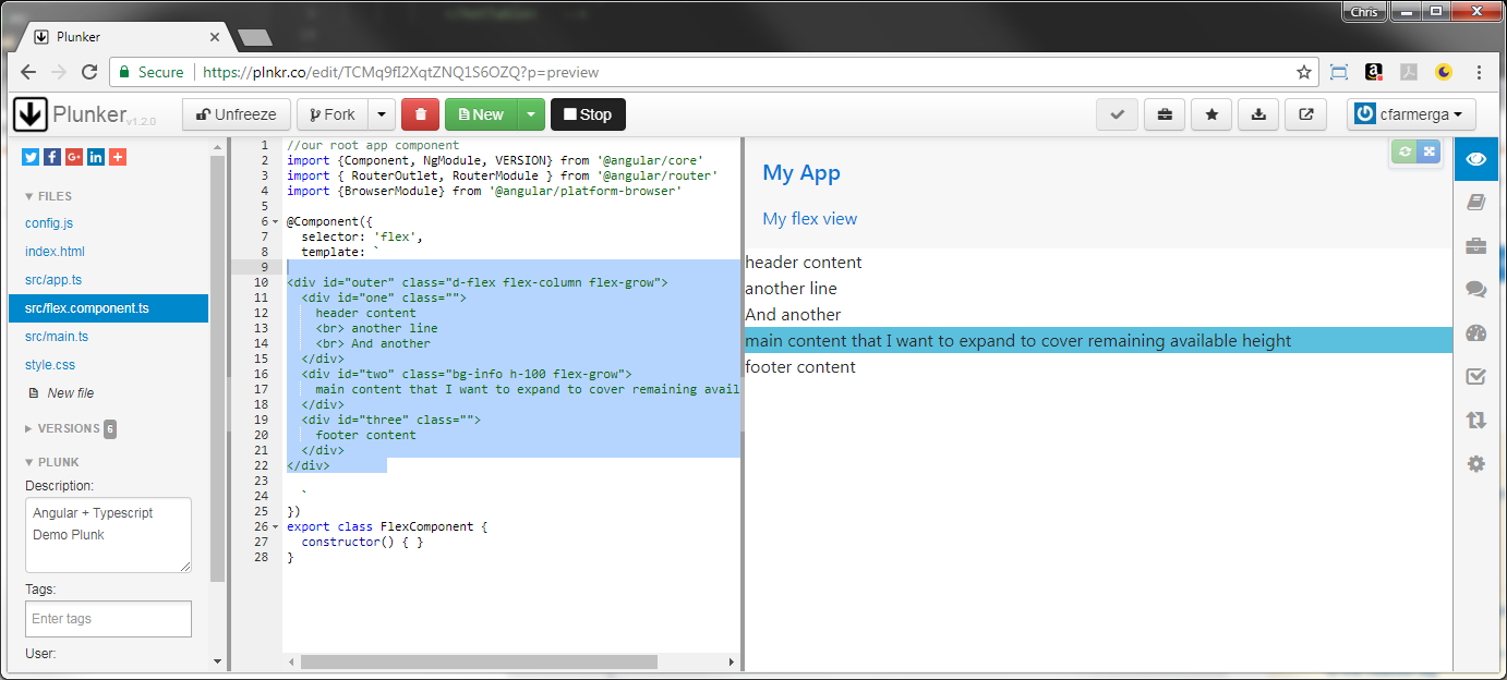
This is the entirety of the angular component I am viewing at the moment:
<div id="outer" class="d-flex flex-column flex-grow">
    <div id="one" class="">
        header content <br>
        another line <br>
        And another
    </div>
    <div id="two" class="bg-info h-100 flex-grow">
        main content that I want to expand to cover remaining available height
    </div>
    <div id="three" class="">
        footer content
    </div>
</div>
And here's the application container showing the navbar and injection point:
<div class="d-flex flex-column h-100">
    <nav class="navbar navbar-toggleable-md sticky-top bg-faded">
        <a class="navbar-brand" href="#">
            <h1 class="navbar-brand mb-0">My App</h1>
        </a>
        <ul class="navbar-nav">
            <li class="nav-item"><a class="nav-link" routerLink="/flex">My flex view</a></li>
        </ul>
    </nav>
    <router-outlet></router-outlet>
</div>
How can I get my
#twodiv to expand to fill the space while having my#oneand#threedivs acting as content headers and footers anchored to the top and bottom of the content area? -
struppi almost 7 yearsThanks for the example. Yours works as I was looking for, but I seem to have broken it when moving into a simple angular project at plnkr.co/edit/TCMq9fI2XqtZNQ1S6OZQ?p=preview. Is anything obviously different from yours? I edited my original post to reflect this plunker example.