Irregular bootstrap column wrapping
Solution 1
This is caused by skills with 2 lines of text or more. It's a well-known bug when using float property. Here is a little picture to understand :

Option #1 : Force the height
Your first option is to force elements to have the same height :
.tutor {
    height: 500px;
}
- [Pro] Simple and work everywhere
- [Con] Use a magic number
- [Con] Limit the number of lines in skills
- [Con] Useless whitespaces on modile version
Option #2 : Use a clearfix
Your second option is to use a clearfix, and force the 5th element to be on a new line (same for the 9th, the 13th...) :
.tutors-listing > .row > .col-md-3:nth-child(4n+1) {
    clear: both;
}
- [Pro] Doesn't limit the number of lines in skills
- [Pro] No useless whitespaces
- [Pro] No magic number
- [Con] One CSS rule per size (
xs/sm/md/lg) - [Con] The rule depends of your grid (
.col-xx-3)
Solution 2
In my case I wanted to show 3 items per row on large screens, 2 on medium screens, and 1 on smaller screens.
You may also uncomment the background colors to verify when the effect is triggering.
http://www.bootply.com/QOor73wFAY#
/* fixes for columns wrapping in odd ways due to variable height */
/* when showing 2 items per row, clear #1, 3, 5 */
@media (min-width: $screen-sm-min){
    .cell-box:nth-child(2n+1){
        clear: both;
        /* background-color: rgba(0, 0, 255, .5); /* blue */
    }
}
/* when showing 3 items per row, clear #1, 4, 7 */
@media (min-width: $screen-md-min){
    .cell-box:nth-child(2n+1){
        clear: none;
    }
    .cell-box:nth-child(3n+1){
        clear: both;
        /* background-color: rgba(0, 255, 0, .5); /* green */
    }
}
Solution 3
Sometimes, I run into this issue as well. I recommend trying to overwrite any padding or margin that you do NOT need. Try changing the margin to 0 first. Then remove some of the padding. That has helped in some of my cases.
Solution 4
By the looks of it you are rendering all of the columns in a single row. You need to change it so that it starts a new row every 4 columns i.e. (in plain old erb)
  <% @users.each_slice(4).to_a.each do |chunk| %>
     <div class="row">
       <% chunk.each do |tutors| %>
         <div class="col-sm-3">
           ...
         </div>
       <% end %>
    </div>
  <% end %>
You might not need the to_a on the first loop
Comments
-
Benoît almost 2 years
Running Rails 4.1.4 with the latest releases of haml, haml-rails, sass, and bootstrap-sass. For a user display, my HAML is as such:
.tutors-listing
    .row
      - @users.each do |tutor|
        .col-xs-12.col-md-3
          .row.tutor
            .col-xs-offset-1.col-xs-4.col-md-12
              = image_tag tutor.photo, :class => 'img-responsive img-circle tutor-photo'
              %h4.tutor-name
                = tutor.first_name

             %p
                teaches
             %strong.tutor-skills
               = tutor.teachables
However, this markup results in the following glitch:
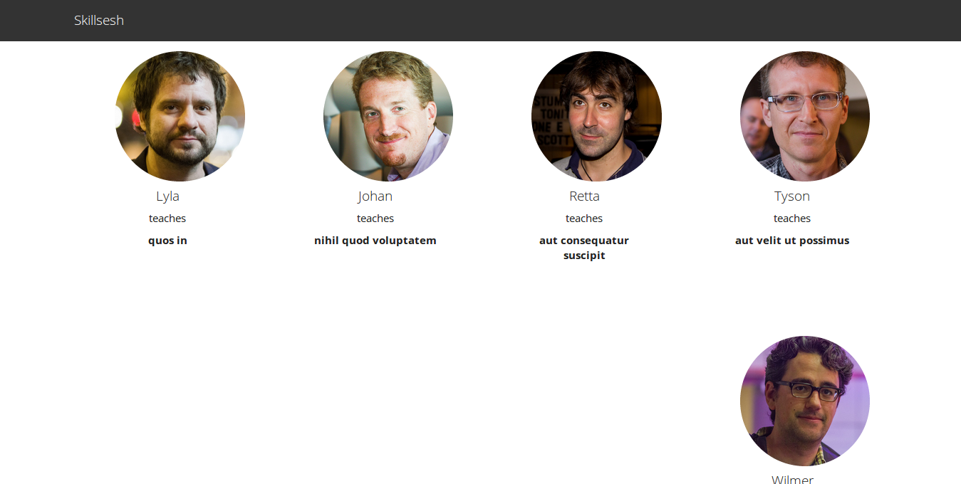
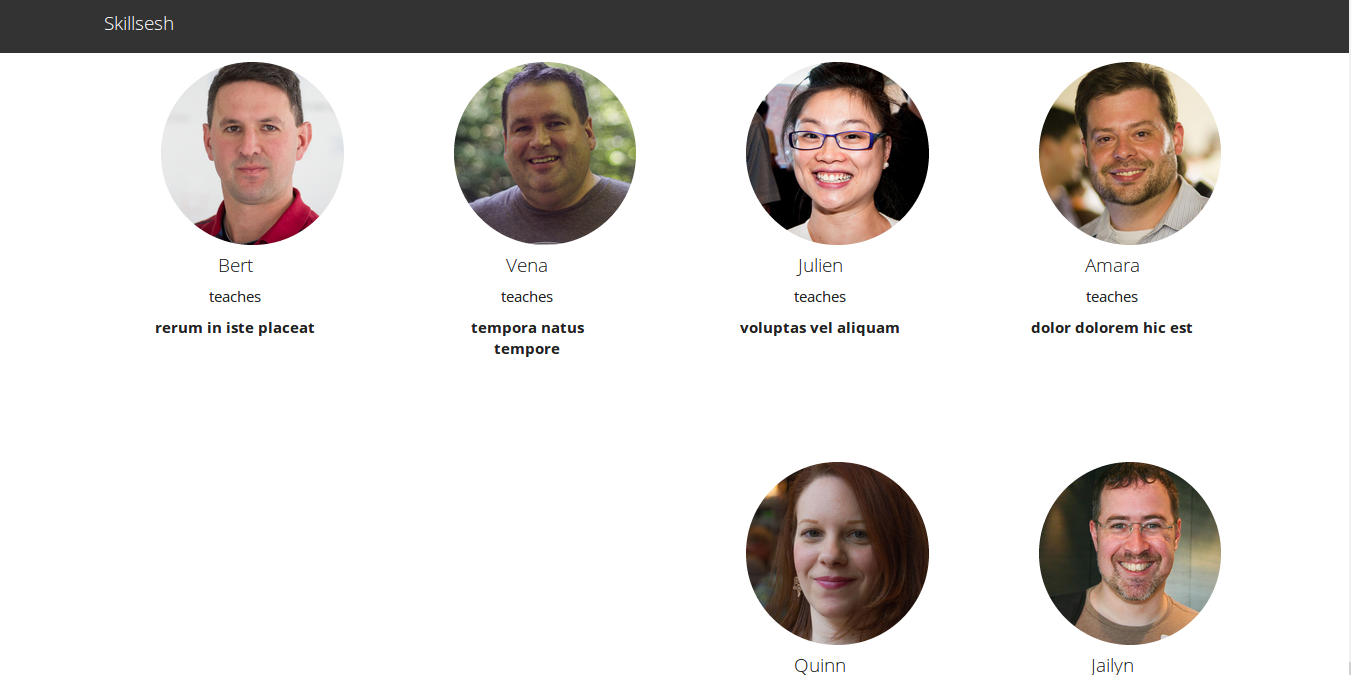
I'm hoping somenone can devine what's wrong here. At the medium breakpoint, there should be 4 columns evenly.
-
 Dimas Pante over 9 yearsGreat answer. I'd add that you can put the tutor's skills into another div and define a min-height for it, so even if it doesn't have much content, will maintain the heights.
 -
zessx over 9 yearsThanks. The problem is not the minimal height, but the maximal one. Whatever
min-height, if one element is higher than its followers it'll break you grid. -
 Devin over 9 years@zessx I just answered a similar question today and gave a more or less similar approach to your first one since it's a very common scenario. Personally, I tend to use a combo of max and min height for better control (this way I might give more room/spacing but use less coding on media queries). However, I want to add another approach for the OP: to simply limit the skills by character (instead of words) so they're always the same length, or to force a min number of lines. Either way, +1 for this answer and the explanation
 -
 Stephan Muller over 9 yearsThe problem is then that they cannot switch from 3 to 4 columns easily on different screen sizes.
 -
Benoît over 9 yearsGreat documentation, bounty awarded
-
Benoît over 9 yearsThanks for the recommendation
-
 jfren484 almost 9 years@zessx, your clearfix option should set
clear: left, notclear: both. -
Vipin Verma about 8 yearsBut it won't work if the height of the rows changes dynamically. I mean you don't know which child will overflow it's parent
-
zessx about 8 years@vipin8169 I don't see the problem. The #2 solution doesn't care about your rows' height. Even if it's changed dynamically, it'll work and push the whole next line down.
-
 Shiva almost 7 yearsThis was exactly what I was looking for. Thanks! I modified it to suite my breakpoints and "items per line" in a single row (in loop).