Make div 100% Width of Browser Window
Solution 1
There are new units that you can use:
vw - viewport width
vh - viewport height
#neo_main_container1
{
   width: 100%; //fallback
   width: 100vw;
}
Opera Mini does not support this, but you can use it in all other modern browsers.
Solution 2
.myDiv {
    background-color: red;
    width: 100%;
    min-height: 100vh;
    max-height: 100%;
    position: absolute;
    top: 0;
    left: 0;
    margin: 0 auto;
}
Basically, we're fixing the div's position regardless of it's parent, and then position it using margin: 0 auto; and settings its position at the top left corner.
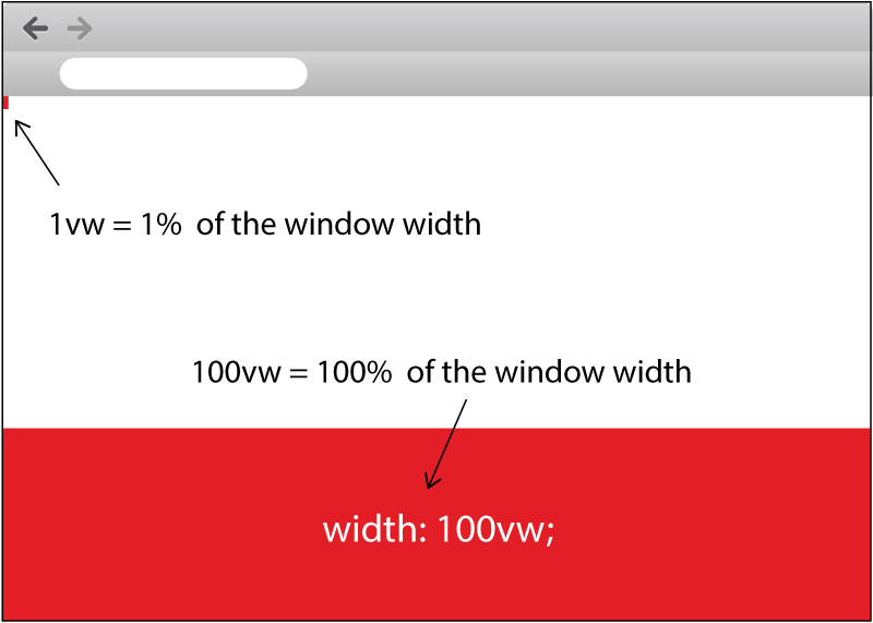
Solution 3
If width:100% works in any cases, just use that, otherwise you can use vw in this case which is relative to 1% of the width of the viewport.
That means if you want to cover off the width, just use 100vw.
Look at the image I draw for you here:
Try the snippet I created for you as below:
.full-width {
  width: 100vw;
  height: 100px;
  margin-bottom: 40px;
  background-color: red;
}

.one-vw-width {
  width: 1vw;
  height: 100px;
  background-color: red;
}
<div class="full-width"></div>
<div class="one-vw-width"></div>Related videos on Youtube
 05 : 26
 02 : 50
 01 : 50
 01 : 50
 01 : 32
Mike K.
Updated on May 06, 2020Comments
-
Mike K. almost 4 years
I'm trying to make one of my containers 100% of the width of the screen.
Here is my SASS
body, html {
    width: 100%;
    height: 100%;
    padding: 0;
    margin: 0;
}

#neo_wrapper {
    width: 960px;
    height: 1500px;
    margin: 0 auto;

    #neo_main_container1 {  /* Slide1 container */
        width: 100%;
        height: 100%;
        margin: 0 auto;
        background: #999999;
        z-index: 350;

        #neo_scroll_button {    /* Div that enables scroll */
            position: absolute;
            bottom: 35px;
            left: 0;
            right: 0;
            margin: 0 auto;
            width: 150px;
            height: 15px;
            background: #F00;
            color: #FFF;
            text-align: center;
            line-height: 15px;
            display: table;

            a {
                &:link {text-decoration: none; color: #FFF;}
                &:visited {text-decoration: none; color: #FFF;}
            }
       }
    }

     #neo_main_container2 {
        width: 100%;
        height: 100%;
        margin: 0 auto;
        background: #CCC;
        z-index: 300;

        #neo_img_container {
           float: left;
           width: 350px;
           height: 500px;
            margin: 0 auto;
            margin-right: 15px;
         }

        #neo_text_container {
            float: left;
            width: 50%;
            height: 500px;
            margin: 0 auto;
        }
    }
 }
And HTML
<body>
<div id="neo_wrapper">
    <div id="neo_main_container1">  <!-- Start container1 -->
        <div id="neo_scroll_button" onClick="scrollBelow()">
            <p>Enter</p>
        </div>
    </div>  <!-- End of container1 -->
    <div id="neo_main_container2">  <!-- Start container2 -->
        <div id="neo_img_container">
            <img src="http://fpoimagery.com/?t=px&w=350&h=250&bg=0ff&fg=000000" />
        </div>
        <div id="neo_text_container">
            <p>Lorem ipsum dolor sit amet, consectetur adipisicing elit, sed do eiusmod tempor incididunt ut labore et dolore magna aliqua. Ut enim ad minim veniam, quis nostrud exercitation ullamco laboris nisi ut aliquip ex ea commodo consequat. Duis aute irure dolor in reprehenderit in voluptate velit esse cillum dolore eu fugiat nulla pariatur. Excepteur sint occaecat cupidatat non proident, sunt in culpa qui officia deserunt mollit anim id est laborum.</p>
        </div>
    </div>  <!-- End container2 -->
</div>
I want #neo_main_container1 to be the full width of the screen. Obviously because it's a child of #neo_wrapper, setting width to 100% will make it 960px. I'm sure how to circumvent this issue, so any help would be appreciated.
Updated: Here is my JS fiddle: http://jsfiddle.net/VkqjH/
-
 emerson.marini almost 10 yearsThe element will have part of its content hidden somewhere within its parent, unless the parent has scrolls.
 -
 Luke almost 10 yearsHe only asked for the sizing :P
 -
emerson.marini almost 10 yearsI know, but it's safe to assume what the OP wants. They're already using
width: 100%. -
Mike K. almost 10 yearsAbsolutely positioning that div seems to get rid of the content I have in my second container
-
Luke almost 10 yearsI only added that for browsers that won't support
100vw. If visibility is an issue, and he asks that question, I'll edit my answer. None of the parent elements haveoverflow: hiddenso wouldn't they just expand? -
 Christopher 'Solidus' DeJong almost 10 yearsThen it's probably on a different z-index layer. Try adjusting the z-index by adding
z-index: 300;for the lower div, and then do the same thing but give it a z-index of 350 for the higher one. -
Mike K. almost 10 yearsDoesn't seem to do anything (gave #neo_main_container1 a z-index of 350 and #neo_main_container2 z-index of 300)
-
Christopher 'Solidus' DeJong almost 10 yearsI'll take a look at it personally in a moment. If you could, please update your post with a fiddle and save me time.
-
Mike K. almost 10 yearsJust realized I didn't actually add the fiddle, just added it to the end of my post. Please take a look whenever you have a moment
-
Christopher 'Solidus' DeJong almost 10 yearsI hadn't realized until now that because you are using SASS, I can't help you as much as I could. I'm not familiar with it, but I can tell you that maybe you should re-work your framework again, and see what happens.
-
 john c. j. over 7 yearsLuke, could you explain please, what is the possible purpose of
width: 100%for body and html elements? Yes, I understand, that from practical point of view,body { margin: 0; }should be enough in most cases. I just want to understand more thoroughly. -
Luke over 7 yearsThe units
vwandvhare relative to the size of the viewport and are for sizing element to be a proportion of the viewport. They have nothing to do with the body, although they can be used on it. You might be confusing this with the body which is typically 100vw but this is not always the case and the height is almost never 100vh.