Make view 80% width of parent in React Native
Solution 1
As of React Native 0.42 height: and width: accept percentages.
Use width: 80% in your stylesheets and it just works.
Screenshot
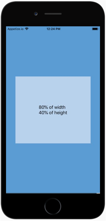
Live Example
Child Width/Height as Proportion of Parent
-
Code
import React from 'react';
import { Text, View, StyleSheet } from 'react-native';

const width_proportion = '80%';
const height_proportion = '40%';

const styles = StyleSheet.create({
  screen: {
    flex: 1,
    alignItems: 'center',
    justifyContent: 'center',
    backgroundColor: '#5A9BD4',
  },
  box: {
    width: width_proportion,
    height: height_proportion,
    alignItems: 'center',
    justifyContent: 'center',
    backgroundColor: '#B8D2EC',
  },
  text: {
    fontSize: 18,
  },
});

export default () => (
  <View style={styles.screen}>
    <View style={styles.box}>
      <Text style={styles.text}>
        {width_proportion} of width{'\n'}
        {height_proportion} of height
      </Text>
    </View>
  </View>
);
Solution 2
That should fit your needs:
var yourComponent = React.createClass({
    render: function () {
        return (
            <View style={{flex:1, flexDirection:'column', justifyContent:'center'}}>
                <View style={{flexDirection:'row'}}>
                    <TextInput style={{flex:0.8, borderWidth:1, height:20}}></TextInput>
                    <View style={{flex:0.2}}></View> // spacer
                </View>
            </View>
        );
    }
});
Solution 3
If you are simply looking to make the input relative to the screen width, an easy way would be to use Dimensions:
// De structure Dimensions from React
var React = require('react-native');
var {
  ...
  Dimensions
} = React;

// Store width in variable
var width = Dimensions.get('window').width;

// Use width variable in style declaration
<TextInput style={{ width: width * .8 }} />
I've set up a working project here. Code is also below.
https://rnplay.org/apps/rqQPCQ
'use strict';

var React = require('react-native');
var {
  AppRegistry,
  StyleSheet,
  Text,
  View,
  TextInput,
  Dimensions
} = React;

var width = Dimensions.get('window').width;

var SampleApp = React.createClass({
  render: function() {
    return (
      <View style={styles.container}>
        <Text style={{fontSize:22}}>Percentage Width In React Native</Text>
        <View style={{marginTop:100, flexDirection: 'row',justifyContent: 'center'}}>
            <TextInput style={{backgroundColor: '#dddddd', height: 60, width: width*.8 }} />
          </View>
      </View>
    );
  }
});

var styles = StyleSheet.create({
  container: {
    flex: 1,
    marginTop:100
  },

});

AppRegistry.registerComponent('SampleApp', () => SampleApp);
Solution 4
In your StyleSheet, simply put:
width: '80%';
instead of:
width: 80%;
Keep Coding........ :)
Solution 5
You can also try react-native-extended-stylesheet that supports percentage for single-orientation apps:
import EStyleSheet from 'react-native-extended-stylesheet';

const styles = EStyleSheet.create({
  column: {
    width: '80%',
    height: '50%',
    marginLeft: '10%'
  }
});
Mark Amery
Email address: [email protected]. No spam, please. I work for Curative Inc: https://curative.com/ I license you to use any of my Stack Overflow contributions in any way you like. If you find something wrong in one of my posts, feel free to edit it. I'm a frequent visitor and can always roll back if I think a change you've made is wrong or stupid, so you may as well be bold - it's better, here, to ask for forgiveness than permission.
Updated on November 30, 2020Comments
-
Mark Amery over 3 years
I'm creating a form in React Native and would like to make my
TextInputs 80% of the screen width.With HTML and ordinary CSS, this would be straightforward:
input {
    display: block;
    width: 80%;
    margin: auto;
}
Except that React Native doesn't support the
displayproperty, percentage widths, or auto margins.So what should I do instead? There's some discussion of this problem in React Native's issue tracker, but the proposed solutions seem like nasty hacks.
-
 A A Karim almost 8 yearsThe React Native docs should mention the Dimensions package on the front page - that it doesn't astounds me...
 -
AlxVallejo almost 7 yearsyou can imagine the spacer will contain different content? why? i can think of plenty examples where a spacer is just filler html.
-
user3044484 over 6 yearsjust <View style={{ width: '75%', borderWidth: 1 }}></View>
-
phil about 6 yearsvery valuable answer. Dimensions is actually very useful. Note: "Although dimensions are available immediately, they may change (e.g due to device rotation) so any rendering logic or styles that depend on these constants should try to call this function on every render, rather than caching the value (for example, using inline styles rather than setting a value in a StyleSheet)."
-
 ratsimihah over 5 yearsNote that using Dimensions breaks your layouts post screen rotation if you support landscape and don't handle those layout changes manually.
 -
SureshCS50 over 3 yearsCan we use
flexBasis: 80%instead? @krishna -
 Krishna Raj Salim over 3 years@SureshCS50: Haven't tried it. I hope you can. More details here: stackoverflow.com/questions/43143258/…