Mobile overflow:scroll and overflow-scrolling: touch // prevent viewport "bounce"
Solution 1
I've managed to find a CSS workaround to preventing bouncing of the viewport. The key was to wrap the content in 3 divs with -webkit-touch-overflow:scroll applied to them. The final div should have a min-height of 101%. In addition, you should explicitly set fixed widths/heights on the body tag representing the size of your device. I've added a red background on the body to demonstrate that it is the content that is now bouncing and not the mobile safari viewport.
Source code below and here is a plunker (this has been tested on iOS7 GM too). http://embed.plnkr.co/NCOFoY/preview
If you intend to run this as a full-screen app on iPhone 5, modify the height to 1136px (when apple-mobile-web-app-status-bar-style is set to 'black-translucent' or 1096px when set to 'black'). 920x is the height of the viewport once the chrome of mobile safari has been taken into account).
<!doctype html>
<html>

<head>
    <meta name="viewport" content="initial-scale=0.5,maximum-scale=0.5,minimum-scale=0.5,user-scalable=no" />
    <style>
        body { width: 640px; height: 920px; overflow: hidden; margin: 0; padding: 0; background: red; }
        .no-bounce { width: 100%; height: 100%; overflow-y: scroll; -webkit-overflow-scrolling: touch; }
        .no-bounce > div { width: 100%; height: 100%; overflow-y: scroll; -webkit-overflow-scrolling: touch; }
        .no-bounce > div > div { width: 100%; min-height: 101%; font-size: 30px; }
        p { display: block; height: 50px; }
    </style>
</head>

<body>

    <div class="no-bounce">
        <div>
            <div>
                <h1>Some title</h1>
                <p>item 1</p>
                <p>item 2</p>
                <p>item 3</p>
                <p>item 4</p>
                <p>item 5</p>
                <p>item 6</p>
                <p>item 7</p>
                <p>item 8</p>
                <p>item 9</p>
                <p>item 10</p>
                <p>item 11</p>
                <p>item 12</p>
                <p>item 13</p>
                <p>item 14</p>
                <p>item 15</p>
                <p>item 16</p>
                <p>item 17</p>
                <p>item 18</p>
                <p>item 19</p>
                <p>item 20</p>
            </div>
        </div>
    </div>

</body>

</html>
Solution 2
There's a great blog post on this here:
http://www.kylejlarson.com/blog/2011/fixed-elements-and-scrolling-divs-in-ios-5/
Along with a demo here:
http://www.kylejlarson.com/files/iosdemo/
In summary, you can use the following on a div containing your main content:
.scrollable {
    position: absolute;
    top: 50px;
    left: 0;
    right: 0;
    bottom: 0;
    overflow: scroll;
    -webkit-overflow-scrolling: touch;
}
The problem I think you're describing is when you try to scroll up within a div that is already at the top - it then scrolls up the page instead of up the div and causes a bounce effect at the top of the page. I think your question is asking how to get rid of this?
In order to fix this, the author suggests that you use ScrollFix to auto increase the height of scrollable divs.
It's also worth noting that you can use the following to prevent the user from scrolling up e.g. in a navigation element:
document.addEventListener('touchmove', function(event) {
   if(event.target.parentNode.className.indexOf('noBounce') != -1
|| event.target.className.indexOf('noBounce') != -1 ) {
    event.preventDefault(); }
}, false);
Unfortunately there are still some issues with ScrollFix (e.g. when using form fields), but the issues list on ScrollFix is a good place to look for alternatives. Some alternative approaches are discussed in this issue.
Other alternatives, also mentioned in the blog post, are Scrollability and iScroll
Solution 3
you could try
$('*').not('#div').bind('touchmove', false);
add this if necessary
$('#div').bind('touchmove');
note that everything is fixed except #div
Solution 4
This answer seems quite outdated and not adapt for nowadays single page applications. In my case I found the solution thank to this aricle where a simple but effective solution is proposed:
html,
body {
  position: fixed;
  overflow: hidden;
}
This solution it's not applicable if your body is your scroll container.
Comments
-
Ben almost 4 years
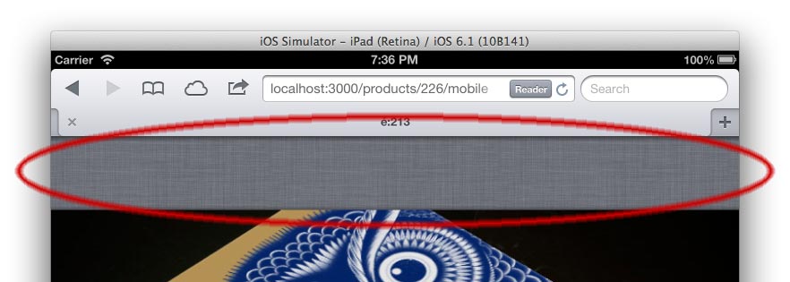
On a mobile (Safari, webviews, wherever),
overflow:scrollandoverflow-scrolling: touchgive a pretty smooth scroll, which is cool.But, it makes the page "bounce" (area circled below), which is not the case when you are not using it, but which makes the experience a little less "native" (and more simply, as far as I can have an opinion about it, is absolutely un-useful)
Is there a way to prevent it to happen?