Printing HTML table with many columns/rows using CSS layout?
Solution 1
You absolutely need to move away from a table if you need readable vertical printing on the page. Tables are great for display on the page when it's tabular data but are not a viable solution for printing as they don't respect flow.
There are plugins (like this one here, no affiliation – just a Google result) that will do this automatically for you, but here's the example. When you use this, make sure that the @media print is listed appropriately. To test locally, you can change that to @media screen.
That won't show the @page rules listed, but those are visible via a print preview.
Hope this helps:
Fiddle for printing in portrait
HTML
<section class="table">
  <div class="row">
    <div>The_quick_brown_fox_jumped_over_the_lazy_dog_A_0</div>
    <div>The_quick_brown_fox_jumped_over_the_lazy_dog_A_1</div>
    <div>The_quick_brown_fox_jumped_over_the_lazy_dog_A_2</div>
    <div>The_quick_brown_fox_jumped_over_the_lazy_dog_A_3</div>
    <div>The_quick_brown_fox_jumped_over_the_lazy_dog_A_4</div>
    <div>The_quick_brown_fox_jumped_over_the_lazy_dog_A_5</div>
    <div>The_quick_brown_fox_jumped_over_the_lazy_dog_A_6</div>
    <div>The_quick_brown_fox_jumped_over_the_lazy_dog_A_7</div>
    <div>The_quick_brown_fox_jumped_over_the_lazy_dog_A_8</div>
    <div>The_quick_brown_fox_jumped_over_the_lazy_dog_A_9</div>
  </div>
</section>
CSS
@media print {
    @page {
      margin: 2.5cm;
    }
    div.row > div {
      display: inline-block;
      border: solid 1px #ccc;
      margin: 0.2cm;
    }
    div.row {
      display: block;
    }
}


.table {
    display: table;
    border-spacing: 2px;
}
.row {
    display: table-row;
}
.row > div {
    display: table-cell;
    border: solid 1px #ccc;
    padding: 2px;
}
Edit - Printing horizontally across several pages:
Okay, so this is probably a far less common use case, and we have to do some goofy things with it – so fair warning. I'll try to explain this step-by-step as it's cryptic and obnoxious.
Fiddle for printing in landscape here!
CSS
@media print {
    @page {
      margin: 0;
    }
    body {
        height: 100%;
        width: 100%;
    }
    div.row > div {
      display: inline-block;
      border: solid 1px #ccc;
      margin: 0.1cm;
      font-size: 1rem;
    }
    div.row {
      display: block;
      margin: solid 2px black;
      margin: 0.2cm 1cm;
      font-size: 0;
      white-space: nowrap;
    }
    .table {
        transform: translate(8.5in, -100%) rotate(90deg);
        transform-origin: bottom left;
        display: block;
    }
}
This is the part that matters, as it's setting your print directives. Most of this is stuff we've seen in the original (with some tweaks as I was playing with it).
The part we care about comes here:
 .table {
     transform: translate(8.5in, -100%) rotate(90deg);
     transform-origin: bottom left;
     display: block;
 }
What we're doing is flopping the whole thing on its side, and then sliding it to where we expect it to be. translate(8.5in, -100%) is telling the browser – Slide this element 8.5 inches (the width of a standard letter paper in the US) to the right, and then slide it up 100% of its height (the negative indicates up as opposed to down). We slide it to the right 8.5 inches so that it'll appear at the top of the page when rotated. We slide it up its calculated height so that we don't have an ugly gap to the left of the table when the rotation happens either.
Then, we instruct it that we want all of those calculations run in relation to the bottom left of the element's normal position in document flow. This keeps this crazy long table from being rotated way off to the right by setting the left property. The bottom property is important because we're rotating it clockwise a quarter turn, and if we did that from the top, it would be off the page to the left. That quarter turn is described in the next part of the transform statement: rotate(90deg);
Voila. The thing prints across multiple pages.
Before you ask: No. There is no way to prevent the page break inside the element of which I'm aware. I know it's obnoxious, ugly and all that garbage, but we can only work with the tools which we're given.
Update Firefox confirmed working: 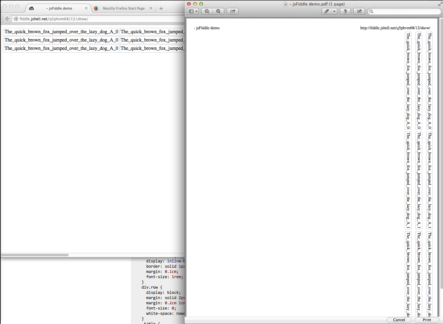
Solution 2
page-break-inside: auto; is the default style, so unless you have a rule setting them differently, those rules will do nothing.
If your table isn't being broken onto multiple pages, then it's most likely because there some other rule you added, which prevents it - my guess an overflow: hidden.
What you first should do is remove all styles, and see if that prints on multiple pages. If yes, start adding your styles back (rule by rule, or if necessary line by line) to find the problem.
Solution 3
If you want to force page break you should use page-break-before or page-break-after. You need to know that the styled element should contain a non-empty block-level element and that it can't be absolutely positioned. However it is quite inconsistent on tables elements. Which leads us to your last question : yes, it would be more consistent to build your tables with divs.
However, considering what you want to achieve (printing large horizontal tables) you should know that trying to fit 3 pages into 1 can't work as your content won't be readable. As a matter of fact, the only best practice would be to use a vertical layout instead (just for print or for both web and print).
Drux
Updated on July 09, 2022Comments
-
Drux almost 2 years
I want to print a large table (so large that its rows are approx. 3 sheets of papers wide) from HTML. If possible, CSS should suffice for layout and the solution should work with different browsers.
I'm currently defining the following style rules:
table { page-break-inside:auto; }
tr    { page-break-inside:auto; }
When I inspect the DOM elements e.g. in Firefox 33.0.2 (on OS X) I can see that the rules are recognized, but then when I look at a print preview ( File | Print | PDF | Open PDF in Preview) all columns that don't fit on the first page are cut off, i.e. I receive 1 page of printed output instead of 3. I have also tried Internet Explorer 11 and 10 to the same effect.
So how can I layout large HTML tables (ultimately large both in terms of columns an rows) for print out using CSS?
Bonus question: If page-break style components indeed only apply to block-level elements as is indicated in this previous answer, would it help if I construct my table from
divs instead oftds when aiming for print output?UPDATE
Here is a relevant sample that I just tried on JSFiddle. (I don't have an account there, so FWIK I cannot provide a direct link.)
HTML:
<body>
<table>
<tr>
<td>The_quick_brown_fox_jumped_over_the_lazy_dog_A_0</td>
<td>The_quick_brown_fox_jumped_over_the_lazy_dog_A_1</td>
<td>The_quick_brown_fox_jumped_over_the_lazy_dog_A_2</td>
<td>The_quick_brown_fox_jumped_over_the_lazy_dog_A_3</td>
<td>The_quick_brown_fox_jumped_over_the_lazy_dog_A_4</td>
<td>The_quick_brown_fox_jumped_over_the_lazy_dog_A_5</td>
<td>The_quick_brown_fox_jumped_over_the_lazy_dog_A_6</td>
<td>The_quick_brown_fox_jumped_over_the_lazy_dog_A_7</td>
<td>The_quick_brown_fox_jumped_over_the_lazy_dog_A_8</td>
<td>The_quick_brown_fox_jumped_over_the_lazy_dog_A_9</td>
</tr>
</table>
</body>
CSS:
table { page-break-inside:auto; }
td    { border:1px solid lightgray; }
tr    { page-break-inside:auto; }
If I try to print this table (e.g. by applying This Frame | Print Frame ... | PDF | Open PDF in Preview to JSFiddle's Result view in Firefox 33.1 for OS X and for Paper Size/Orientation A4/Portrait) I get one page of output. All columns but the first and part of the second are cut off.