SEO - Responsive Website and Duplicated Menus
Solution 1
You have nothing to worry about. You can use display: none; to switch menus. Search engines are much better at understanding JS and CSS.
As long as you are not intentionally trying to manipulate things to get a better ranking. Using display: none; to hide big blocks of text will get you penalized. So if you are only using to hide your desktop menu on mobile and visa verse you are not in any danger. Take a look a this old thread from StackExchange:
How bad is it to use display: none in CSS?
Google is actually quite fond of responsive design and prefers it to a separate mobile site.
Here is a good article on "SEO of Responsive Design"
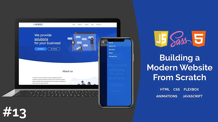
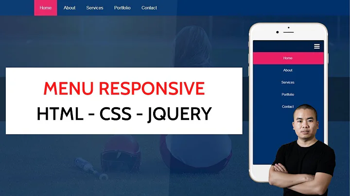
Also, check out this article/video:
Solution 2
Most mobile menu's are "opened" via a button click, essentially opening in a modal window of some sort or another. When it comes to a website meeting accessibility standards - those menu's need to be placed in the DOM in a deliberate fashion. It isn't enough to simply use one NAV in the header and apply different CSS to achieve the desired layout (in most cases).
Bottom line - if your menu isn't initially visible, and overlays the rest of the content - it will probably be necessary to have multiple nav elements placed in different positions in the DOM (hiding one and showing the other depending on screen size and desire).
Solution 3
You can use display: flex and then specify an alternative order: n value for divisions that moves your menu division above or below other divisions.
In other words, you don't need two menus with the same content if you always hide one or other of them.
Related videos on Youtube
Howdy_McGee
Updated on September 18, 2022Comments
-
Howdy_McGee over 1 year
Whenever I create a Responsive Website I usually create 2 menus: 1 hidden and used for mobile and the other displayed as the main menu, then hidden to show the mobile menu. Whenever it comes to SEO and spiders navigating the website do I get dinged for having duplicate menus? Is there anything I can do to indicate to the spider that this menu is for mobile and this is the main?
The end reason why I have 2 different menus are because of location, usually the main menu is in some kind of bar underneath the logo etc, but the mobile menu I want on top of everything, so above the logo etc.
-
 Simon Hayter over 9 yearsWhy not use responsive queries and make the menu
position:fixedorposition:absolute, additionally most frameworks such as bootstrap and zurb foundation have query pulls that can move elements around based on which device is accessing the page... -
hexalys about 9 yearsIf you create 2 menus, that's not Responsive. A responsive menus use the same
<nav>content, and style it differently given a particular media query breakpoint. -
Howdy_McGee about 9 years@hexalys not necessarily. I could have a partial menu for a "Main Desktop Navigation" then a "Mobile Menu" with a more full navigation, both in a
<nav>just displaying more items in the mobile version so it's easier to navigate. -
hexalys about 9 years@Howdy_McGee Sure. But that's not really what you describe in the question. The problematic of transforming a middle navbar into a top or hamburger menu for mobile, for example, can be tough, but is workable via CSS layout changes. I have managed ok here: goo.gl/v8HdLD. And I am here right now, because I am also extremely concerned about that kind of deliberate poor man's lazy approach for two so called "responsive menu" plugin for wordpress, and their implications in terms of their search engine compliance, accessibility and performance.
-
Howdy_McGee about 9 years@hexalys I think there are pros and cons; both have their place respectively it just depends on the situation. Since I've asked this I've seen more favor to one single menu but haven't seen anything that says having two separate menus is a bad thing or it being dinged in SEO.
-
-
Howdy_McGee over 9 yearsMost of your quotes and articles refer to having a responsive website and having a mobile website, which is not necessarily what I'm asking ( sorry for the confusion ) but more regarding the dis/advangages or using 2 menus, one menu for a mobile main menu and one for desktop main menu. It seems like having 2 menus, and crawlers reading source code would interpret these separately.
-
 dasickle over 9 yearsThose were there to support my second statement about responsive design in general. I included another link on top for you and there are quite a few of them out there.
 -
 Dragos Rizescu over 8 years@dasickle Given this approach with multiple menus, when searching a specific domain on google (for example, search for "warmane") it will include in the search result the navigation of that website, will that be affected by any means?


