Set com.google.android.material.chip.Chip selected color
Solution 1
Just set an attribute app:chipBackgroundColor and pass a color state list to it:
<android.support.design.chip.Chip
android:id="@+id/test"
android:layout_width="wrap_content"
android:layout_height="wrap_content"
android:checkable="true"
android:clickable="true"
android:focusable="true"
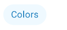
app:chipBackgroundColor="@color/bg_chip_state_list"
app:chipText="Test" />
bg_chip_state_list looks like this:
<?xml version="1.0" encoding="utf-8"?>
<selector xmlns:android="http://schemas.android.com/apk/res/android">
    <item android:color="@color/colorSecondaryLight" android:state_checked="true" />
    <item android:color="@color/colorPrimaryDark" />
</selector>
However I also had to set android:clickable to true to make this work
Solution 2
Using a ColorStateList is a proper way. The only thing I want to add is using custom defined style much more clear to read especially if you want to customise a bunch of properties.
Among other things, one common style applied to all views allows you to make changes in one place that apply immediately to all views
styles.xml
<style name="CustomChipChoice" parent="@style/Widget.MaterialComponents.Chip.Choice">
        <item name="chipBackgroundColor">@color/background_color_chip_state_list</item>
        <item name="android:textColor">@color/text_color_chip_state_list</item>
</style>
text_color_chip_state_list.xml
<selector xmlns:android="http://schemas.android.com/apk/res/android">
    <item android:state_checked="true"
        android:color="@color/color_checked" />
    <item android:state_checked="false"
        android:color="@color/color_unchecked" />
</selector>
background_color_chip_state_list.xml
<?xml version="1.0" encoding="utf-8"?>
<selector xmlns:android="http://schemas.android.com/apk/res/android">
    <item android:color="@color/color1" android:state_checked="true" />
    <item android:color="@color/color2" />
</selector>
After that all you need is apply your custom style for all the Chip views like this.
<android.support.design.chip.Chip
    android:layout_width="wrap_content"
    android:layout_height="match_parent"
    style="@style/CustomChipChoice"
    android:checkable="true"
    android:clickable="true"
    android:focusable="true"
    android:text="Chip text" />
Solution 3
To change the colors in the Chip you can use a custom style:
    <com.google.android.material.chip.Chip
        style="@style/My_Widget.MaterialComponents.Chip.Choice"
         ../>
With this style:
 <style name="My_Widget.MaterialComponents.Chip.Choice" parent="Widget.MaterialComponents.Chip.Choice">
    <!-- Chip background color selector -->
    <item name="chipBackgroundColor">@color/my_choice_chip_background_color</item>
    <!-- Border color -->
    <item name="chipStrokeColor">@color/primaryDarkColor</item>

    <!-- Chip text color selector -->
    <item name="android:textColor">@color/mtrl_choice_chip_text_color</item>
    <!-- Chip close icon color selector -->
    <item name="closeIconTint">@color/mtrl_chip_close_icon_tint</item>
  </style>
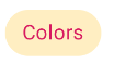
For the chipBackgroundColor you can use a selector like this:
<?xml version="1.0" encoding="utf-8"?>
<selector xmlns:android="http://schemas.android.com/apk/res/android">
  <!-- 24% opacity -->
  <item android:alpha="0.24" android:color="@color/custom" android:state_enabled="true" android:state_selected="true"/>
  <item android:alpha="0.24" android:color="@color/secondaryDarkColor" android:state_enabled="true" android:state_checked="true"/>
  <!-- 12% of 87% opacity -->
  <item android:alpha="0.10" android:color="@color/primaryLightColor" android:state_enabled="true"/>
  <item android:alpha="0.12" android:color="@color/colorPrimary"/>

</selector>
For the text color you can use something like:
<selector xmlns:android="http://schemas.android.com/apk/res/android">

  <item android:color="@color/colorAccent" android:state_enabled="true" android:state_selected="true"/>
  <item android:color="?attr/colorPrimary" android:state_enabled="true" android:state_checked="true"/>
  <!-- 87% opacity. -->
  <item android:alpha="0.87" android:color="?attr/colorOnSurface" android:state_enabled="true"/>
  <!-- 38% of 87% opacity. -->
  <item android:alpha="0.33" android:color="?attr/colorOnSurface"/>

</selector>
Result for normal/selected state:
Solution 4
For those using alpha-05, I found that state_checked was being ignored on the filterable (parent="Widget.MaterialComponents.Chip.Filter") Chips. Instead, you need state_selected:
<?xml version="1.0" encoding="utf-8"?>
<selector xmlns:android="http://schemas.android.com/apk/res/android">
  <item android:color="@color/apricot" android:state_selected="true"/>
  <item android:color="@color/apricotSubtle"/>
</selector>
Solution 5
As others mentioned, you need to set the background color property of the chip element to a ColorStateList that you define. But I just wanted to point out an important note on how to do that since I ran into issues getting the different states to work.
When defining your own ColorStateList (xml resource) you need to make sure you set the different state options in the ColorStateList BEFORE the default color! This was tripping me up for a few days before I figured it out, so I hope this helps someone else as well.
Also, your chip needs to be clickable and focusable (checkable didn't work for me) so set these properties to true as well.
<?xml version="1.0" encoding="utf-8"?>
<selector xmlns:android="http://schemas.android.com/apk/res/android">
    <item android:state_selected="true"
          android:color="@color/chipColorLight" />
    <item android:color="@color/chipColorDefault"/>
</selector>
If you want to programmatically set different ColorStateOptions you can do that like so:
binding.myChip.chipBackgroundColor = resources.getColorStateList(R.color.chip_color_state_list)
Jeffrey Liu
Updated on July 15, 2021Comments
-
Jeffrey Liu almost 3 years
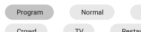
How do I set the selected com.google.android.material.chip.Chip color? I don't want it to be the default gray. This is a single selection chip group.
Original documentation here
<com.google.android.material.chip.ChipGroup android:id="@+id/chipgroup" android:layout_width="0dp" android:layout_height="wrap_content" android:layout_marginStart="16dp" android:layout_marginTop="16dp" android:layout_marginEnd="16dp" app:checkedChip="@+id/chip_program" app:chipSpacingHorizontal="32dp" app:chipSpacingVertical="8dp" app:layout_constraintEnd_toEndOf="parent" app:layout_constraintStart_toStartOf="parent" app:layout_constraintTop_toBottomOf="@+id/detailText" app:singleSelection="true"> <com.google.android.material.chip.Chip android:id="@+id/chip_program" style="@style/Widget.MaterialComponents.Chip.Choice" android:layout_width="wrap_content" android:layout_height="wrap_content" android:text="Program" app:chipEndPadding="16dp" app:chipStartPadding="16dp" /> <com.google.android.material.chip.Chip android:id="@+id/chip_normal" style="@style/Widget.MaterialComponents.Chip.Choice" android:layout_width="wrap_content" android:layout_height="wrap_content" android:text="@string/program_normal" app:chipEndPadding="16dp" app:chipStartPadding="16dp" /> </com.google.android.material.chip.ChipGroup> -
Jeffrey Liu almost 6 yearsIt's working, how did you figure this out? Is this the doc? developer.android.com/guide/topics/resources/…
-
Jeffrey Liu almost 6 yearsBetter mention the file location is res/color/bg_chip_state_list.xml
-
Jeffrey Liu almost 6 yearsI don't need set clickable to true though.
-
Jeffrey Liu almost 6 yearsNow almost the same question, how to do the same with text color?
-
Dizarray almost 6 years@JeffreyLiu The docs don't mention all available attributes, so I discovered it in the source code
-
 airowe over 5 years@JeffreyLiu Did you ever figure it out?
 -
Jeffrey Liu over 5 years@airowe well, with the source code provided now, yes.
-
 Shudy over 5 yearshow about set up programatically the style? I'm not able to set it properly
 -
 Konstantin Kuznetsov over 5 yearsSorry for keeping you waiting... I have an answer, but not sure if this is the best way of applying the style programatically to views. 1. values/attrs.xml
<resources> <attr name="CustomChipChoiceStyle" format="reference" /> </resources>2. styles.xml<!-- Base application theme. --> <style name="AppTheme" parent="Base.Theme.MaterialComponents.Light"> ... <item name="CustomChipChoiceStyle">@style/CustomChipChoice</item> </style>3. in codeval chip = Chip(requireContext(), null, R.attr.CustomChipChoiceStyle) -
 silvio.pereira about 5 yearsI had to use
state_selectedinstead ofstate_checkedto make it to work. I'm usingChoice Chipstyle though. -
 Bhavin Patel about 5 yearsand what about checkedIconVisible checked icon is still black how to change that too?
 -
Bhavin Patel about 5 yearsand what about checkedIconVisible checked icon is still black how to change that too?
-
Bhavin Patel about 5 yearsand what about checkedIconVisible checked icon is still black how to change that too?
-
Konstantin Kuznetsov about 5 yearsapp:checkedIconVisible="true" app:checkedIcon="@drawable/your_custom_icon"
-
 Werder over 4 years
 -
hmac almost 4 yearsNo need to add
clickableandfocusableif you use a style inheriting from one of theWidget.MaterialComponents.Chip...