Setting the font-size of a body tag
Solution 1
h1 has a default font-size set to 2em which means 2 x the font size of the parent element. Same thing with the others headings, they all have a font-size specified using em unit.
Using percentage with font-size is also relative to parent font-size and means p x the font size of the parent element where p is a value between 0 (for 0%) and 1 (for 100%).
So if you specify 100% within the body then the body will have 16px (the default font-size) and h1 will have 32px.
You can use the same logic to find the font-size for the other headings.
body {
  font-size:100%;
}
<h1>this a text</h1>If you specify 12px within the body then the h1 will have 24px
body {
  font-size:12px;
}
<h1>this a text</h1>And specifiying 62.5% will make the body to have 10px and the h1 20px
body {
  font-size:62.5%;
}
<h1>this a text</h1>And since p has no default value for font-size it will simply inherit the value specified within the body.
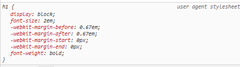
You can easily check those values in the computed tab using the dev tools:

From the documenation:
The size of an em value is dynamic. When defining the font-size property, an em is equal to the size of the font that applies to the parent of the element in question. If you haven't set the font size anywhere on the page, then it is the browser default, which is often 16px
And for percentage:
A positive
<percentage>value, relative to the parent element's font size.
Solution 2
The rem is relative to HTML, not BODY
The rem unit is based on the font size of the HTML element, not the BODY element. So you should set base font size this way:
HTML {font-size: 62.5%; } /* Now `rem` is equivalent to `10px` */
instead of
BODY {font-size: 62.5%; } /* Does NOT affect `rem` */
HTML font size may affect scrolling speed
Note that at least in some browsers, font size of the HTML element affects the wheel-scrolling step size: the smaller the font size of the HTML element is, the smaller the step size is and the slower scrolling is.
Resetting font size for all elements
To reset font size for all elements, you can use the universal selector:
* {font-size: 100%; }
or:
* {font-size: 1em; }
Proper DOCTYPE for cross-browser consistency
Also, make sure you have the proper DOCTYPE declaration in the beginning of your HTML document to turn the standards-compliance mode on for the document for consistent cross-browser rendering and behavior:
<!DOCTYPE html>
Solution 3
Why doesn't
<h1>-<h6>take this font size of 12px?
<h1> and related elements don't change their font size to be the same as their ancestor when you change their ancestor's font size simply because their default font size (in the stylesheet built into the browser) is not set to 100%, 1em, inherit or similar and you haven't specified a different font size to override the one supplied by the browser.
<h1>-<h6>does get smaller (by 75% as 12/16 = 0.75). I'd expect h1 to be either 12px or stay the same default value because the value specified for h1-h6 in the user agent stylesheets is MORE specific.
The value specified in the browser stylesheet (in my browser at least) uses the em unit, so it is proportional (double in the case of <h1>) to the font size of the parent element.
How do the rules work in terms of specifying percentages?
The choice of unit you use for the font size of an ancestor element (px, % or anything else) is irrelevant.
Related videos on Youtube
 18 : 12
 09 : 21
 04 : 51
 17 : 35
 08 : 45
 15 : 36
 01 : 32
user483934
Updated on May 26, 2022Comments
-
user483934 about 2 years
I've been trying to configure a basic CSS template that I can use to start working with REM. I see the method of setting the following
body { font-size: 62.5% };so that the math is easier (1rem = 10px as 16px is the default font-size).I'm not sure I like this way as it involves having to specify the size of
<h1>-<h6>as well as<p>tags if a font-size of 10px isn't my baseline.I've been experimenting with some different ways and have been very confused with how
pxand%relates in terms of font size. Take the following example:<html> <body> <header> <h1>Testing h1</h1> <h2>Testing h2</h2> </header> <main> <p>Random paragraph</p> </main> </body> </html>Consider the following css:
body {
 font-size: 100%;
}
I expected the browser to render font in their default size, which is 16px. Anything in a
<p>tag is 16px still, but<h1>-<h6>revert to their original size as specified in the browser stylesheet. Why isn't ALL text set to 16px?Another example:
body {
  font-size: 12px;
}
Why doesn't
<h1>-<h6>take this font size of12px?<h1>-<h6>does get smaller (by 75% as 12/16 = 0.75). I'd expect h1 to be either 12px or stay the same default value because the value specified for h1-h6 in the user agent stylesheets is MORE specific.How do the rules work in terms of specifying percentages? What is the best practice in terms of setting up a stylesheet so that REM can be used?
-
 Tharaka Nilupul Dharmabandu almost 6 yearsWhy dont you use Normalize CSS first
 -
user483934 almost 6 yearsI should have pointed out I actually do use normalize.css. I don't see how this will make a difference to anything though? Normalize.css doesn't do anything to font sizes from what I saw.
-
-
user483934 almost 6 yearsThis is such a detailed answer, thanks very much for that, especially pointing out the default values of
h1-h6. When dealing with REM, the way I've set my baseline is for the body tag to have a font-size of 100%, and for responsiveness, I've set some breakpoints where the font-size changes to 75% and 60% atmax-width: 768pxandmax-width: 410px; respectively. Would this be a good approach? -
user483934 almost 6 yearsThanks for the reply. You said "...and you haven't specified a different font size to override the one supplied by the browser." I thought that the body tag would override the default browser stylesheet (even
htags) due to the fact that stylesheets cascade. However, I think I missed precedence here. Would I be correct in saying that this is not the case because in the browser stylesheet, theh1property is a more specific selector thanbody, and specificity takes precedence over less specific rules that appear later? -
 Temani Afif almost 6 years@ftahir good or bad is probably opinion based ... if it's working fine and their is no conflict then it's good but if you have some issue then you should probably re-think it ... simply pay attention to not use very small font-size, I think we should avoid having less than 14px because it can be diffuclt to read for some person
 -
Temani Afif almost 6 years@ftahir it's not about specifity here but inheritance ... since there is a value specified within h1 than this one will be used unless there is a more specific selector to override this (and body is not one of them! beause it's not selecting h1) BUT if no value is specified then you will inherit the value of the parent element which is the body
-
Quentin almost 6 years"I thought that the body tag would override the default browser stylesheet (even h tags) due to the fact that stylesheets cascade." — The cascade handles the order in which rules are applied when multiple, conflicting rules are applied to the same element. A rule targetting
bodyis not targettingh1at all, so the cascade isn't relevant. -
Quentin almost 6 years"the h1 property is a more specific selector than body" —
h1andbodyare equally specific. You haven't specified a rule forh1at all. -
user483934 almost 6 yearsAha okay, that makes more sense now regarding cascading. So in the case of
font-size:12px;forbody,h1isn't actually being affected explicitly, but because it's defined by relational values (em), then ifbody's font size changes, thenh1will also change becausebodyis the closest ancestor with a defined font-size? If that's correct then I think I understand this. -
Quentin almost 6 years@ftahir — Every element will have a defined font size. The
bodyis just the only one defined by you. -
user483934 almost 6 years@Quentin, understood, but the
h1tag is defined inemby default, meaning it will be proportional to the ancestor with the closest absolutefont-sizevalue, which in this case, is thebodytag, if I understood correctly -
Quentin almost 6 years@ftahir — It is proportional to the parent element. That element might be proportional to its parent, but it doesn't really help to think in those terms. If it is
200%then it is double it's parent's font size. If its parent is also200%then it is 4 times it's grandparent. And thinking "200% -> proportional to grandparent" is just going to risk you thinking it is double, not 4 times, the grandparent. -
user483934 almost 6 yearsMakes a lot more sense now, thanks for the help - much appreciated :) Sorry it took me a while to get there!