Styling a GroupBox
Solution 1
Take the default GroupBox Template and alter it to look the way you want
For example,
  <ControlTemplate TargetType="GroupBox">
    <Grid>
      <Grid.RowDefinitions>
        <RowDefinition Height="Auto" />
        <RowDefinition Height="*" />
      </Grid.RowDefinitions>

      <Border Grid.Row="0"
              BorderThickness="1"
              BorderBrush="#25A0DA"
              Background="#25A0DA">
          <Label Foreground="White">
              <ContentPresenter Margin="4"
                          ContentSource="Header"
                          RecognizesAccessKey="True" />
          </Label>
      </Border>

      <Border Grid.Row="1"
              BorderThickness="1,0,1,1"
              BorderBrush="#25A0DA">
        <ContentPresenter Margin="4" />
      </Border>

    </Grid>
  </ControlTemplate>
Solution 2
This thread is a bit old, but someone could find this useful...
A small modification to Jakob's answer if you want to have full width header.
You can bind to the parent GroupBox, so you can use it without having a named GroupBox.
<GroupBox.HeaderTemplate>
  <DataTemplate>
    <TextBlock Text="{Binding}"
           Width="{Binding RelativeSource={RelativeSource Mode=FindAncestor, AncestorType=GroupBox}, Path=ActualWidth }"
           Background="#25A0DA" Grid.Column="0" Height="20" Padding="5,0,0,0" Margin="1" Foreground="White"/>
  </DataTemplate>
</GroupBox.HeaderTemplate>
Solution 3
You probably will not be able to make it look exactly like your example without writing a completely different template but I gave it a simple shot by binding the width of the grid in your HeaderTemplate to the width of the groupbox and by specifying appropriate margin and padding:
<GroupBox.HeaderTemplate>
    <DataTemplate>
        <Grid Width="{Binding ElementName=groupBox1, Path=ActualWidth}" Margin="-10, 0, -10, 0" >
            <Grid.ColumnDefinitions>
                <ColumnDefinition />
            </Grid.ColumnDefinitions>
            <Label Content="{Binding}" HorizontalAlignment="Stretch" Background="#25A0DA" Grid.Column="0" Height="20" Padding="5, 0, 0, 0" Margin="10" Foreground="White"/>
        </Grid>
    </DataTemplate>
</GroupBox.HeaderTemplate>
The result looks like this:

Solution 4
I realize this is way late, but the MahApps.Metro package has a nice GroupBox that seems to like nearly exactly like what is posted in the OP.
https://github.com/MahApps/MahApps.Metro/blob/develop/MahApps.Metro/Styles/Controls.GroupBox.xaml
Here's the Xaml from version 1.22
<ResourceDictionary xmlns="http://schemas.microsoft.com/winfx/2006/xaml/presentation"
                xmlns:x="http://schemas.microsoft.com/winfx/2006/xaml"
                xmlns:Controls="clr-namespace:MahApps.Metro.Controls"
                xmlns:Converters="clr-namespace:MahApps.Metro.Converters">

<Converters:ThicknessBindingConverter x:Key="ThicknessBindingConverter" />

<Style x:Key="MetroGroupBox" TargetType="{x:Type GroupBox}">
    <Setter Property="Foreground" Value="{DynamicResource BlackBrush}" />
    <Setter Property="Background" Value="{DynamicResource AccentColorBrush}" />
    <Setter Property="BorderBrush" Value="{DynamicResource AccentColorBrush}" />
    <Setter Property="BorderThickness" Value="1" />
    <Setter Property="Controls:ControlsHelper.ContentCharacterCasing" Value="Upper" />
    <Setter Property="Controls:ControlsHelper.HeaderFontSize" Value="{DynamicResource ContentFontSize}" />
    <Setter Property="Controls:GroupBoxHelper.HeaderForeground" Value="{x:Null}" />
    <Setter Property="Margin" Value="5" />
    <Setter Property="Padding" Value="5" />
    <Setter Property="SnapsToDevicePixels" Value="True" />
    <Setter Property="Template">
        <Setter.Value>
            <ControlTemplate TargetType="{x:Type GroupBox}">
                <Grid x:Name="GroupBoxRoot">
                    <Grid.RowDefinitions>
                        <RowDefinition Height="Auto" />
                        <RowDefinition Height="*" />
                    </Grid.RowDefinitions>
                    <Border x:Name="HeaderSite"
                            Grid.Row="0"
                            Background="{TemplateBinding Background}"
                            BorderBrush="{TemplateBinding BorderBrush}"
                            BorderThickness="{TemplateBinding BorderThickness}"
                            SnapsToDevicePixels="{TemplateBinding SnapsToDevicePixels}"
                            UseLayoutRounding="True">
                        <Controls:ContentControlEx x:Name="HeaderContent"
                                                   Padding="{TemplateBinding Padding}"
                                                   FontSize="{TemplateBinding Controls:ControlsHelper.HeaderFontSize}"
                                                   FontWeight="{TemplateBinding Controls:ControlsHelper.HeaderFontWeight}"
                                                   FontStretch="{TemplateBinding Controls:ControlsHelper.HeaderFontStretch}"
                                                   Content="{TemplateBinding Header}"
                                                   ContentCharacterCasing="{Binding RelativeSource={RelativeSource TemplatedParent}, Path=(Controls:ControlsHelper.ContentCharacterCasing)}"
                                                   ContentStringFormat="{TemplateBinding HeaderStringFormat}"
                                                   ContentTemplate="{TemplateBinding HeaderTemplate}"
                                                   ContentTemplateSelector="{TemplateBinding HeaderTemplateSelector}"
                                                   RecognizesAccessKey="True"
                                                   SnapsToDevicePixels="{TemplateBinding SnapsToDevicePixels}"
                                                   UseLayoutRounding="False">
                            <TextElement.Foreground>
                                <MultiBinding Converter="{x:Static Converters:BackgroundToForegroundConverter.Instance}">
                                    <Binding RelativeSource="{RelativeSource TemplatedParent}"
                                             Path="Background"
                                             Mode="OneWay" />
                                    <Binding RelativeSource="{RelativeSource TemplatedParent}"
                                             Path="(Controls:GroupBoxHelper.HeaderForeground)"
                                             Mode="OneWay" />
                                </MultiBinding>
                            </TextElement.Foreground>
                        </Controls:ContentControlEx>
                    </Border>
                    <Border Grid.Row="1"
                            Background="Transparent"
                            BorderBrush="{TemplateBinding BorderBrush}"
                            BorderThickness="{Binding RelativeSource={RelativeSource TemplatedParent}, Path=BorderThickness, Converter={StaticResource ThicknessBindingConverter}, ConverterParameter={x:Static Converters:IgnoreThicknessSideType.Top}}"
                            SnapsToDevicePixels="{TemplateBinding SnapsToDevicePixels}"
                            UseLayoutRounding="True">
                        <ContentPresenter Margin="{TemplateBinding Padding}"
                                          Content="{TemplateBinding Content}"
                                          ContentTemplate="{TemplateBinding ContentTemplate}"
                                          Cursor="{TemplateBinding Cursor}"
                                          UseLayoutRounding="False" />
                    </Border>
                </Grid>
            </ControlTemplate>
        </Setter.Value>
    </Setter>
</Style>
gulbaek
Updated on March 04, 2020Comments
-
gulbaek about 4 years
I'm trying to create a GroupBox design like this.
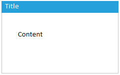
I have looked at the
GroupBox.HeaderTemplatebut I'm having problems creating the blue background color, with a width of 100%. The same goes for the border.
My code so far
<GroupBox.HeaderTemplate>
                <DataTemplate>
                    <Grid>
                        <Grid.ColumnDefinitions>
                            <ColumnDefinition Width="*"/>
                        </Grid.ColumnDefinitions>
                        <Label Content="{Binding}" HorizontalAlignment="Stretch" Background="#25A0DA" Grid.Column="0" Height="20" Padding="5,0,0,0" Margin="1" Foreground="White"/>
                    </Grid>
                </DataTemplate>
            </GroupBox.HeaderTemplate>
And this is what it looks like right now.
