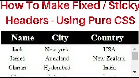
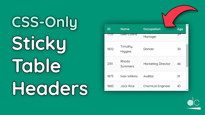
Table with fixed header and fixed column on pure css
Solution 1
A pure CSS solution with a fixed header row and first column
The position: sticky property supports both sticking to the top and to the side in modern versions of Chrome, Firefox, and Edge. This can be combined with a div that has the overflow: scroll property to give you a table with fixed headers that can be placed anywhere on your page.
Place your table in a container:
<div class="container">
  <table></table>
</div>
Use overflow: scroll on your container to enable scrolling:
div.container {
  overflow: scroll;
}
As Dagmar pointed out in the comments, the container also requires a max-width and a max-height.
Use position: sticky to have table cells stick to the edge and top, right, or left to choose which edge to stick to:
thead th {
  position: -webkit-sticky; /* for Safari */
  position: sticky;
  top: 0;
}

tbody th {
  position: -webkit-sticky; /* for Safari */
  position: sticky;
  left: 0;
}
As MarredCheese mentioned in the comments, if your first column contains <td> elements instead of <th> elements, you can use tbody td:first-child in your CSS instead of tbody th
To have the header in the first column stick to the left, use:
thead th:first-child {
  left: 0;
  z-index: 1;
}
/* Use overflow:scroll on your container to enable scrolling: */

div {
  max-width: 400px;
  max-height: 150px;
  overflow: scroll;
}


/* Use position: sticky to have it stick to the edge
 * and top, right, or left to choose which edge to stick to: */

thead th {
  position: -webkit-sticky; /* for Safari */
  position: sticky;
  top: 0;
}

tbody th {
  position: -webkit-sticky; /* for Safari */
  position: sticky;
  left: 0;
}


/* To have the header in the first column stick to the left: */

thead th:first-child {
  left: 0;
  z-index: 2;
}


/* Just to display it nicely: */

thead th {
  background: #000;
  color: #FFF;
  /* Ensure this stays above the emulated border right in tbody th {}: */
  z-index: 1;
}

tbody th {
  background: #FFF;
  border-right: 1px solid #CCC;
  /* Browsers tend to drop borders on sticky elements, so we emulate the border-right using a box-shadow to ensure it stays: */
  box-shadow: 1px 0 0 0 #ccc;
}

table {
  border-collapse: collapse;
}

td,
th {
  padding: 0.5em;
}
<div>
<table>
<thead>
<tr>
<th></th>
<th>headheadhead</th>
<th>headheadhead</th>
<th>headheadhead</th>
<th>headheadhead</th>
<th>headheadhead</th>
<th>headheadhead</th>
<th>headheadhead</th>
</tr>
</thead>
<tbody>
<tr>
<th>head</th>
<td>body</td>
<td>body</td>
<td>body</td>
<td>body</td>
<td>body</td>
<td>body</td>
<td>body</td>
</tr>
<tr>
<th>head</th>
<td>body</td>
<td>body</td>
<td>body</td>
<td>body</td>
<td>body</td>
<td>body</td>
<td>body</td>
</tr>
<tr>
<th>head</th>
<td>body</td>
<td>body</td>
<td>body</td>
<td>body</td>
<td>body</td>
<td>body</td>
<td>body</td>
</tr>
<tr>
<th>head</th>
<td>body</td>
<td>body</td>
<td>body</td>
<td>body</td>
<td>body</td>
<td>body</td>
<td>body</td>
</tr>
<tr>
<th>head</th>
<td>body</td>
<td>body</td>
<td>body</td>
<td>body</td>
<td>body</td>
<td>body</td>
<td>body</td>
</tr>
<tr>
<th>head</th>
<td>body</td>
<td>body</td>
<td>body</td>
<td>body</td>
<td>body</td>
<td>body</td>
<td>body</td>
</tr>
</tbody>
</table>
</div>https://jsfiddle.net/qwubvg9m/1/
Solution 2
Nowadays, this is possible to achieve using CSS only with position: sticky property.
Here goes a snippet:
(jsFiddle: https://jsfiddle.net/hbqzdzdt/5/)
.grid-container {
  display: grid; /* This is a (hacky) way to make the .grid element size to fit its content */
  overflow: auto;
  height: 300px;
  width: 600px;
}
.grid {
  display: flex;
  flex-wrap: nowrap;
}
.grid-col {
  width: 150px;
  min-width: 150px;
}

.grid-item--header {
  height: 100px;
  min-height: 100px;
  position: sticky;
  position: -webkit-sticky;
  background: white;
  top: 0;
}

.grid-col--fixed-left {
  position: sticky;
  left: 0;
  z-index: 9998;
  background: white;
}
.grid-col--fixed-right {
  position: sticky;
  right: 0;
  z-index: 9998;
  background: white;
}

.grid-item {
  height: 50px;
  border: 1px solid gray;
}
<div class="grid-container">
<div class="grid">
<div class="grid-col grid-col--fixed-left">
<div class="grid-item grid-item--header">
<p>HEAD</p>
</div>
<div class="grid-item">
<p>Hello</p>
</div>
<div class="grid-item">
<p>Hello</p>
</div>
<div class="grid-item">
<p>Hello</p>
</div>
<div class="grid-item">
<p>Hello</p>
</div>
<div class="grid-item">
<p>Hello</p>
</div>
<div class="grid-item">
<p>Hello</p>
</div>
<div class="grid-item">
<p>Hello</p>
</div>
<div class="grid-item">
<p>Hello</p>
</div>
<div class="grid-item">
<p>Hello</p>
</div>
<div class="grid-item">
<p>Hello</p>
</div>
</div>
<div class="grid-col">
<div class="grid-item grid-item--header">
<p>HEAD</p>
</div>
<div class="grid-item">
<p>P</p>
</div>
<div class="grid-item">
<p>P</p>
</div>
<div class="grid-item">
<p>P</p>
</div>
<div class="grid-item">
<p>P</p>
</div>
<div class="grid-item">
<p>P</p>
</div>
<div class="grid-item">
<p>P</p>
</div>
<div class="grid-item">
<p>P</p>
</div>
<div class="grid-item">
<p>P</p>
</div>
<div class="grid-item">
<p>P</p>
</div>
<div class="grid-item">
<p>P</p>
</div>
</div>
<div class="grid-col grid-col--fixed-right">
<div class="grid-item grid-item--header">
<p>HEAD</p>
</div>
<div class="grid-item">
<p>9</p>
</div>
<div class="grid-item">
<p>9</p>
</div>
<div class="grid-item">
<p>9</p>
</div>
<div class="grid-item">
<p>9</p>
</div>
<div class="grid-item">
<p>9</p>
</div>
<div class="grid-item">
<p>9</p>
</div>
<div class="grid-item">
<p>9</p>
</div>
<div class="grid-item">
<p>9</p>
</div>
<div class="grid-item">
<p>9</p>
</div>
<div class="grid-item">
<p>9</p>
</div>
</div>
</div>
</div>Regarding compatibility. It works in all major browsers, but not in IE. There is a polyfill for position: sticky but I never tried it.
Solution 3
This is no easy feat.
The following link is to a working demo:
Link Updated according to lanoxx's comment
http://jsfiddle.net/C8Dtf/366/
Just remember to add these:
<script type="text/javascript" charset="utf-8" src="http://datatables.net/release-datatables/media/js/jquery.js"></script>
<script type="text/javascript" charset="utf-8" src="http://datatables.net/release-datatables/media/js/jquery.dataTables.js"></script>
<script type="text/javascript" charset="utf-8" src="http://datatables.net/release-datatables/extras/FixedColumns/media/js/FixedColumns.js"></script>
i don't see any other way of achieving this. Especially not by using css only.
This is a lot to go through. Hope this helps :)
Solution 4
All of these suggestions are great and all, but they're either only fixing either the header or a column, not both, or they're using javascript. The reason - it don't believe it can be done in pure CSS. The reason:
If it were possible to do it, you would need to nest several scrollable divs one inside the other, each with a scroll in a different direction. Then you would need to split your table into three parts - the fixed header, the fixed column and the rest of the data.
Fine. But now the problem - you can make one of them stay put when you scroll, but the other one is nested inside the scrolling area of first and is therefore subject to being scrolled out of sight itself, so can't be fixed in place on the screen. 'Ah-ha' you say 'but I can somehow use absolute or fixed position to do that' - no you can't. As soon as you do that you lose the ability to scroll that container. It's a chicken and egg situation - you can't have both, they cancel each other out.
I believe the only solution is through javascript. You need to completely seperate out the three elements and keep their positions in sync through javascript. There are good examples in other posts on this page. This one is also worth a look:
http://tympanus.net/codrops/2014/01/09/sticky-table-headers-columns/
Solution 5
I've made some changes in in jsfiddle. This might be what you're trying to do.
I have hardcoded the titles like so:
<table id="left_table" class="freeze_table">
    <tr class='tblTitle'>
         <th>Title 1</th>
         <th>Title 2</th>
    </tr>
</table>
And I added some styles as well.
.tblTitle{
   position:absolute;
    top:0px;
    margin-bottom:30px;
    background:lightblue;
}
td, th{
    padding:5px;
    height:40px;
    width:40px;
    font-size:14px;
}
Hope this is what you want :)
Related videos on Youtube
 07 : 13
 09 : 40
 08 : 04
 01 : 24
 14 : 20
 06 : 02
 01 : 18
panfil
Updated on December 12, 2021Comments
-
panfil over 2 years
I need to create a html table (or something similar looking) with a fixed header and a fixed first column.
Every solution I've seen so far uses Javascript or
jQueryto set scrollTop/scrollLeft, but it doesn't work smoothly on mobile browsers, so I'm looking for a pure CSS solution.I found a solution for a fixed column here: jsfiddle.net/C8Dtf/20/ but I don't know how I can enhance it to make the header fixed too.
I want it to work on webkit browsers or use some
css3features, but I repeat, I don't want to useJavascriptfor scrolling.EDIT: This is example of the behaviour I want to achieve: https://web.archive.org/web/20130829032141/http://datatables.net/release-datatables/extras/FixedColumns/css_size.html
-
 Milche Patern about 11 yearsI dont see where <html> <table> with fixed header <thead> has to do with css-level-3 for the moment. What else do you have ? What have you tried so far ?
 -
panfil about 11 yearsI've tried to apply complex
positionbehavior to rows and cells, but I don't quite understand where it is apllicable or not. -
Garry about 8 yearsThis answer may help you stackoverflow.com/questions/14834198/…
-
-
panfil about 11 yearsI need not only header, but first column fixed too.
-
panfil about 11 yearsI need a header of the right table to scroll together with its content.
-
Phillip-juan about 11 yearsHere is the URL: jsfiddle.net/C8Dtf/84 . You just need to play around with the styling for the right-hand table to align the two tables.
-
panfil about 11 yearsNo. You don't quite understand. I need the header of the right table to be fixed to the top so it would be still visible when the table scrolls up and down, but when the table scrolls right or left header must scroll right or left but still be fixed at the top. Sorry me for my bad English skills.
-
Phillip-juan about 11 yearsSo want the right-hand table's header to be fixed when scrolling vertically, and to scroll when scrolling horizontally?
-
panfil about 11 yearsThis is example of the behaviour I want to achieve: datatables.net/release-datatables/extras/FixedColumns/…
-
 lanoxx over 10 yearsTo switch of the filter use:
"bFilter": false -
 Jimmy T. over 10 yearsIt is possible to achieve this with css only. Not easy but possible.
 -
panfil over 10 yearsI needed not only heder fixed, but the first column too.
-
 Akash Kava over 10 yearsProblem is headers loose their width. It looks ugly with different header column size and data column size.
 -
 darkzangel about 10 yearsGood try, but doesn't work too well for me. In this exemple (jsfiddle.net/5ka6e), the header doesn't resize correctly. This kind of error could eventually ended up have data and header mismatching.
 -
Albert Català about 10 yearsYou forget to add
div.cost_center table{border-collapse: collapse;}and the third caption has to be something that fits within the 60px (in this example) -
 hansaplast almost 10 yearsfrom about 10 solutions this was the only one that worked. Btw, to remove the "Showing 1 to 57 of 57 entries" add
"bInfo" : falseinto the.dataTable()call -
 David Tansey over 9 yearsThis example shows an approach with two tables in the html: one table renders the header only; the second table renders the rows only but does so within a
div. It is thedivthat permits the row-scrolling while the header stays in the same place. This approach worked for my needs. -
 Eaten by a Grue over 9 yearsdatatables == "awesome"
 -
panfil over 9 yearsNeed both fixed header and fixed first column.
-
Cody over 9 yearsAh... thx for pointing this out, panfil. I'll make an edit. Cheers
-
cazzer about 8 yearsThough the header of the right-handle table doesn't scroll, this is still a very cool solution. Particularly how it is the only solution which allows
table-layout: auto. For smaller tables the header issue can be resolved with a scroll listener, here's an example using React(not fully styled so a bit ugly...) -
 Zoltán Tamási almost 8 yearsIf there is horizontal scrolling too, you need some JS to synchronize the scroll positions of the tables.
 -
Bravo almost 7 yearsin your demo the first column is not fixed
-
vsync almost 7 yearsdownvoting this solution because it is bad. the
theadis in its own table which isn't bound to changes oftdelements, so if a cell text is long, thethwidth will not adjust accordingly. -
Phillip-juan almost 7 yearsI agree even though it's my answer. It is quite old
-
 Admin about 6 yearsThis is great, love it!
 -
 Alvaro about 6 yearsThis answer is outdated. Nowadays It is possible to do using CSS only. See stackoverflow.com/a/46919521/4436816.
 -
Andreas about 6 yearsany way to achieve this with <table>-tags and not <div>
-
user1190132 almost 6 yearsThis seems like the best answer.
-
 igasparetto over 5 yearsI think this is not going to have good performance if you are developing an application and need to loop through records to print this table because for every column in the table, you have to loop through the entire record's array. This HTML works column by column.
 -
Alvaro over 5 years@igasparetto You can actually arrange the rows/columns the other way around and the solution would still work. If I have some time later I can create a snippet with the grid ordered row -> column.
-
 PirateApp over 5 yearsupvoted! how would you do 2 columns sticky instead of one with this
 -
 Matthew Schlachter over 5 years@PirateApp If you know the
widthof your first column, you can useposition: stickyon the cells in your second column with aleftvalue equal to your first column'swidth: jsfiddle.net/wvypo83c/794 -
Ben Morris over 5 yearsI would advise against displaying tabular data without using <table> and associated tags. There are several issues with breaking the intended use of HTML in this way, including accessibility. See also: w3.org/WAI/tutorials/tables
-
mlerley over 5 yearsThis answer proves it's worth it to read all the way to the bottom!
-
PussInBoots over 5 yearsFirst link is broken. Second one uses jQuery.
-
PussInBoots over 5 yearsDid you base this on anyone elses answer and added the shadow?
-
Matthew Schlachter over 5 years@PussInBoots It depends on the browser, but according to caniuse it should work on mobile Chrome, Firefox, and Safari (with the
-webkit-prefix) -
PussInBoots over 5 yearsSeems to be working fine in Chrome, Safari on iPhone and Samsung Galaxy.
-
Aberrant about 5 yearsThis is perfect! I had almost given up hope that this would be possible without javascript and div hacks.
-
 Dagmar about 5 yearsThis doesn't work without a max-width and max-height set on the container.
 -
Sainath S.R almost 5 yearsThis is actually the best solution as of 2019. Works fine for any number of rows or columns.should be the accepted answer
-
MarredCheese almost 5 yearsThis answer is a lighthouse guiding us home through the endless sea of malfunctioning, overcomplicated, time-wasting answers from surprisingly-confident, bafflingly-upvoted posters here on SO and across the web. Note that if your first column contains
<td>elements instead of<th>elements, you can usetbody td:first-childin your CSS instead oftbody th. -
 Luca Detomi almost 5 yearsUpdated answer to remove dead link
 -
Octabode over 4 yearsThere aren't enough up-votes in the universe for this answer. So simple, so right. Even in IE 11 it doesn't fall apart (doesn't scroll like we want, but at least it's legible). I've been using a fancy JS table component to get this effect and it falls apart pretty completely on IE 11 and breaks other stuff on Edge.
-
juminoz over 4 yearsThis is perfect. Now if there is a spec for the browsers to offload content from DOM when it's outside of viewport, then there really is no need for Javascript to display large set of data. This is such a common use case so I never understand why they don't just bake it into the HTML table spec and save million of us misery of dealing with tables. I'm using AG Grid for now, but it's just too heavy and too slow once it gets very complex. A native solution like this is still much preferred.
-
 Sergiy Ostrovsky almost 4 yearsThis is so cool! Also if you want 1st column header you can add some
z-indexto make it not overlapped by other sticky's -
maoanz almost 4 yearsAfter several test of previous solutions, it seems to be the best and simplest solution. it's also the newest.
-
Richard Housham almost 4 yearsIt's a great answer, but if you move into needing 3.4.5 columns then it falls apart - still +1
-
user1063287 almost 4 yearshow to get a
border-right: 1px solidto stay visible on the first column? -
Matthew Schlachter almost 4 years@user1063287 Most browsers drop the border for sticky elements on scroll, but you can emulate the same effect of a border more reliably on sticky elements by using a box-shadow like
box-shadow: 1px 0 0 0 #ccc; -
 Zohaib Ijaz over 3 yearsthe best solution. Thanks @Alvaro
 -
Greg over 2 yearsThis should be accepted as the answer to this question, unless and until a future version of CSS overrides this behavior.
-
Samantha Adrichem over 2 yearsInstead of overflow: scroll you can use overflow: auto; this way the scrollbar only shows up when the content is too large.
-
 BNetz about 2 yearsVery good answer - don't forget to giving the th a background-color.