Using object-fit on a <div> with child elements, including a <canvas>
Solution 1
I don't know if it's ok for you, but I think it can be done mostly in css if you allow a little bit more HTML.
Consider the following html
<div class="outerContainer">
  <div class="canvasContainer">
    <canvas width="640" height="360"></canvas>
  </div>
  <div class="beside">
  </div>
</div>
I just added a little div around the canvas. This way we let the canvas handle it's things and we use the div for the flex things.
Using the following css:
* {
  box-sizing: border-box;
}
.outerContainer {
  display: flex;
  border: 0.5em solid #444;
  margin-bottom: 2em;
}
.canvasContainer canvas {
  width: 100%;
  background: #777;
  margin-bottom: -4px
}
.canvasContainer {
  flex-grow: 1;
  background: #77a;
}
/* This element has a fixed width, and should be whatever height the <canvas> is */
.outerContainer .beside {
  flex-basis: 3em;
  flex-grow: 0;
  flex-shrink: 0;
  background: #7a7;
}
We have canvas container taking all the available space. And then the canvas adapt accordingly with the image scaling in it. However I don't know why, there was a bit of a margin on the bottom of the canvas, hence the negative margin on it.
fiddle: https://jsfiddle.net/L8p6xghb/3/
As a side note, if you're looking to use that for captions, there are html5 element for it, like <figure> and <figcaption>!
Solution 2
I think a pure CSS solution is a bit far-fetched considering the solution you require - and here is a proposal using script that involves the following steps:
Find the aspect ratio for the image that best fits the available space for
canvasUpdate
widthforcanvasand theflexbox's height.Draw the image now in the canvas.
Note that for illustration, on window resize I have reloaded the frame - see demo below for details (more explanations are given inline):
// Document.ready
$(() => {
  putImageOnCanvas();
});
// Window resize event
((() => {
  window.addEventListener("resize", resizeThrottler, false);
  var resizeTimeout;
  function resizeThrottler() {
    if (!resizeTimeout) {
      resizeTimeout = setTimeout(function() {
        resizeTimeout = null;
        actualResizeHandler();
      }, 66);
    }
  }
  function actualResizeHandler() {
    // handle the resize event - reloading page for illustration
    window.location.reload();
  }
})());
function putImageOnCanvas() {
  $('.outerContainer canvas').each((index, canvas) => {
    const ctx = canvas.getContext('2d');
    canvas.width = $(canvas).innerWidth();
    canvas.height = $(canvas).innerHeight();
    const img = new Image;
    img.src = 'https://static1.squarespace.com/static/56a1d17905caa7ee9f27e273/t/56a1d56617e4f1177a27178d/1453446712144/Picture7.png';
    img.onload = (() => {
      // find the aspect ratio that fits the container
      let ratio = Math.min(canvas.width / img.width, canvas.height / img.height);
      let centerShift_x = (canvas.width - img.width * ratio) / 2;
      let centerShift_y = (canvas.height - img.height * ratio) / 2;
      canvas.width -= 2 * centerShift_x;
      canvas.height -= 2 * centerShift_y;
      // reset the flexbox height and canvas flex-basis (adjusting for the 0.5em border too)
      $('.outerContainer').css({
        'height': 'calc(' + canvas.height + 'px + 1em)'
      });
      $('.outerContainer canvas').css({
        'width': 'calc(' + canvas.width + 'px)'
      });
      // draw the image in the canvas now
      ctx.clearRect(0, 0, canvas.width, canvas.height);
      ctx.drawImage(img, 0, 0, img.width, img.height, 0, 0, img.width * ratio, img.height * ratio);
    });
  });
}
* {
box-sizing: border-box;
}
body {
margin: 0;
}
.outerContainer {
display: flex;
border: 0.5em solid #444;
margin-bottom: 2em;
/*max available flexbox height*/
height: calc(100vh - 2em);
}
.outerContainer canvas {
background: #77a;
/*max available canvas width*/
width: calc(100vw - 4em);
}
.outerContainer .beside {
flex-basis: 3em;
flex-grow: 0;
flex-shrink: 0;
background: #7a7;
}<script src="https://ajax.googleapis.com/ajax/libs/jquery/2.1.1/jquery.min.js"></script>
<div class="outerContainer">
<canvas></canvas>
<div class="beside">
</div>
</div>EDIT:
I was setting
flex-basisforcanvasinitially - but Firefox was not behaving well - so now I'm usingwidthinstead.Snippet has some issue on screen resize (page reload) again in Firefox - so have included a fiddle too.
Related videos on Youtube
 06 : 01
Brad
Software engineer. Web evangelist. Core competencies include: Audio Streaming Media Teaching Oddball cross-systems integration Newfangled browser APIs and standards I like to work on strange projects that enable people to do things in the real world that would be otherwise difficult or impossible. Want to integrate GNSS with sonar sensors to make 3D maps of a river bed? How about control MIDI synthesizers and DMX lighting with your brainwaves? Perhaps you just want to build and deploy something reliable and scalable without unnecessary complexity? This is what I do. I also like to teach others anything I can. I embed well with existing teams and can help up-level developers' skills in areas I have knowledge of. Do you already have an effective web team that needs help adding streaming audio/video to your site? Invite me to meet your folks to see if I can assist. I am available for consulting. You may contact me at [email protected] Thank you!
Updated on June 04, 2022Comments
-
Brad 7 months
I have an outer container that is variable in size and width. Suppose that inside this container, I have a canvas that I want to have grow as much as it can while maintaining proportion and not cropping. For this, I would normally use
object-fit: contain.Now, suppose instead of just a canvas, I have a canvas with another element placed next to it.
HTML:
<div class="outerContainer">
  <canvas width="640" height="360"></canvas>
  <div class="beside">
  </div>
</div>
CSS:
.outerContainer {
  display: flex;
  border: 0.5em solid #444;
  margin-bottom: 2em;
  object-fit: contain;
}
.outerContainer canvas {
  flex-grow: 1;
  background: #77a;
}
/* This element has a fixed width, and should be whatever height the <canvas> is */
.outerContainer .beside {
  flex-basis: 3em;
  flex-grow: 0;
  flex-shrink: 0;
  background: #7a7;
}
In this case, I want to scale the whole outerContainer size, just like I did with canvas. The problem is that
object-fitdoesn't actually scale the element... it scales its contents. This doesn't seem to apply to normal block elements, resulting in a case where the canvas inside is potentially skewed if there is enough width.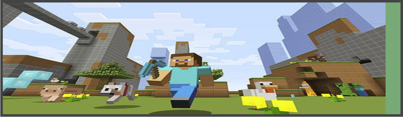
If I add
object-fit: containto thecanvaselement, it maintains proportion but still uses the full width, meaning the.besideelement is all the way to the right. This is visualized with the purple background on the canvas.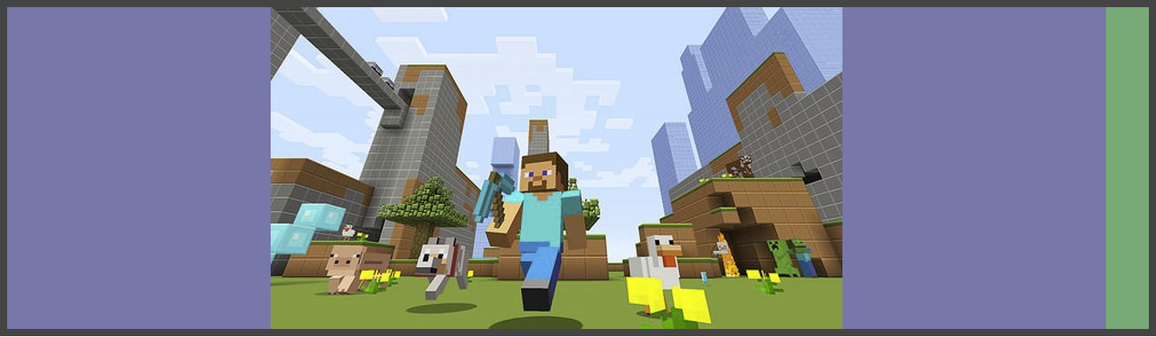
What I would like is the
outerContainerto be scaled with the canvas contents, so that.besidealways has the height of the canvas contents. The.outerContainershould be centered in the parent element, taking up as much space as it can without distorting the canvas. Like this, at any proportional scale:
Is this doable with modern CSS? Or must I use a scripted solution?
Fiddle with examples: https://jsfiddle.net/nufx10zc/
-
 Py. about 6 yearsWhat browser are you targeting? For me it works differently in firefox and chrome. Firefox doesn't seem to stretch the image, just scale it for both image in jsfiddle. While chrome does the behavior you describe in your post.
 -
Brad about 6 years@Py. Chrome first, Firefox second, but the solution needs to work in both in the end.
-
-
 Christos Lytras about 6 yearsNice solution, but why do you use a direct call to a direct unnamed function for the Window resize event
((() => {...})());? Couldn't you just have the code outside an unnamed function like you have thefunction putImageOnCanvas()? -
 kukkuz about 6 years:) well, no particular reason... was learning about them and their effect on this, arguments etc, and just tried it out...