Vuetify v-list-item style change on hover
11,512
Use v-hover and v-overlay...
          <v-list two-line>
                <v-list-item-group v-model="selected" multiple active-class="pink--text">
                    <template v-for="(item, index) in items">
                        <v-hover v-slot:default="{ hover }">
                            <v-list-item :key="item.title">
                                <template v-slot:default="{ active, toggle }">
                                    <v-expand-transition>
                                        <v-overlay
                                          absolute
                                          :opacity=".2"
                                          :value="hover"
                                        >
                                          <v-btn
                                            color="white"
                                            class="black--text"
                                          >
                                            Button
                                          </v-btn>
                                        </v-overlay>
                                    </v-expand-transition>
                                    <v-list-item-content>
                                        <v-list-item-title v-text="item.title"></v-list-item-title>
                                        <v-list-item-subtitle class="text--primary" v-text="item.headline"></v-list-item-subtitle>
                                        <v-list-item-subtitle v-text="item.subtitle"></v-list-item-subtitle>
                                    </v-list-item-content>
                                    <v-list-item-action>
                                        <v-list-item-action-text v-text="item.action"></v-list-item-action-text>
                                    </v-list-item-action>
                                </template>
                            </v-list-item>
                        </v-hover>
                        <v-divider v-if="index + 1 < items.length" :key="index"></v-divider>
                    </template>
                </v-list-item-group>
         </v-list>
Demo: https://codeply.com/p/16POCG8AKf
Related videos on Youtube
 17 : 45
Hover 컴포넌트 - Vuetify v-hover 직접 구현하기
 09 : 01
Vuetify Tutorial #10 - Lists
 10 : 22
Vuetify Tutorial #21 - Expansion Panels
 03 : 49
Vuetify Tutorial #18 - Tooltips
 21 : 15
Vue.js Demos, Part 3: Mouse Over with Style Binding
Author by
Fred II
Updated on June 04, 2022Comments
-
Fred II almost 2 years
I'm new to vuetify.
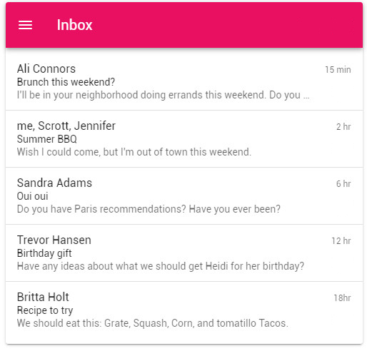
I use Vuetify v-list sample (Github)My v-list:
Code:
<template>
  <v-card
    max-width="500"
    class="mx-auto"
  >
    <v-toolbar
      color="pink"
      dark
    >
      <v-app-bar-nav-icon></v-app-bar-nav-icon>

      <v-toolbar-title>Inbox</v-toolbar-title>
    </v-toolbar>

    <v-list two-line>
      <v-list-item-group
        v-model="selected"
        multiple
        active-class="pink--text"
      >
        <template v-for="(item, index) in items">
          <v-list-item :key="item.title">
            <template v-slot:default="{ active, toggle }">
              <v-list-item-content>
                <v-list-item-title v-text="item.title"></v-list-item-title>
                <v-list-item-subtitle class="text--primary" v-text="item.headline"></v-list-item-subtitle>
                <v-list-item-subtitle v-text="item.subtitle"></v-list-item-subtitle>
              </v-list-item-content>

              <v-list-item-action>
                <v-list-item-action-text v-text="item.action"></v-list-item-action-text>
              </v-list-item-action>
            </template>
          </v-list-item>

          <v-divider
            v-if="index + 1 < items.length"
            :key="index"
          ></v-divider>
        </template>
      </v-list-item-group>
    </v-list>
  </v-card>
</template>

<script>
  export default {
    data: () => ({
      selected: [2],
      items: [
        {
          action: '15 min',
          headline: 'Brunch this weekend?',
          title: 'Ali Connors',
          subtitle: "I'll be in your neighborhood doing errands this weekend. Do you want to hang out?",
        },
        {
          action: '2 hr',
          headline: 'Summer BBQ',
          title: 'me, Scrott, Jennifer',
          subtitle: "Wish I could come, but I'm out of town this weekend.",
        },
        {
          action: '6 hr',
          headline: 'Oui oui',
          title: 'Sandra Adams',
          subtitle: 'Do you have Paris recommendations? Have you ever been?',
        },
        {
          action: '12 hr',
          headline: 'Birthday gift',
          title: 'Trevor Hansen',
          subtitle: 'Have any ideas about what we should get Heidi for her birthday?',
        },
        {
          action: '18hr',
          headline: 'Recipe to try',
          title: 'Britta Holt',
          subtitle: 'We should eat this: Grate, Squash, Corn, and tomatillo Tacos.',
        },
      ],
    }),
  }
</script>
I want when I hover on each v-list-item, A light white background with some shadow a button in it's center to be appeared. (I made this hover concept in Photoshop):
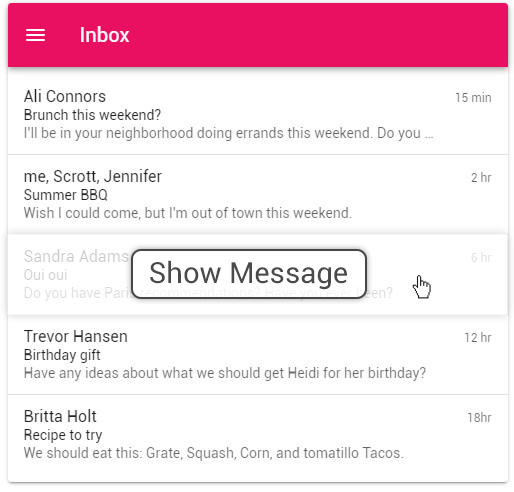
Should I use v-hover component? And what style should I use?
Thanks.