What is the difference among col-lg-*, col-md-* and col-sm-* in Bootstrap?
Solution 1
Updated 2020...
Bootstrap 5
In Bootstrap 5 (alpha) there is a new -xxl- size:
col-* - 0 (xs)
col-sm-* - 576px
col-md-* - 768px
col-lg-* - 992px
col-xl-* - 1200px
col-xxl-* - 1400px
Bootstrap 4
In Bootstrap 4 there is a new -xl- size, see this demo. Also the -xs- infix has been removed, so smallest columns are simply col-1, col-2.. col-12, etc..
col-* - 0 (xs)
col-sm-* - 576px
col-md-* - 768px
col-lg-* - 992px
col-xl-* - 1200px
Additionally, Bootstrap 4 includes new auto-layout columns. These also have responsive breakpoints (col, col-sm, col-md, etc..), but don't have defined % widths. Therefore, the auto-layout columns fill equal width across the row.
Bootstrap 3
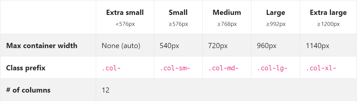
The Bootstrap 3 grid comes in 4 tiers (or "breakpoints")...
- Extra small (for smartphones
.col-xs-*) - Small (for tablets
.col-sm-*) - Medium (for laptops
.col-md-*) - Large (for laptops/desktops
.col-lg-*).
These grid sizes enable you to control grid behavior on different widths. The different tiers are controlled by CSS media queries.
So in Bootstrap's 12-column grid...
col-sm-3 is 3 of 12 columns wide (25%) on a typical small device width (> 768 pixels)
col-md-3 is 3 of 12 columns wide (25%) on a typical medium device width (> 992 pixels)
The smaller tier (xs, sm or md) also defines the size for larger screen widths. So, for the same size column on all tiers, just set the width for the smallest viewport...
<div class="col-lg-3 col-md-3 col-sm-3">..</div> is the same as,
<div class="col-sm-3">..</div>
Larger tiers are implied. Because col-sm-3 means 3 units on sm-and-up, unless specifically overridden by a larger tier that uses a different size.
xs(default) > overridden by sm > overridden by md > overridden by lg
Combine the classes to use change column widths on different grid sizes. This creates a responsive layout.
<div class="col-md-3 col-sm-6">..</div>
The sm, md and lg grids will all "stack" vertically on screens/viewports less than 768 pixels. This is where the xs grid fits in. Columns that use the col-xs-* classes will not stack vertically, and continue to scale down on the smallest screens.
Resize your browser using this demo and you'll see the grid scaling effects.
This article explains more about how the Bootstrap grid
Solution 2
The bootstrap docs do explain it, but it still took me a while to get it. It makes more sense when I explain it to myself in one of two ways:
If you think of the columns starting out horizontally, then you can choose when you want them to stack.
For example, if you start with columns: A B C
You decide when should they stack to be like this:
A
B
C
If you choose col-lg, then the columns will stack when the width is < 1200px.
If you choose col-md, then the columns will stack when the width is < 992px.
If you choose col-sm, then the columns will stack when the width is < 768px.
If you choose col-xs, then the columns will never stack.
On the other hand, if you think of the columns starting out stacked, then you can choose at what point they become horizontal:
If you choose col-sm, then the columns will become horizontal when the width is >= 768px.
If you choose col-md, then the columns will become horizontal when the width is >= 992px.
If you choose col-lg, then the columns will become horizontal when the width is >= 1200px.
Solution 3
From Twitter Bootstrap documentation:
- small grid (≥ 768px) =
.col-sm-*, - medium grid (≥ 992px) =
.col-md-*, - large grid (≥ 1200px) =
.col-lg-*.
Solution 4
Let's un-complicate Bootstrap!

Notice how the col-sm occupies the 100% width (in other terms breaks into new line) below 576px but col doesn't. You can notice the current width at the top center in gif.
Here comes the code:
<div class="container">
    <div class="row">
        <div class="col">col</div>
        <div class="col">col</div>
        <div class="col">col</div>
    </div>
    <div class="row">
        <div class="col-sm">col-sm</div>
        <div class="col-sm">col-sm</div>
        <div class="col-sm">col-sm</div>
    </div>
</div>
Bootstrap by default aligns all the columns(col) in a single row with equal width. In this case three col will occupy 100%/3 width each, whatever the screen size. You can notice that in gif.
Now what if we want to render only one column per line i.e give 100% width to each column but for smaller screens only? Now comes the col-xx classes!
I used col-sm because I wanted to break the columns into separate lines below 576px. These 4 col-xx classes are provided by Bootstrap for different display devices like mobiles, tablets, laptops, large monitors etc.
So,col-sm would break below 576px, col-md would break below 768px, col-lg would break below 992px and col-xl would break below 1200px
Note that there's no
col-xsclass in bootstrap 4.
This pretty much sums-up. You can go back to work.
But there's bit more to it. Now comes the col-* and col-xx-* for customizing width.
Remember in the above example I mentioned that col or col-xx takes the equal width in a row. So if we want to give more width to a specific col we can do this.
Bootstrap row is divided into 12 parts, so in above example there were 3 col so each one takes 12/3 = 4 part. You can consider these parts as a way to measure width.
We could also write that in format col-* i.e. col-4 like this :
<div class="row">
  <div class="col-4">col</div>
  <div class="col-4">col</div>
  <div class="col-4">col</div>
</div>
And it would've made no difference because by default bootstrap gives equal width to col (4 + 4 + 4 = 12).
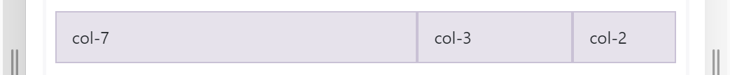
But, what if we want to give 7 parts to 1st col, 3 parts to 2nd col and rest 2 parts (12-7-3 = 2) to 3rd col (7+3+2 so total is 12), we can simply do this:
<div class="row">
  <div class="col-7">col-7</div>
  <div class="col-3">col-3</div>
  <div class="col-2">col-2</div>
</div>
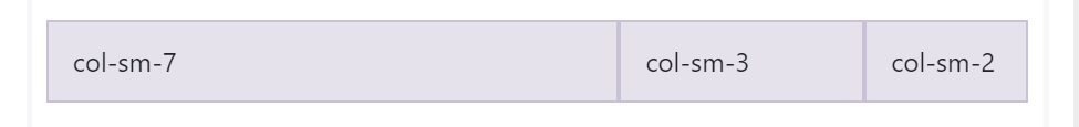
and you can customize the width of col-xx-* classes also.
<div class="row">
    <div class="col-sm-7">col-sm-7</div>
    <div class="col-sm-3">col-sm-3</div>
    <div class="col-sm-2">col-sm-2</div>
</div>
How does it look in the action?

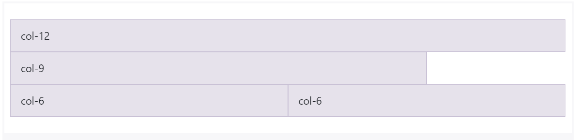
What if sum of col is more than 12? Then the col will shift/adjust to below line. Yes, there can be any number of columns for a row!
<div class="row">
        <div class="col-12">col-12</div>
        <div class="col-9">col-9</div>
        <div class="col-6">col-6</div>
        <div class="col-6">col-6</div>
    </div>
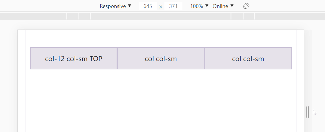
What if we want 3 columns in a row for large screens but split these columns into 2 rows for small screens?
<div class="row">
    <div class="col-12 col-sm">col-12 col-sm TOP</div>
    <div class="col col-sm">col col-sm</div>
    <div class="col col-sm">col col-sm</div>
</div>
You can play around here: https://jsfiddle.net/JerryGoyal/6vqno0Lm/
Solution 5
I think the confusing aspect of this is the fact that BootStrap 3 is a mobile first responsive system and fails to explain how this affects the col-xx-n hierarchy in that part of the Bootstrap documentation. This makes you wonder what happens on smaller devices if you choose a value for larger devices and makes you wonder if there is a need to specify multiple values. (You don't)
I would attempt to clarify this by stating that... Lower grain types (xs, sm) attempt retain layout appearance on smaller screens and larger types (md,lg) will display correctly only on larger screens but will wrap columns on smaller devices. The values quoted in previous examples refer to the threshold as which bootstrap degrades the appearance to fit the available screen estate.
What this means in practice is that if you make the columns col-xs-n then they will retain correct appearance even on very small screens, until the window drops to a size that is so restrictive that the page cannot be displayed correctly. This should mean that devices that have a width of 768px or less should show your table as you designed it rather than in degraded (single or wrapped column form). Obviously this still depends on the content of the columns and that's the whole point. If the page attempts to display multiple columns of large data, side by side on a small screen then the columns will naturally wrap in a horrible way if you did not account for it. Therefore, depending on the data within the columns you can decide the point at which the layout is sacificed to display the content adequately.
e.g. If your page contains three col-sm-n columns bootstrap would wrap the columns into rows when the page width drops below 992px. This means that the data is still visible but will require vertical scrolling to view it. If you do not want your layout to degrade, choose xs (as long as your data can be adequately displayed on a lower resolution device in three columns)
If the horizontal position of the data is important then you should try to choose lower granularity values to retain the visual nature. If the position is less important but the page must be visible on all devices then a higher value should be used.
If you choose col-lg-n then the columns will display correctly until the screen width drops below the xs threshold of 1200px.
StreetCoder
Web application Developer: expert on python, php, nodejs, angular
Updated on July 17, 2020Comments
-
StreetCoder almost 4 years
What is the difference among
col-lg-*,col-md-*andcol-sm-*in Twitter Bootstrap? -
Donato about 9 yearsWhat is the effect of nesting col-sm within a col-md? How would that change the behavior of col-sm and col-md?
-
 Zim about 9 yearsIt causes the nested
smremain in columns at narrower widths. Try for yourself: codeply.com/go/LGyFiEJqXq -
 Istiaque Ahmed about 9 years@Skelly, may I ask you to have a look at a responsive design related question here : tinyurl.com/nadfh2u ?
 -
bvgheluwe almost 9 yearsI guess this is what the OP was asking for (not the raw numbers), but got flamed upon.
-
 Jo Smo almost 8 yearsThis answer explains it best. At least for me it did. This was all i needed to know: "If you choose col-lg, then the columns will stack when the width is < 1200px.". Thanks!
 -
 Kevin Le - Khnle over 7 yearsThis is how you explain in an elevator ride and still get your explanation understood.
 -
Max over 7 yearsI agree this should be the accepted answer as it states exactly the behaviour of the different sizes.
-
jbyrd over 7 yearsWhy is
<div class="col-sm-3">..</div>the same as<div class="col-lg-3 col-md-4 col-sm-3">..</div>and not<div class="col-lg-3 col-md-3 col-sm-3">..</div>(xx-3 for all)? -
Zim over 7 yearsThanks.. I fixed that:
<div class="col-lg-3 col-md-3 col-sm-3">..</div>is the same as<div class="col-sm-3">..</div> -
null over 6 yearsI know this is old, so it doesn't matter what col-* i choose it will stack eventually on different sizes?
-
kds23 about 6 yearsThis just revamped my understanding of Bootstrap.
-
Sha over 3 yearsThank you for the clear explanation, elaborate answer with animations and several examples.
-
developer01 over 3 yearsExcellent explanation. Thanks!
-
 Homunculus Reticulli almost 3 yearsFantastic explanation! You should consider making some tutorials! You seem to have a knack of making things simple to understand! :)