What is the screen size used by Google's PageSpeed Insights for mobile previews?
Solution 1
As stated in Google's PageSpeed Insights FAQ:
Does PageSpeed Insights use a real device?
PageSpeed Insights' analysis does not use real devices. PageSpeed Insights fetches a site with a webkit renderer (the same rendering engine that powers Chrome and Safari) that emulates both mobile device and desktop devices.
Therefore, screen width should not be a factor as it will render accordingly in WebKit.
As long as you're using a common screen width, you should be fine. As stated in Google's Webmaster Central Blog on Responsive Design and Media Queries:
The default viewport width for the default Android browser is 800px, and 980px for iOS,
So for both target OS's, you might use 800px for landscape smartphones, portrait tablets, and narrow desktops, and 479px for smartphones in portrait mode.
An example from the blog is:
@media screen and (min-width:480px) and (max-width:800px) {
  /* Target landscape smartphones, portrait tablets, narrow desktops

  */
}

@media screen and (max-width:479px) {
  /* Target portrait smartphones */
}
The following is a list of viewport widths for specific devices should you need to target one: Viewport Sizes
Alternatively, using the following would set the viewport to the default width of the device automatically, and should work in PageSpeed Insights too:
<meta name="viewport" content="width=device-width, initial-scale=1">
In summary, if your screen width renders fine in mobile browsers, it should render fine in PageSpeed Insights as well.
Solution 2
It's 320px wide.
To figure this out I ran Page Speed Insight (PSI) on a page with ranges of media queries that changed the background color at different breakpoints. After narrowing the width down to within 20px, I added a media query for every width within that 20px range until I found exactly the width PSI was using.
The reason this is (arguably) important is, for me, I was attempting to get my portfolio site a 100 PSI score as an exercise. My smallest media query is max-width="600px". I was using responsive images with picturefill setting the smallest image in the srcset to the largest the images would appear at my smallest breakpoint (600px + 80px padding = 520px wide images) but was getting an awful PSI score. Adding a smaller, 320px wide image to the srcset fixed the score.
The reason I say arguably is that, for real-world usage, my page was optimized perfectly without caring about PSI's viewport width. But my goal was specifically to get a high PSI score therefore it was important to figure this number out.
Solution 3
I created a test you can run in order to check. For me, it was 412px for mobile and 1350px for desktop:
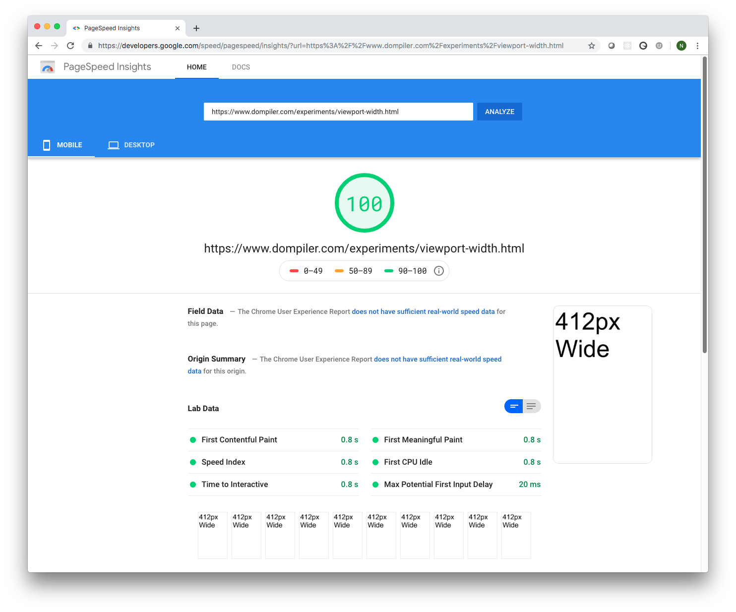
Here's the test: https://developers.google.com/speed/pagespeed/insights/?url=https%3A%2F%2Fwww.dompiler.com%2Fexperiments%2Fviewport-width.html
Here's the HTML code you can use if you want to build your own test:
<!doctype html>
<html>
<head>
    <title>Viewport Width</title>
    <meta name="viewport" content="width=device-width, initial-scale=1.0" />
    <style type="text/css">
        body {
            font-size: 100px;
        }
    </style>
</head>
<body>
    <script>
        document.querySelector("body").appendChild(
            document.createTextNode(window.innerWidth.toString() + "px Wide"));
    </script>
</body>
</html>
All it's doing is adding some text to the body of the page based on window.innerWidth (which is the viewport width).
I imagine this width changes from time to time (and maybe even dynamically or randomly), but at least this gives you a way to periodically check it.
Solution 4
The exact viewport size of the PageSpeed Insights Checker varies.
This is probably to encourage real responsive web design instead of optimization for certain devices.
Additionally, if the viewport size was fixed, people might be able to target PageSpeed.
You can check What's my Viewport Size? with PageSpeed and see the used viewport size in the screenshot.
As statet in the comments and other answers, this will result in different viewport sizes.
Of course this doesn't tell whether the Algorithms in the back actually check at 1.024 px viewport width only. One would need to set up a proper experiment, which f.e. loads a way too big JPG @1.025, and check if PageSpeed complains about it.
Related videos on Youtube
 08 : 09
 05 : 21
 21 : 48
 09 : 55
 04 : 35
Jérôme Verstrynge
You can contact me via my LinkedIn profile.
Updated on September 18, 2022Comments
-
Jérôme Verstrynge over 1 year
Google's PageSpeed Insights allows one to check a website's speed issues for both desktop and smartphone devices.
I have some media query CSS for smartphones on my website, but I am unsure about PageSpeed's smartphone screen size. Does anyone know the screen width?
-
 Stephen Ostermiller over 9 years320px is the width that all iPhone web browsers use. Given that it is such a common size, it would make sense for Google to pick it.
 -
 Iggy about 8 yearsshows 411x731 to me with your page
 -
Andy about 8 yearsInteresting. I was wondering: If the size would be fixed, it would be possible to target Page Speed – which is something Google definitely doesn't want. So they probably vary the screen dimensions.
-
Andy about 8 years@StephenOstermiller 320 px is not every iPhone's viewport width. The iPhone 6 already uses 375 px. viewportsizes.com
-
Andy about 8 yearsOriginally it was 375 × 667 px² for mobile and 1024 × 768 px² for desktop in my case. Jesse reported 320 px width for mobile.
-
 smlync over 3 yearsThe FAQ location has changed and now specifically answers this question. Updated FAQ Link Currently, Lighthouse simulates a page load on a mid-tier device (Moto G4) on a mobile network. It also links to another page which includes the throttling info, which appears to currently be Slow 4G.
 -
 dooo2710 over 3 yearsAs of now (Oct 30th, 2020), mobile is 360px wide (3x pixel density) and 1350px desktop