Adjacent bar charts with different scalings
7,476
The trick is in the data layout of the data source. Put the Net Revenue value in its own column. Insert a gap column. Then select the whole table and insert a clustered column chart. Select the "No. of Accounts" series and send it to the secondary axis. Format both series to a gap width of 0.

Related videos on Youtube
 09 : 58
How to Show Two Scales in Bar Line Combo Chart in Chart js
 11 : 05
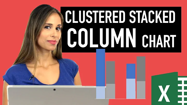
Excel Column Chart - Stacked and Clustered combination graph
 08 : 09
Clustered Stacked Bar Chart In Excel
 15 : 45
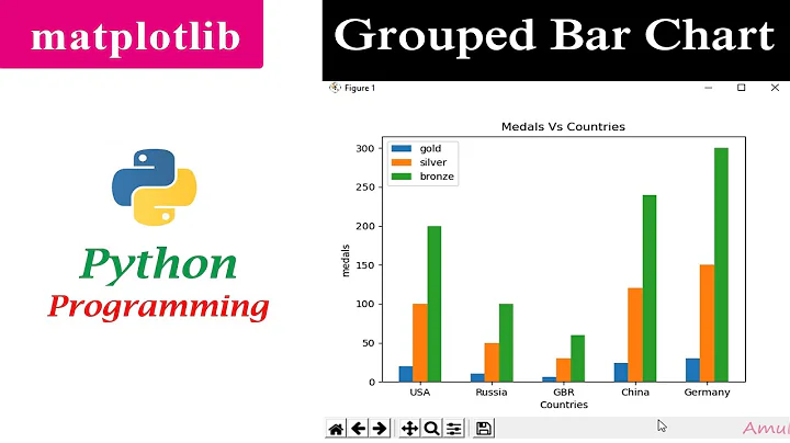
Multiple Bar Chart | Grouped Bar Graph | Matplotlib | Python Tutorials
 02 : 51
Adjacent bar charts with different scalings
Author by
phg
Updated on September 18, 2022Comments
-
phg over 1 year
I have this chart created in Excel 2013:

using this data:
                   Last 4 Weeks  Last 12 Months
No. of Accounts              36             186
Net Revenue             149,562       1,176,829
I wish to have the line (Net Revenue) as a bar chart next to the already present No. of Accounts bar charts, with the same scalings on the vertical axes.
When I change the
Combosettings inChange Chart TypeI get the plot shown below, which is not quite what I want. I wish to have the blue & red bars beside, not above, each other.
-
 Mike Honey over 9 yearsThis seems like a very confusing design for a chart. I prefer your first example - most readers "get" that the line is from a separate series. I would also axis titles to clarify the meaning of each Y axis.
-