Bootstrap 3 grid, does it *really* matter how many columns are in a row?
No, there's nothing to mandate that the bootstrap grid must add up to 12 columns.
It's just a preference / stylistic thing.
Less than 12 Columns -> Aligns Left:
If you have less than twelve of the columns filled, by default they will left align, leaving empty space to the right.
The following code:
<div class='row'>
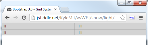
<div class="col-xs-2">Hi</div>
<div class="col-xs-2">Hi</div>
</div>
.row > div {
    background: lightgrey;
    border: 1px solid grey;
}
Results in this: (Demo in Fiddle)

More than 12 Columns -> Wraps:
If the total adds to more than 12 columns, as long as the columns are within a row class, they will just wrap to additional rows. A good use case would be a photo grid system where you would like to add tons of photos but don't know how many rows you'll have and would still like to define the number of columns.
The following code:
<div class='row'>
    <div class="col-xs-6">Hi</div>
    <div class="col-xs-6">Hi</div>
    <div class="col-xs-6">Hi</div>
    <div class="col-xs-6">Hi</div>
</div>
Results in this: (Demo in Fiddle)
Other than that, sometimes it's the case that 12 column layouts look better, but you don't have to use them; it's not a sudoku :)
Related videos on Youtube
 40 : 19
 08 : 40
 17 : 20
 06 : 07
 15 : 49
 22 : 36
 07 : 43
 11 : 50
 01 : 22
 01 : 22
 01 : 24
 01 : 40
JohnC
Updated on June 26, 2022Comments
-
JohnC about 2 years
I have a form layout that has bootstrap 3 form groups on it. I want these form groups in a single column on < small, 2 columns on tablet size break and 4 column on larger screens.
I have it apparently working perfectly, however after doing some reading here what I did seems to violate the supposed rule that every column in a row must add up to 12. However every tutorial and docs I could find always use weasel words like "should" or "ideally" when saying it should add up to 12. There doesn't seem to be a clear guidance here.
I defined my groups like this:
<div class="row">
    <div class="form-group col-md-6 col-lg-3" ><!--....etc-->
and I currently have 4 of these in each row. This means that the 4 * col-lg-3 adds up to 12 but the 4 * col-md-6 form group divs adds up to 24 not 12.
However this doesn't seem to matter and it works perfectly at each breakpoint.
Should I be concerned? Does it matter in any way? Surely I'm not supposed to do two completely different layouts that duplicate all these controls once each for col-md-6 and col-lg-3 on the same page?
-
 Zim about 9 yearsThanks for this great explanation. There are many that mistakenly think there is a problem with have more than 12 column units per row.
 -
 trognanders almost 8 yearsIf the column blocks are not all the same height, wrapping gets messy.
 -
engineersmnky almost 8 years@Bailey my answer was more directed at the rule of 12 questions the OP stated and how they work. Not necessarily an answer to controlling the visual aspect of what defines a row.