Creating a responsive divider (vertical/horizontal) in Bootstrap
17,370
Solution 1
This is a simple example how to make a responsive horizontal line with words by Bootstrap 4.1
<link href="https://stackpath.bootstrapcdn.com/bootstrap/4.1.3/css/bootstrap.min.css" rel="stylesheet"/>
<div class="d-flex">
  <hr class="my-auto flex-grow-1">
  <div class="px-4">SOME TEXT HERE</div>
  <hr class="my-auto flex-grow-1">
</div>
Solution 2
This has to be done using a class which can change with media queries. Check this link out for a solution http://www.bootply.com/cwvl8JaIEi. Its basically what you have already with a few additions as follows:
- A class for the line
- media queries
.sepText {
    background: #ffffff;
    margin: -15px 0 0 -38px;
    padding: 5px 0;
    position: absolute;
    left: 43%;
    text-align: center;
}
hr{-webkit-transform: translate(-45px, -11px) rotate(90deg) scale(0.8);
    -ms-transform: translate(-45px, -11px) rotate(90deg) scale(0.8);
    transform: translate(-45px, -11px) rotate(90deg) scale(0.8);}

@media only screen and (max-width: 999px) {
   hr{
       -webkit-transform: none;
    -ms-transform: none;
    transform: none;
    }
   .sepText {
    left: 50%;
    top:50%
	}
 }
<link href="https://maxcdn.bootstrapcdn.com/bootstrap/3.3.6/css/bootstrap.min.css" rel="stylesheet"/>
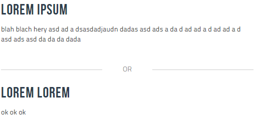
<div class="row">
<div class="col-md-5">
<h2>Lorem ipsum</h2>
<p>blah blach hery asd
ad a dsasdadjaudn dadas asd ads a da d ad ad a d ad ad a d<br>asd ads asd da da da dada
</p>
</div>
<div class="col-md-2">
<div class="sep">
<hr><div class="sepText">
OR
</div>
</div>
</div>
<div class="col-md-5">
<h2>Lorem lorem</h2>
<p>ok ok ok</p>
</div>
</div>
Author by
darkdark
Updated on June 05, 2022Comments
-
darkdark almost 2 years
I'm struggling a bit with creating a responsive divider in Bootstrap. By responsive divider I mean a divider which is vertical on large screens and horizontal on smaller screens.
Vertical divider:

Horizontal divider:
-
darkdark about 8 yearsI would accept this answer if it wasn't for the
height:150px;for the.hrelement. Not very generic. -
 Sphinx about 8 yearschallenge accepted.....I have edited the above code, please check it out and the new link
 -
darkdark about 8 yearsThe equal height property of
display: table-celldoesn't work for floats. -
darkdark about 8 yearsI checked your second link, and it doesn't seem to work as intented. I really liked the simplicity of your first solution. A shame that it only worked with fixed height. I'm gonna leave the question open until I someone posts a good solution. I'm aware that 100% height is somewhat tricky, but I'm still hoping.
-
 LWRMS about 3 yearsmx-auto to align will vertical align the <hr> with the text center so you get ----- TEXT ----- instead of ______ TEXT ______
 -
Vigneshwaran Sivalingam over 2 yearsDoes it change to a horizontal divider in responsive mode?