Flexbox: center horizontally and vertically
Solution 1
I think you want something like the following.
html, body {
height: 100%;
}
body {
margin: 0;
}
.flex-container {
height: 100%;
padding: 0;
margin: 0;
display: flex;
align-items: center;
justify-content: center;
}
.row {
width: auto;
border: 1px solid blue;
}
.flex-item {
background-color: tomato;
padding: 5px;
width: 20px;
height: 20px;
margin: 10px;
line-height: 20px;
color: white;
font-weight: bold;
font-size: 2em;
text-align: center;
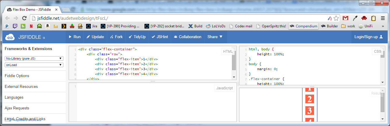
}<div class="flex-container">
<div class="row">
<div class="flex-item">1</div>
<div class="flex-item">2</div>
<div class="flex-item">3</div>
<div class="flex-item">4</div>
</div>
</div>See demo at: http://jsfiddle.net/audetwebdesign/tFscL/
Your .flex-item elements should be block level (div instead of span) if you want the height and top/bottom padding to work properly.
Also, on .row, set the width to auto instead of 100%.
Your .flex-container properties are fine.
If you want the .row to be centered vertically in the view port, assign 100% height to html and body, and also zero out the body margins.
Note that .flex-container needs a height to see the vertical alignment effect, otherwise, the container computes the minimum height needed to enclose the content, which is less than the view port height in this example.
Footnote:
The flex-flow, flex-direction, flex-wrap properties could have made this design easier to implement. I think that the .row container is not needed unless you want to add some styling around the elements (background image, borders and so on).
A useful resource is: http://demo.agektmr.com/flexbox/
Solution 2
How to Center Elements Vertically and Horizontally in Flexbox
Below are two general centering solutions.
One for vertically-aligned flex items (flex-direction: column) and the other for horizontally-aligned flex items (flex-direction: row).
In both cases the height of the centered divs can be variable, undefined, unknown, whatever. The height of the centered divs doesn't matter.
Here's the HTML for both:
<div id="container"><!-- flex container -->
    <div class="box" id="bluebox"><!-- flex item -->
        <p>DIV #1</p>
    </div>
    <div class="box" id="redbox"><!-- flex item -->
        <p>DIV #2</p>
    </div>
</div>
CSS (excluding decorative styles)
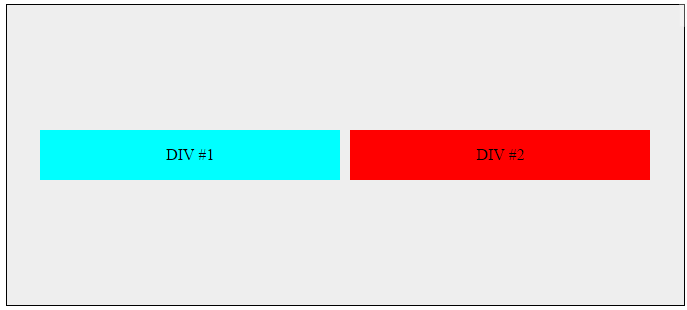
When flex items are stacked vertically:
#container {
    display: flex;           /* establish flex container */
    flex-direction: column;  /* make main axis vertical */
    justify-content: center; /* center items vertically, in this case */
    align-items: center;     /* center items horizontally, in this case */
    height: 300px;
}
.box {
    width: 300px;
    margin: 5px;
    text-align: center;     /* will center text in <p>, which is not a flex item */
}
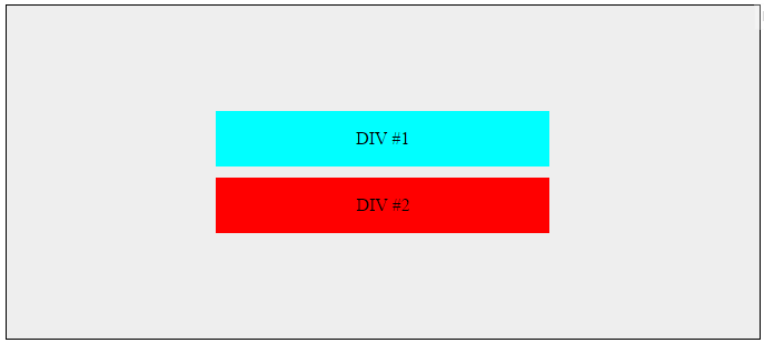
When flex items are stacked horizontally:
Adjust the flex-direction rule from the code above.
#container {
    display: flex;
    flex-direction: row;     /* make main axis horizontal (default setting) */
    justify-content: center; /* center items horizontally, in this case */
    align-items: center;     /* center items vertically, in this case */
    height: 300px;
}
Centering the content of the flex items
The scope of a flex formatting context is limited to a parent-child relationship. Descendants of a flex container beyond the children do not participate in flex layout and will ignore flex properties. Essentially, flex properties are not inheritable beyond the children.
Hence, you will always need to apply display: flex or display: inline-flex to a parent element in order to apply flex properties to the child.
In order to vertically and/or horizontally center text or other content contained in a flex item, make the item a (nested) flex container, and repeat the centering rules.
.box {
    display: flex;
    justify-content: center;
    align-items: center;        /* for single line flex container */
    align-content: center;      /* for multi-line flex container */
}
More details here: How to vertically align text inside a flexbox?
Alternatively, you can apply margin: auto to the content element of the flex item.
p { margin: auto; }
Learn about flex auto margins here: Methods for Aligning Flex Items (see box#56).
Centering multiple lines of flex items
When a flex container has multiple lines (due to wrapping) the align-content property will be necessary for cross-axis alignment.
From the spec:
8.4. Packing Flex Lines: the
align-contentpropertyThe
align-contentproperty aligns a flex container’s lines within the flex container when there is extra space in the cross-axis, similar to howjustify-contentaligns individual items within the main-axis. Note, this property has no effect on a single-line flex container.
More details here: How does flex-wrap work with align-self, align-items and align-content?
Browser support
Flexbox is supported by all major browsers, except IE < 10. Some recent browser versions, such as Safari 8 and IE10, require vendor prefixes. For a quick way to add prefixes use Autoprefixer. More details in this answer.
Centering solution for older browsers
For an alternative centering solution using CSS table and positioning properties see this answer: https://stackoverflow.com/a/31977476/3597276
Solution 3
Add
.container {
    display: flex;
    justify-content: center;
    align-items: center;
}
to the container element of whatever you want to center. Documentation: justify-content and align-items.
Solution 4
You can make use of
display: flex;
align-items: center;
justify-content: center;
on your parent component
Solution 5
Don't forgot to use important browsers specific attributes:
align-items: center; -->
-webkit-box-align: center;
-moz-box-align: center;
-ms-flex-align: center;
-webkit-align-items: center;
align-items: center;
justify-content: center; -->
-webkit-box-pack: center;
-moz-box-pack: center;
-ms-flex-pack: center;
-webkit-justify-content: center;
justify-content: center;
You could read this two links for better understanding flex: http://css-tricks.com/almanac/properties/j/justify-content/ and http://ptb2.me/flexbox/
Good Luck.
bsr
Updated on January 28, 2022Comments
-
bsr over 1 year
How to center div horizontally, and vertically within the container using flexbox. In below example, I want each number below each other (in rows), which are centered horizontally.
.flex-container {
  padding: 0;
  margin: 0;
  list-style: none;
  display: flex;
  align-items: center;
  justify-content: center;
}
row {
  width: 100%;
}
.flex-item {
  background: tomato;
  padding: 5px;
  width: 200px;
  height: 150px;
  margin: 10px;
  line-height: 150px;
  color: white;
  font-weight: bold;
  font-size: 3em;
  text-align: center;
}
<div class="flex-container"> <div class="row"> <span class="flex-item">1</span> </div> <div class="row"> <span class="flex-item">2</span> </div> <div class="row"> <span class="flex-item">3</span> </div> <div class="row"> <span class="flex-item">4</span> </div> </div>-
 Hamid Mayeli over 3 yearsIn your CSS you have
row{which has no effect on rows. If you change it to.row{the result would be totally different.
-
-
 cimmanon over 9 yearsFlex items do not need to be block level unless the content they contain requires it. Also, you've prefixed all of the display properties, but didn't prefix any of the other Flexbox properties (which have different names in the other drafts).
 -
 Marc Audet over 9 years@cimmanon I agree about with you about block level, and I edited my post accordingly. Block level is not required for alignment but may be needed if the user wants to specify height and so on. I took liberty about the browser prefixes, I just assumed a perfect browser for the sake of arriving at a working demo. Thank you again for your comment, appreciate the feedback.
 -
 Pete Kozak almost 9 yearsthis is a good point, for today (to support only the newest browsers) you just need the last two lines -webkit.. for safari and the last one for all the others
 -
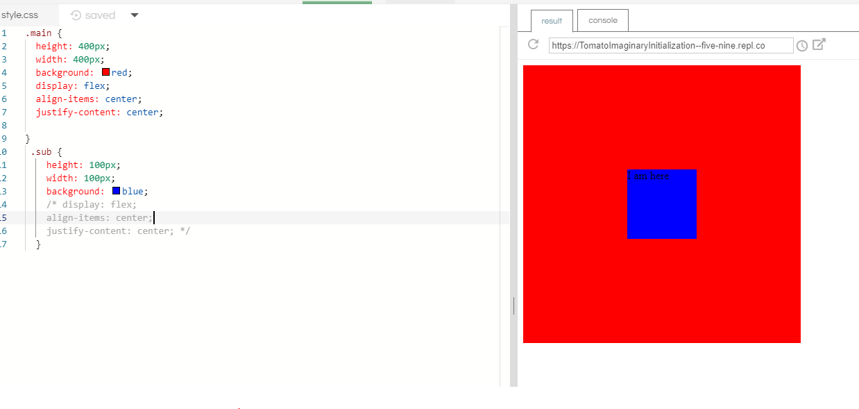
 Brian Gates over 8 yearsIf it overflows, it crops the top. i.imgur.com/3dgFfQK.png Any way to avoid this?
 -
Marc Audet over 8 years@BrianGates If the height of the window is too short, how do you want the 4 elements to be displays, 2x2, 1x4?
-
Brian Gates over 8 yearsSolution is here: stackoverflow.com/questions/24538100/…
-
 benebun over 8 years+1 because old 2009 and March 2012 working drafts still have significant user share (combined about 8% according to caniuse.com).
 -
 user3378649 over 8 yearsFlext doesn't work in safari, how could u solve that problem ?
 -
 QMaster over 8 yearsI checked the last version of safari on windows many days ago and I don't remember it very well, but I'll check and will say you. Just please tell me what version of safari did you mean? and on which OS?
 -
 bungleofsketches over 7 yearssince this is easily and widely supported by modern browsers with pure flexbox your library solution is surely not necessary. Especially since he asked how to do it using flex box not a css library.
 -
QMaster over 6 years@user3378649 Latest safari version could support Flex-box, Please see this link: caniuse.com/#search=flexbox
-
QMaster over 6 yearsThese links maybe useful too: stackoverflow.com/a/33502857/1830909 and sketchingwithcss.com/samplechapter/cheatsheet.html
-
 kapil over 6 yearscan we do it horizontally right, left and vertically center?
 -
 Michael Benjamin over 6 years@kapil, adjust the justify-content property to space-between or space-around... jsfiddle.net/8o29y7pd/105
 -
 CodeFinity about 6 yearsThorough answer, but is it necessary to put all of the vendor prefixes. Perhaps brevity is a consideration here.
 -
Marc Audet about 6 years@VisWebsoft When I posted the answer in 2013, vendor prefixes were a good idea, but in 2017, flex has pretty good support so it is not as critical, it really depends on the audience you are expecting (how old their browsers are, for example).
-
 AmerllicA over 5 yearsAwesome answer, It solve my deep question, thanks a lot.
flex-directionforcedisplay: flex;element to have inverse behaviour withalign-itemsandjustify-content. -
 SeaWarrior404 over 5 yearsThis answer should be up on top. Using Flex should be the preferred way for doing this, since it scales nicely across devices and screen. Its far more easier than using floats and managing multiple divs adhere to that.
 -
 giveJob about 4 yearsIe 11 is not working properly horizontal and vertical center
 -
 Piotr Labunski about 3 yearsWhile this code may answer the question, providing additional context regarding how and/or why it solves the problem would improve the answer's long-term value.
 -
 klewis over 2 yearsthank you for noting that child elements are not automatically flex items. We need to cater to them if we want them to be.
 -
 Alan Evangelista almost 2 years@MarcAudet Given that the flex layout is supported in all popular browsers nowadays, it'd be nice to update your answer by removing the vendor prefixes from the main code and mentioning it that these are only required if you need to support old browsers X, Y and Z (e.g. Internet Explorer 10 or older)