Flexbox wraps last column of the first row in Safari
Solution 1
Just to update on my question
This is the solution I go with, this is obviously fixed for Bootstrap4, which is flexbox compatible. So this is only for bootstrap3.
.row.flexthis:after, .row.flexthis:before{
  display: none;
}
Solution 2
Explanation
This happens because Safari treats :before and :after pseudo-elements as if they were real elements. E.g. think about a container with 7 items. If container has :before and :after Safari will position the items like this:
[:before ] [1st-item] [2nd-item]

[3rd-item] [4th-item] [5th-item]

[6th-item] [7th-item] [:after  ]
Solution
As an alternative to the accepted answer I remove :before & :after from flex containers instead of altering the HTML. In your case:
.flexthis.container:before,
.flexthis.container:after,
.flexthis.row:before,
.flexthis.row:after {
   content: normal; // IE doesn't support `initial`
}
Solution 3
I know the issue is quite old, but I ran into this issue today, and wasted over 12 hours in fixing it. Though about 10 hours out of that were spent in realizing that safari is failing with 12-column bootstrap grid, and it is no other issue.
Fix that I made is rather simple. Here is the version for Visual Composer. Class names may vary for other frameworks.
.vc_row-flex:before, .vc_row-flex:after{
  width: 0;
}
Solution 4
I didn't want to add more classes to fix this kind of bug, so alternatively you can fix the .row class itself.
.row {
    &:before {
        content: none;
    }

    &:after {
        content: '';
    }
}
Solution 5
I was able to fix it by adding
.row:before, .row:after {
display: flex !important;
}
Obviously this isn't the most elegant solution but it may work for some in the meantime until they fix it.
DominikN.
Updated on July 05, 2022Comments
-
DominikN. almost 2 years
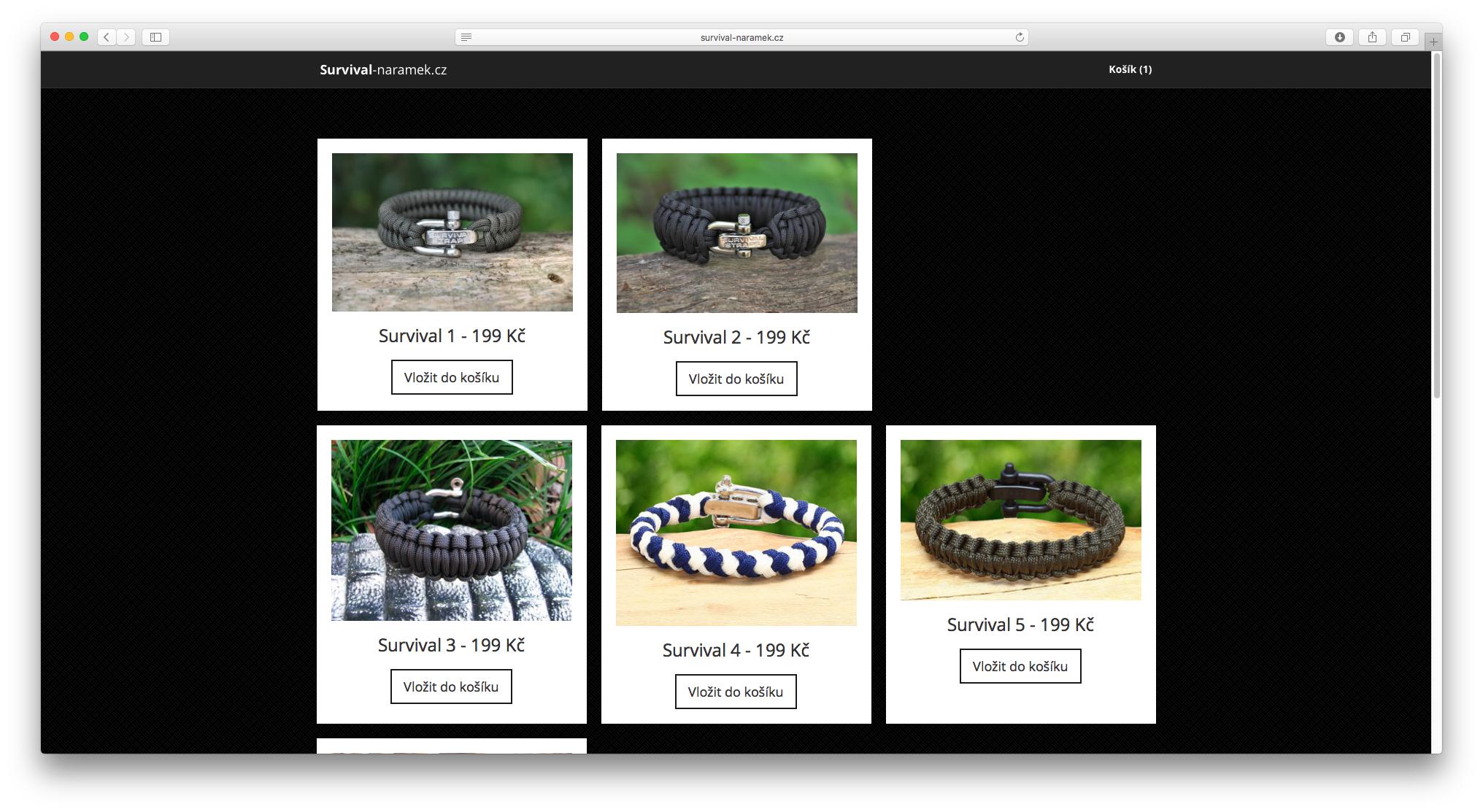
The last column of the first row is wrapped to the next line when viewing in Safari, and some other iOS based browsers.
Safari:
Chrome / Others:
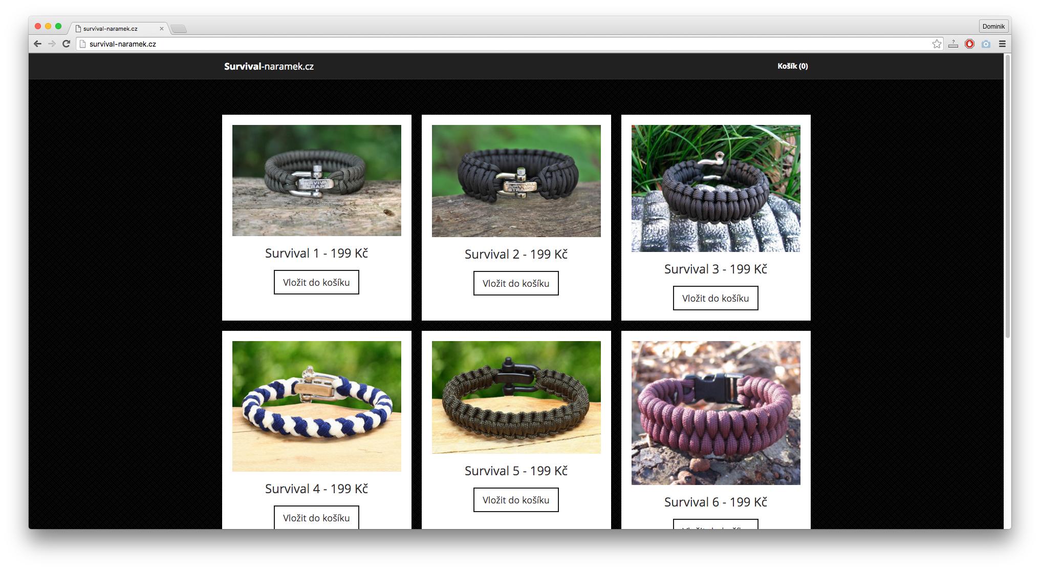
Code:
.flexthis {
  display: -webkit-box;
  display: -webkit-flex;
  display: -ms-flexbox;
  display: flex;
  -webkit-flex-wrap: wrap;
  -ms-flex-wrap: wrap;
  flex-wrap: wrap;
}

.flexthis .col-md-4 {
  display: -webkit-box;
  display: -webkit-flex;
  display: -ms-flexbox;
  display: flex;
}
<div class="row flexthis"> <div class="col-md-4 col-sm-6 text-center"> <div class="product"> <img src="img.jpg" alt="" class="img-responsive"> <h3>Name</h3> <p>Description</p> </div> </div> </div> -
Ben almost 8 yearsI can confirm resetting
beforeandafterfixes the issue in Safari -
 rap-2-h almost 8 yearsI can confirm it too. Seems to be the best answer.
 -
Simon almost 8 yearsThis really should be the answer. The structure is unchanged, only a css edit to correct the OP's problem.
-
athms over 7 yearsThanks - this resolves an issue with Foundation's flex grid in Safari
-
 DadNapper over 7 yearsAwesome! Thank you!
 -
totallyNotLizards over 7 yearsI've been hunting a bug in our grid system with safari only, turned out to be caused by this because there was a wrapper class that was applying a clearfix that uses ::before and ::after, just incase the columns were floated and not using flex. what a nonsense.
-
rubeonline about 7 yearsGreat explantation. Thank you
-
Bojan Petkovic over 6 yearsplease explain why that will work. What part is the key
-
aljabear over 6 yearsbless you and all of your children
-
Stephen Sabatini over 5 yearsBrilliant. Thank you.
-
synweap15 over 4 yearsAbsolutely amazing, confirmed to be working, thank you very much.