Font looks blurry after translate in Chrome
Solution 1
A suggestion from a related discussion solved the issue for me: https://stackoverflow.com/a/46117022/7375996
Using calc with some offset solved the issue in my case:
transform: translate(calc(-50% + 0.5px), calc(-50% + 0.5px));
Solution 2
I've tried different solutions in different, sometimes scary, combinations:
-
translate3dinstead oftranslateY -
zoom:2; transform: scale(0.5);orzoom:0.5; transform: scale(2); transform: translate(calc(-50% + 0.5px), calc(-50% + 0.5px));-webkit-filter: blur(0);perspective: 1000pxscale(1.0, 1.0)-webkit-font-smoothing: subpixel-antialiased;
none of them work in july 2019.
The only solution i found for modals, that should be centered - to use a flexbox aligment instead of transform: translate.
.modal__container {
  display: flex;
  justify-content: center;
  align-items: center;
  position: fixed;
  top: 0;
  right: 0;
  bottom: 0;
  left: 0;
  background: rgba(0, 0, 0, 0.5);
}

  .modal {
    box-sizing: border-box;
    max-width: 80%;
    max-height: 80%;
    padding: 20px;
    overflow-y: auto;
    background: #fff;
  }
<div class="modal__container">
<div class="modal">
Lorem ipsum dolor sit amet, consectetur adipiscing elit, sed do eiusmod tempor incididunt ut labore et dolore magna aliqua. Ut enim ad minim veniam, quis nostrud exercitation ullamco laboris nisi ut aliquip ex ea commodo consequat. Duis aute irure dolor in reprehenderit in voluptate velit esse cillum dolore eu fugiat nulla pariatur. Excepteur sint occaecat cupidatat non proident, sunt in culpa qui officia deserunt mollit anim id est laborum.
</div>
</div>Solution 3
Problem in half of pixel.
Try: transform: translate(-50%, -51%);
It will work!
Solution 4
I found out -webkit-filter: blur(0) could fix your blurry font in Chrome on Windows:
#projectPopup {
    ...
    -webkit-filter: blur(0);
    -webkit-transform: translate(-50%, -50%);
    transform: translate(-50%, -50%);
}
Solution 5
The only solution that worked for me:
Translates can cause blur due to result not being rounded to the nearest pixels, so rounding the div height to an even number fixes it.
We can't do it in CSS as it doesn't know yet its final height, so we have to do it after rendering. Using Jquery is a breeze:
$(window).on("load", function() {
    if($('.popup').height()%2==1) $('.popup').height( 2*Math.round($('.popup').height()/2 ) ) ;
    if($('.popup').width()%2==1) $('.popup').width( 2*Math.round($('.popup').width()/2 ) ) ;
});
Comments
-
joppiesaus almost 2 years
EDIT 2016-07-04(Since this question is getting popular): This is a bug in Chrome. Developers are actively working on a fix.
EDIT 2017-05-14 The bug seems to be fixed, the fix will be introduced in Chrome 60
EDIT 2018-05-04 A fix has been merged, but the bug still appears to be present.
So I have this very ugly-looking window that is centered on the screen by this CSS:
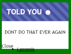
.popup
{
   position: fixed;
   top: 0;
   bottom: 0;

   transform: translate(-50%, -50%);
}
However, it looks like this on Chrome (the font looks really blurry):
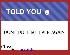
But like this on Firefox:
When I remove the
transformrule, the text looks nice and crispy again, but then it's no longer correctly centered.When I go to
chrome://flagsand execute#disable-direct-writeit looks nicer, but users are obviously not going to do that and it doesn't solve the problem.How can I make my font look nice while still having the window centered?
My chrome version is
44.0.2403.155I have a
three.jsdemo using WebGL that renders on a background canvas. When I disable the demo, the problem no longer occurs. -
 sergdenisov over 8 years@joppiesaus oh, it's strange(. It's OK in my Chrome 44 on Windows 7/8.1/10, OS X, Ubuntu 14.04, something like this. Which OS do you use? Is this snippet crashed too?
 -
joppiesaus over 8 yearsIt's probably because I'm using Chrome 45 now. I'll test it on Linux with the latest stable version(44), I'm sure that will be fine.
-
joppiesaus over 7 yearsNo, it does not work. it might look nicer at a specific situation and specific resolution, but this is not a solution to the problem.
-
 egor.xyz over 7 yearsGive me example when it's not working. This problem exist only in Chrome. I saw many solutions like
translateZ(0)orperspective:1000pxorz-index:1. Idea to move your layout to another layer. But problem in many cases when you are usingscale(1.1)ortranslateX(-50%)not enough: 0.5px and browser making text like blurry. In many cases you can change height of current tag (Add 1px). -
Experimenter over 7 yearszoom: 1.05; help for me
-
trysis about 7 years
scaleandtranslatedo not really mix. This ended up moving my text down too much. -
chifliiiii over 4 yearsflexbox it's ideal with one modal/popup, when you need multiple in different positions you are in trouble
-
Александр Михайлов over 4 yearsYes, every modal needs it's own container in situation with multiple modals on different positions.