How to Apply card view cornerRadius & shadow like iOS appstore in swift 4
Solution 1
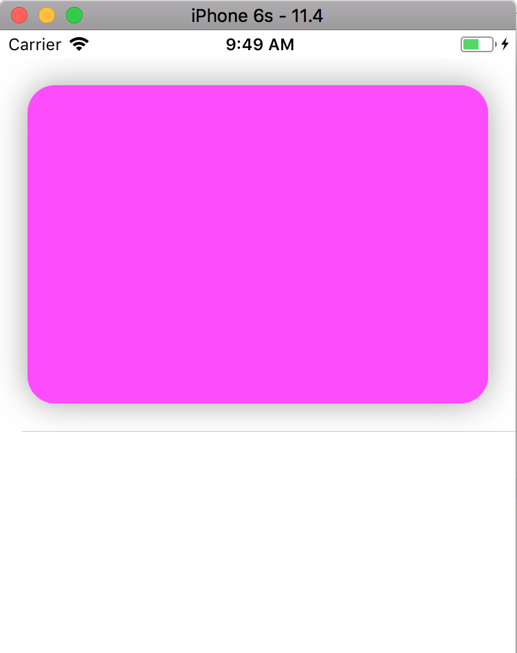
Just add a subview to the cell and manipulate it's layer property. Tweak the values to your liking. The following code should give a similar result to how it looks in the App Store:
    // The subview inside the collection view cell
    myView.layer.cornerRadius = 20.0
    myView.layer.shadowColor = UIColor.gray.cgColor
    myView.layer.shadowOffset = CGSize(width: 0.0, height: 0.0)
    myView.layer.shadowRadius = 12.0
    myView.layer.shadowOpacity = 0.7
Solution 2
Create a new UIView subclass named "CardView" like below:
import Foundation
import UIKit

@IBDesignable
class CardView: UIView {

    @IBInspectable var cornerRadius: CGFloat {
        get {
            return layer.cornerRadius
        }
        set {
            layer.cornerRadius = newValue
            layer.shadowRadius = newValue
            layer.masksToBounds = false
        }
    }

    @IBInspectable var shadowOpacity: Float {
        get {
            return layer.shadowOpacity
        }
        set {
            layer.shadowOpacity = newValue
            layer.shadowColor = UIColor.darkGray.cgColor
        }
    }

    @IBInspectable var shadowOffset: CGSize {
        get {
            return layer.shadowOffset
        }
        set {
            layer.shadowOffset = newValue
            layer.shadowColor = UIColor.black.cgColor
            layer.masksToBounds = false
        }
    }

}
Then just set "CardView" as Custom Class for your view from XCode Interface Builder. It's simple and easily configurable!
Solution 3
- SwiftUI
struct SimpleRedView: View {
    var body: some View {
        Rectangle()
            .foregroundColor(.red)
            .frame(width: 340, height: 500, alignment: .center)
    }
}

struct ContentView: View {
    var body: some View {
        SimpleRedView()
        .cornerRadius(28)
        .shadow(radius: 16, y: 16)
    }
}
SimpleRedView() is just for placeholder and you can replace it with any kind of View you like.
Solution 4
To add onto @oyvindhauge 's great answer -- make sure none of the subviews inside myView extend to the edges. For instance, my card view contained a table view that fills the card -- so it's necessary to set the tableView.layer.cornerRadius = 20.0 as well. This applies to any subview that fills the card.
Rahul Singha Roy
Updated on July 05, 2022Comments
-
Rahul Singha Roy almost 2 years
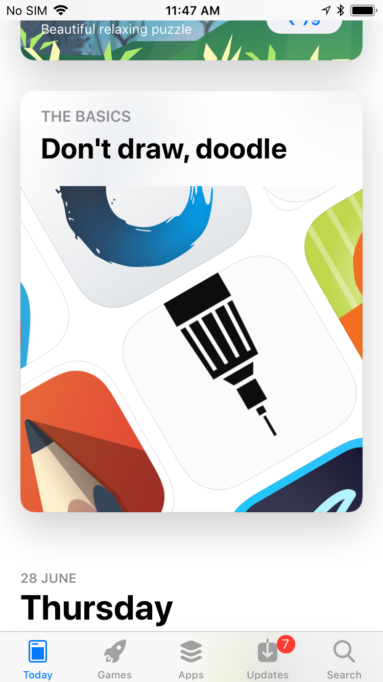
I want to apply "cornerRadius" and card view "shadow" in my collection view cell like iOS appstore today View.