How to center vertically with Angular Flex Layout?
39,334
Solution 1
Vertically centering elements with flexbox has no effect if the container element is the same height as its contents. Making the top level <div> in your example take up all the available vertical space with height: 100% (or some other Angular Flex Layout specific solution if available - maybe fxFlexFill) should center its contents right where you want them.
Solution 2
If the parent element has a known height, all you need is fxLayoutAlign="center center":
<section class="intro-section">
  <div
   fxLayout="row"
   fxLayout.xs="column"
   fxFlexFill
   fxLayoutAlign="center center"
  >
    <div fxFlex="50">
      <h1>MAYABI PORTFOLIO MULTIPURPOSE THEME</h1>
      <p>lorem ipsum dolor sit amt, consectet adop adipisicing elit, sed do eiusmod
teporara incididunt ugt labore.</p>
    </div>
    <div fxLayout="50">
      hello
   </div>
  </div>
</section>

.intro-section {
   height: 500px;
}
Solution 3
You have to specify the height of the fxLayout (Edited)
<div fxLayout="row" fxLayoutAlign="center center" class="row-height">
    <mat-card fxFlex="30%">
        <mat-card-title>Login</mat-card-title>

        <mat-card-content fxLayout="column">
            <mat-form-field>
                <input matInput placeholder="Username">
            </mat-form-field>
            <mat-form-field>
                <input matInput placeholder="Password">
            </mat-form-field>
        </mat-card-content>

        <button mat-raised-button color="accent">Login</button>
    </mat-card>
</div>
CSS
.row-height {
    height: 100%
}
Author by
Christian
Updated on July 09, 2022Comments
-
Christian almost 2 years
I've created a simple login component and I'd like to vertically center, but I'm not sure how to achieve this using the Angular Flex Layout library.
app.component.html
<router-outlet></router-outlet>login.component.html
<div fxLayout fxLayoutAlign="center center">
    <mat-card fxFlex="30%">
        <mat-card-title>Login</mat-card-title>

        <mat-card-content fxLayout="column">
            <mat-form-field>
                <input matInput placeholder="Username">
            </mat-form-field>
            <mat-form-field>
                <input matInput placeholder="Password">
            </mat-form-field>
        </mat-card-content>

        <button mat-raised-button color="accent">Login</button>
    </mat-card>
</div>
styles.scss
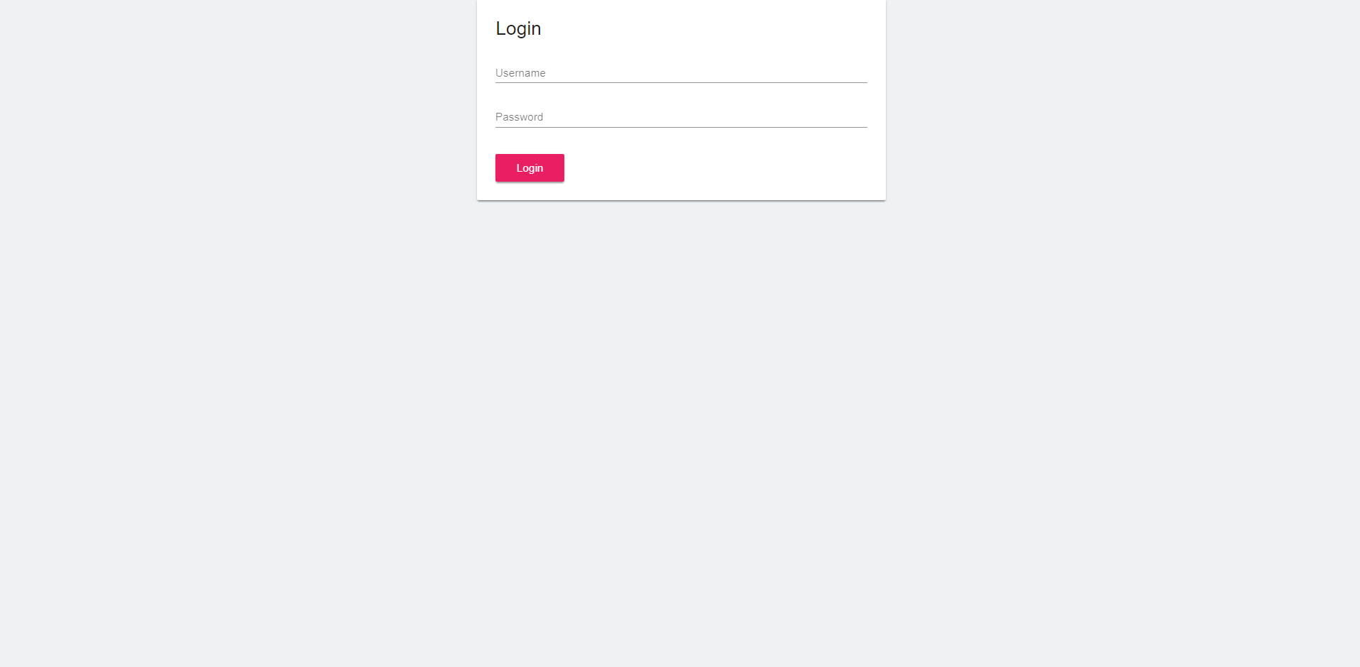
body{
    margin: 0;
    background-color: #eff2f5;
}
screenshot:
-
Christian over 6 yearsI added style="min-height: 100vh"
-
 Saad Abbasi almost 4 yearsin my case, I was using parent div
margin-top:-100px;now added in child divpadding-top:100px;problem solved. this may helpful for some one. -
Ruben Szekér almost 4 yearsI tried this. The code makes sense to me, but it doesn't work as expected. The height, although set to 100%, just takes the required height depending on the children elements, which in my case is only 161px so it's just centered horizontally, but not vertically. So I set the height as
850px. However, this is just a workaround and should not rely on a static number, because it will not be centered on every device/screen width.